
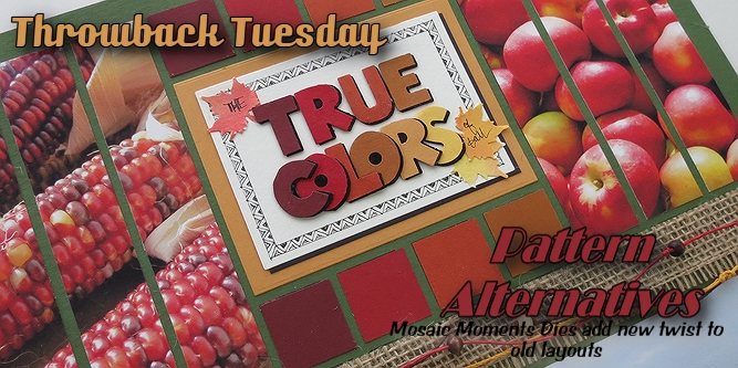
Mosaic Moments Dies adding a new twist to old layouts
Throwback Tuesday:
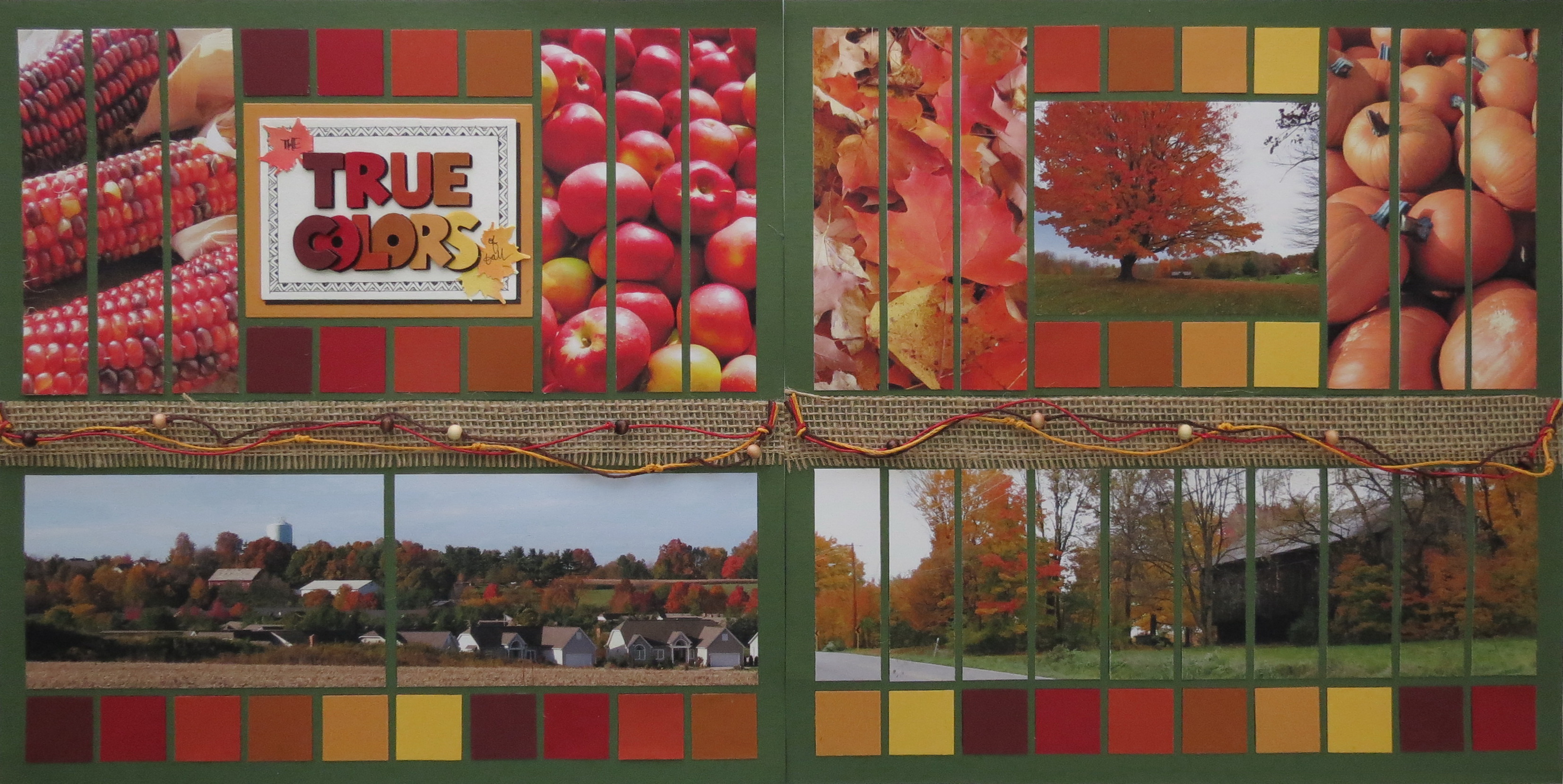
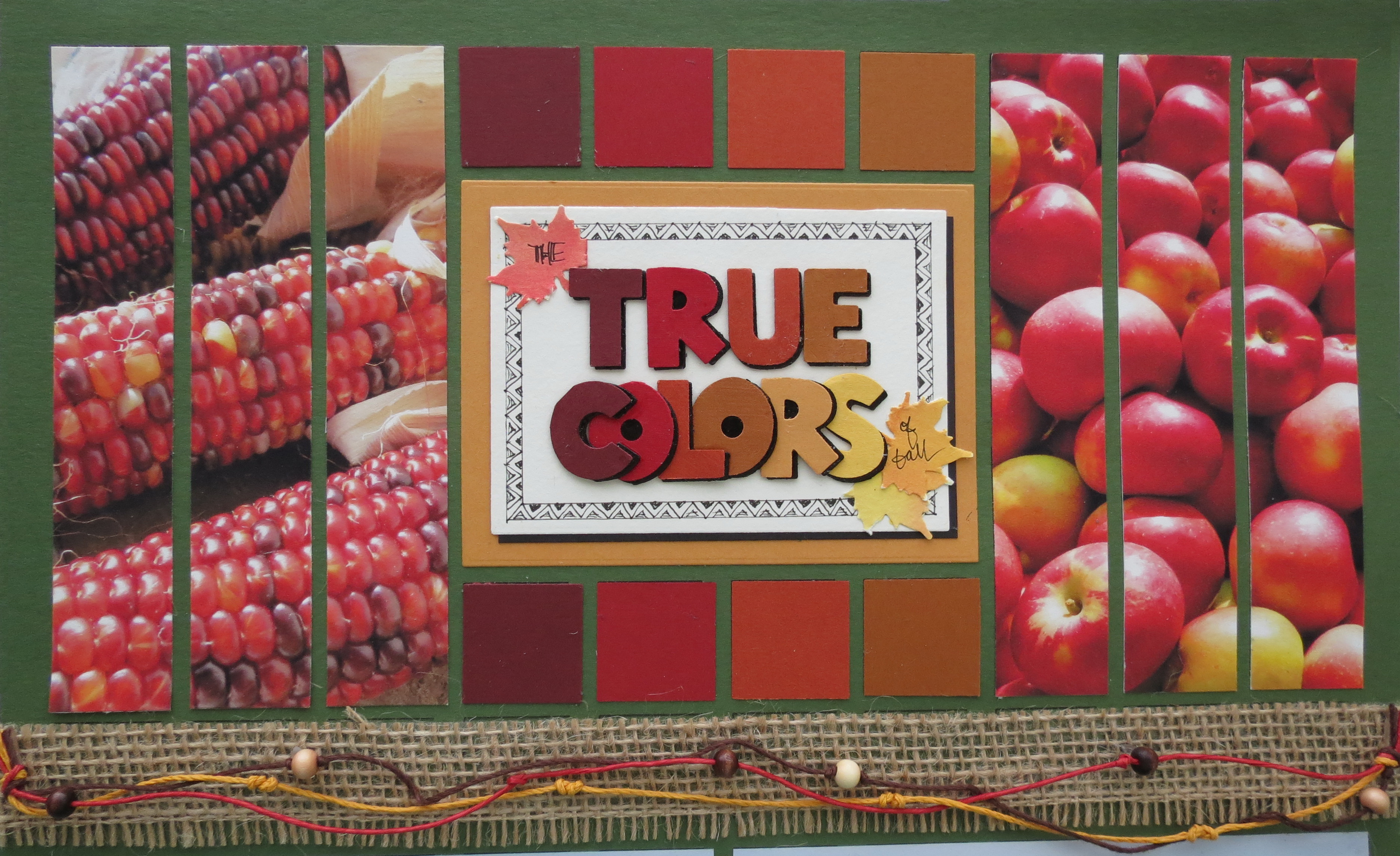
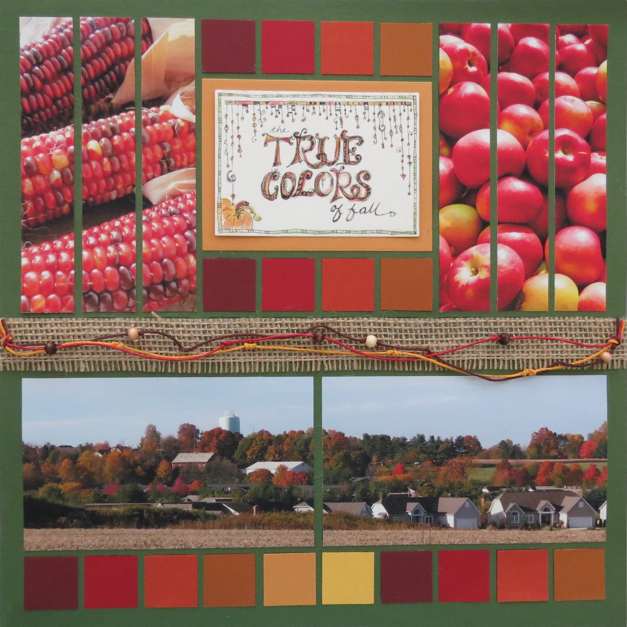
Signs of Autumn becomes The True Colors of Fall
It’s Throwback Tuesday with a look at fall! I’m going to borrow the pattern I began with then and show you a few pattern alternatives that will freshen up an old layout with new ideas.
The original photo challenge can be found here on Journella.
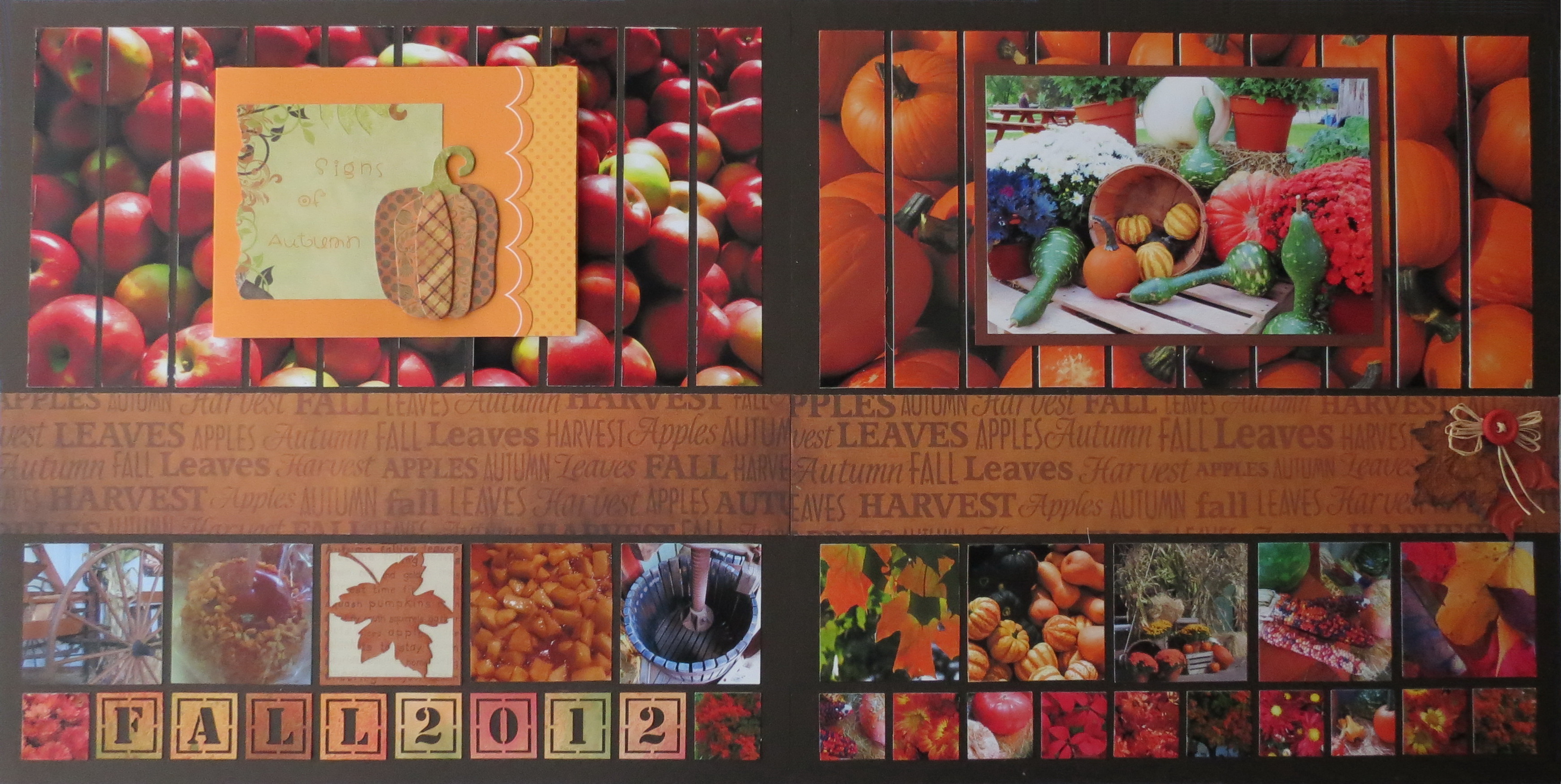
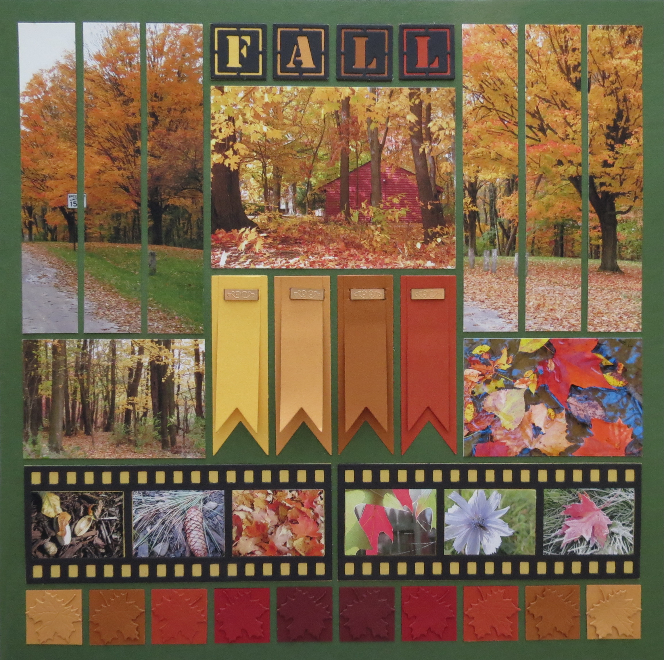
Signs of Autumn
Even in the original layout I tweaked the pattern to suit my photos, so let’s go back to the original and begin there.
Pattern Alternatives beginning with the old…
Pattern Alternatives
Pattern Alternatives: #1
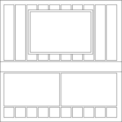
This pattern isn’t currently in our Pattern Gallery it was #43 in the old format. The pattern is divided in half with a panoramic band on the top half and the bottom half with a 1” strip dividing it, two 3×5 photos and the bottom strip in 1” squares.
Page One:
Altering the top half to make use of the new strip die was the first step. Although in the original layout I followed the original pattern to place a mounted photo on top of the panoramic photo, this time a center section for a photo or a title with 1” tiles above and below was flanked by two photos cut with the 1x5.5” strip die. The bottom half of the layout remains the same as the original.
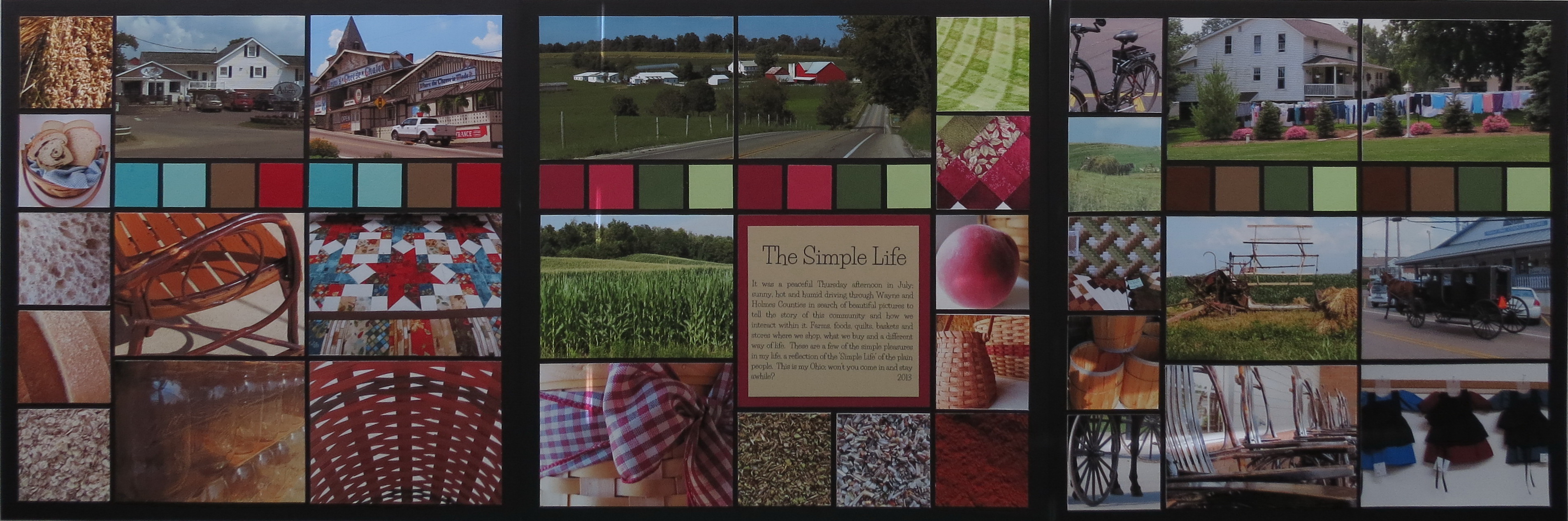
Pattern Alternatives: #2
Page Two:
The bottom half is where the alternative will take place on this layout. The two 3×5 sections are now replaced with 1” strips again using the 1×5.5” strip die.
Pattern Alternatives
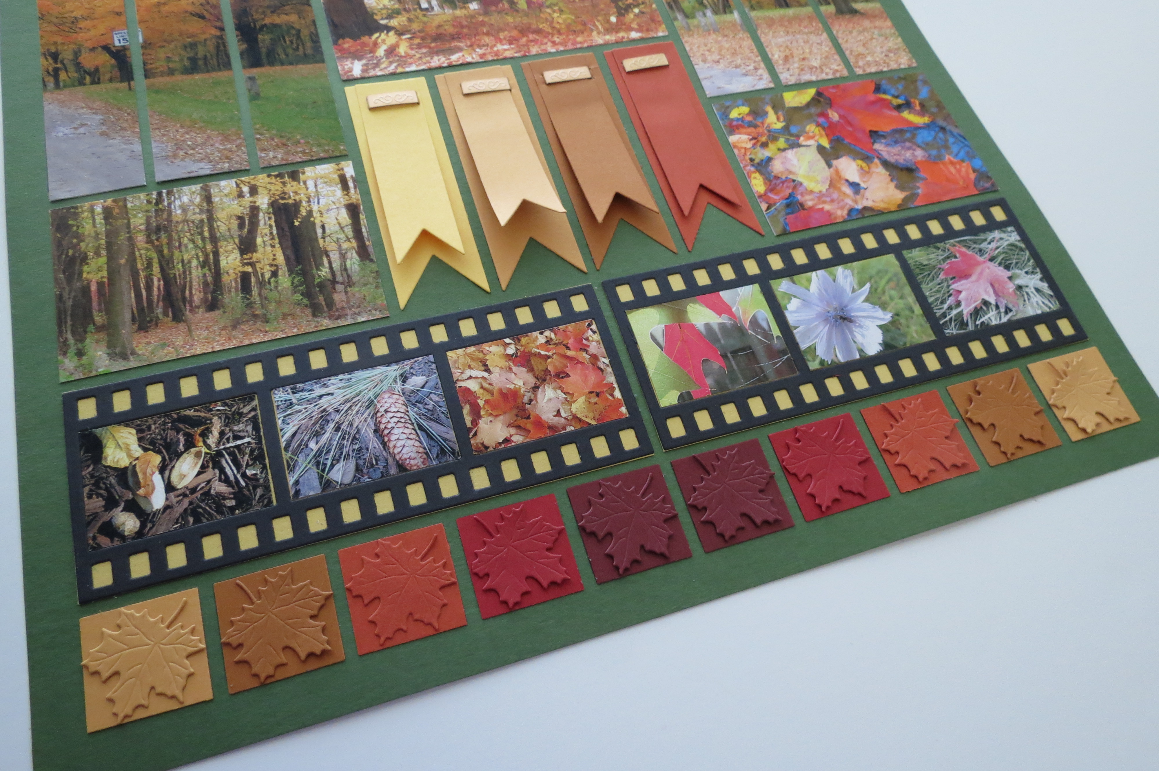
Pattern Alternatives: #3
Page Three:
This layout follows my original pattern alternatives replacing the 1” band in the middle with a two in band. On this page the band was divided to have two photos on the ends giving space to the banners placed below the center photo.
Increasing the center band reduced the next row to a 2” section that I found to be the perfect spot to place two filmstrip die pieces. The bottom row remains perfect for the 1” squares.
Tips for Fall Photos
1. Use photos with vistas showing off colors like in a landscape. After all that’s what we love about fall isn’t it?
2. Use photos with details, close-ups or even macro shots. See the things you may normally overlook. You may surprise yourself with what you find!
3. Remember to use the shots that are in between the two. It creates interest and a bit of balance.
Techniques
Finally, let’s look at some of the techniques used for each of the layouts to create those pattern alternatives.
Color:
Taking an idea from an older post on Journella to include colors right from the photos and use them in 1” squares is repeated here. Originally the colors came from the quilts on each page. For these six of the rich colors of the photos became my borders.
See the layout here: Texture
Pattern Alternatives Color Inspiration from Textures challenge
Embellishments:
The 1” strip is trimmed burlap ribbon with three strands of fibers, knots and beads are loosely swagged across the paper. Pop dots were cut into smaller bits to secure the beads in place and to the burlap.
Pattern Alternatives Bold colors and shadow title with fiber, bead and knot border strip
This fall flourish idea is a variation on one from last year that you may remember.
Pattern Alternatives Titles three ways: Zenspiration, without shadow and with shadow
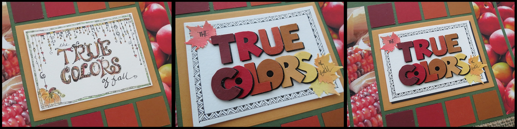
Titles:
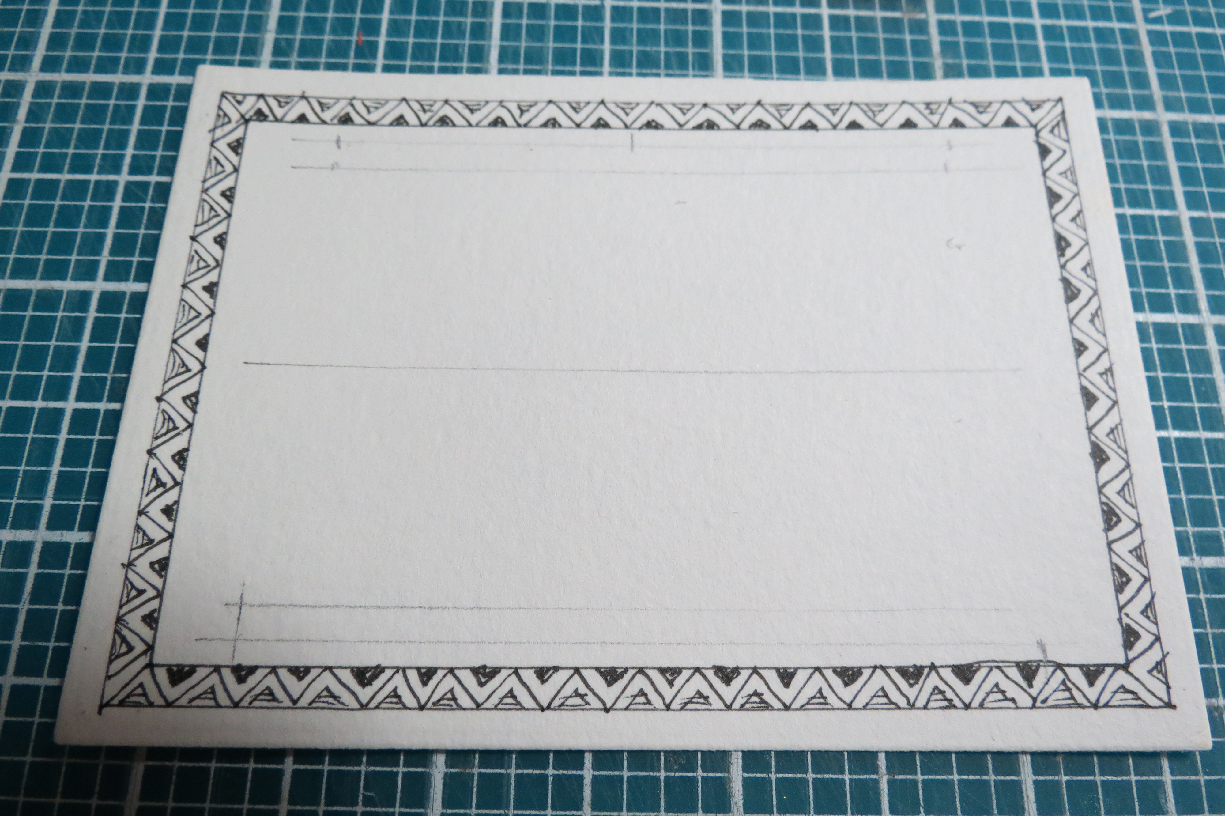
1. A Zenspiration style with tangles and dangles that worked well with the fiber strands was my first choice. Black Micron pens sketch the details and Prismacolor pencils with Gamsol to blend the colors adding a festive feel to this title block.
Pattern Alternatives with Zenspiration style title
2. The second title block relied on the bold colors of the 1” squares to punch each of the letters out (EK Success).
Pattern Alternatives creating the bold color title block
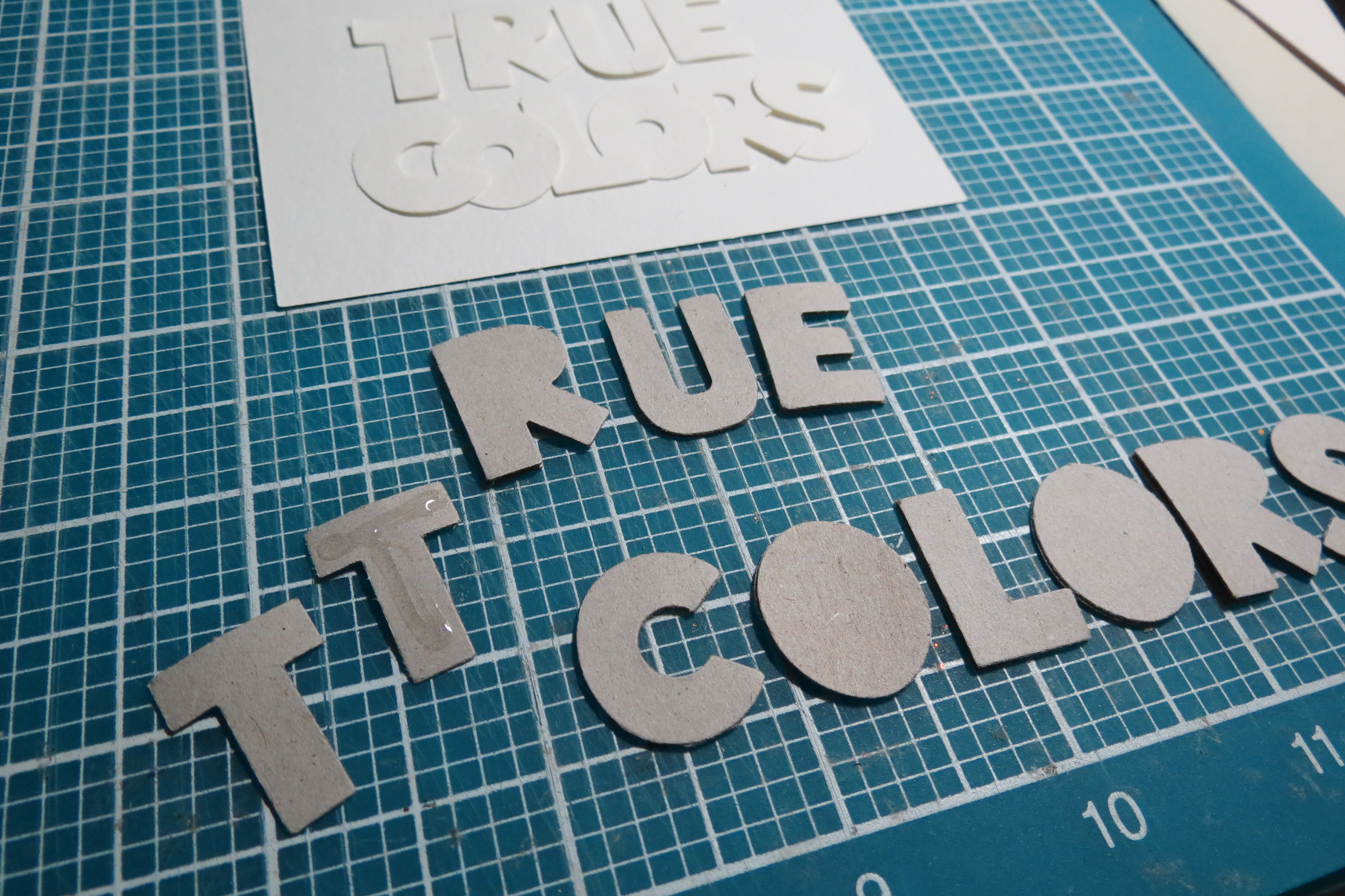
Two additional sets of letters were punched out of chipboard, glued together and then painted black.
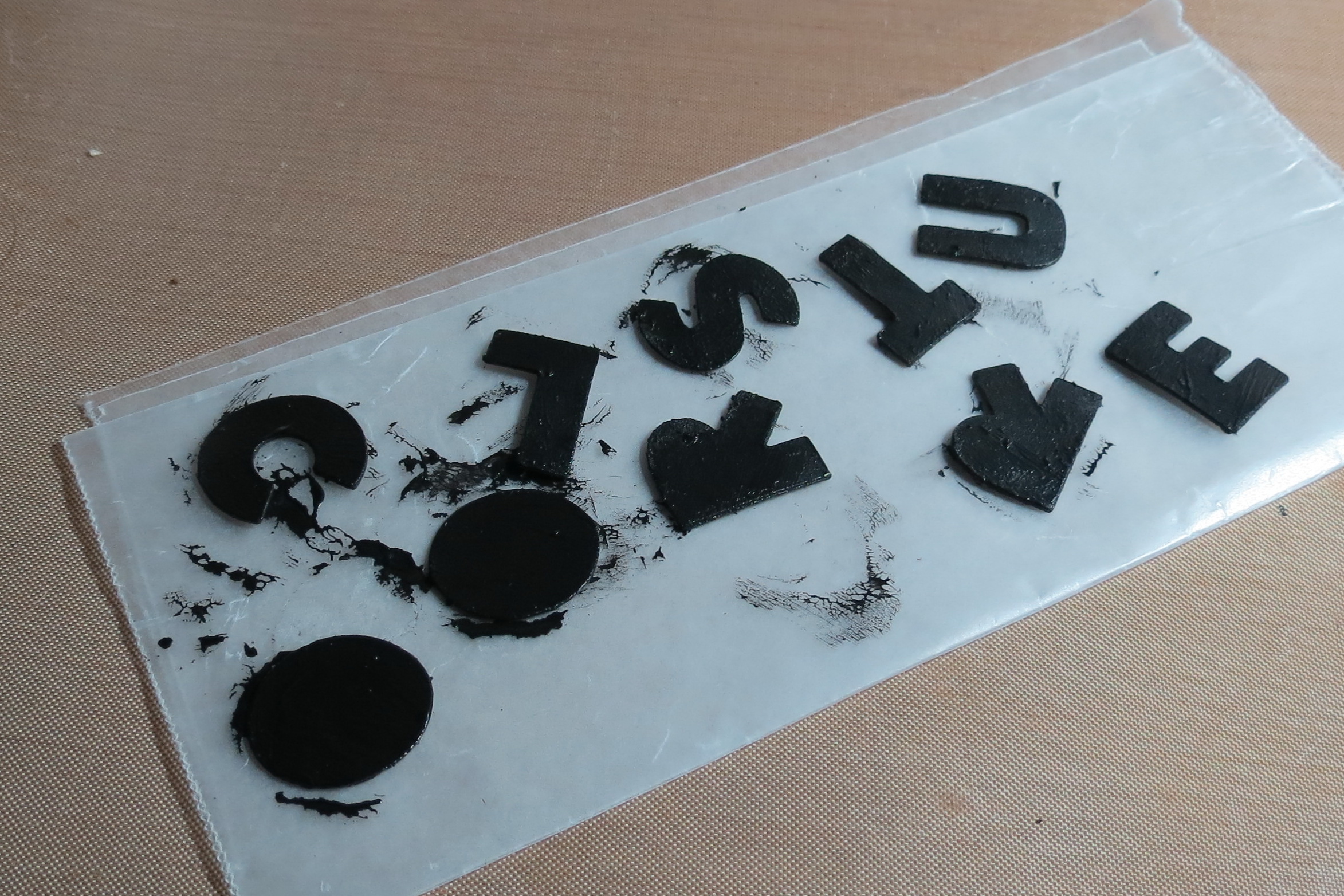
Pattern Alternatives painting letters black
These will be used to create a shadow effect for each of the letters.
Pattern Alternatives cardstock punched letters off-set on black for shadow look
A Zenspiration style border gives the title a bit of definition.
Pattern Alternatives Zenspiration border
A black cut mat is used for a shadow in one version. Twinkling H2O’s watercolors in a fall blend was punched to obtain a full range of colored leaves.
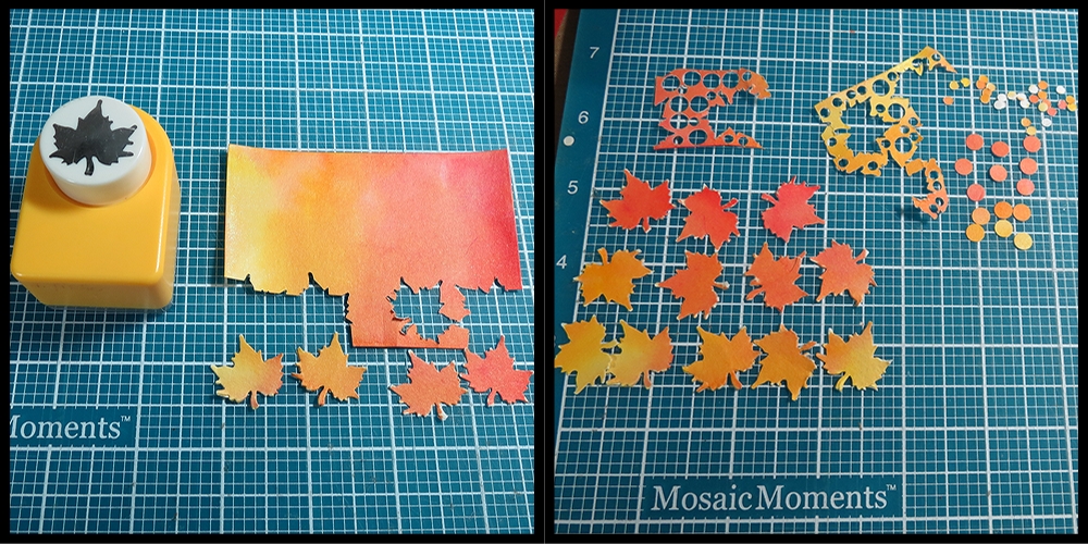
Pattern Alternatives watercolor paper Twinkling H2O’s leaf punch
Three were selected to add to the block with the smaller details of the title.
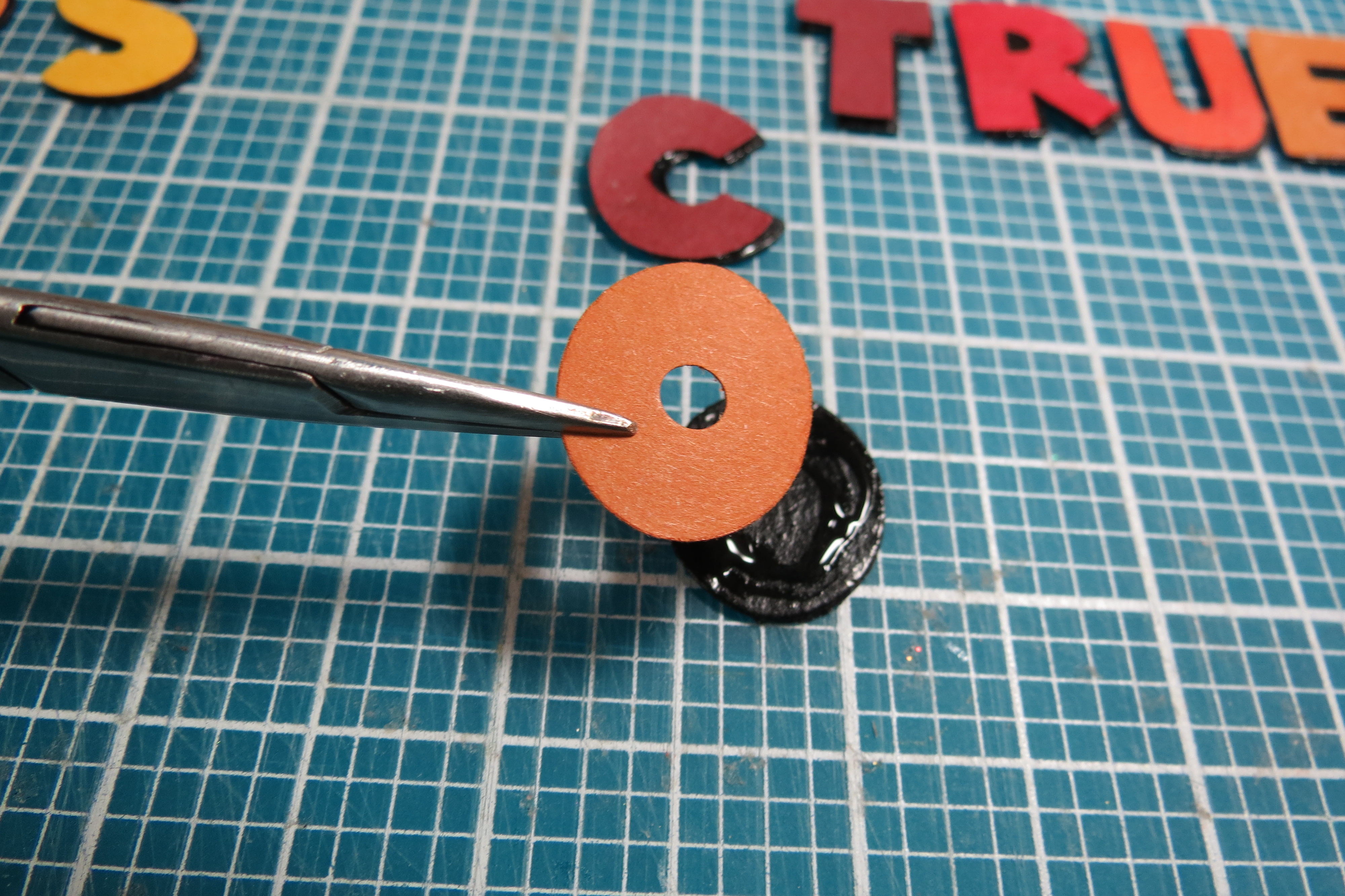
3. The third title was created using the new Alphabet Die cut in black and mounted on the blocks of color matching the banners below.
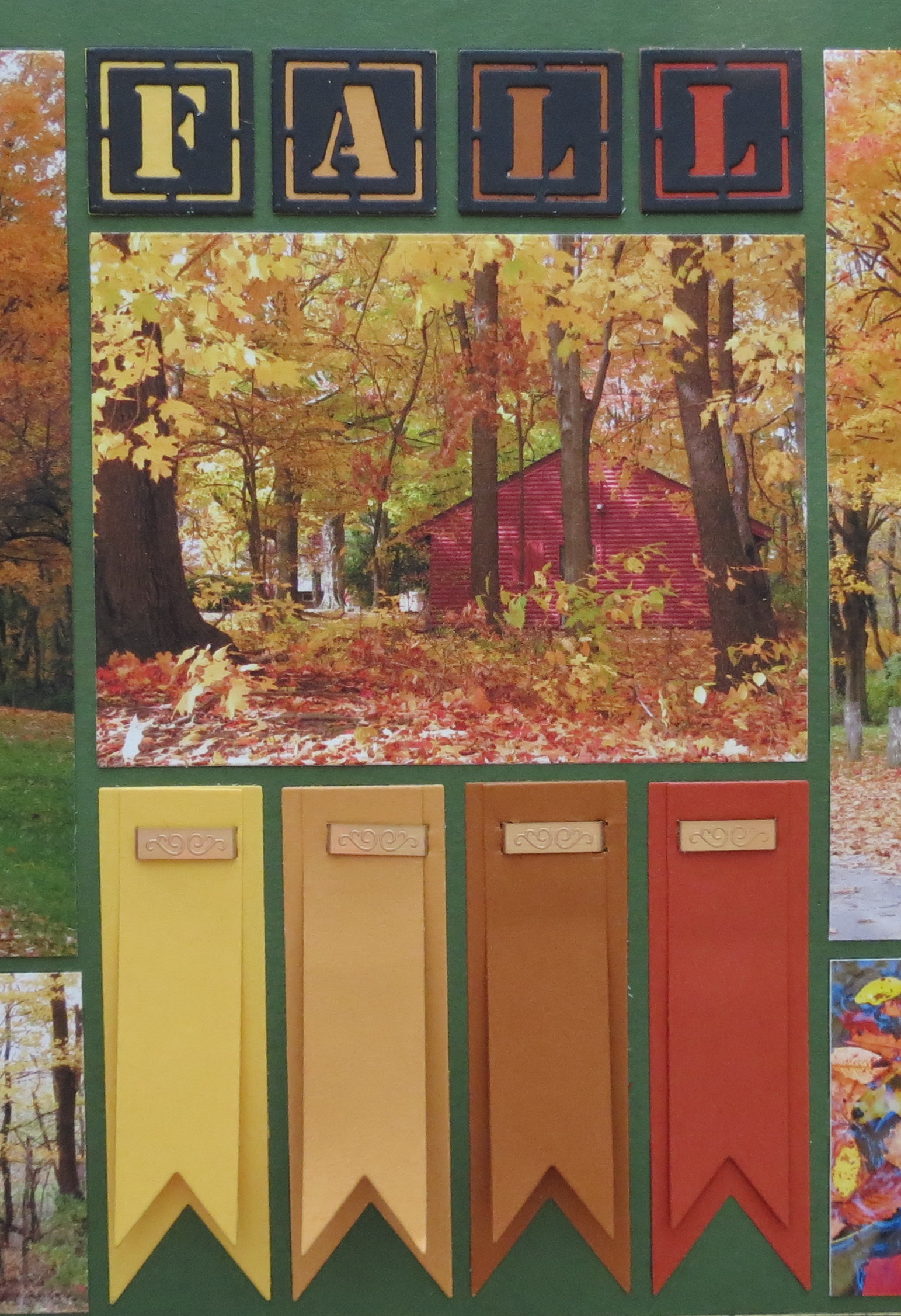
Pattern Alternatives banners and title
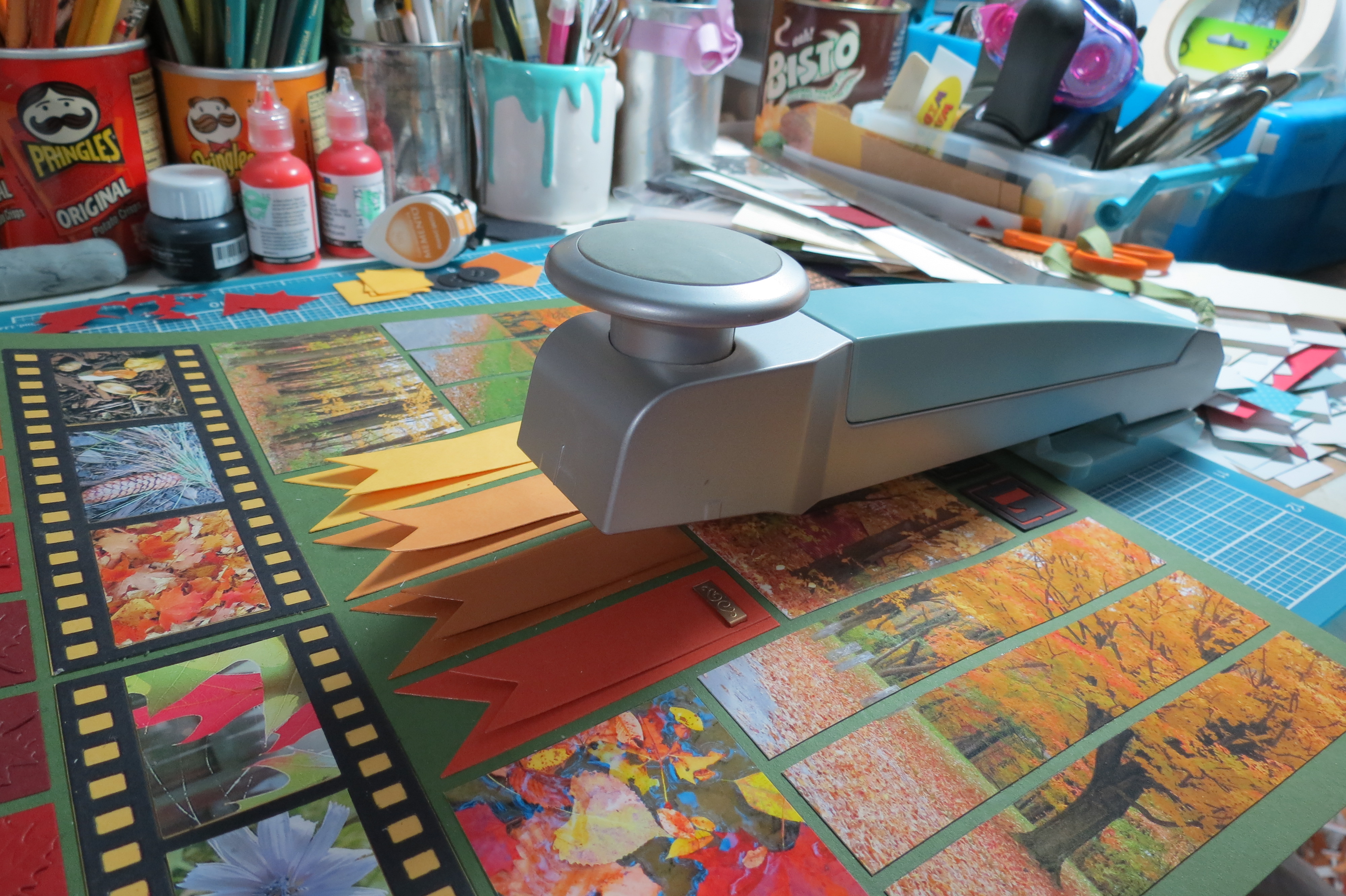
Banners:
Fall makes me think of the swirling falling leaves so why not include some banners that may be swirling overhead on a fall foliage tour stop?
I’ve cut and used both of the banners on the die, used a glue dot to tack it in place so I can use a decorative staple to add a copper touch to the page.
Pattern Alternatives Attaching Banners with decorative staples
Filmstrip:
I was going for a Kodak inspiration by using the black filmstrip and the gold mat that shows through the edges of the strip.
Pattern Alternatives Filmstrip die and tone on tone leaf border
Border:
I could have left the bottom border plain, but fall is not plain! Using a leaf die to cut leaves from each of the block colors I’ve arranged them in a tip and tail pattern and tone on tone.
Mosaic Moments Dies used in the Pattern Alternatives post
Supplies used:
• Mosaic Moments Deep Spring Green 12×12 Grid paper
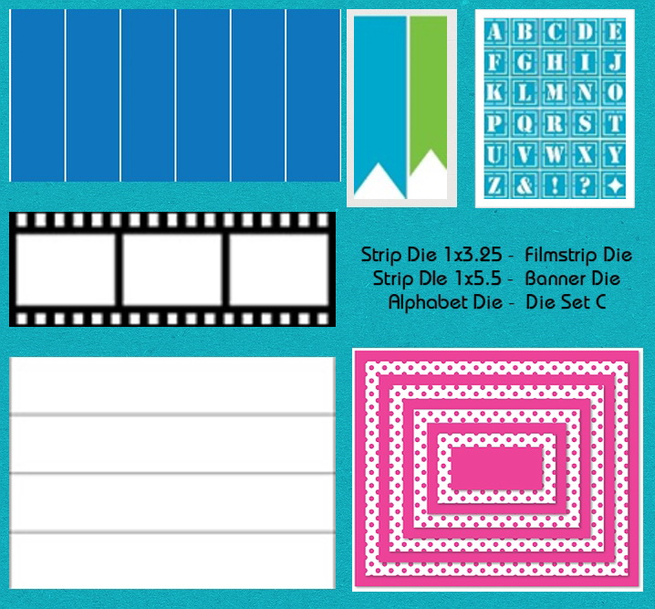
• Mosaic Moments Dies: Set C, Banners, 1×5.5 and 1×3.25 strip dies, Alphabet, filmstrip
• Assorted fall color cardstocks
• Leaf punch
• Leaf die (Impression Obsession)
• Chipboard
• Black acrylic paint
• Micron pens: 005, 02
• EK Success Fastenater and decorative staples
• Burlap ribbon
• Cording in red, yellow and brown
• Wooden beads
• Prismacolor pencils and Gamsol and blending stumps
So, for this Throwback Tuesday I hope you’ve been inspired to not only use a pattern but to bold enough to find ways to tweak the pattern to suit your photos and use your dies. Maybe you have a particular pattern you enjoy using, try a few of these ideas to create your own pattern alternatives for a fresh fall look!
Andrea Fisher
Visit us on Facebook and find this pin on Pinterest.
Pattern Alternatives utilizing the New Mosaic Moments Dies to freshen up your fall pages