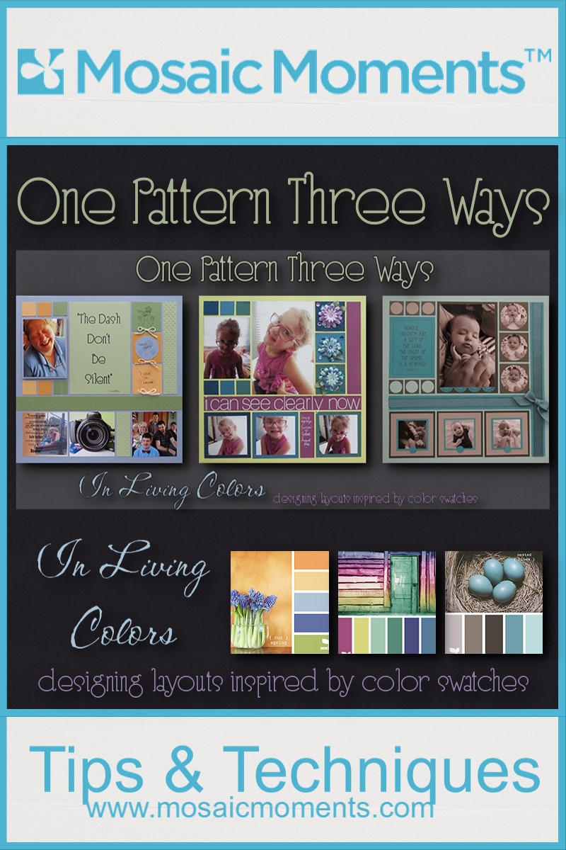
One Pattern Three Ways
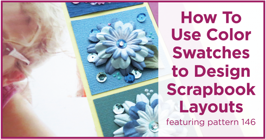
featuring Pattern #146
In Living Colors designing layouts inspired by color swatches
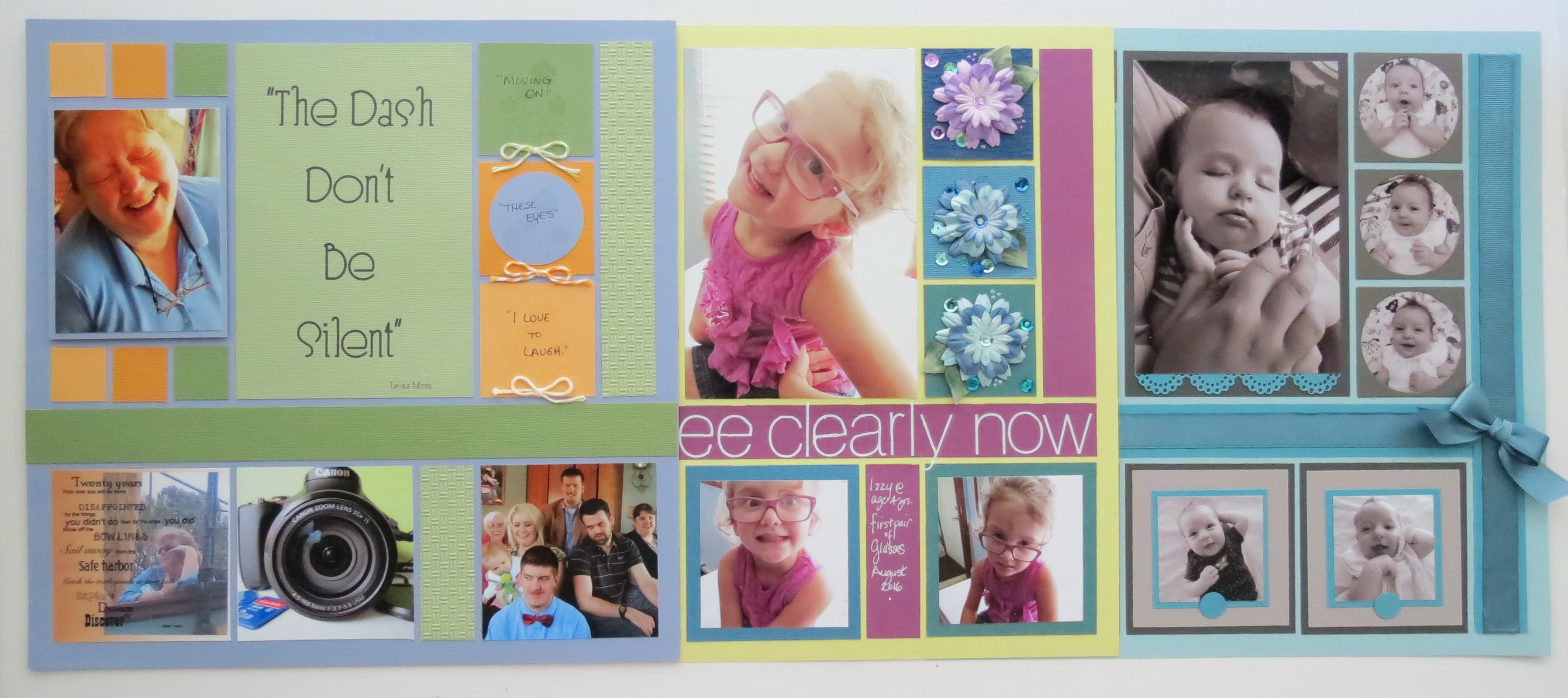
This year we’ve been showing you different ideas for putting together layouts drawing inspiration from our ‘Travels Around the World,’ the colors, textures, patterns and more. We’ve also picked colors from the photos we’ve taken to complement our layouts. Today, I’ll show you three layouts that I’ve used design color swatches to build three pages with those “Living Colors” combinations each using the same pattern #146.

Pattern #146
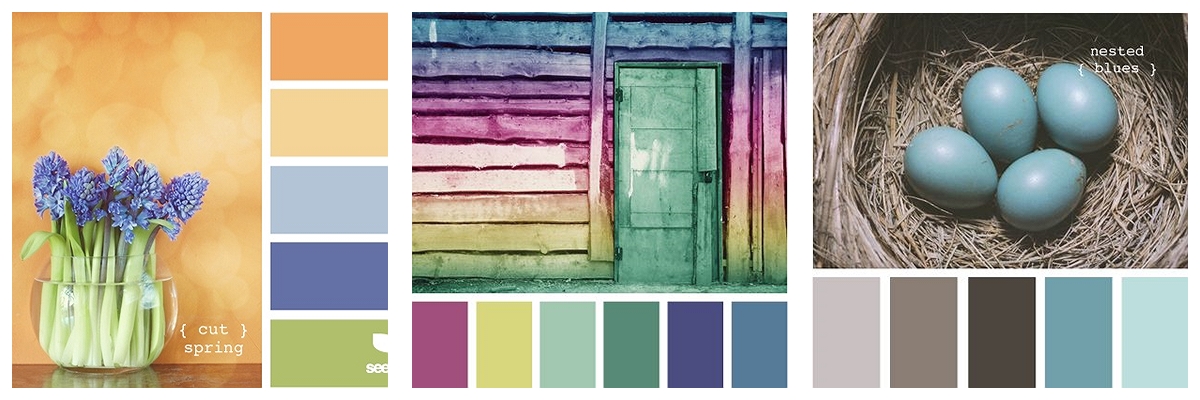
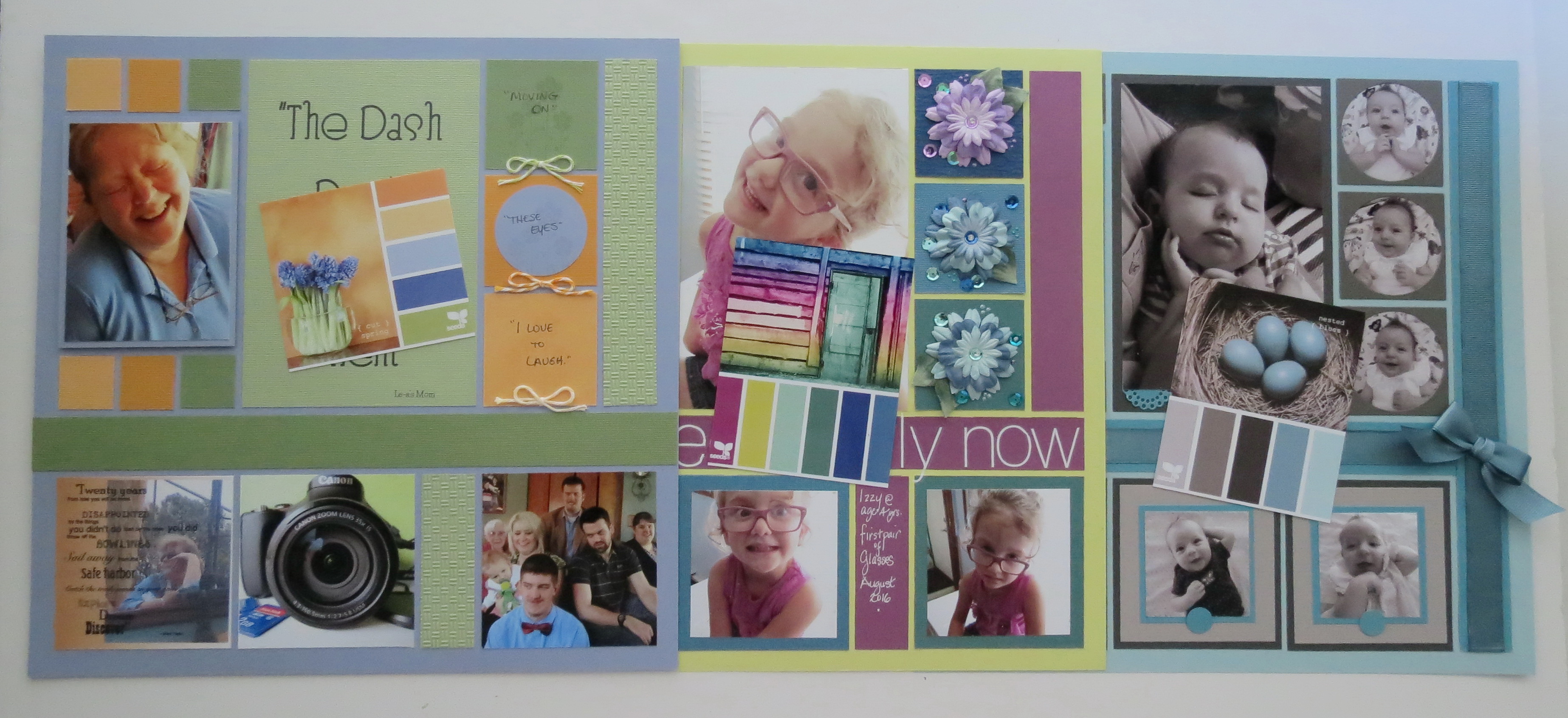
Swatches from Design Seeds
Layout One
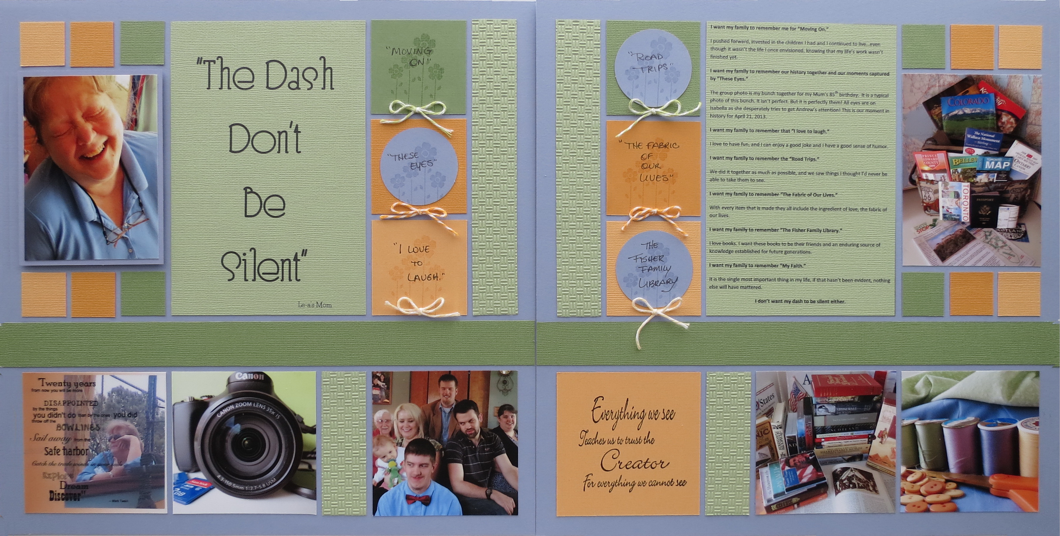
Layout One
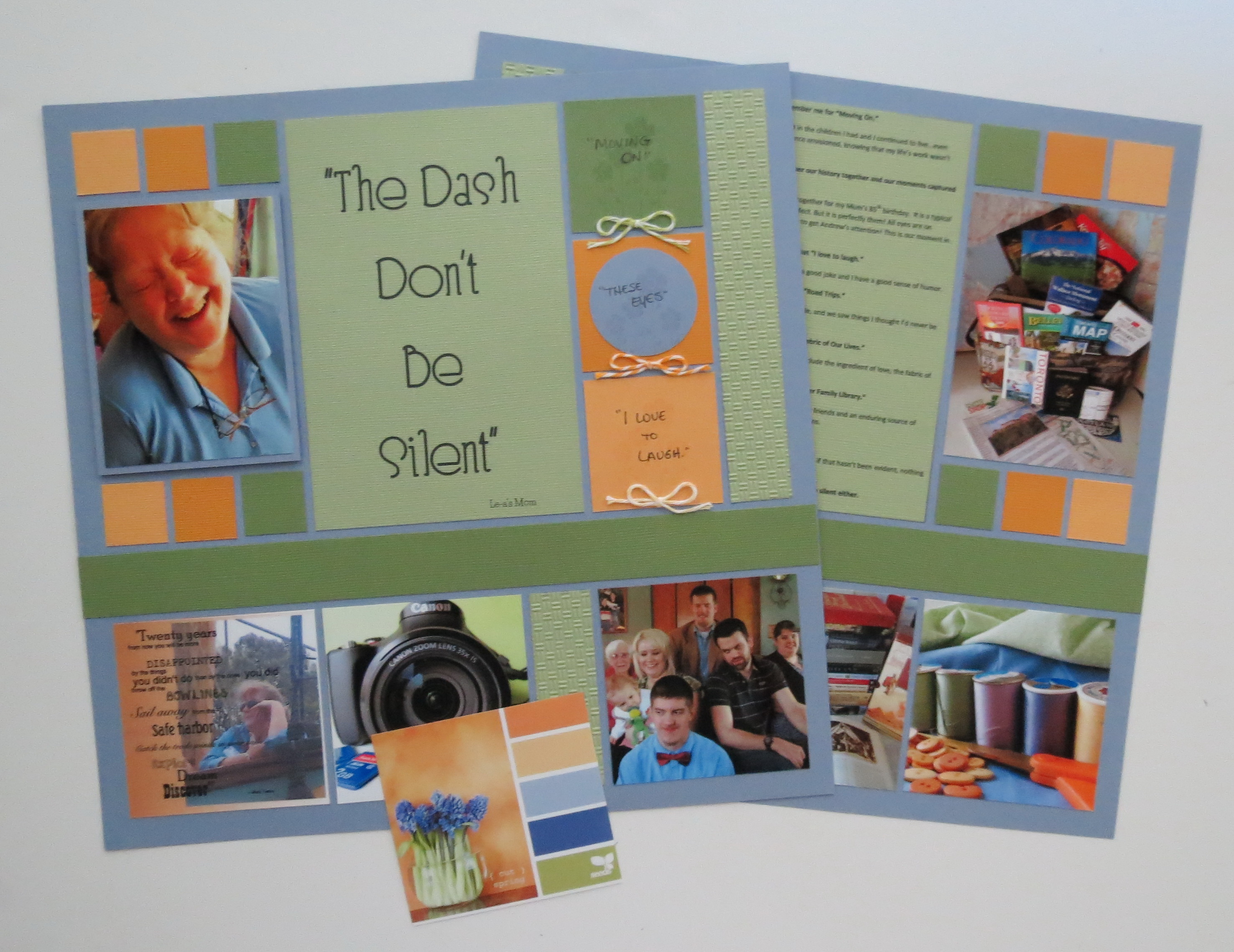
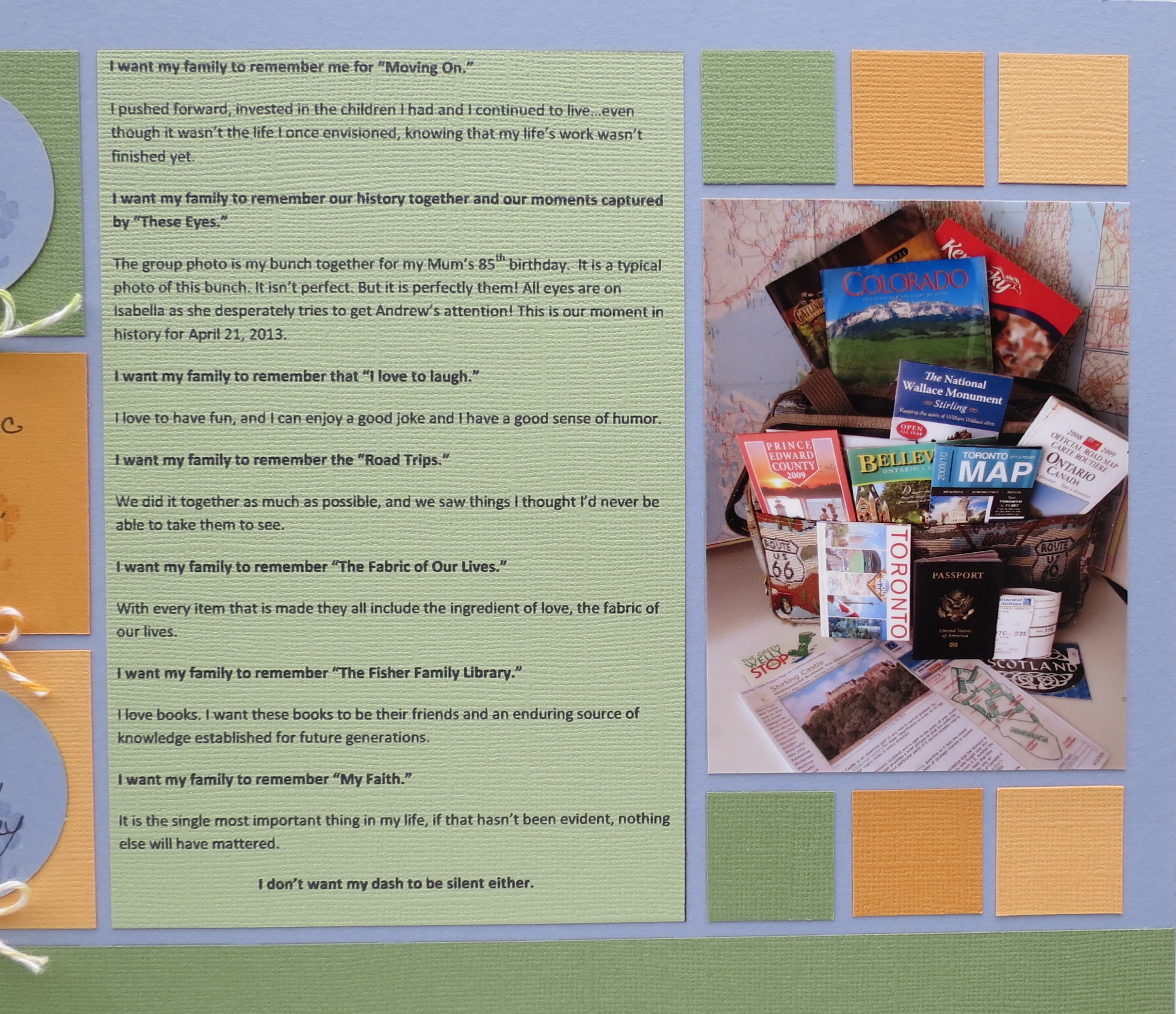
I’m going to bring back a double page layout from an old Design Team challenge where I used a color swatch from Design Seeds to add color to my layout and to the photos I staged for the Challenge “Create a page that conveys a “forget-me-not” message: What do you want others (and yourself) to remember about you at this phase in your life?”
MM 3in1 Pattern #146 In Living Colors
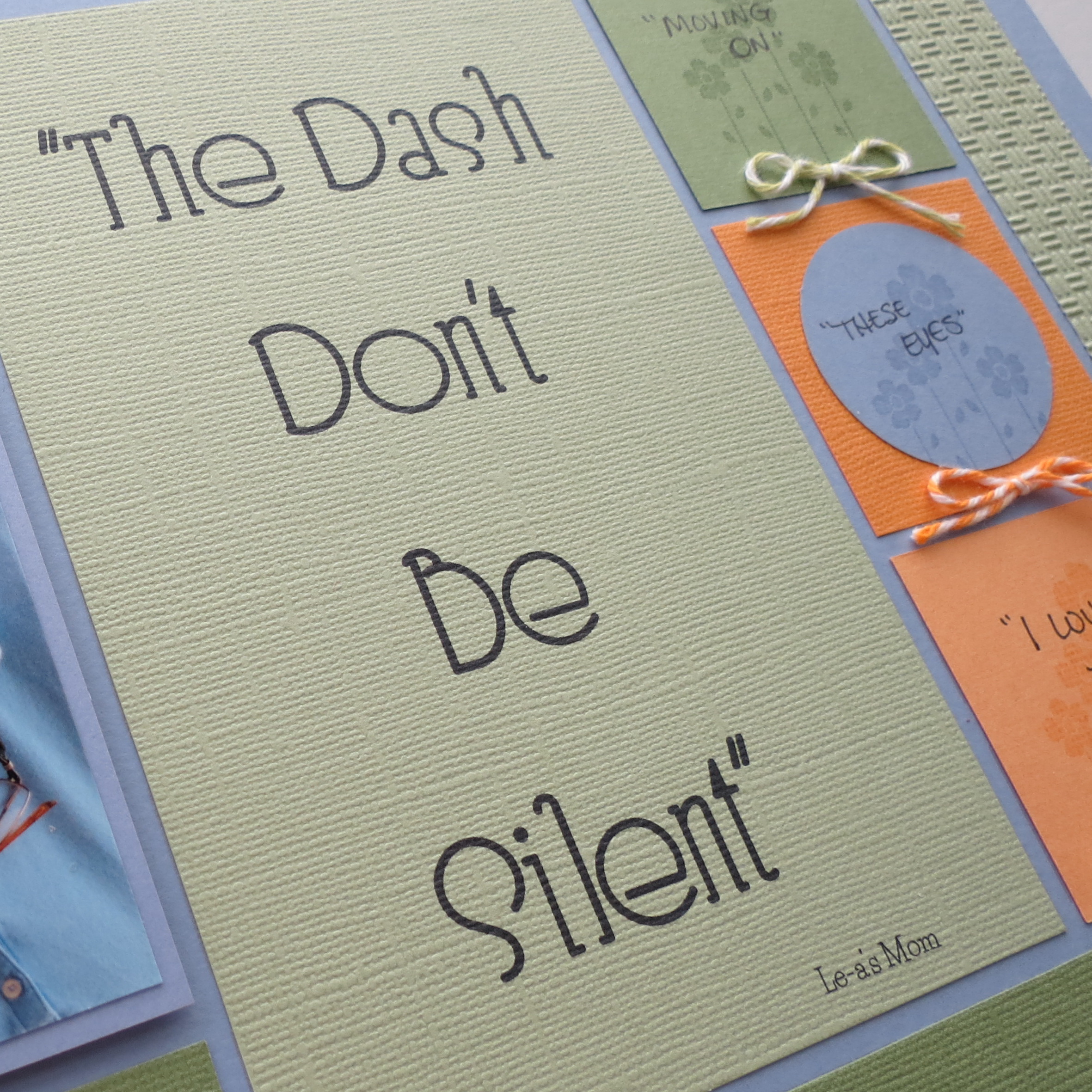
This layout is titled “The Dash Don’t Be Silent”. If you’d like the full story behind this page visit the Journella link.
Textures using an Anna Griffin embossing folder were added to sections of the lighter green cardstock. Matching Doodlebug twines are incorporated to work with the theme “Forget-Me-Not,”(think Uncle Billy “It’s a Wonderful Life”). Mosaic Moments Periwinkle 12×12 grid paper is the base paper.
Stamped images, twine accents, textured cardstock
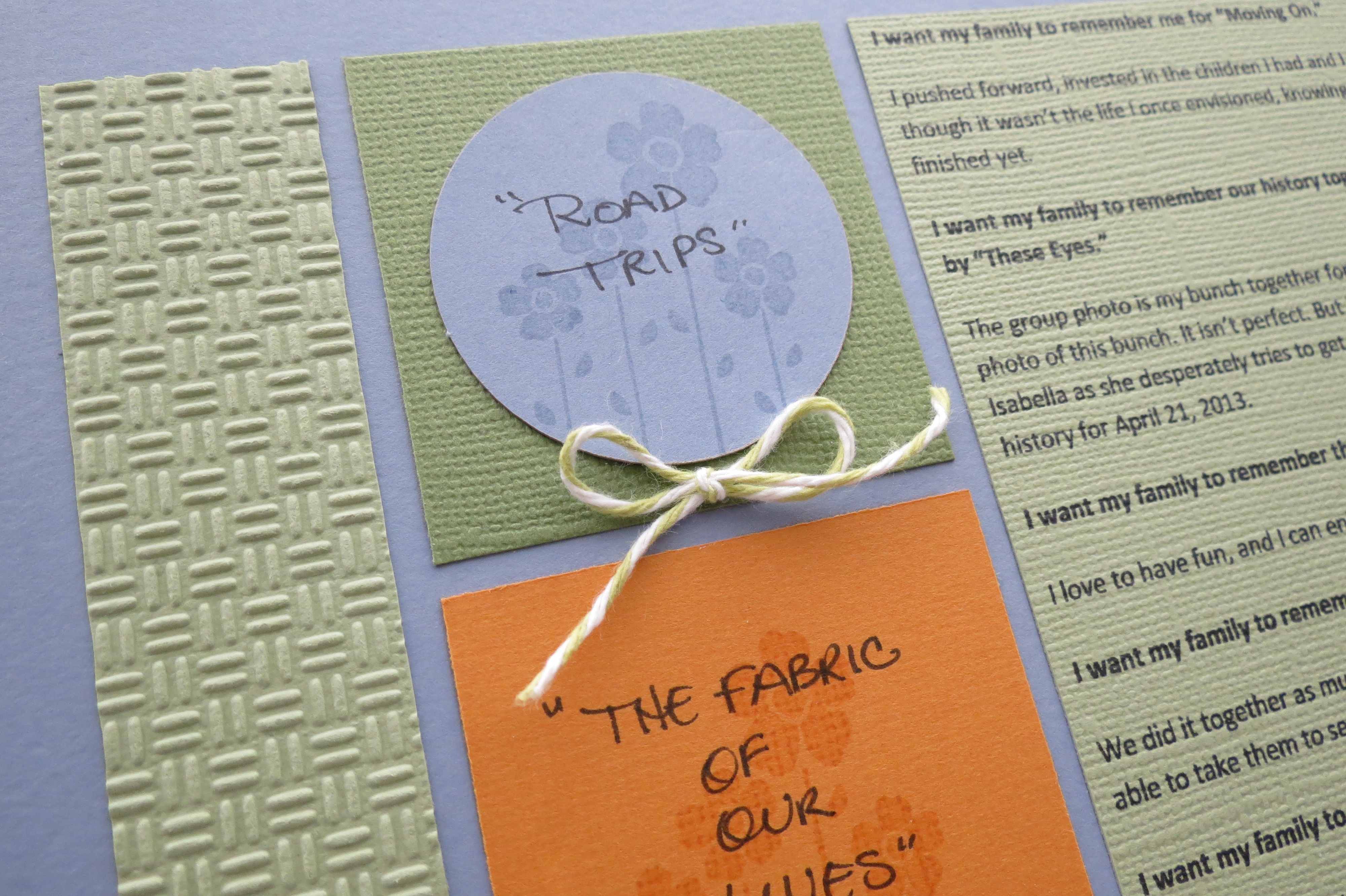
TIP: Stamped images can add interest, color and detail to a plain journal block. Forget-me-not flowers are stamped with VersaMark watermark ink, adding that darker shade of periwinkle from the color swatch.
Large Title
Large Block for the journaling
The pattern originally called for a full strip across the page. The two large blocks on the page and the mirror image companion page act as a title block and journal block. The three 2.125” squares are my journal spots.
Layout Two
MM 3in1 In Living Colors Layout Two
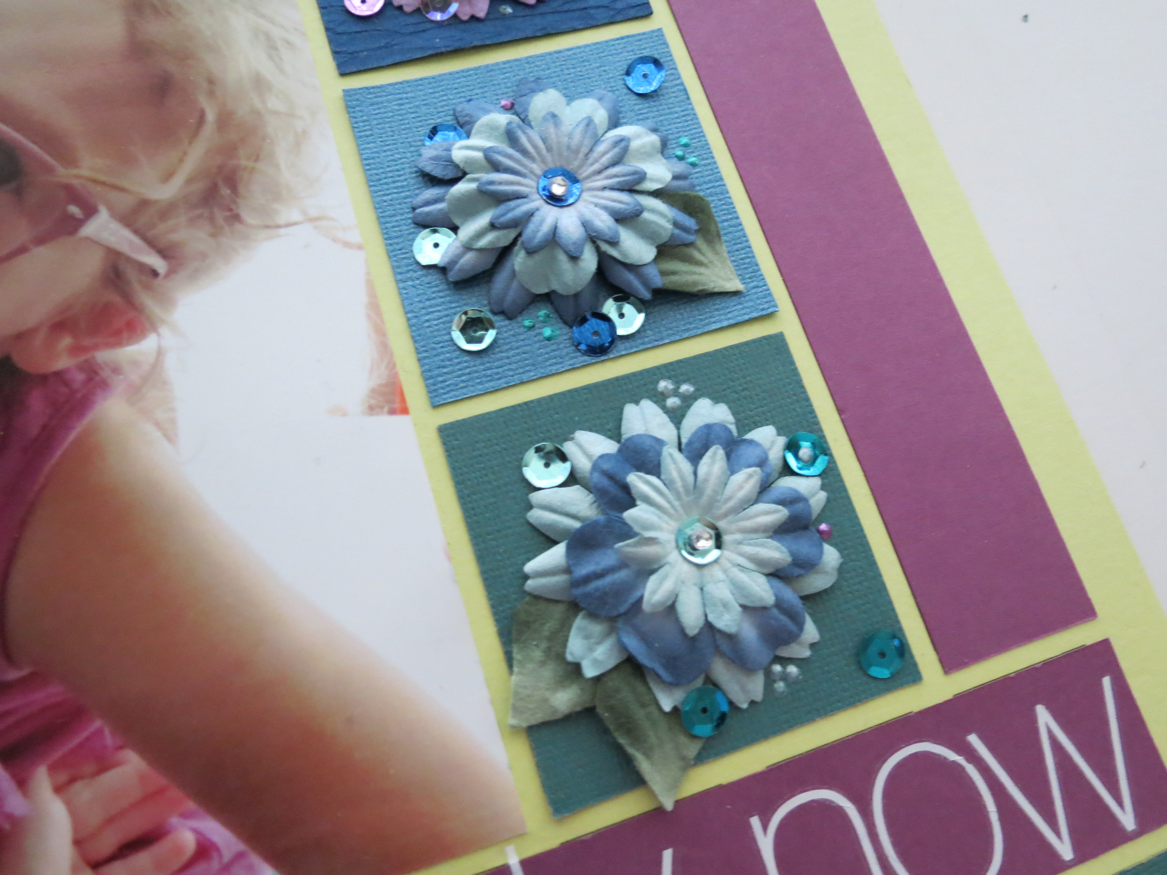
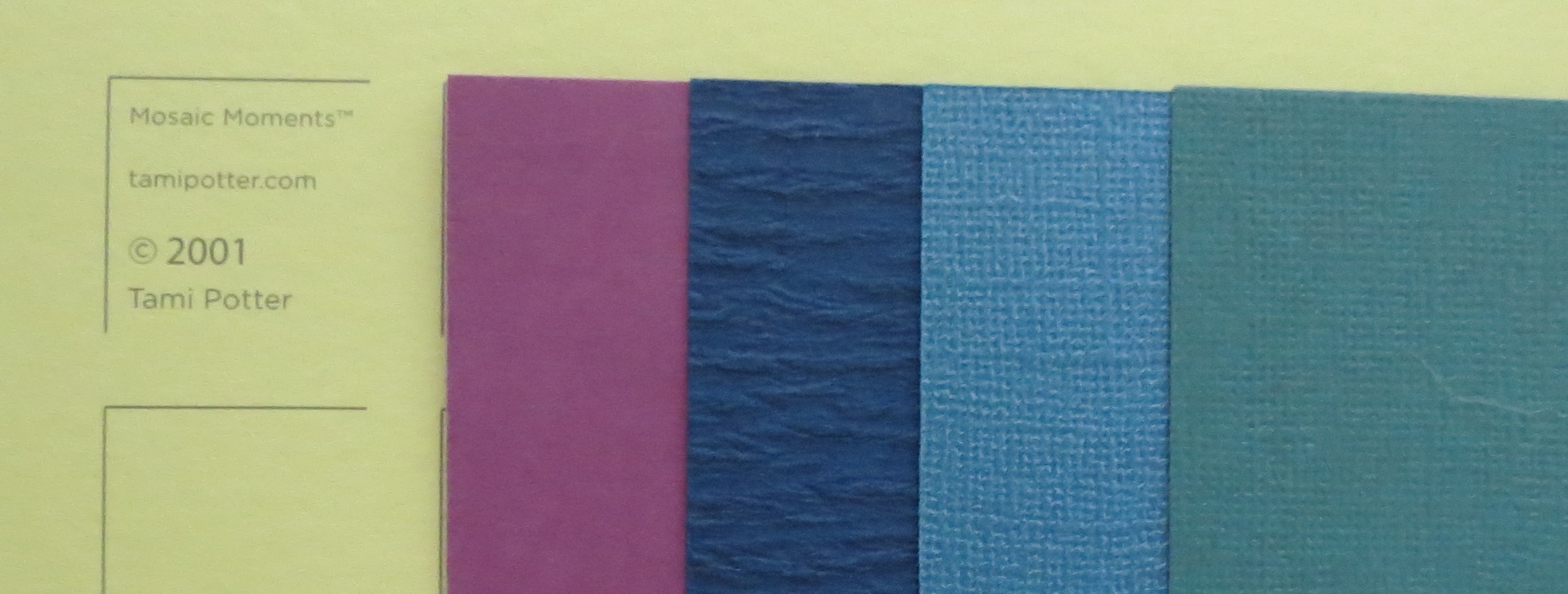
I’ve been hanging on to this swatch for a long time because the colors just really popped and I thought it might be fun to work someday. I’d purchased a pkg. of flowers in the same color palette ages ago. They seemed perfect especially for this layout.
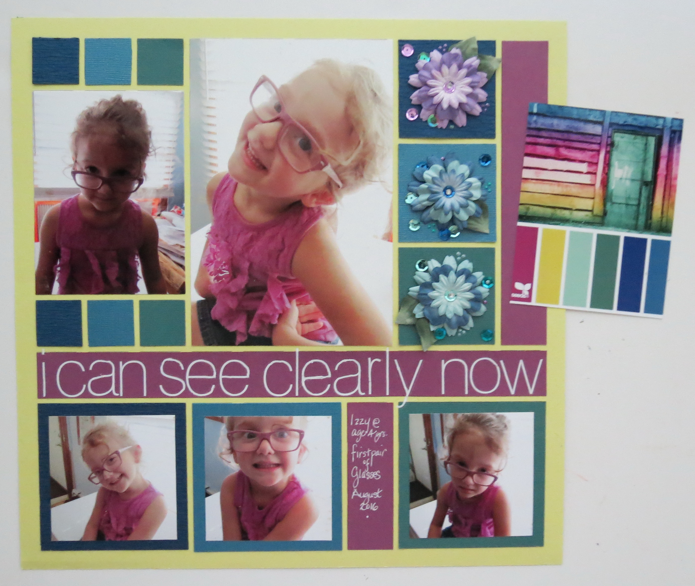
MM 3in1In Living Colors Layout Two and Design Seeds swatch
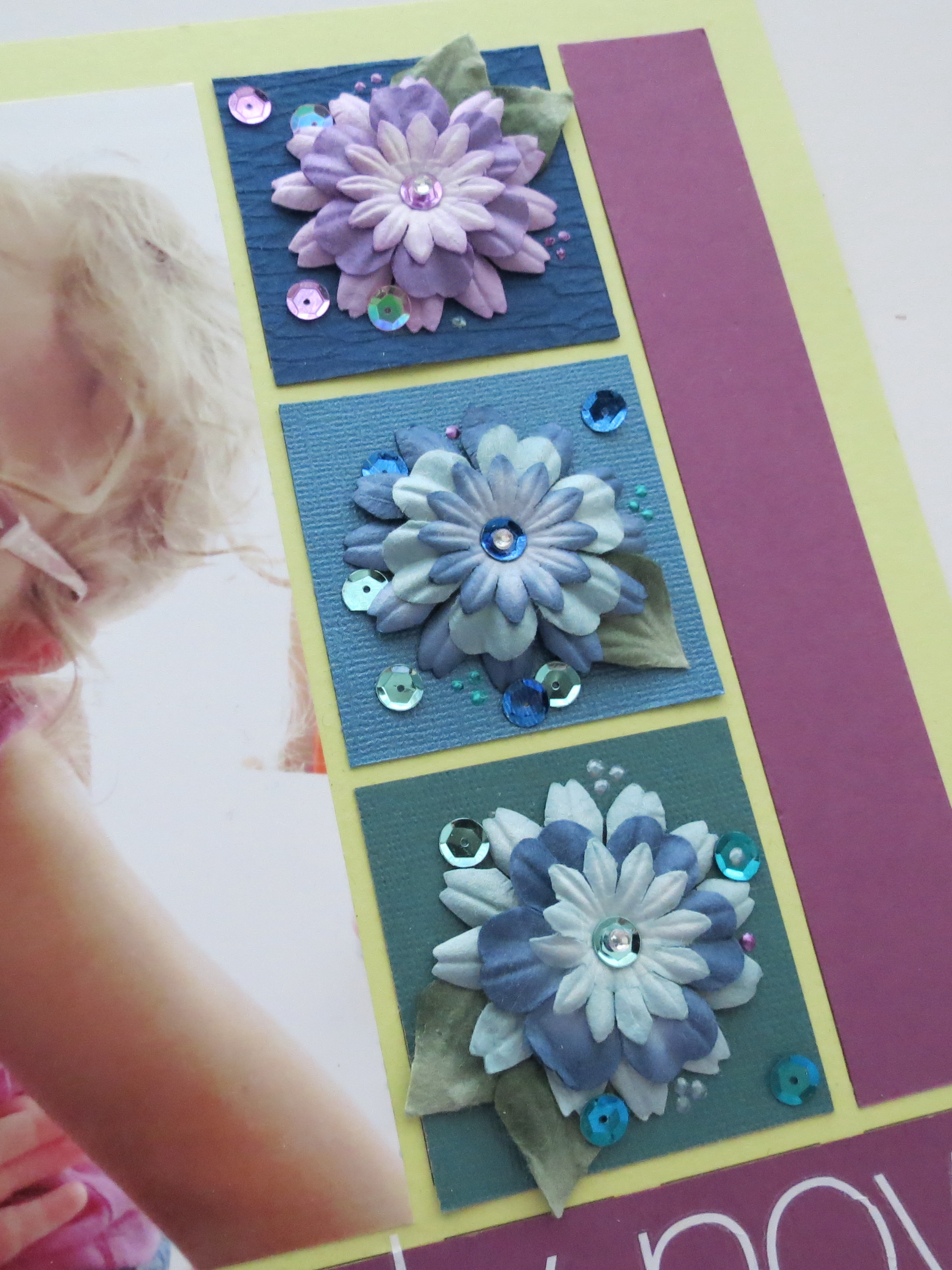
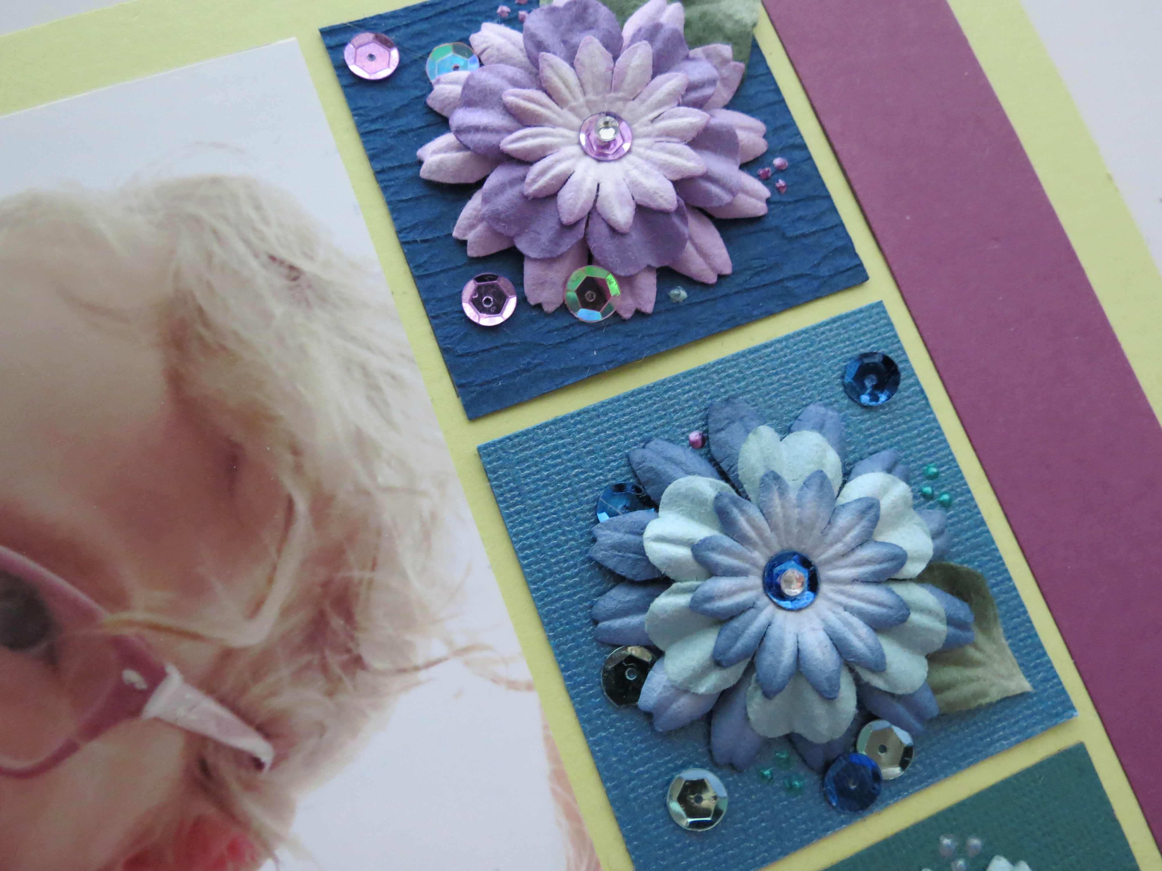
Additional sequins, Liquid Pearls, and gemstones were added to the flower clusters for more sparkle and bling.
MM 3in1 Pattern #146 In Living Colors Embellishments
MM Pattern #146 In Living Colors
MM Pattern #146 In Living Colors
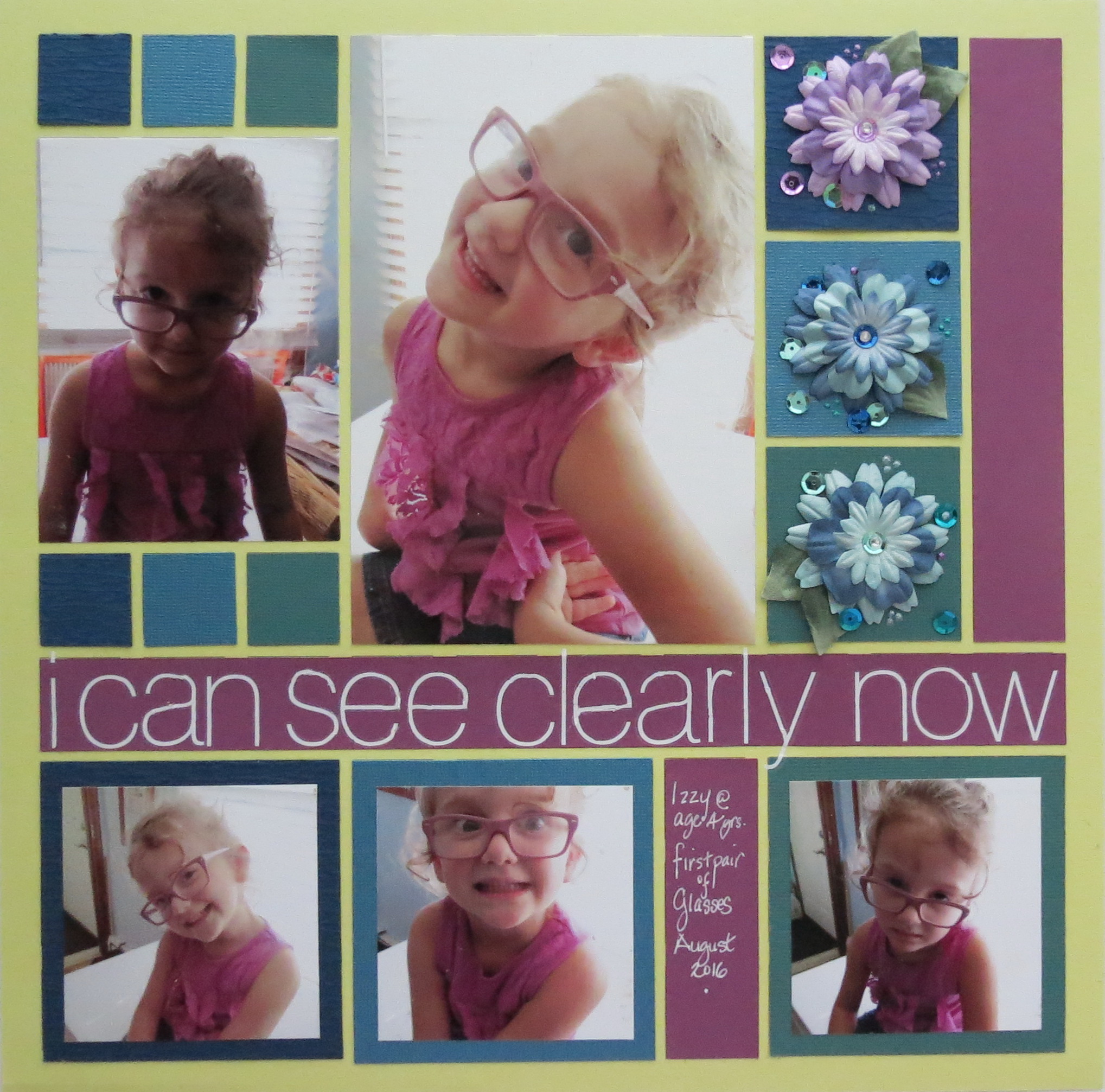
I chose photos of my granddaughter and her new glasses for this layout. I was happy to see her outfit went perfectly with everything without planning it!
I began with Mosaic Moments Grid Paper in Citron for my base. Interest was added by using textured and bling cardstocks and flower clusters to continue the swatch colors in the layout.
MM Colors for Layout Two
TIP: For an eye-catching title I used large letters in a full across the page title. The rub-on letters nearly fill the full 1” strip. Where there were gaps in the transfer of the letters a white gel pen filled them in in addition to adding a few details on another block.
The large full-sized central photo catches your eye right away. My goofy girl has provided all the original poses without any encouragement including the “are we done yet, granny?” look. The photos are framed in the colors from the swatch.
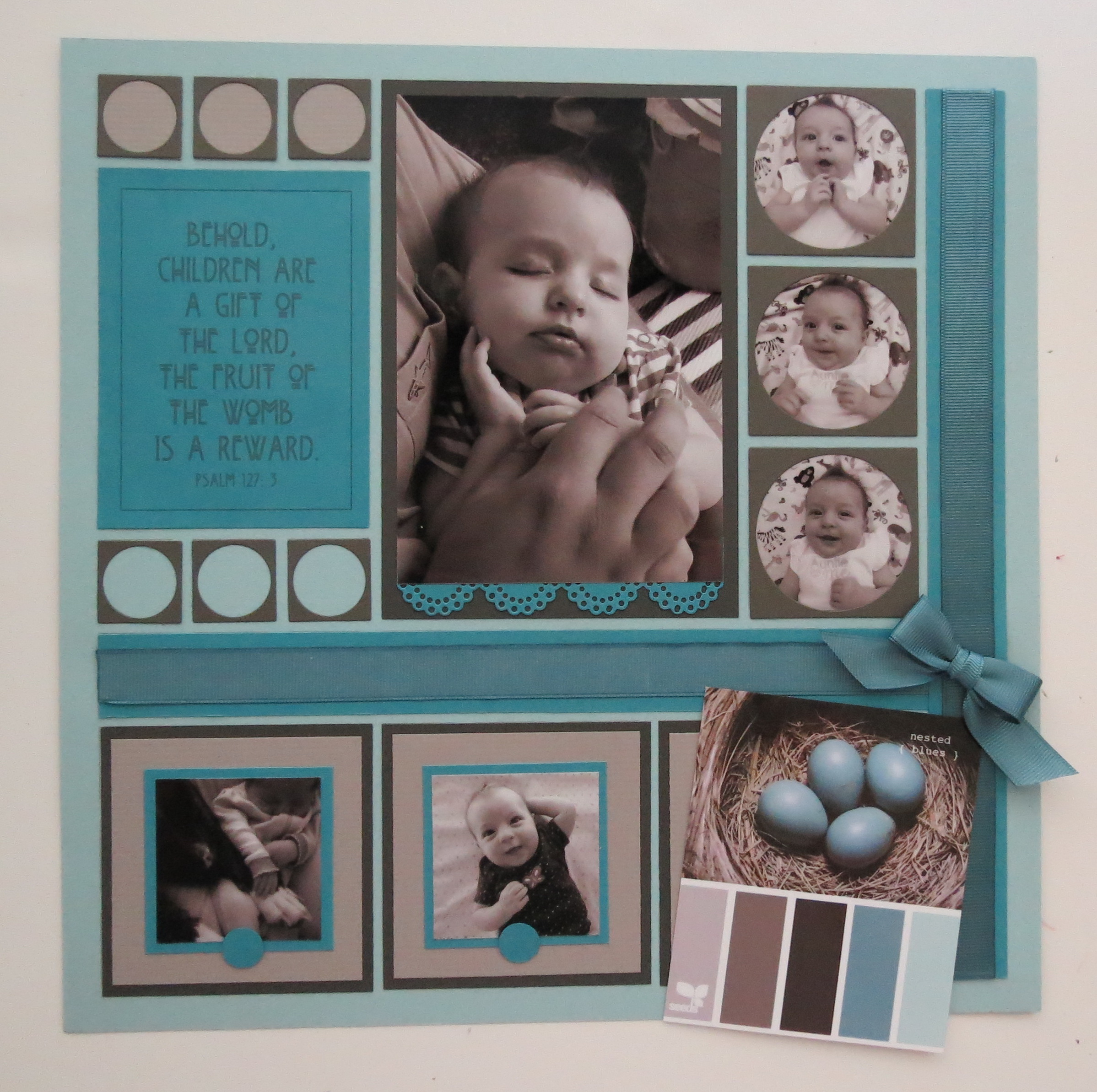
Layout Three
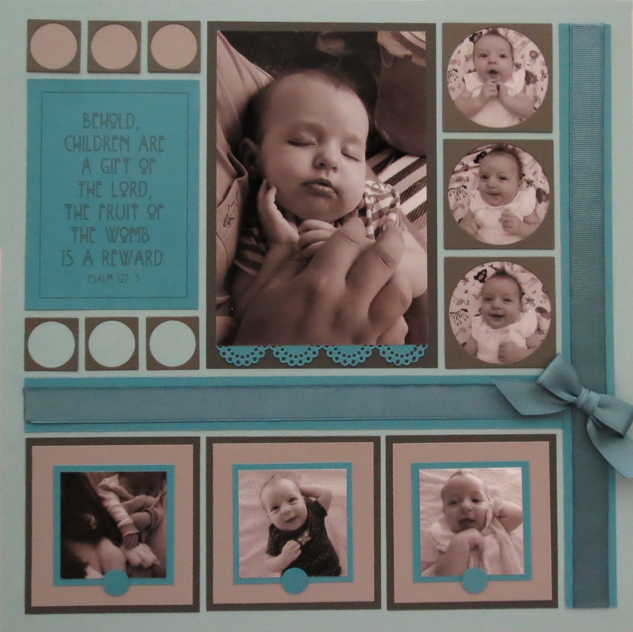
This layout color swatch was so very soothing. I thought it might work well with Black & White photos.
TIP: Because the gray tones in the swatch are warm tones I decided to turn the photos B&W and then add a Sepia color finish for warmth and then reduced the opacity of the sepia until it was barely brown. This helped to work for the colors and to unify the many colors in the photos that were taken over several weeks with different outfits.
MM Tip: Adjusting pattern to fit with theme of page…”children are a Gift…”
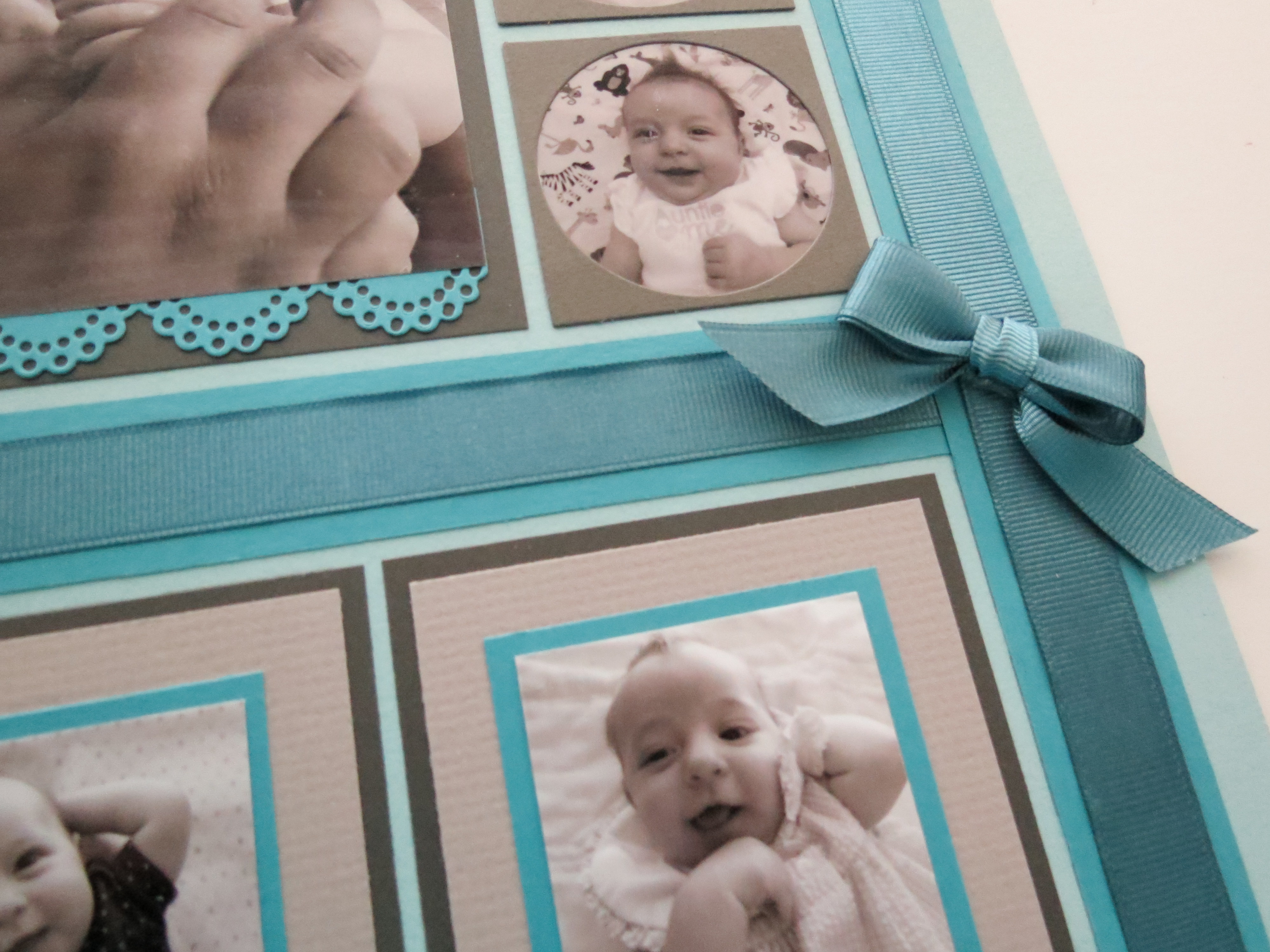
TIP: Adjusting the pattern to suit the story. Deviating slightly from the pattern by moving the end square to sit side by side with the other two squares, the 1 x 3 section was moved to the far right. Instead of splitting it up into sections I made it one long strip to resemble a wrapped gift package where I could add a bow. I covered both sections with matching ribbon and tucked the ribbon ends to the underside by slitting along the edge of the tile. Strong tape holds the ends secure them in place.
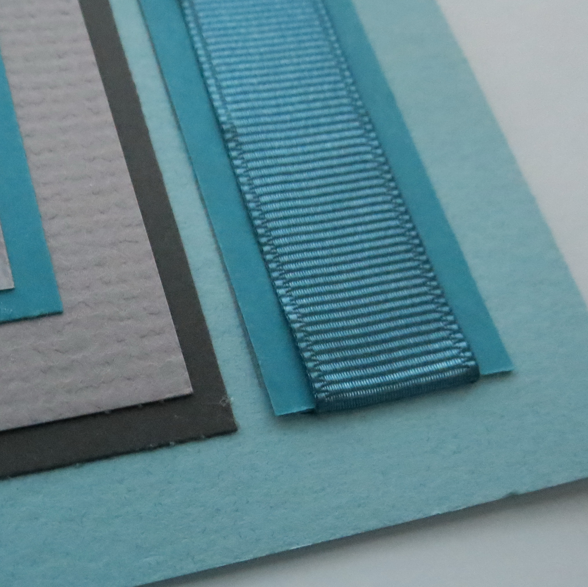
Ribbon ends are tucked to the back page by a slit along the tile edge.
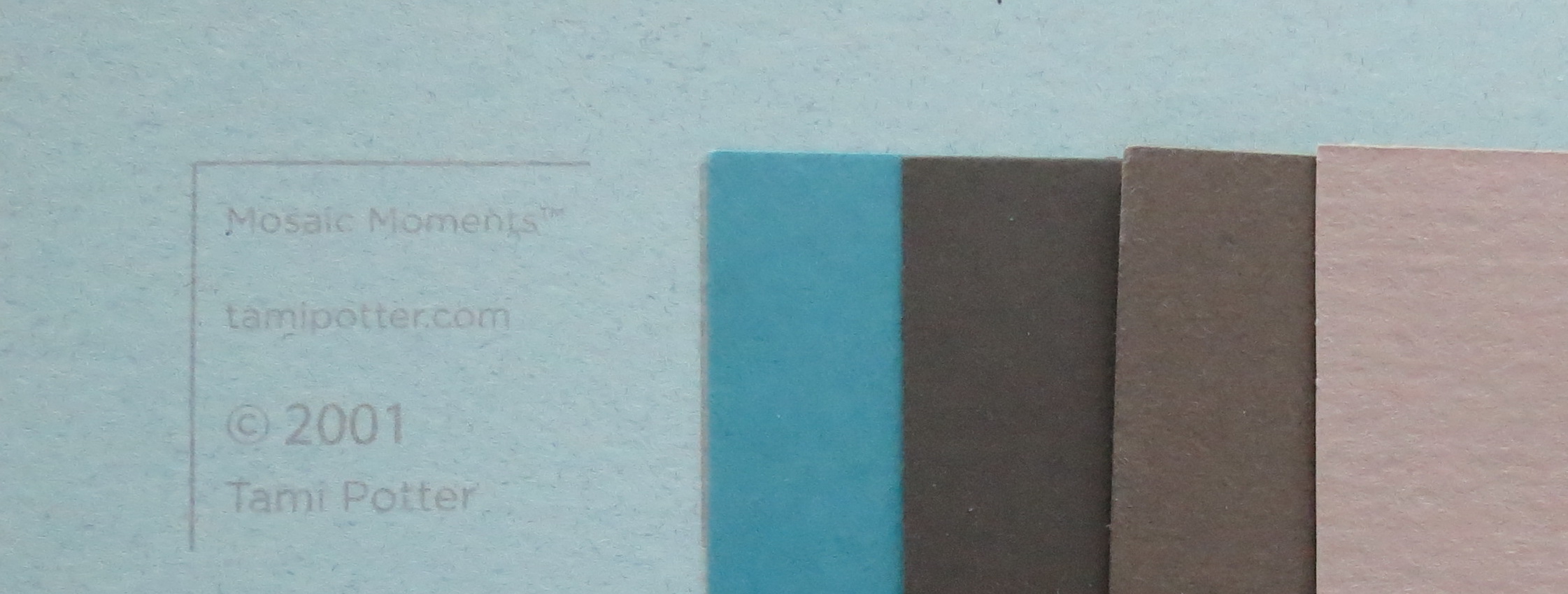
I’ve built this layout on the Mosaic Moments 12×12 Robin’s Egg Grid Paper. The cardstocks used in the layout are three shades of gray in addition to aqua.
MM Colors: Robin’s Egg Grid Paper
The new scallop border die in aqua is added to the center photo layered on the darkest gray.
The Circle Frame Tile is used in the 1” sections and 2.125” blocks down the right-hand side.
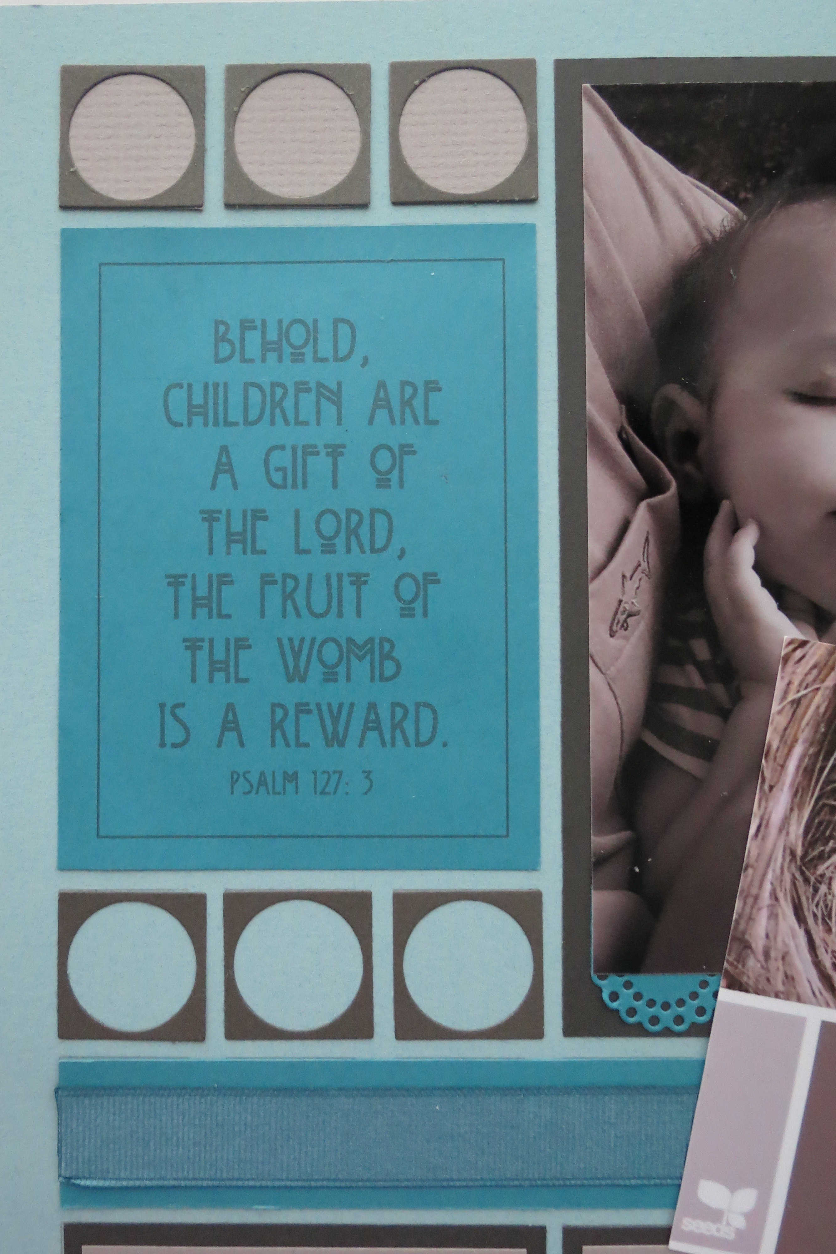
MM Circle Frame Tile and Journaling block
When adding the small 1” Circle Tiles I did so directly onto the grid below without a backing.
The 3×4 tile serves as my journal block with a verse appropriate to the subject and embellishment. The Font is CK Gatsby and I thought was in keeping with the style suggested by the colors of an Art Deco Style.
The bottom photos layered two grays and a narrow Aqua tile beneath the photo and ½” circle in the center of each photo edge.
MM 3in1 Pattern #146 In Living Colors
If you’ve enjoyed saving/pinning color swatches I hope you’ll try at least one layout that features those colors you love and see how many ways you can use them.
MM Pattern #146 One Pattern Three Ways
MM Pattern #146 One Pattern Three Ways with Color Swatches
Andrea Fisher