
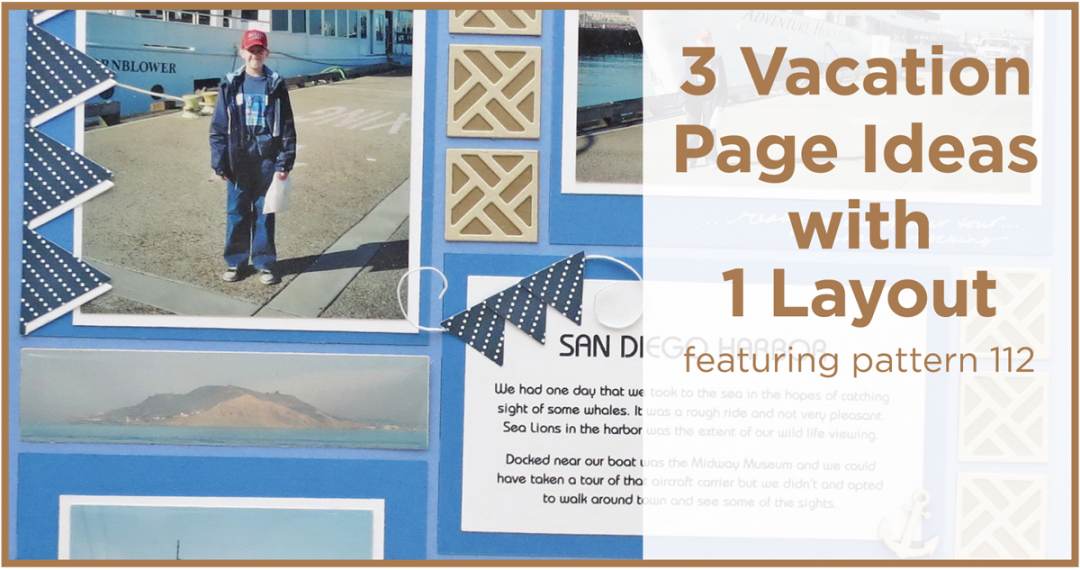
California Dreamin’ ideas for scrapping your vacation photos with one pattern three ways
One pattern can look many different ways I’ll show you three with the use of color, embellishments and textures today. I’ll even throw in a bonus layout, a title page idea, for these California vacation layouts.
By including journal blocks, cornerstone die tiles and banner die embellishments as well as trying a tone on tone textured mats to give you a fresh new look I hope to inspire you to try something new.
Let’s begin with Pattern #112 and three colors of grids; Cornflower Blue, Sage and Periwinkle.

MM Pattern #112 puzzle pattern
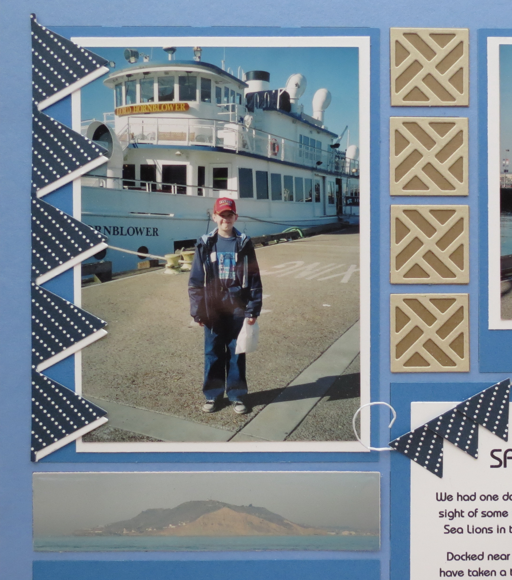
Layout One
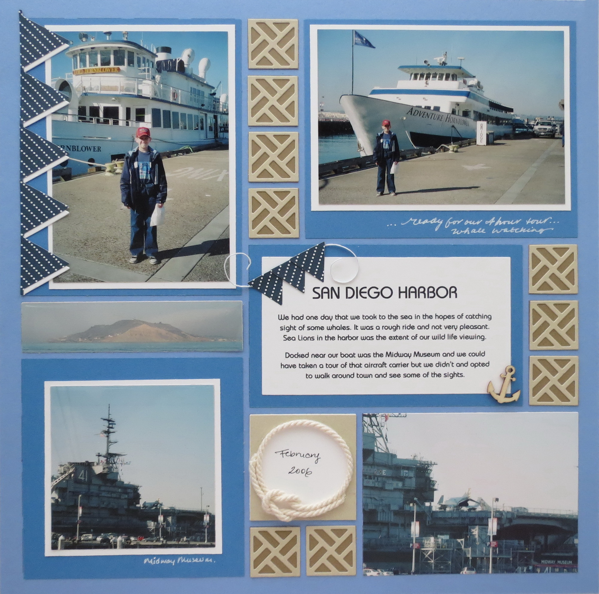
MM Pattern #112 One Pattern Three Ways Nautical Theme
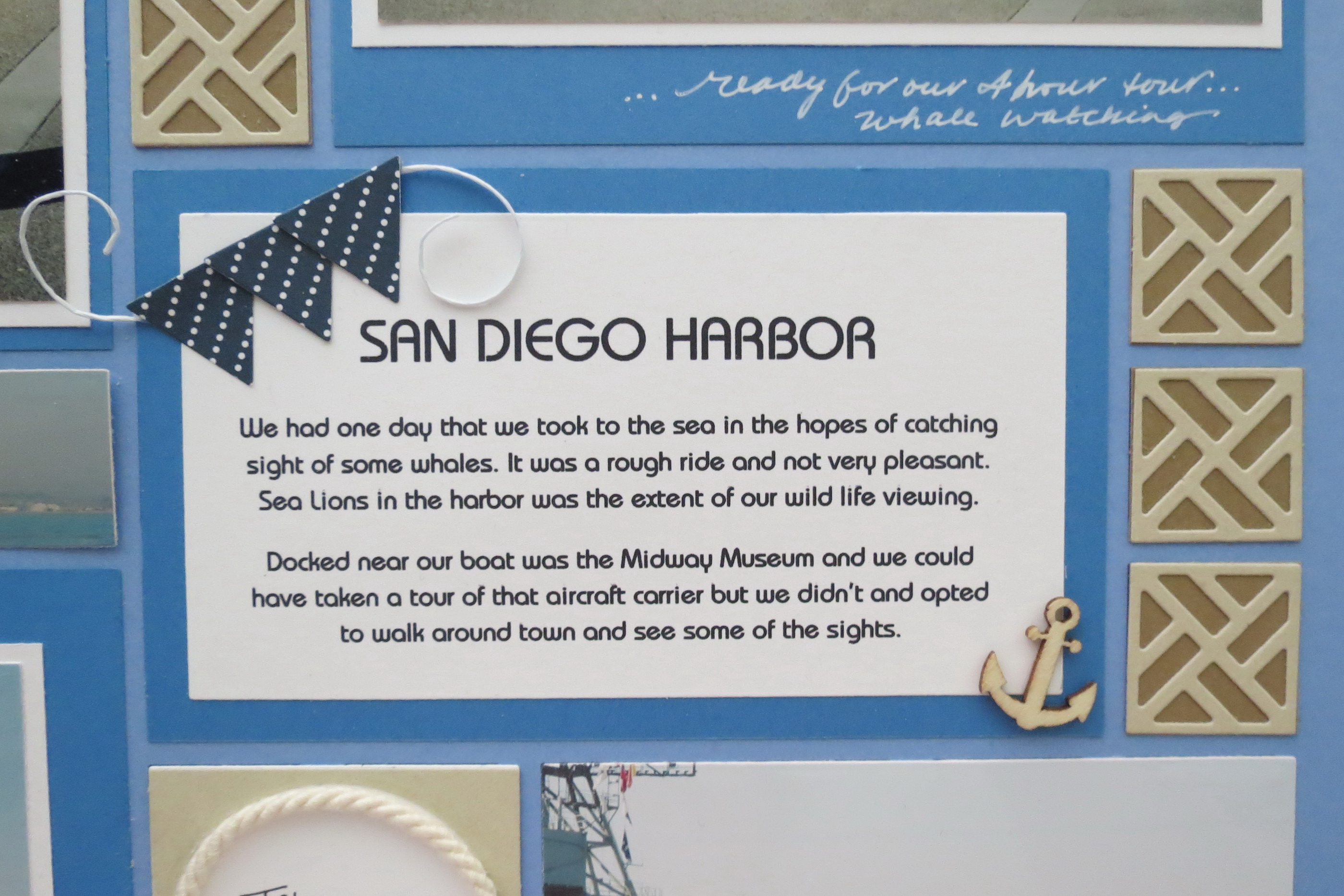
Begin with Cornflower Blue to enhance the blue skies and nautical theme. I’ve used double mats here in blue and white. I’ve cut a blue pattern paper banner with our banner die and a white banner as an underlay to drape along the edge of one photo. Three smaller individual banner tiles and a segment of scrapping floss swags along the top left corner of the journal block and in the lower left corner a wooden anchor finishes the block off.
MM Banner Borders Die

MM The Chippendale Die Set
MM Banner Borders Die
MM Banners Border Die journaling and anchor embellishment
Our Chippendale Cornerstone Tile Die reminded me of rope knot work when I first saw it so I thought I’d incorporate it here for all the 1” spots in the pattern and I’ve used Almond and Latte Paper Tiles. Another Almond tile and the Circle Frame die mounted on white becomes a secondary journal spot to add the date. A knotted rope circle rests on the frame edge.
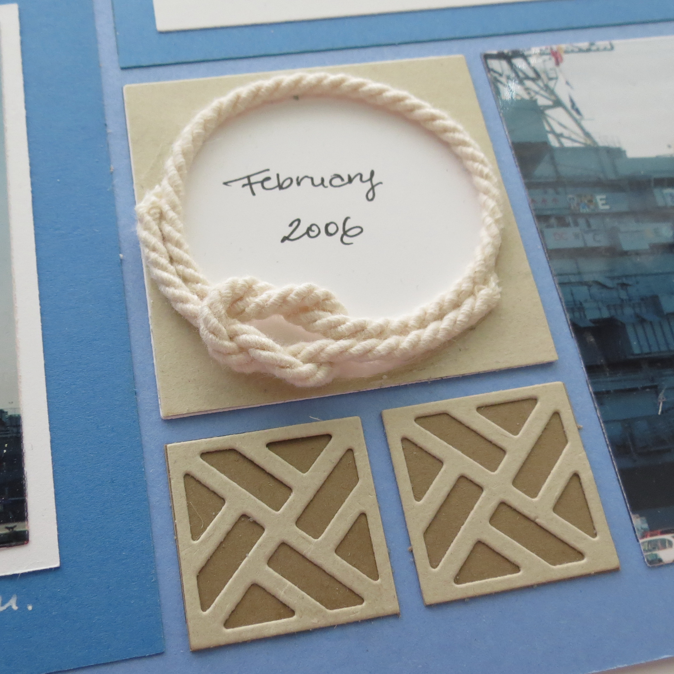
MM Circle Die and Chippendale cornerstone die
Layout Two
MM Pattern #112 One Pattern Three Ways Masculine Rustic Layout
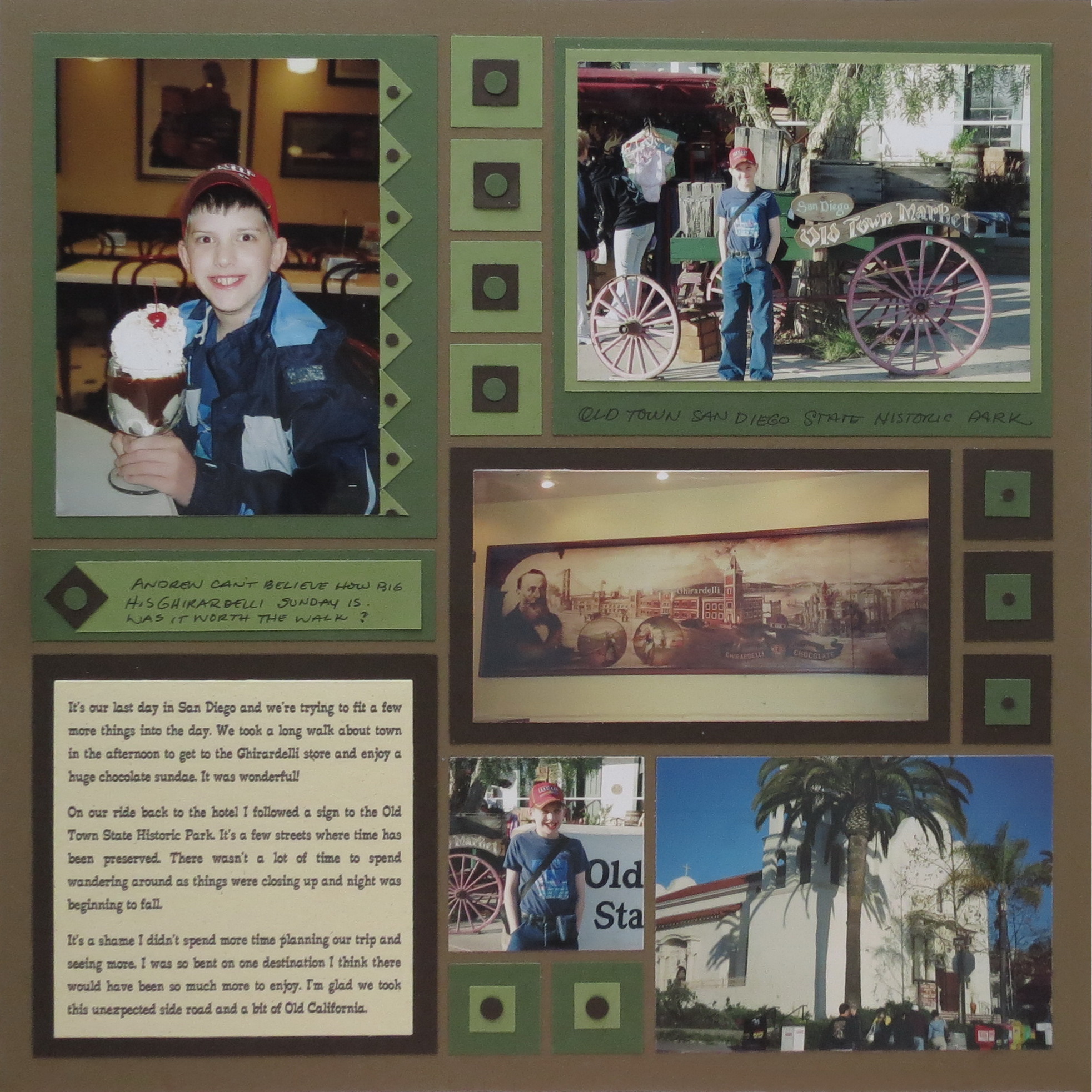
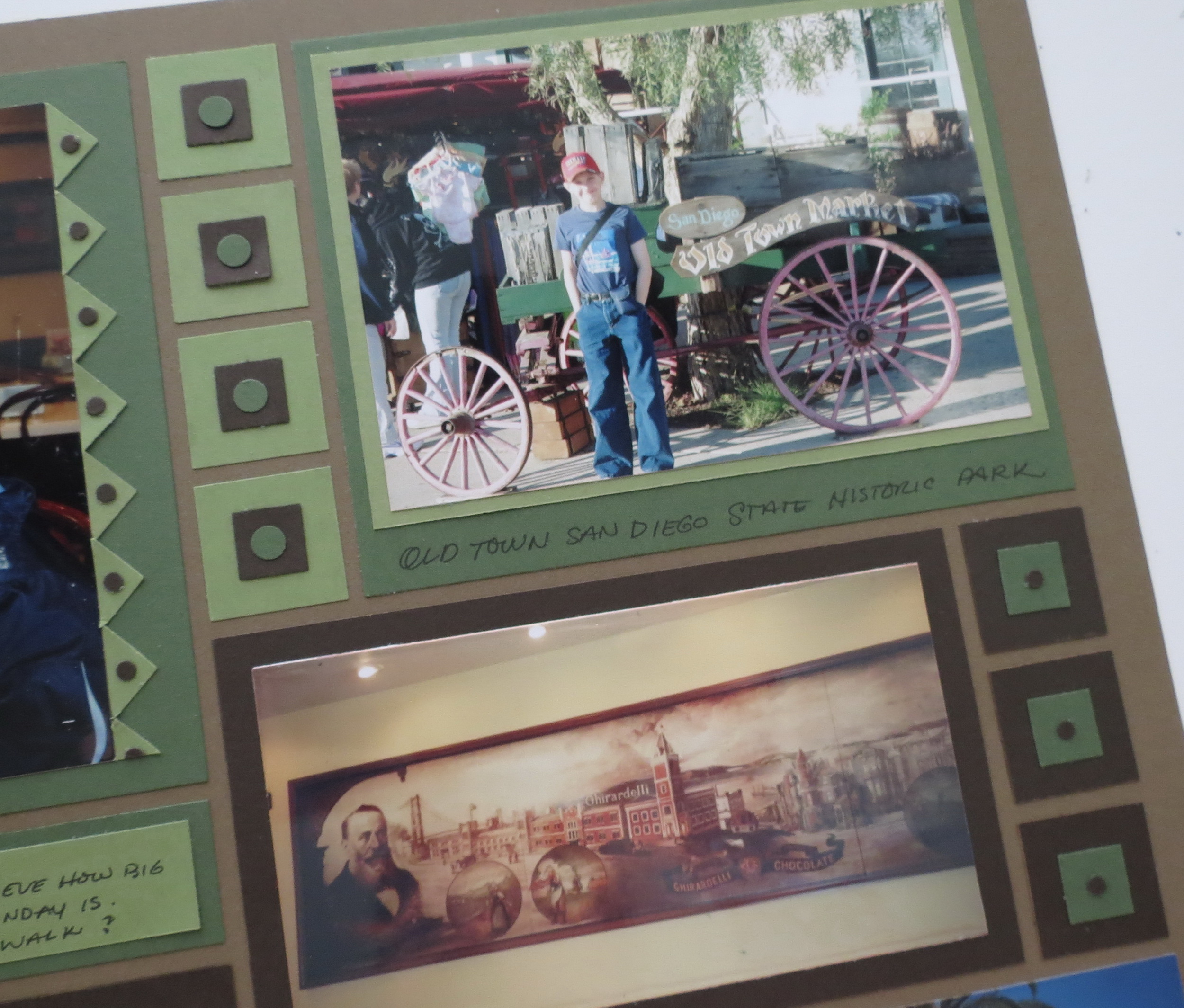
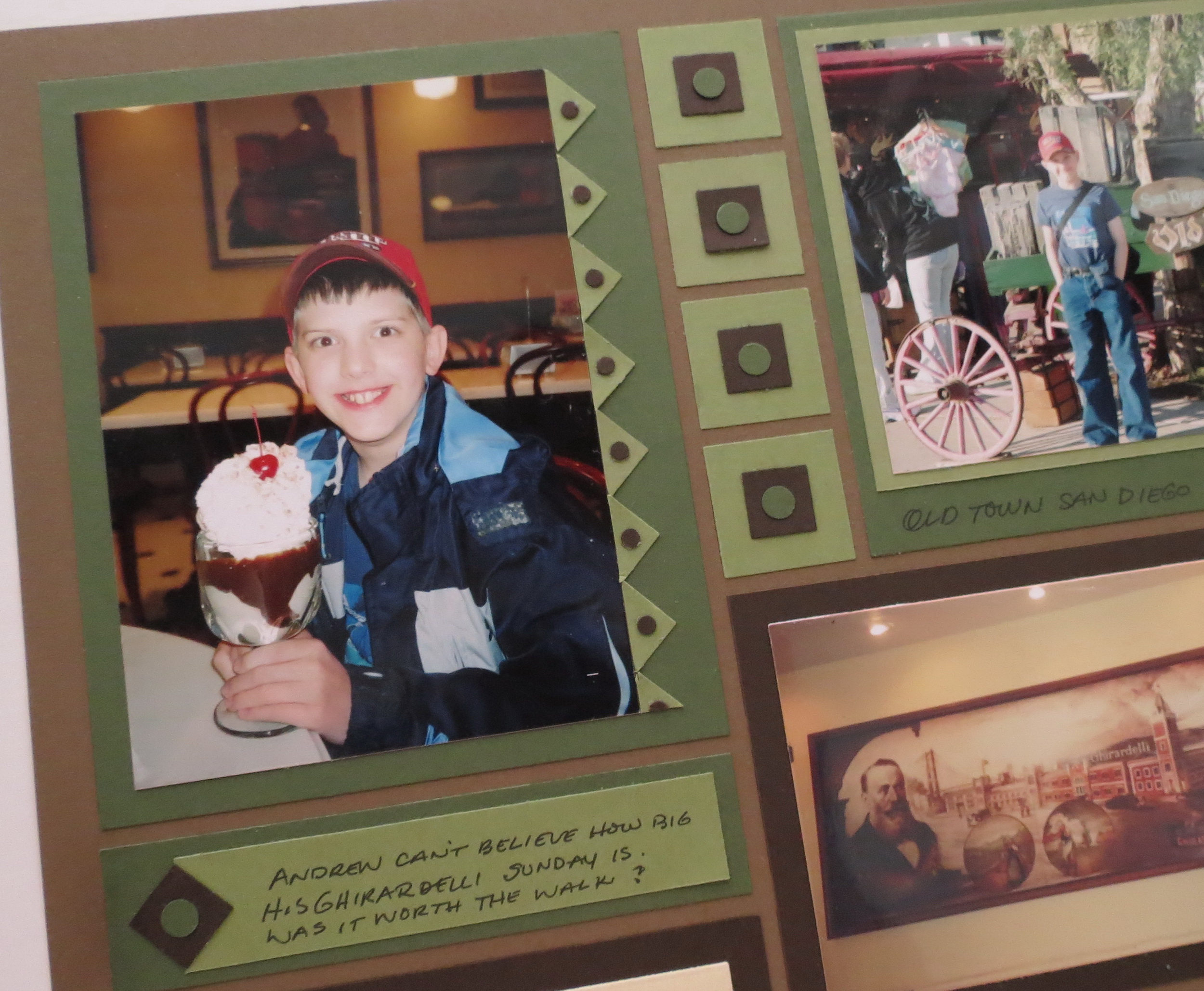
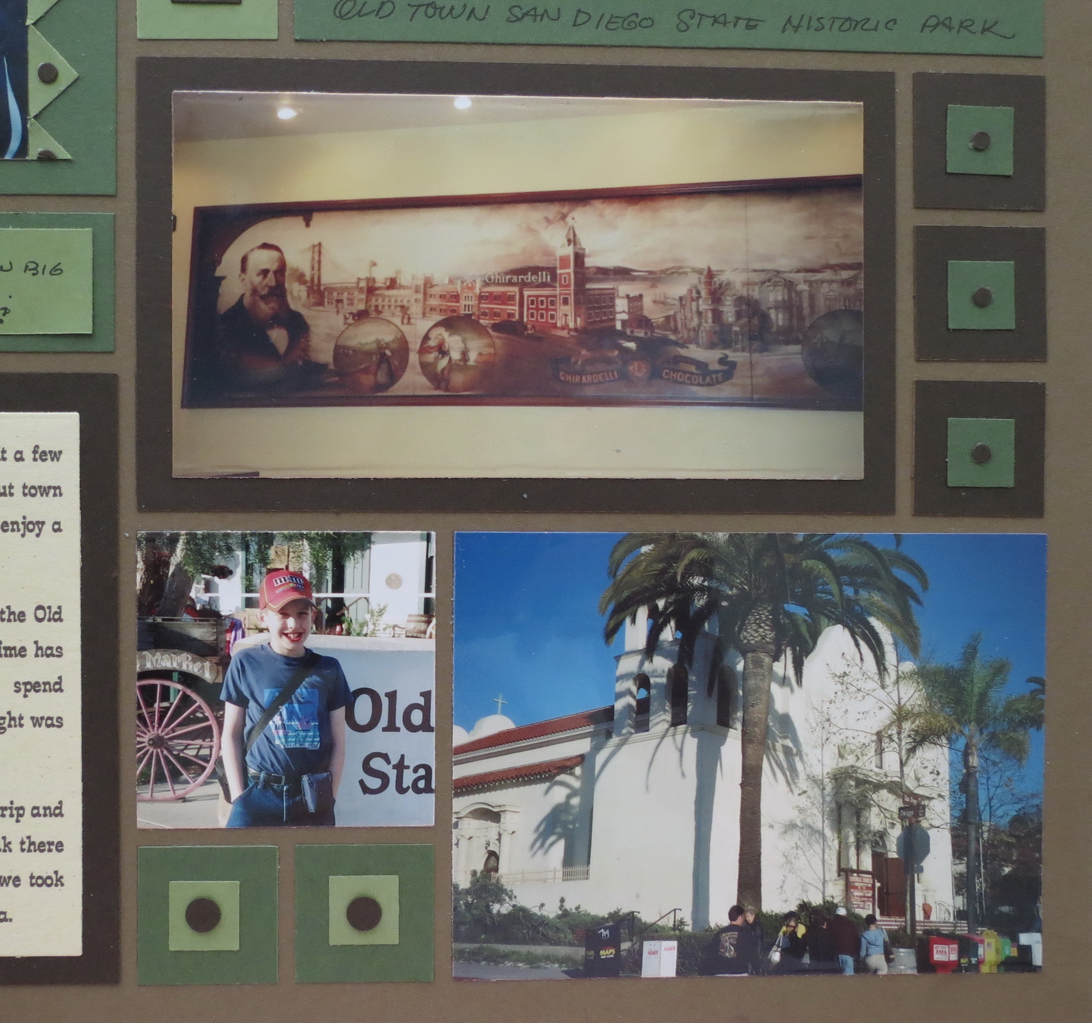
Begin with a Sage Grid foundation, Dark Spring Green, and Cocoa Paper Tiles with a spring green cardstock to add a few color accents for this layout. This has a more masculine, outdoorsy look for an historic feel to the page.
MM hand punched embellishments simple shapes
I only had a couple of photos from both events so combining them on one page was the best solution. I used a western style font for the journaling with triangle, diamond, circle and square touches.
MM Western style font journaling
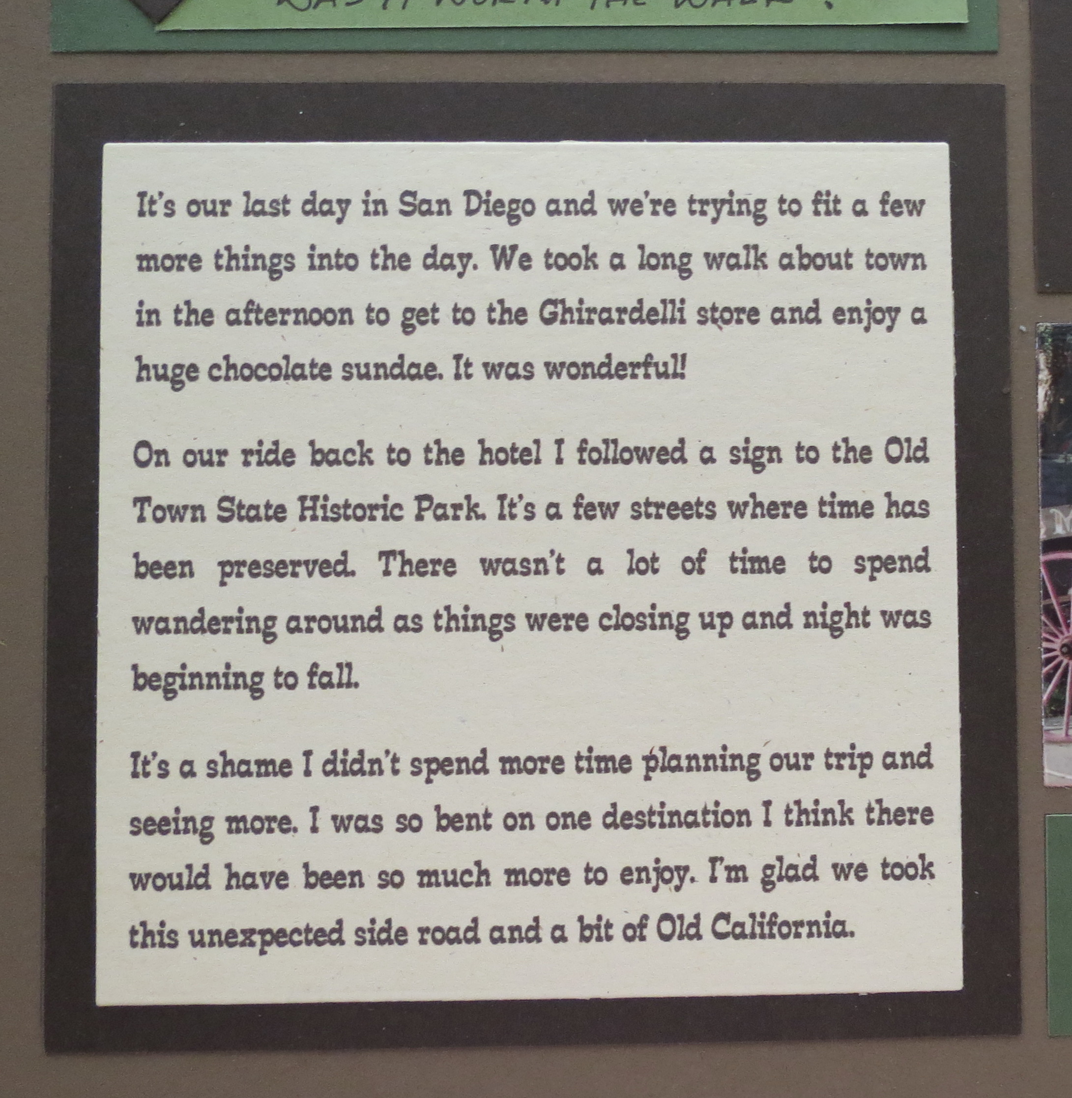
All these simple additions can be achieved with hand-cutting and hand punches and goes fairly quickly. I’ve used the border below the photo to jot a few lines. The 1×4 section is also used for a brief note.
MM Masculine Rustic Outdoorsy
MM hand-punched embellishments
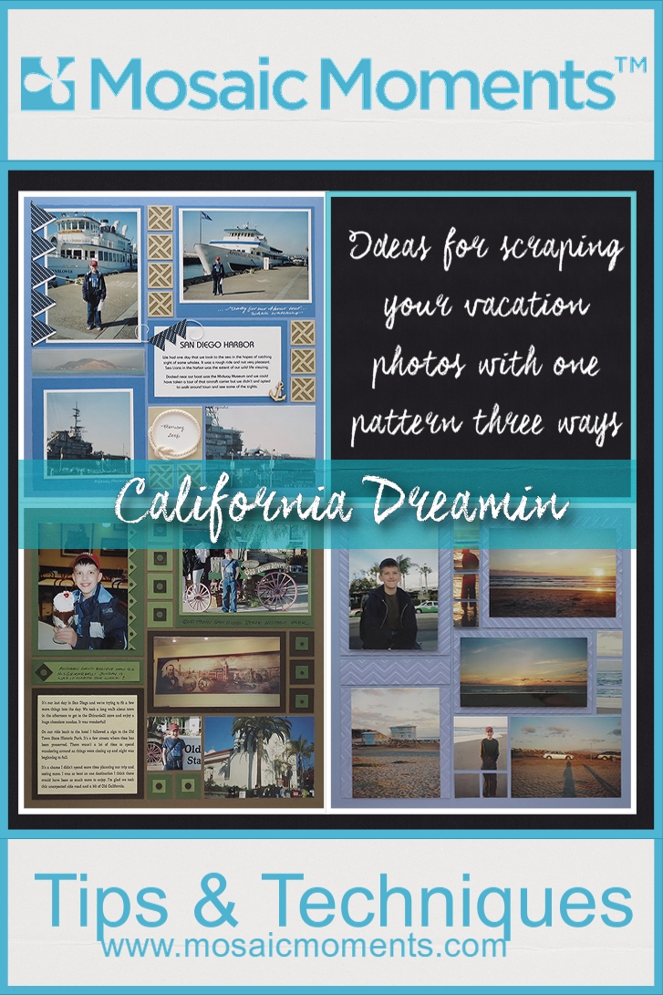
Layout Three
MM One Pattern Three Ways Tone on Tone Periwinkle and Chevron Embossing Folder
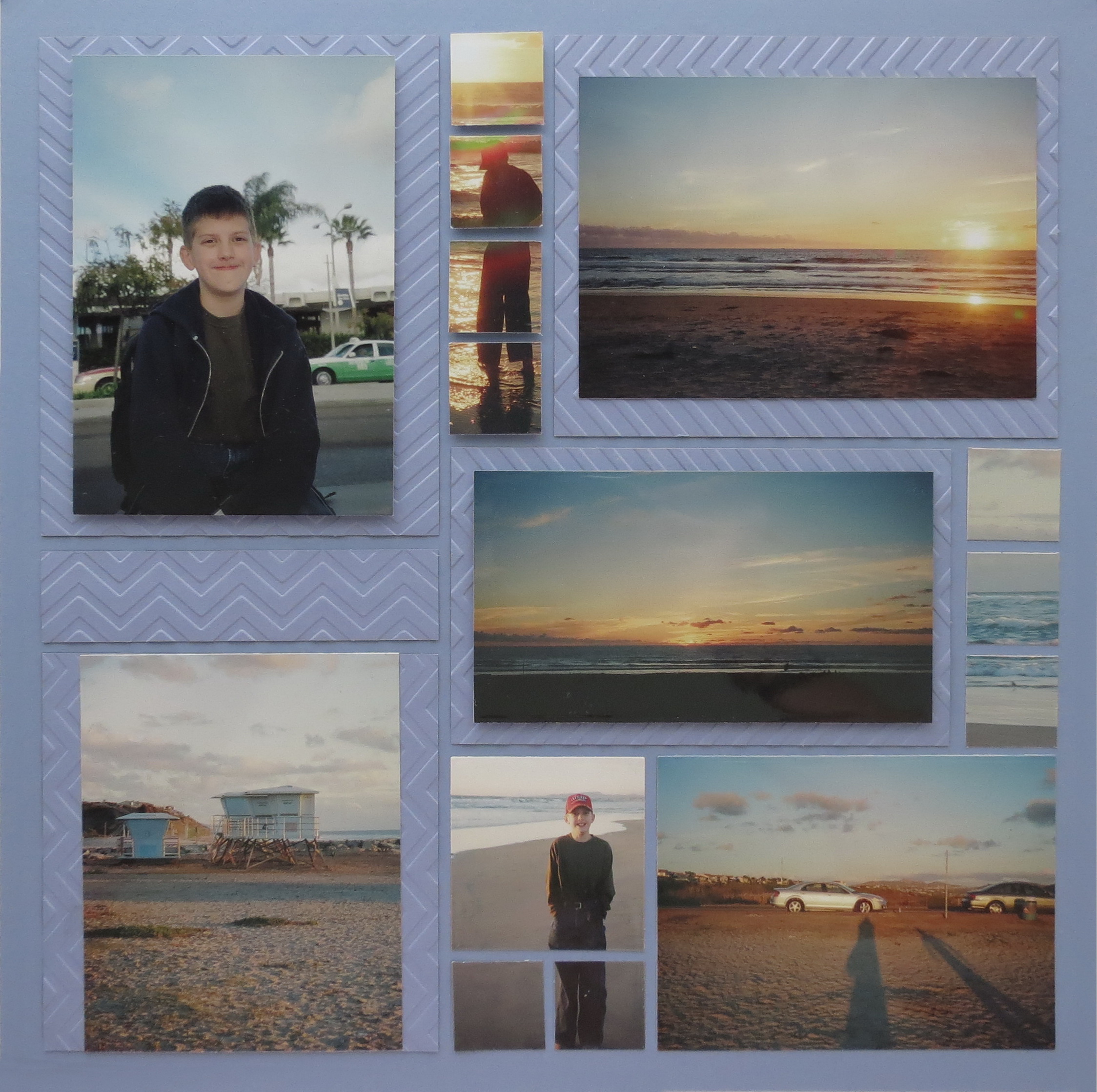
I chose a Periwinkle Grid for these sunsets on the Pacific Ocean photos. It picks up some of the colors very nicely. Once again I’ve tucked in an odd photo and I’ve also included a photo that was less than perfect when printed. The first photo was taken at the airport shortly after we landed and a few hours before the rest.
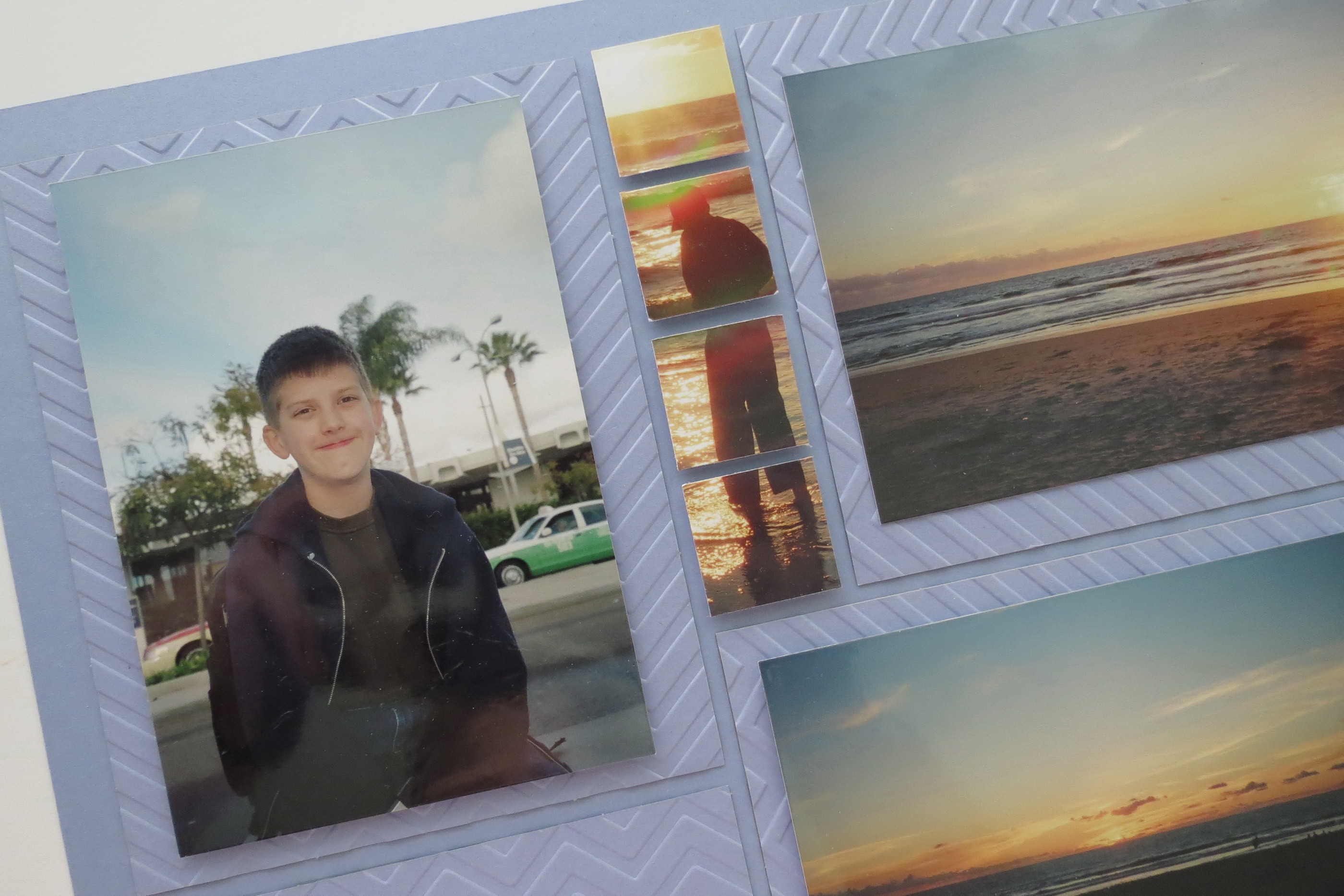
MM salvaging a photo that is less than perfect
The photo I wanted to include was of my son’s first steps into the Pacific Ocean, but the film had been damaged and this was one of several photos that the airport x-rays spoiled. I thought however I had just enough that I could crop to fit this series of four tiles. To set it apart I placed foam mounting tape on them to elevate it slightly above the rest. I used foam tape on two other photos for a change of elevations on the tone on tone base. Next time you have a photo moment you just have to use, but maybe didn’t turn out the best, look for a creative way to remember the moment and include it on your layout.
I really wanted the grid color to be in contact with the photos so Periwinkle Paper Tiles were the answer to my problem. Making it interesting was the role of the Chevron Embossing Folder. I did use both sides the pattern and multiple directions too. If you’ve noticed there are several embossed cardstocks that are the current trend so why not bring them to the grid too? This design allowed me to center my photos on each of the blocks and skip any journaling…although I may add a few lines on the outer border later.
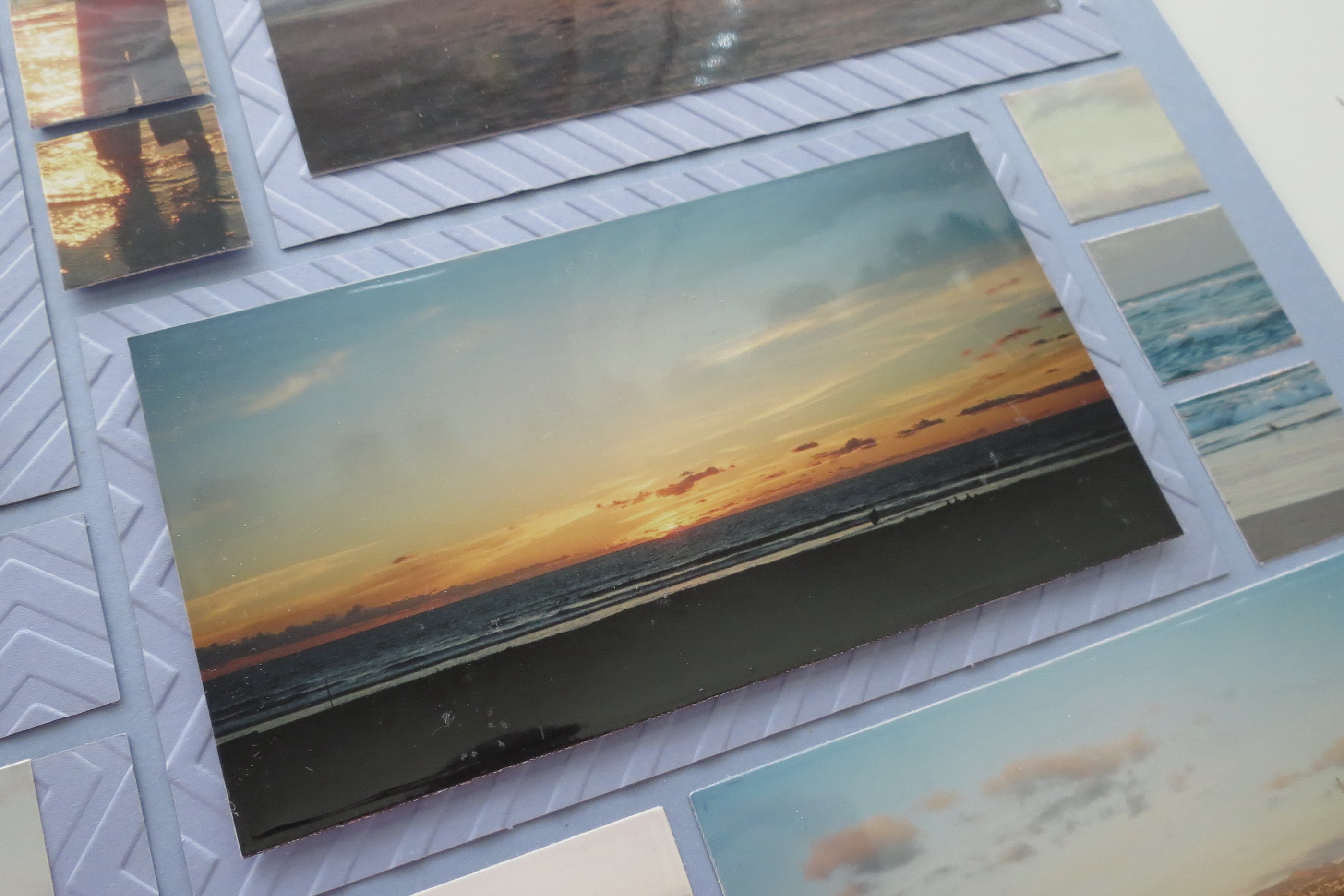
MM Embossing folder will give you a nice textured cardstock for interest against a tone on tone layout.
You might notice the lower left-hand square does not contain a square photo. I really did not want to crop too much off of this photo because I really liked the proportion of sky to sand so it is the full height of the square and a narrow border on each edge. I did line this photo up with the portrait above to keep it visually pleasing.
In the end this tone on tone layout with only texture to embellish allows the photos to stand out and be the focus and don’t we all love a great sunset?
In Review I’ve used:
• Three different grid colors
• Double mats and textured mats
• Multiple spots for journal spots
• Used paper tiles, cornerstone tile dies and photos to fill the 1” squares
Each variation you use will give you a different look on each layout. Why not see how many new ways you can use your favorite pattern with a few of these ideas and those of your own creation and have fun with your memories and make a wonderful album!
BONUS:
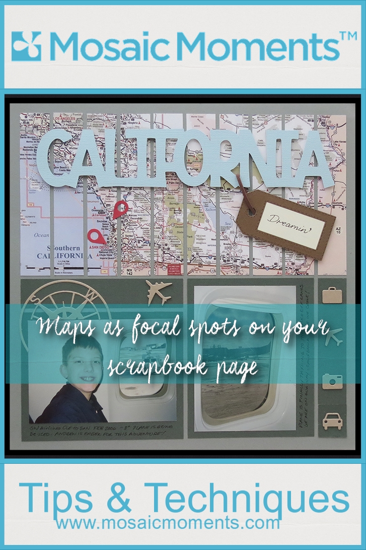
MM Pattern #292
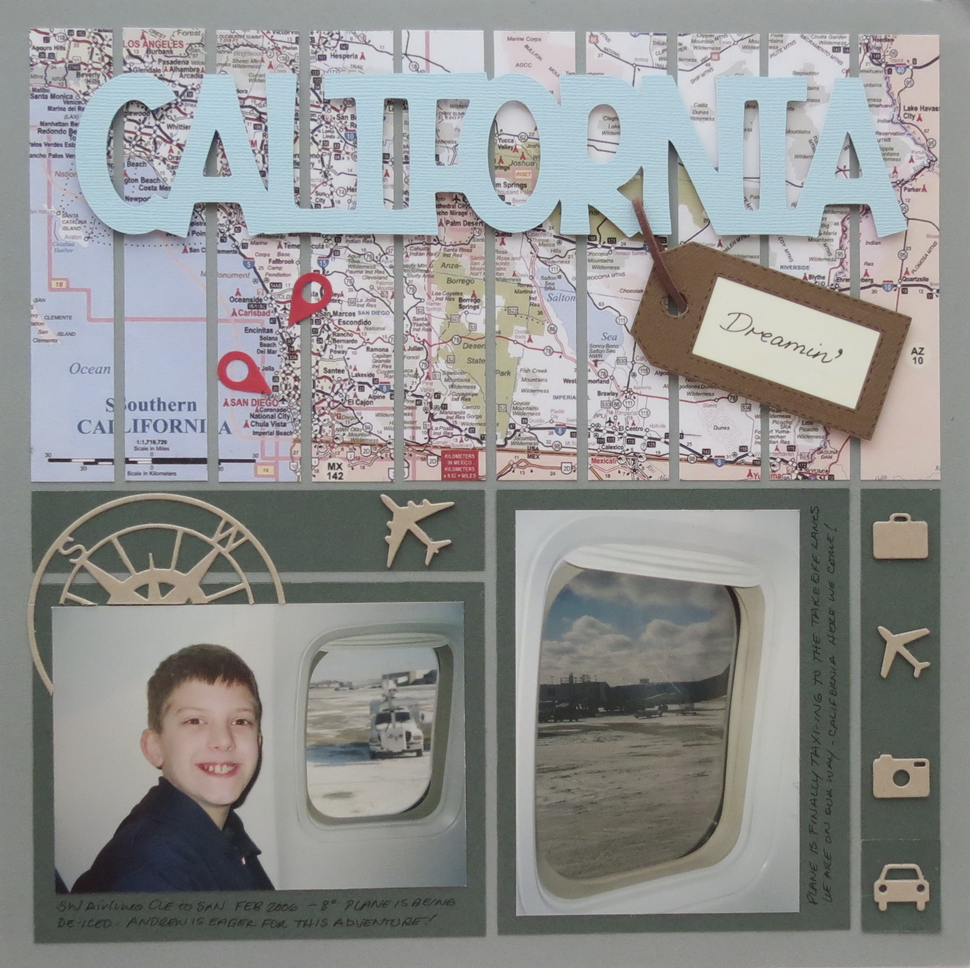
MM Pattern #292 strip pattern Title page idea using a map.
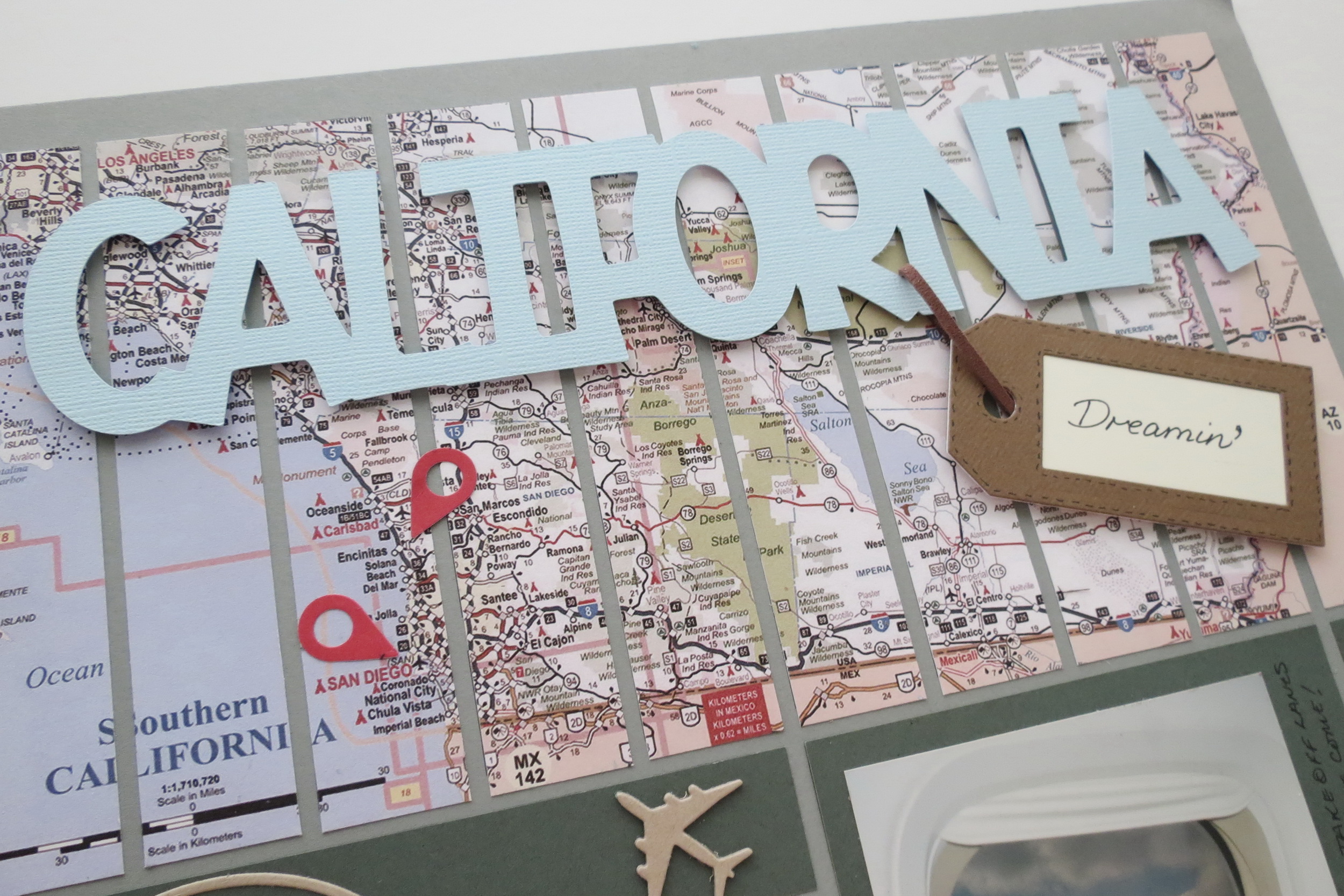
All three of these layouts will be a part of the same vacation album and I thought I’d include as a bonus the title page I’ll be using because it shows off a great way to include a map of your destination. I began with Pattern #292 a strip pattern.
The pattern is divided in two halves. The top with the section of strips I’ve used to include a map of Southern California. The original map was a bit too bright in colors for the photos, Military Green Paper Tiles and Steel Blue Grid Paper so I used the sepia effect on the computer then changed the opacity until I got the muted colors I wanted. I printed it on matte photo paper.
This pattern I tweaked to accommodate the photos I wanted to use. On the bottom section the pattern calls for two horizontal photo spots that normally would be music to my ears, but I had a vertical photo I wanted to use to start the album with, so I just rotated the two sections, easy-peasy!
MM Top half strip pattern lends to the use of a map of your journey
My Cricut cartridge 50 States had a preset California title that I cut and mounted on foam mounting tape. I slipped a faux-leather looking travel tag (Tim Holtz tag dies) through the letters, made easy by being mounted. The leather strip is fastened behind and another piece of foam tape at the bottom of the tag holds it all in place.
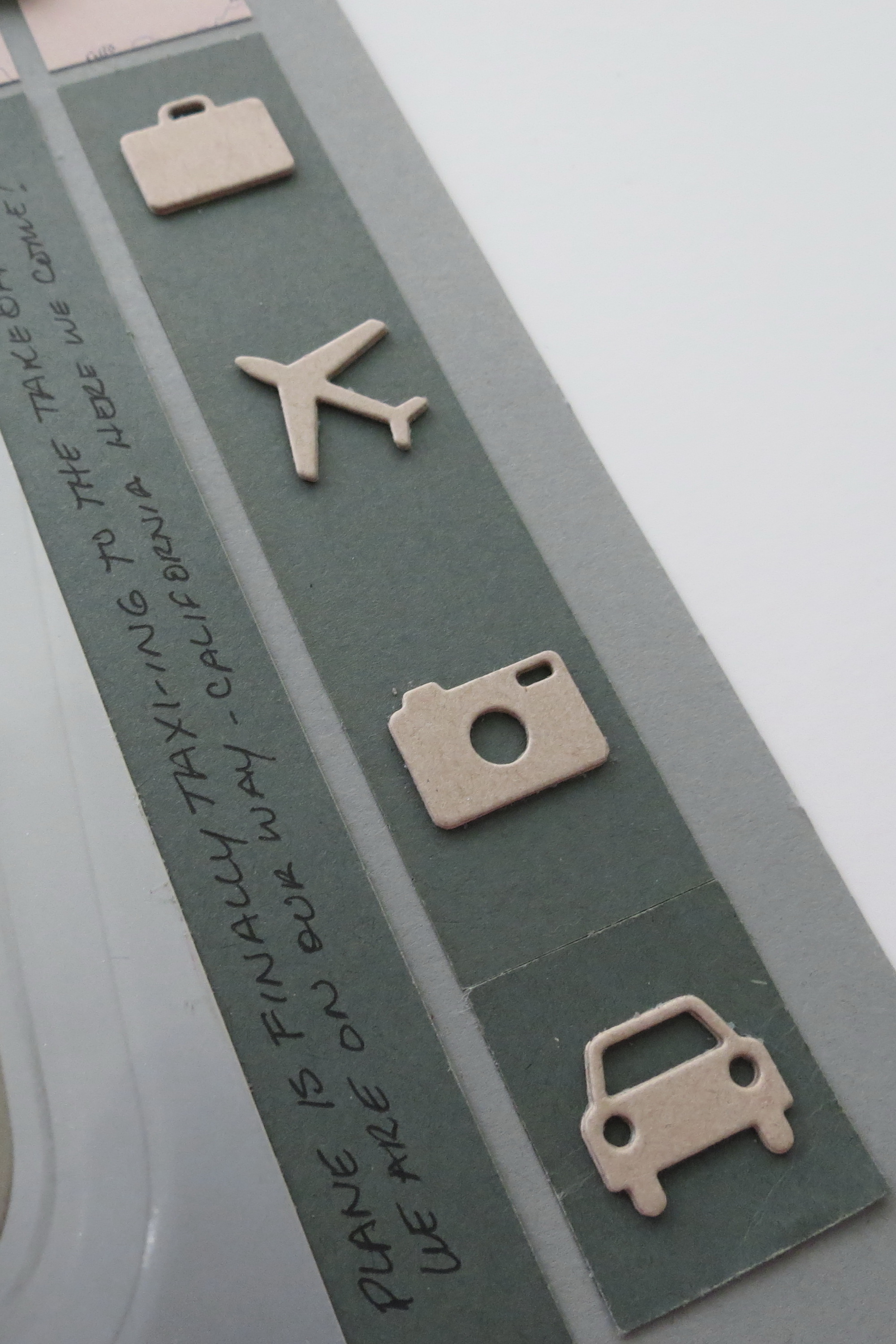
MM creating embellishments with triple layered kraft cardstock
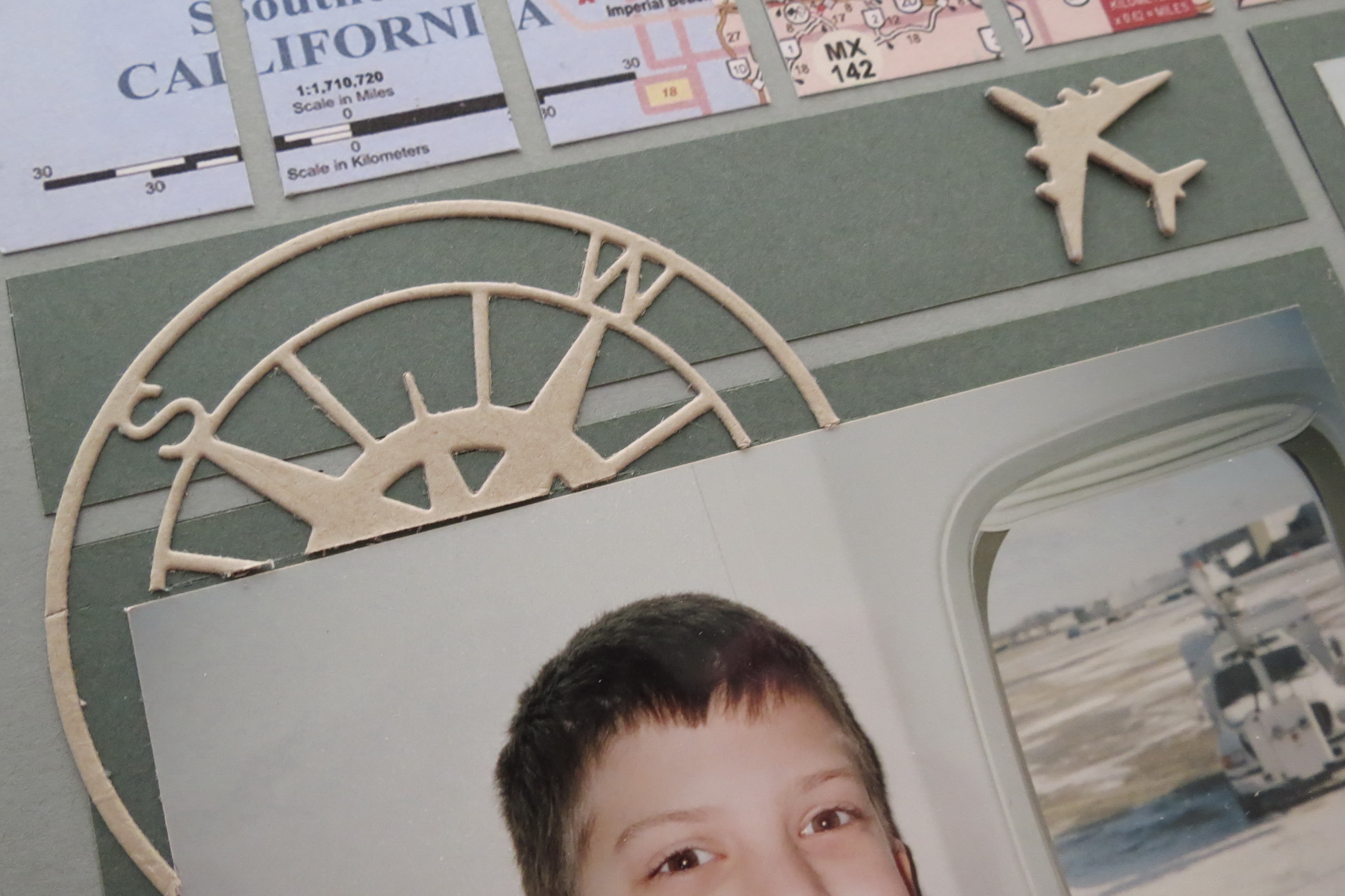
MM compass point embellishment
I’ve made some travel themed embellishments (Technique Tuesday, KaiserCraft,) with kraft cardstock by triple cutting and stacking the elements for depth. The compass point is trimmed to overlap the blocks and appear to fall behind the photo. The geo tags mark our destinations for this trip. Simple additions easily achieve that traveling vibe.
There’s more to this story to come in the future so stay tuned!!
Andrea Fisher
MM Scapping Maps on the Grid
MM California Dreamin’ ideas for scrapping your vacation photos with One Pattern Three Ways