
4 Ways Scrapbookers can draw more attention with Bright Colors:
- High Contrast Elements – Liam’s Birthday
- Colorful Photos (and mats that blend into the grid paper) – Making your Photos Work
- Patterned Papers – Bright Bold Colors
- Embellishments: the “Pop Factor”: – Run for the Borders
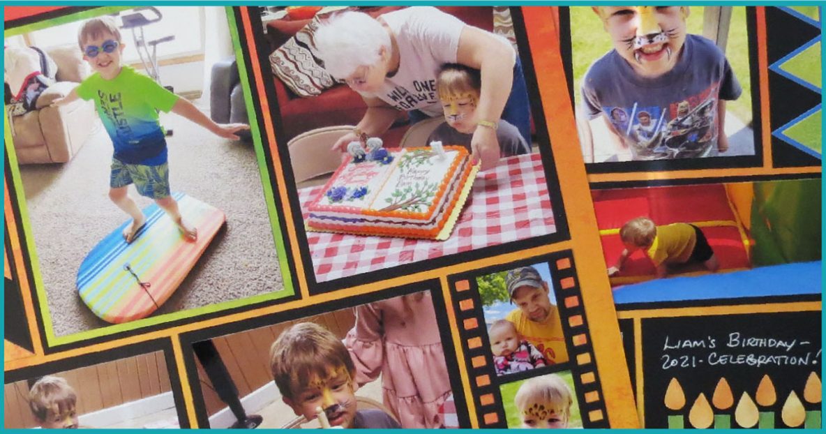
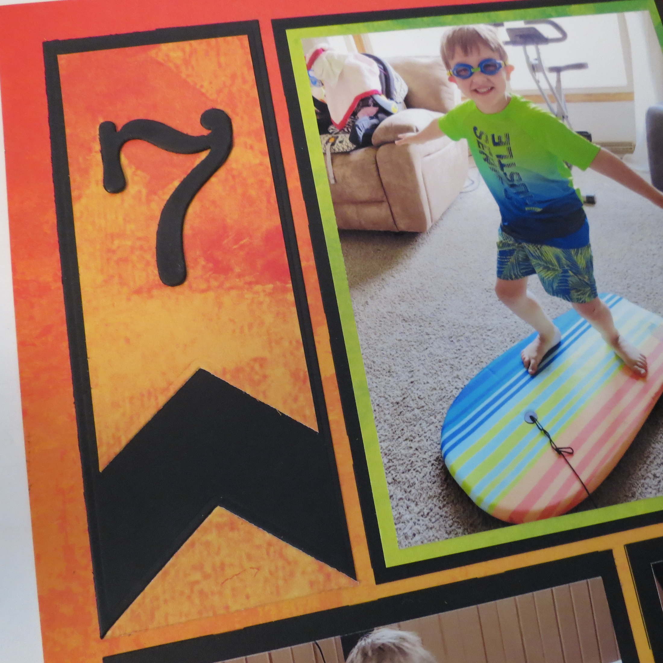
Let’s begin with a new layout using the Heatwave Grid Paper from the Mosaic Moments Summer Grid Collection.
The fiery red, yellow and orange blend of colors was a good choice to work with the photos on these pages. However, there are a lot of bright and bold colors in the photos and it could be a tad busy, there needed to be another component to give the page a “rest.”
That’s where the first way we can draw more attention with bright colors is helpful:
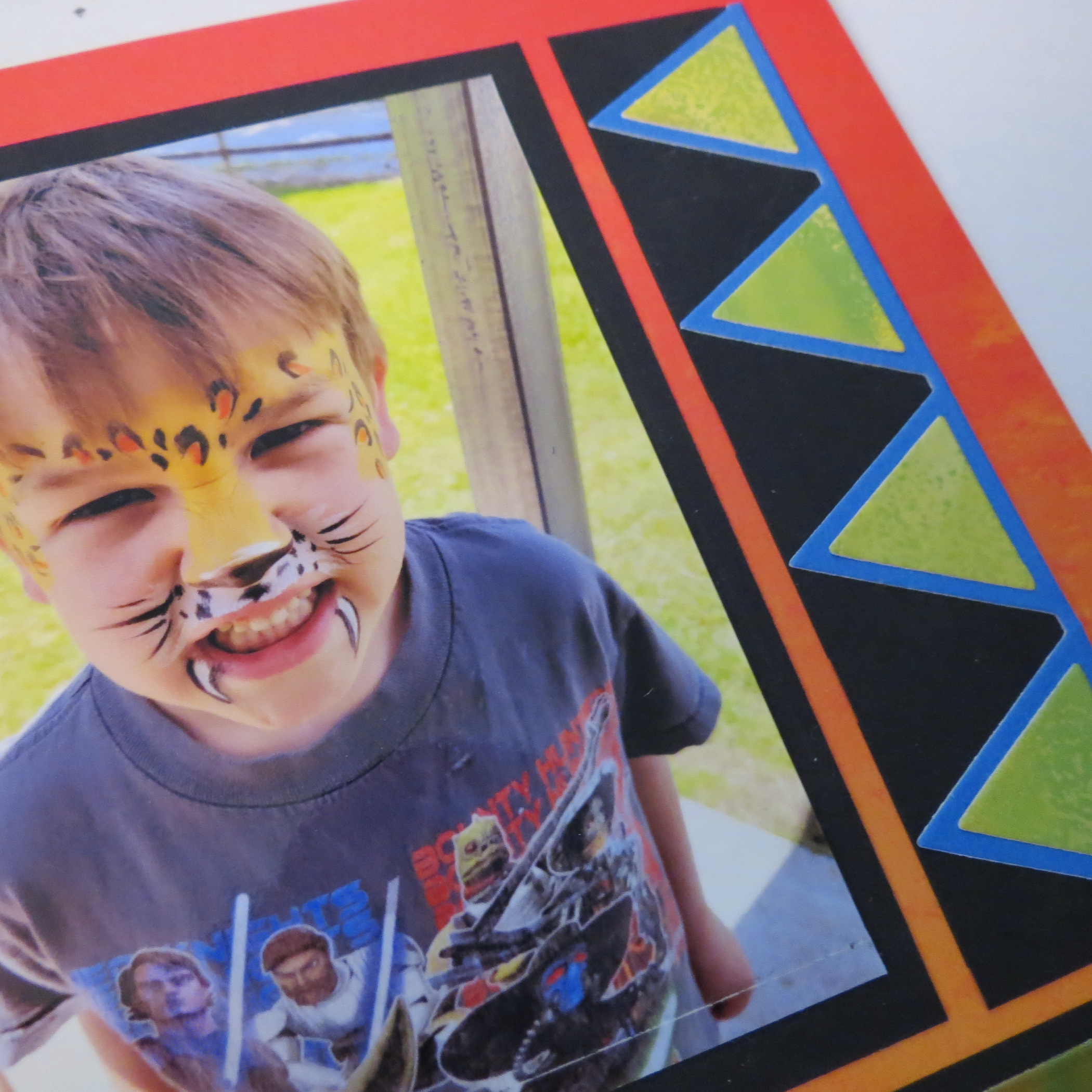
1. Use High Contrast Elements
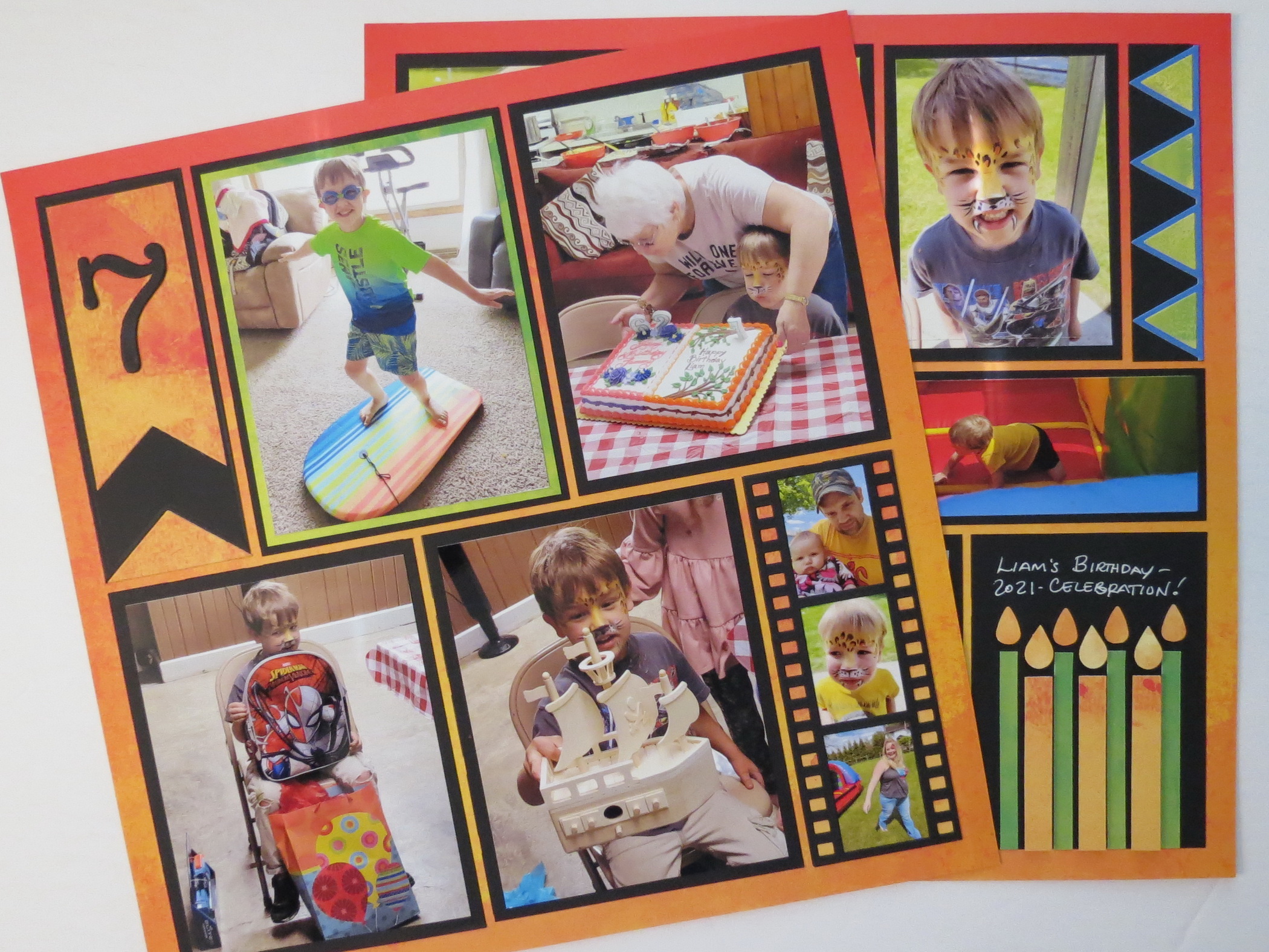
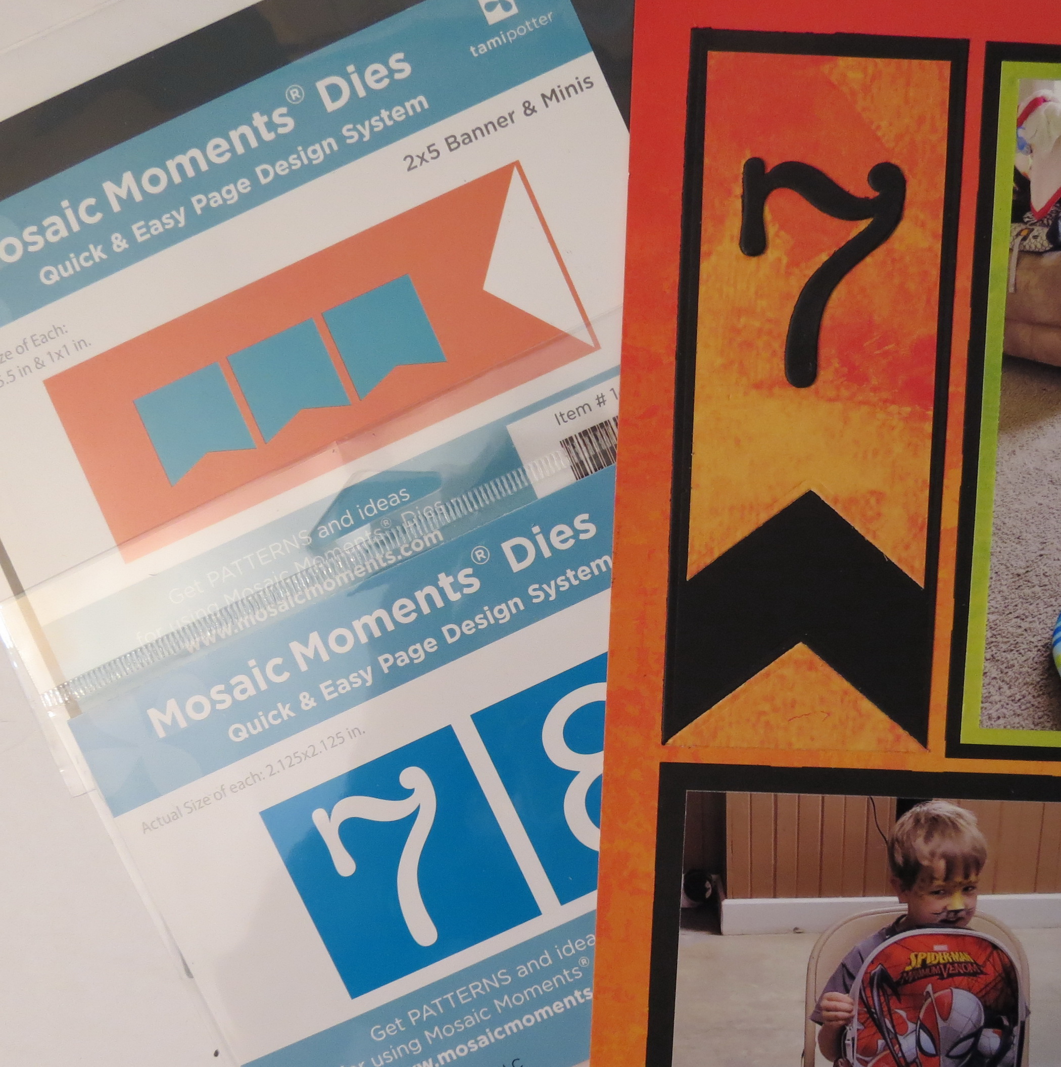
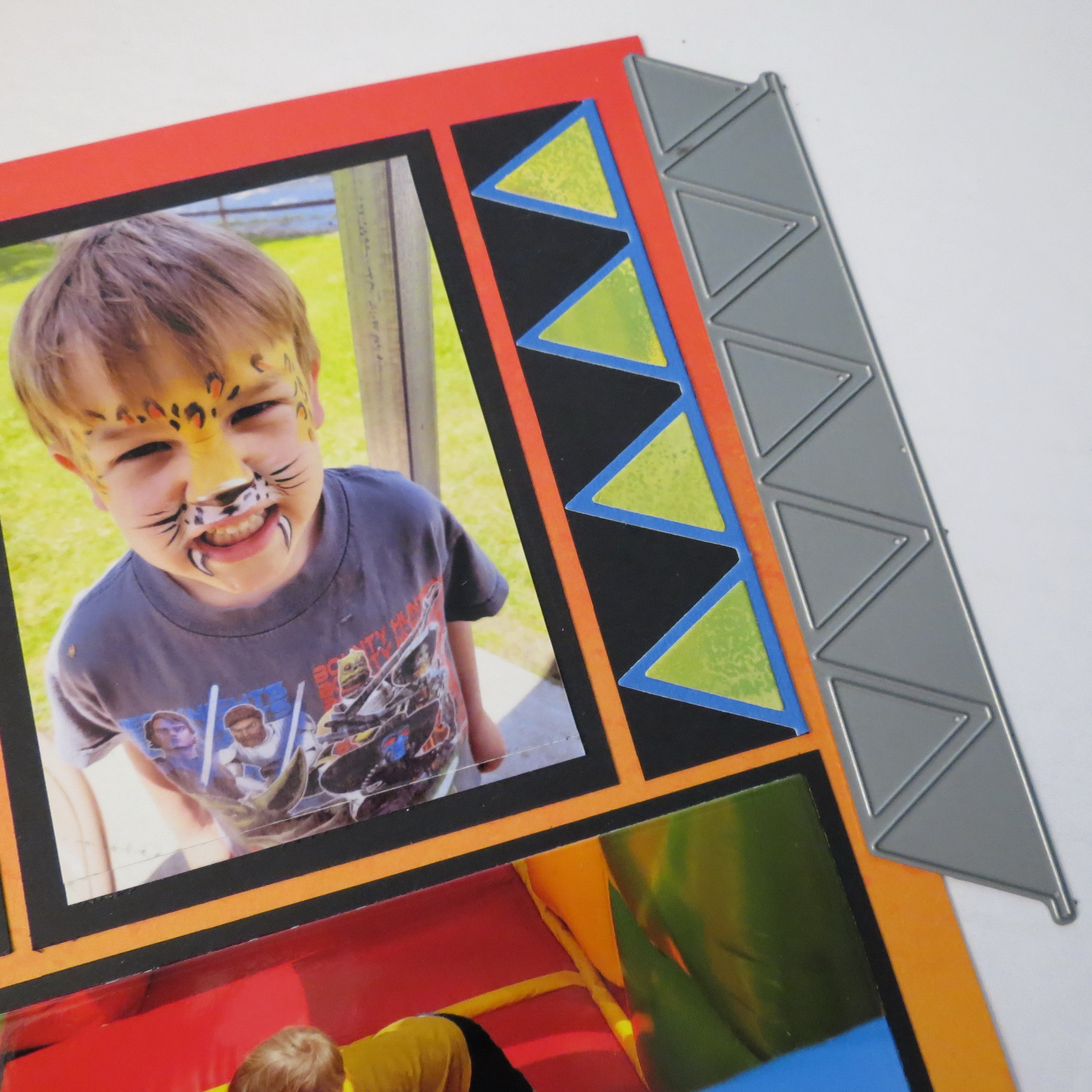
In this case, Black cardstock mats and die cuts give me what I needed.
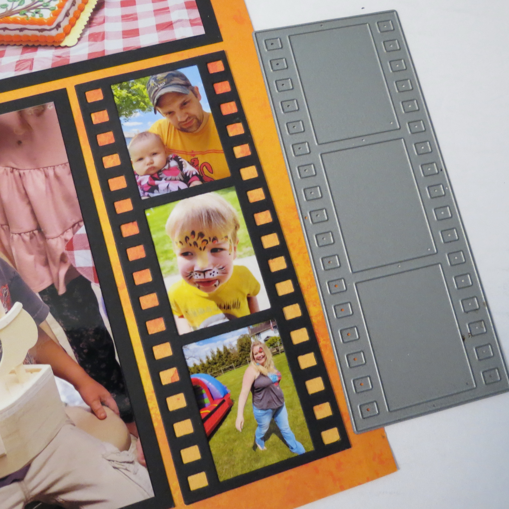
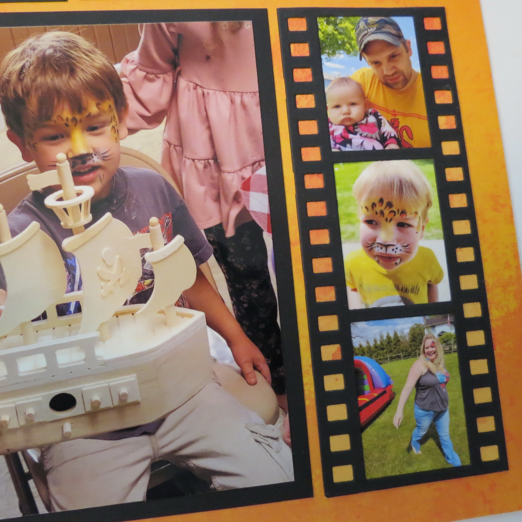
All the spots of the pattern are covered in Black cardstock and the photos are cropped to have a narrow border and non-photo spots, like the 2 – 1×4 spots on page two become a place to add fun colors with 1×4 Banner Dies (retired), or 2×5 Filmstrip Dies and the 2×5 Banner on page one.
Adding a 4 layer “7” to the banner in black adds some balance to the page.
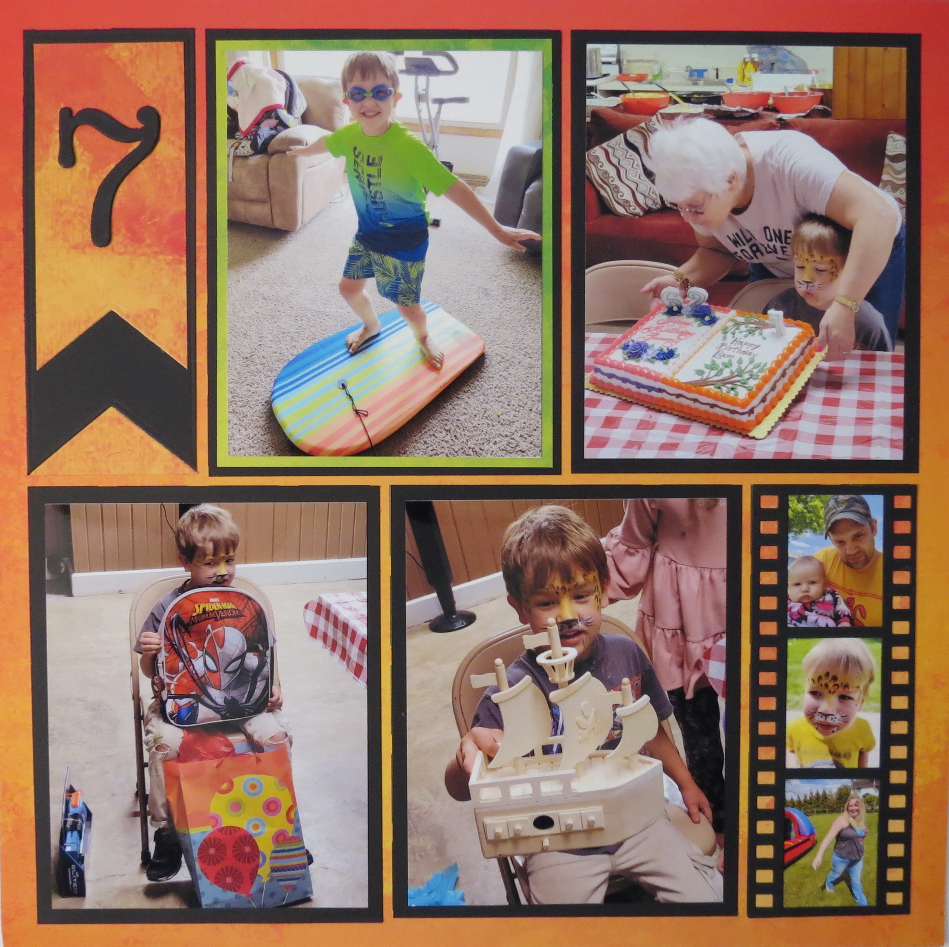
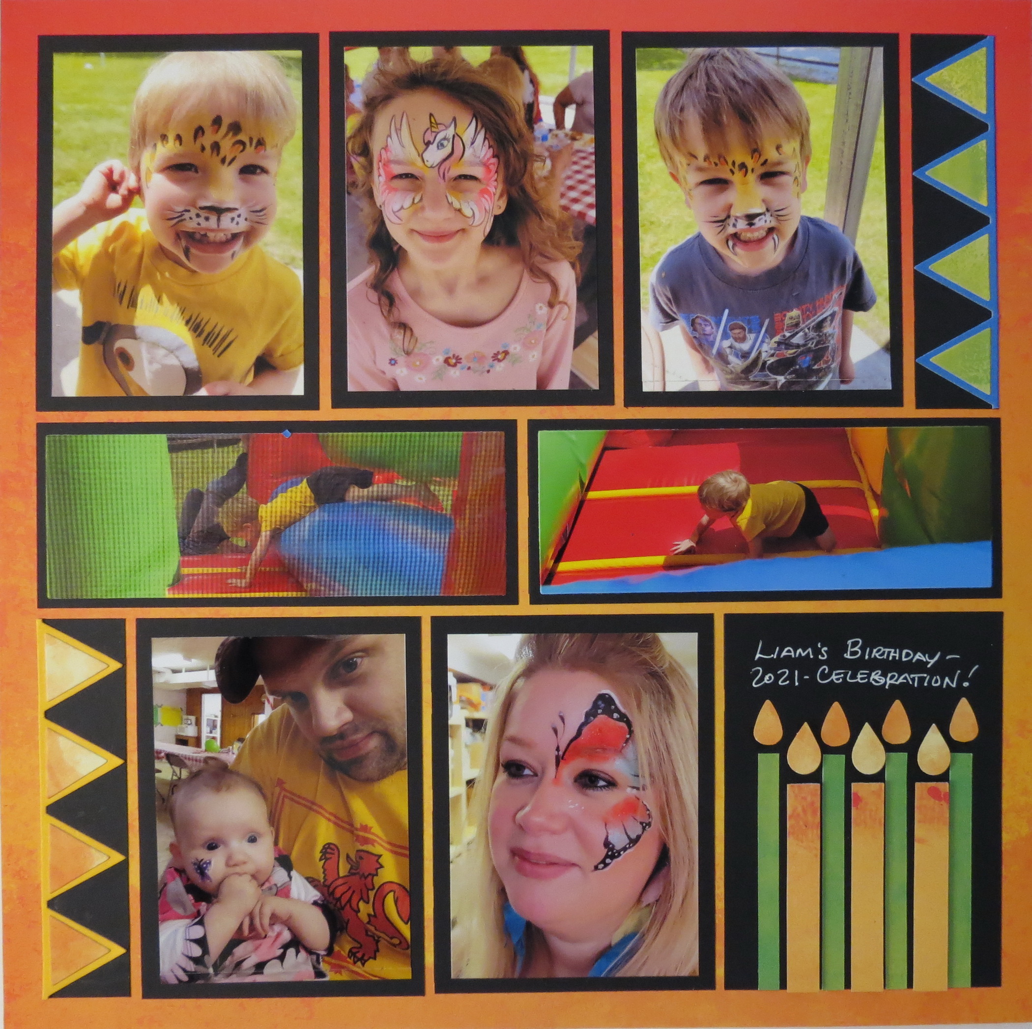
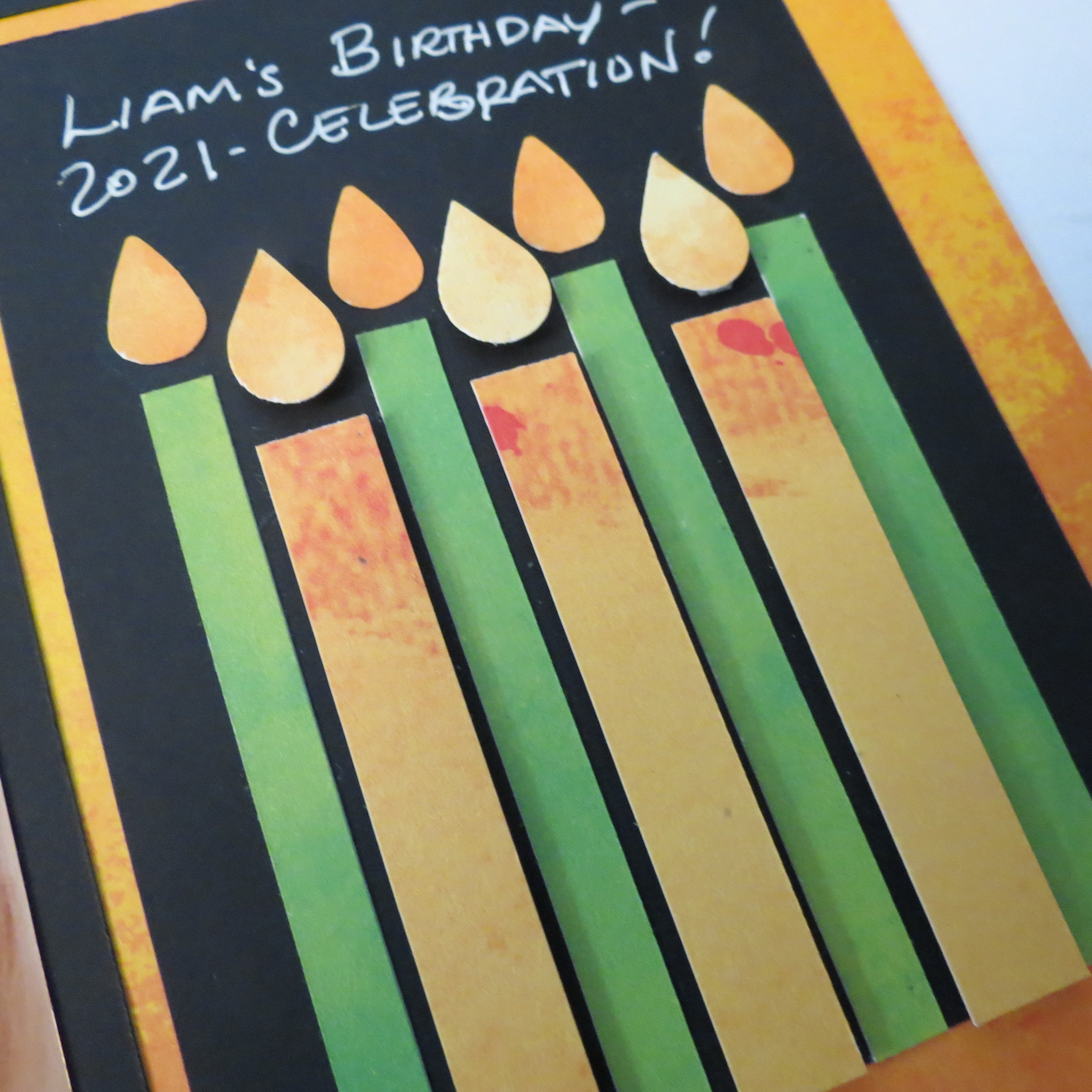
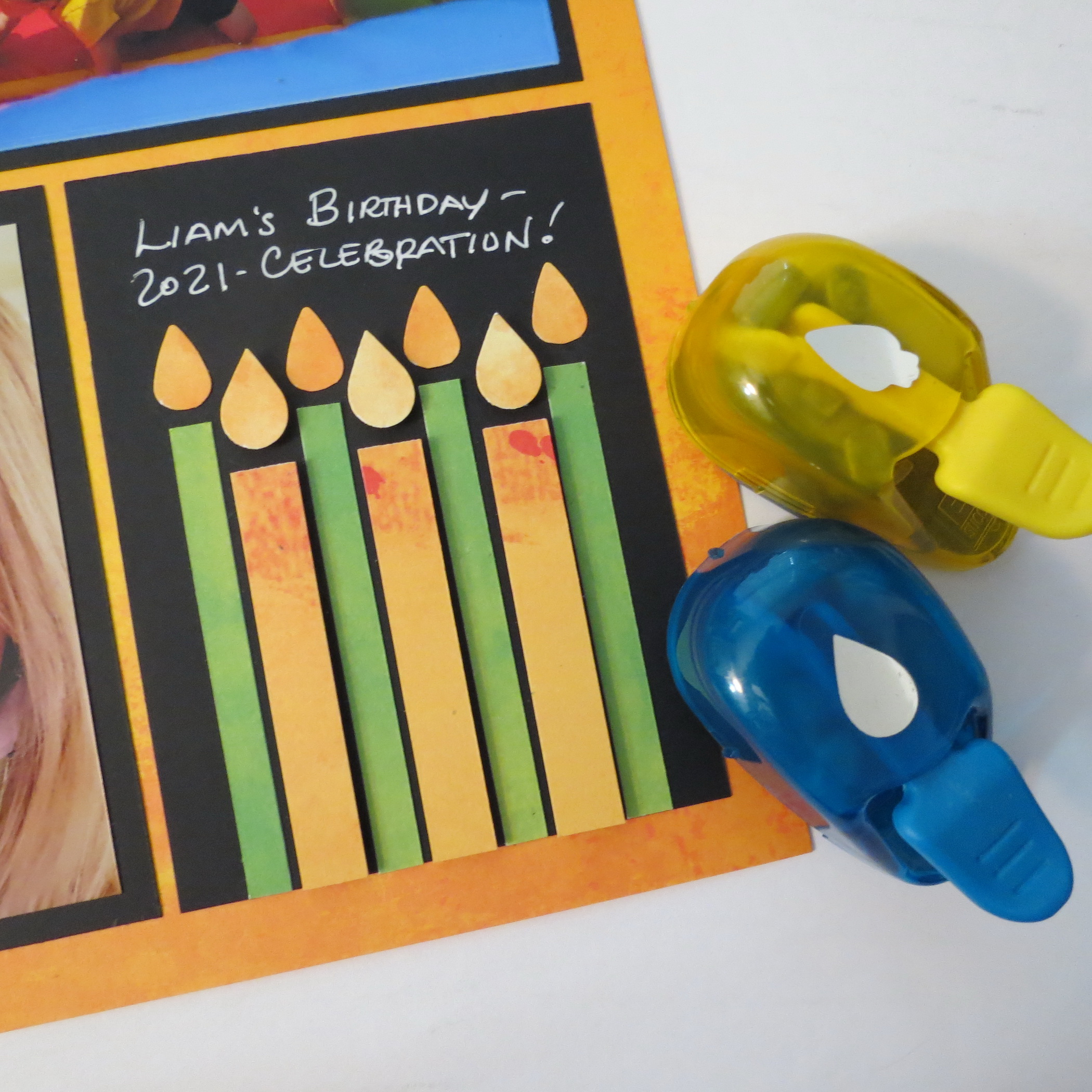
I also used the black cardstock in a 3×4 spot to put a title with candles.
The candles pop not just because of the bold, bright colors, but with the use of foam mounting tape to pop up the shorter, wider candles. My flames were easy to make using a couple of punches, a raindrop and Christmas light bulb with the base removed.
2. Use Colorful Photos
Let’s go back to a previous post for our next way to draw attention with Bright Colors.
Making Your Photos Work incorporated a lot of colorful photos into this two-page layout on Board Shorts Grid Paper from the Summer Collection.
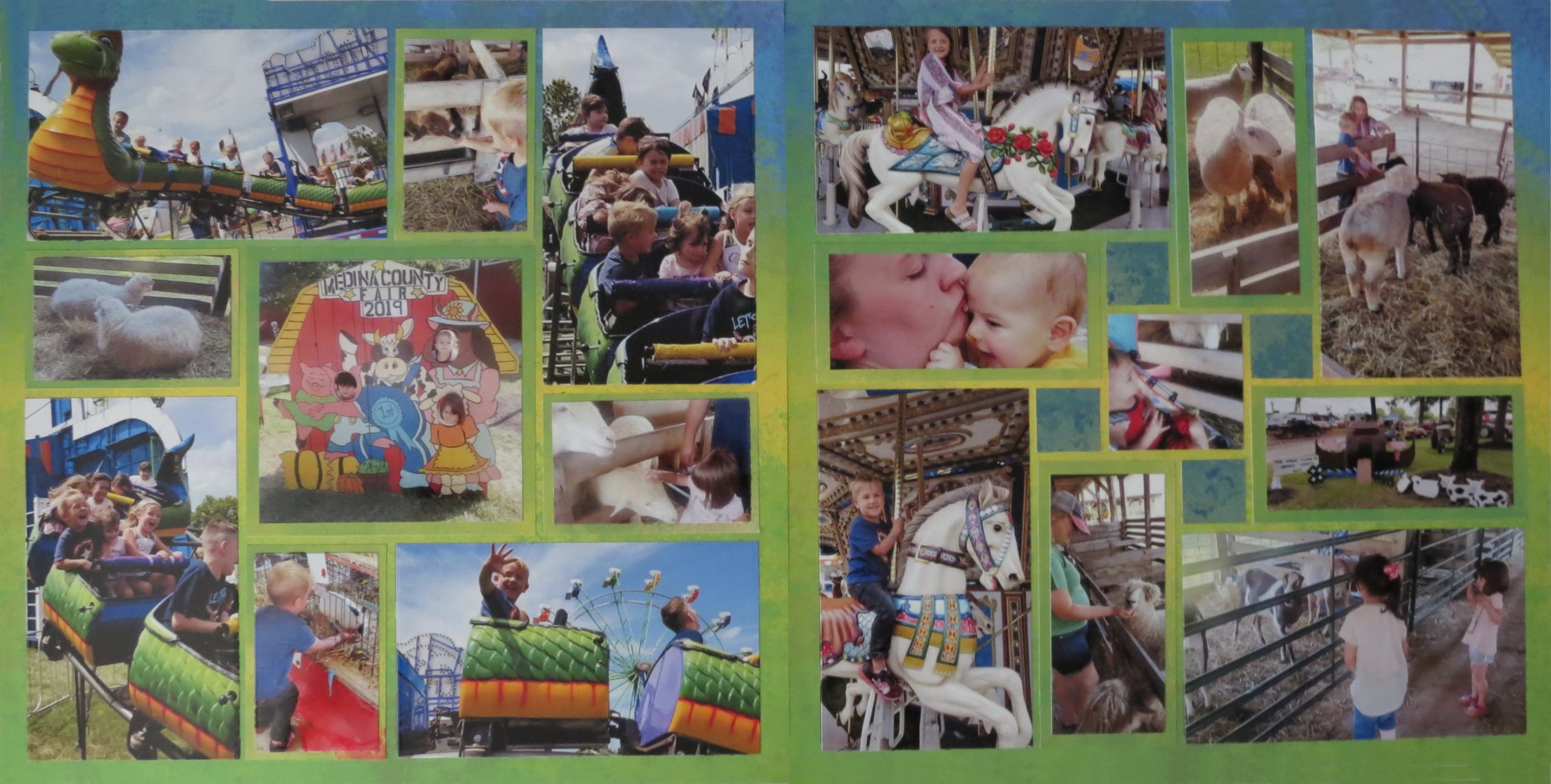
These photos from our county fair are full of color!
I might be inclined to use a white grid to let those colors pop, but the Board Shorts Grid paper picks up many of the colors it was a good choice to use. In these pinwheel patterns all of the 3x5s are mounted directly to the grid and all of the smaller 2×3 and 2x4s are matted with cardstock from Colorbok.
I love these pads of paper because they blend so nicely with this Grid Collection and I don’t have to sacrifice a sheet of grid paper to create mats that blend in.
I’m relying on my photos to bring the attention with the bright fair colors.
However, because the mats I’ve used blend into the grid color, more of the grid color also shows through. It also gives a break from the 1/8” spaces and gives the illusion that there are some wider spaces.
We all have lots of Patterned Papers in our scrapbook stash and we can find lots of bright and bold colors that can be attention getters, so let’s see how to put them to use.
3. Use Bright Patterned Papers
Patterned papers are often the inspiration for a color scheme.
This time Beach Vibe from Vicki Boutin works beautifully with Board Shorts Grid Paper. All the colors of the Grid paper are incorporated into her paper. Arranging the sections of the paper that are greener at the green end of the grid and then the blues where the grid paper blends into blue.
I’ve also added some shades of aquas and blues in papers and inks for mats and stamping, all pulled from the patterned paper.
Once again, I’m relying on the Colorbok “Splash” papers to create mats that blend into the grid paper.
They do Bold and Bright well!
4. Add Embellishments with The “Pop Factor”
Our final look at ways to draw attention with Bright Colors will feature Sunbrella!
This Grid paper begins with a fiery, hot red orange and progresses to a cooler vibrant purple that on its own attracts attention. Let’s see how we can take it up a notch and get a bit more attention with a few embellishments.
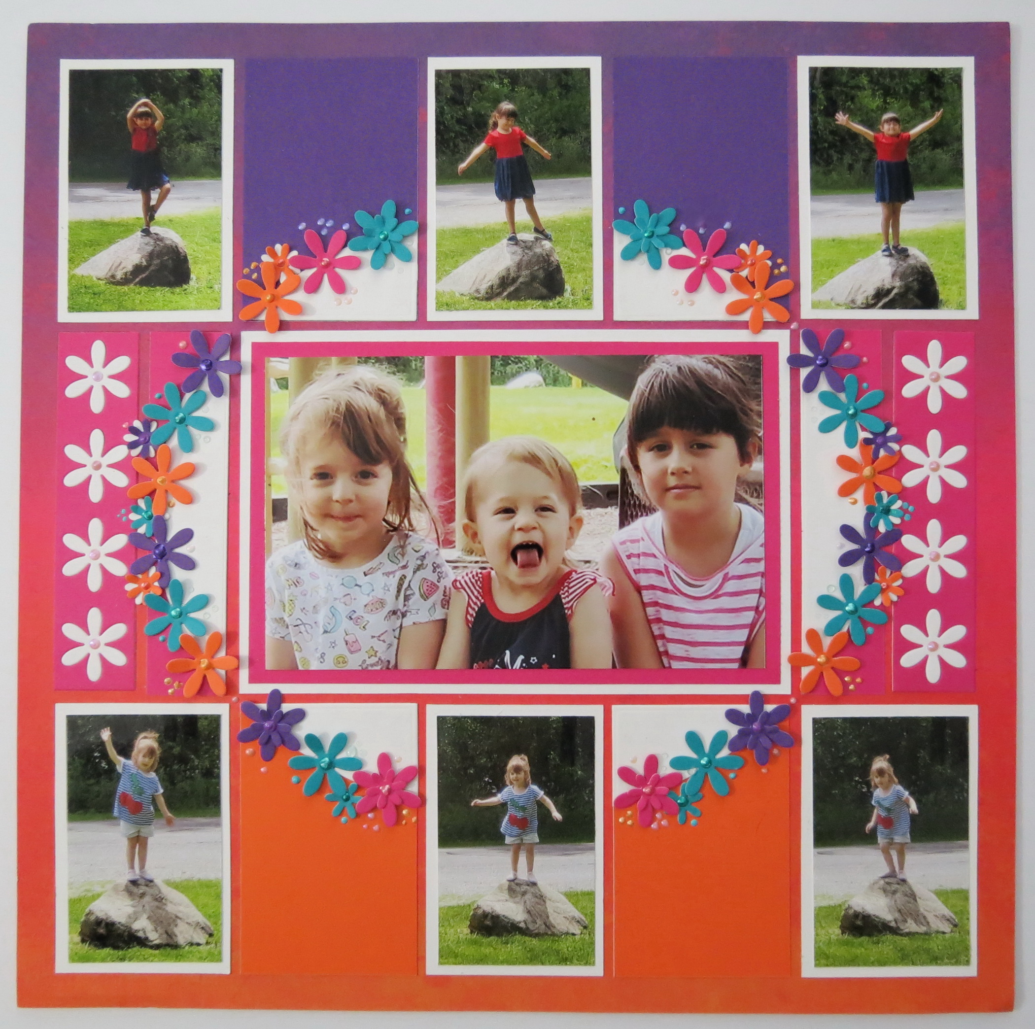
Embellishments can add texture, color, interest and more and help to tell your story.
They can be simple or complex, purchased or handmade. The choices are yours to make to as you work with bright colors. Here’s what I did with Run for the Borders.
This time I want to accent my center photo and emphasize the oval shape.
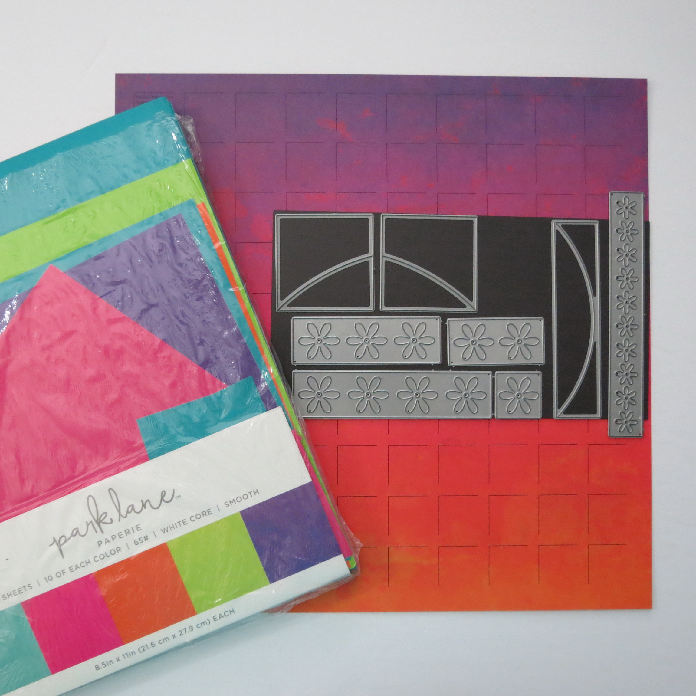
I will use the Daisy Row Die and the layering Ribbon Border Die (now retired). These are great pieces that can stand out from a grid space and can go anywhere you want them to go.
You can even make the petals stand up by gently curling the ends either up or down.
A key element will also be the bright colors from Park Lane’s Jewel tone cardstock papers for mats and flowers.
You’ll notice that the papers also blend in nicely with the grid colors! I added in the blue teal for a little contrast and a bit more pop.
For final touches on and around the flowers are a variety of pearl drops using Ranger’s Liquid Pearls and various Nuvo Drops.
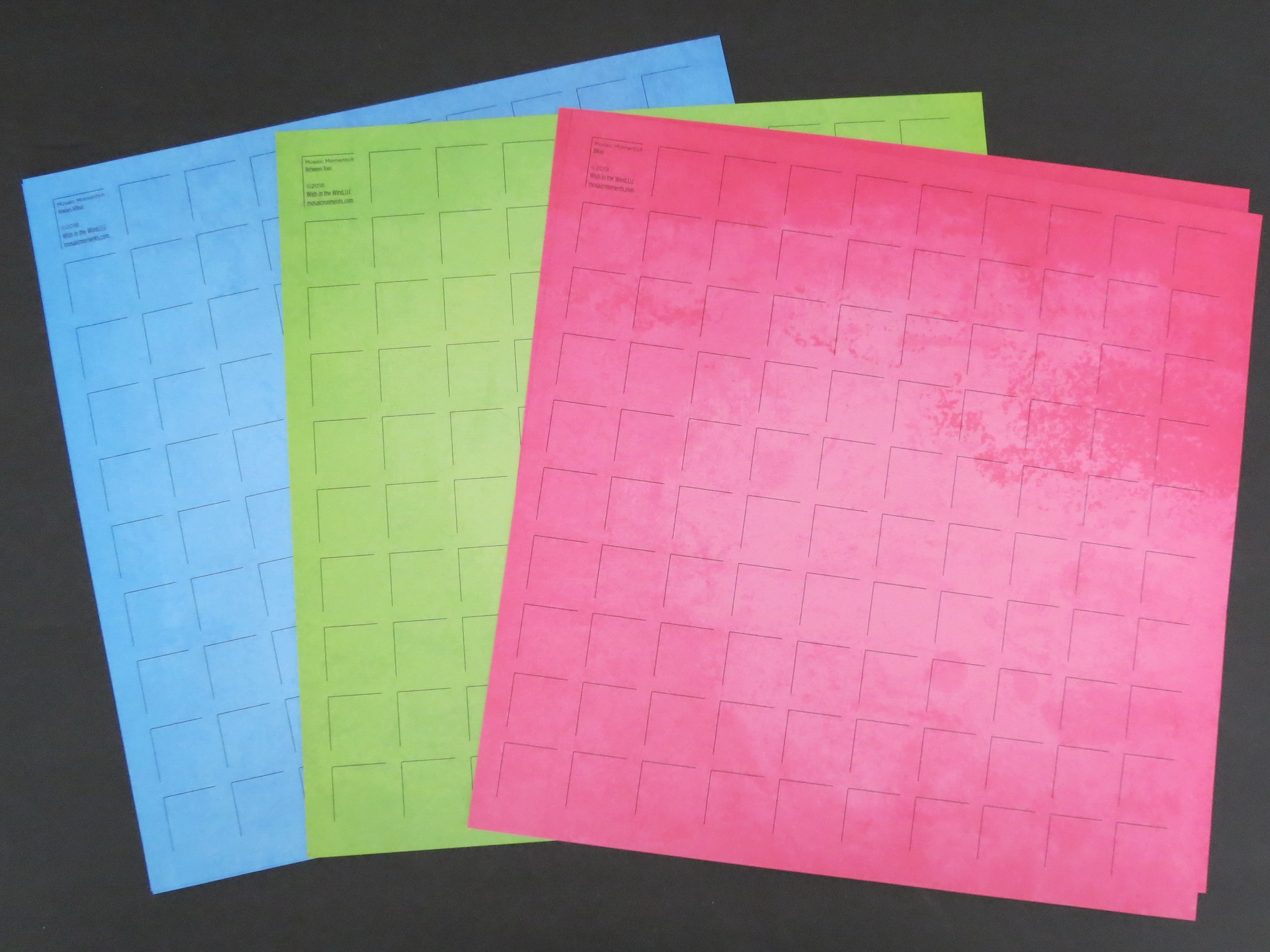
The Sumer Collection Grid Papers
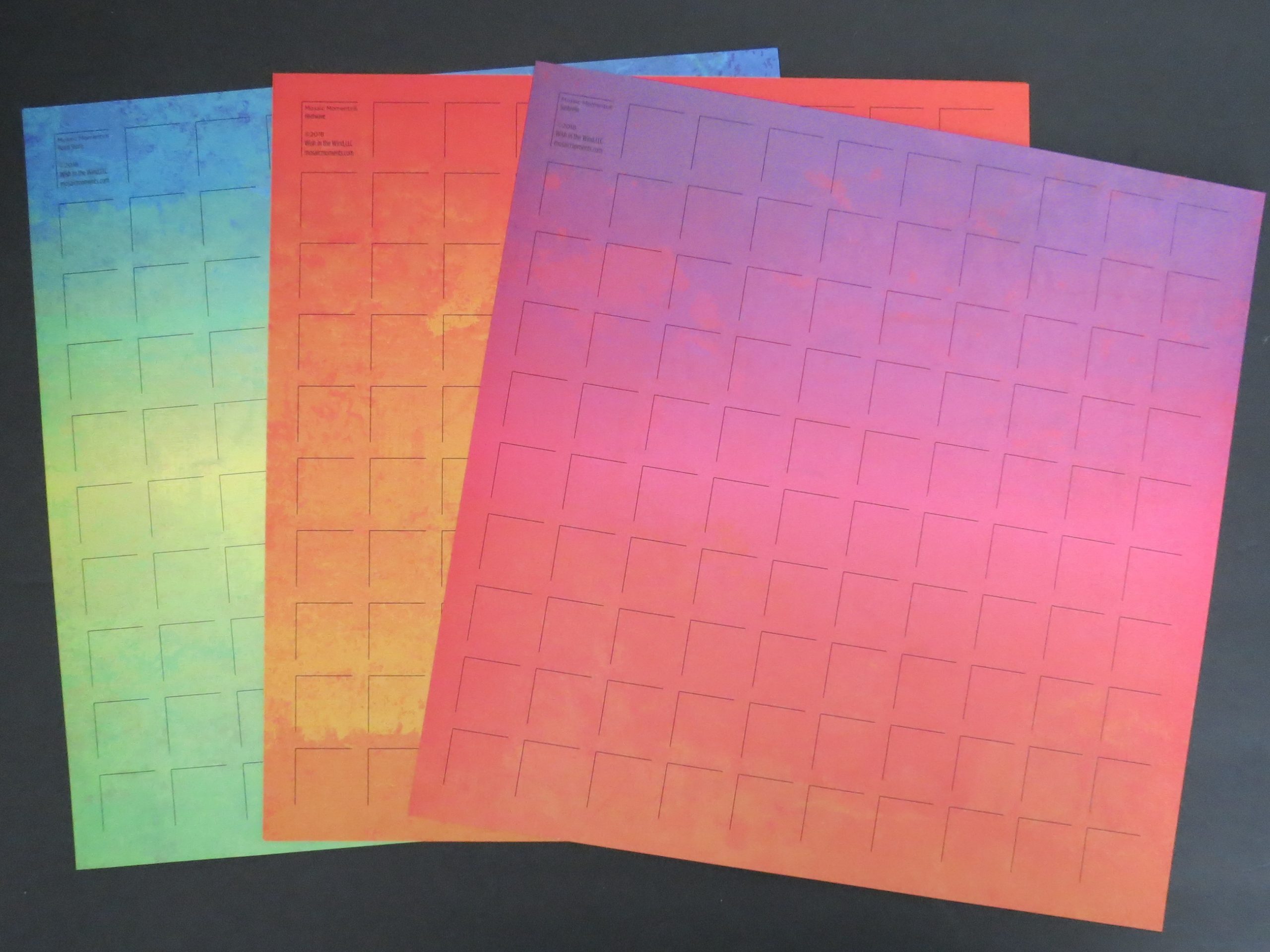
Now if you have a pack of the Summer Collection Grid Papers it’s time to get started and maybe these tips will encourage you purchase a pack if it’s missing from your supplies! Make this summer a colorful one when you scrap your memories!
Andrea Fisher