
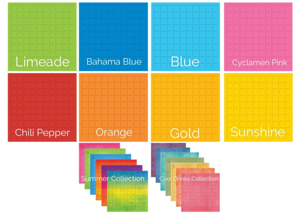
Summer arrives with Bright Bold Colors, shouldn’t some of our grid choices do so too? Mosaic Moments offers several bright bold grid colors to choose from as well as several more found in our Collections, Summer and Cool Drinks. It’s time to break away from your favorites and try something new!
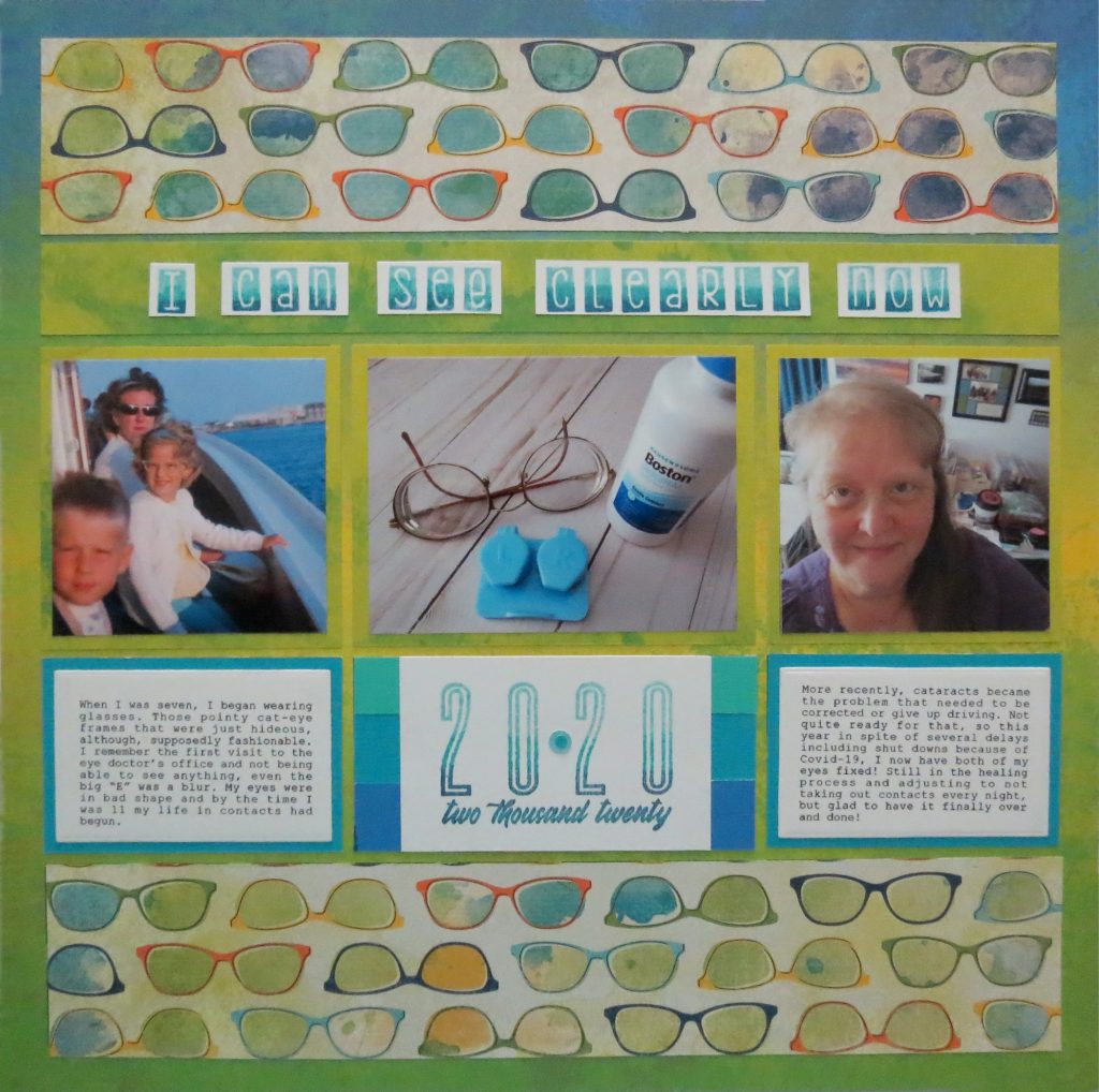
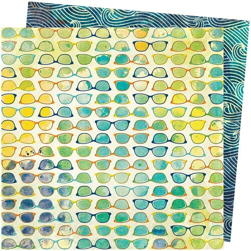
I don’t know about you, but I was intimidated the first time I had to use Cyclamen Pink in a layout! Once I tried it out, the fear subsided. I do tend to fall back into my favorite familiar color palette but it pays to try something out of your comfort zone every once and a while. Let me show you what I did with the Board Shorts Grid paper from the Summer Collection.
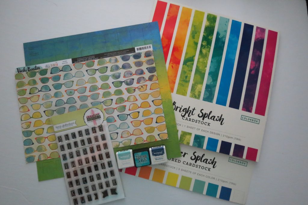
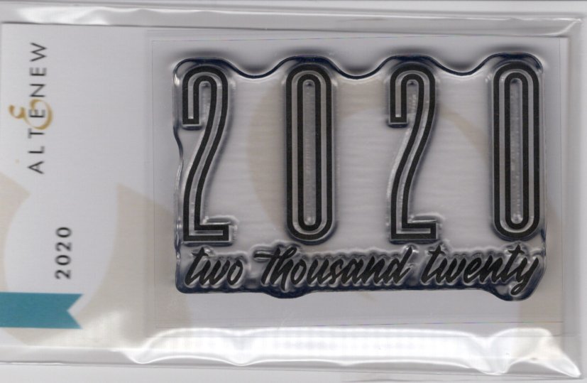
This grid paper was a good match to the patterned paper by Vicki Boutin “Beach Vibe” and coordinated well with cardstocks from Colorbok’s Summer Splash and Bright Splash packs. Additionally, I’ve used stamps from Sweet-n-Sassy ‘Print Blocks’ from the Korin Sutherland Designs line and Altenew’s 2020 Stamp. Inks from Taylored Expressions (Blue Raspberry and Sprinkles) and Tim Holtz Distress Ink in Peacock Feathers are used to achieve an ombre effect on the letters of the stamped images.
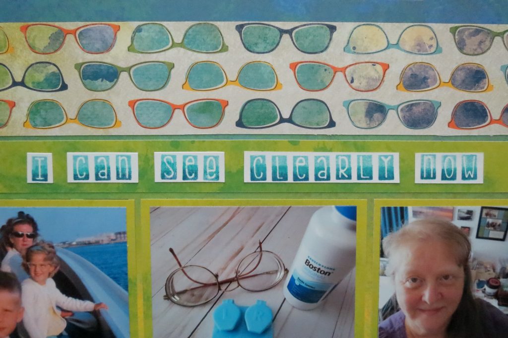
I began by hand cutting 2 – 2.125” x 11.125” strips from the Patterned paper and adhering them to the top and bottom of my grid paper. Fitting them into the grid sections with the closest matching colors really helps to unify the page.
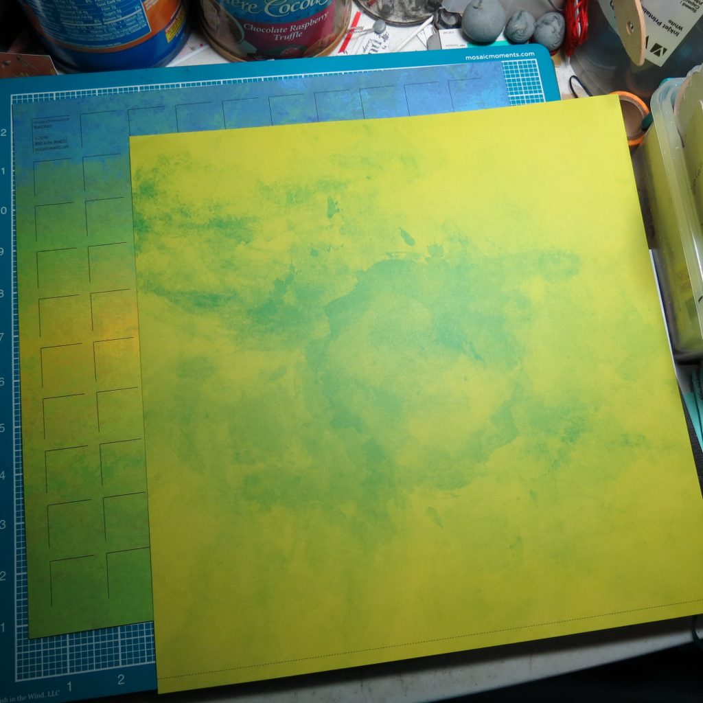
From the green/yellow splash paper I begin with a 3.25” x 11.125” strip that I will hand cut further for 2 – 3.25” square mats and 1 – 3.25” x 4.375” mat.
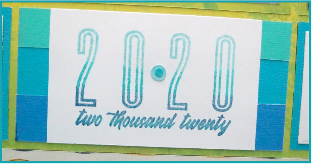
An additional 1” x 11.125” strip will be the foundation for my title. The title is triple stamped, cut and adhered along the strip.
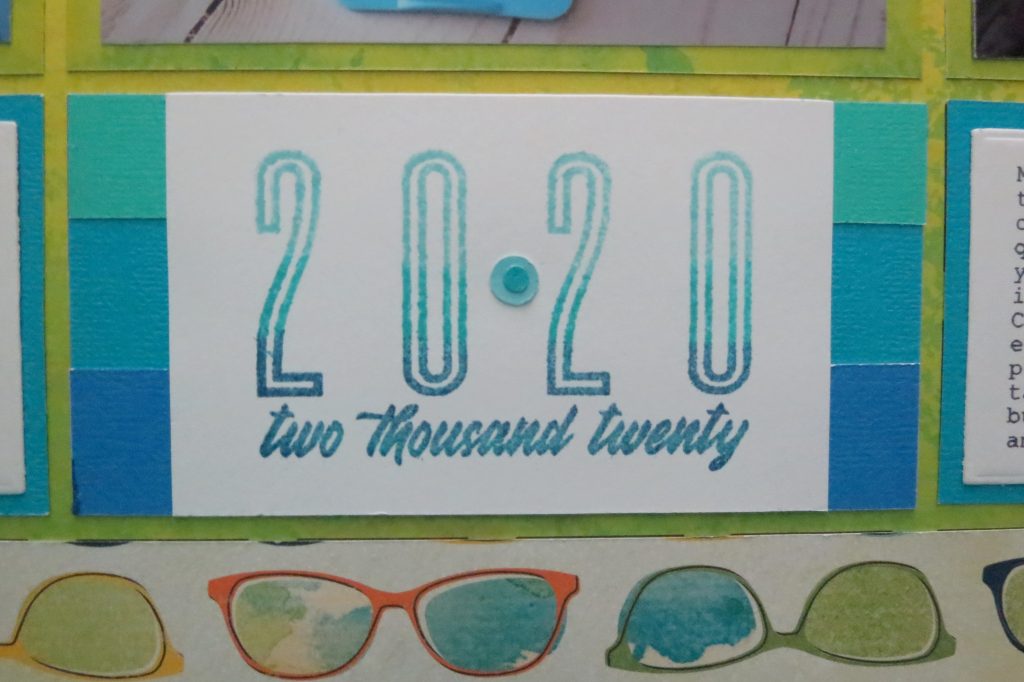
I use the 2020 stamp not only for the date, but by placing a punched circle between the 20 and 20 I go for that play on words for the subject of my page. I’ve mounted the stamped image on a mat I’ve created with strips close to the colors used to stamp, again, giving a bold ombre look in keeping with our bold grid base.
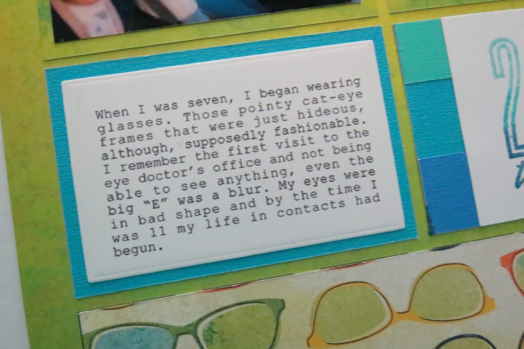
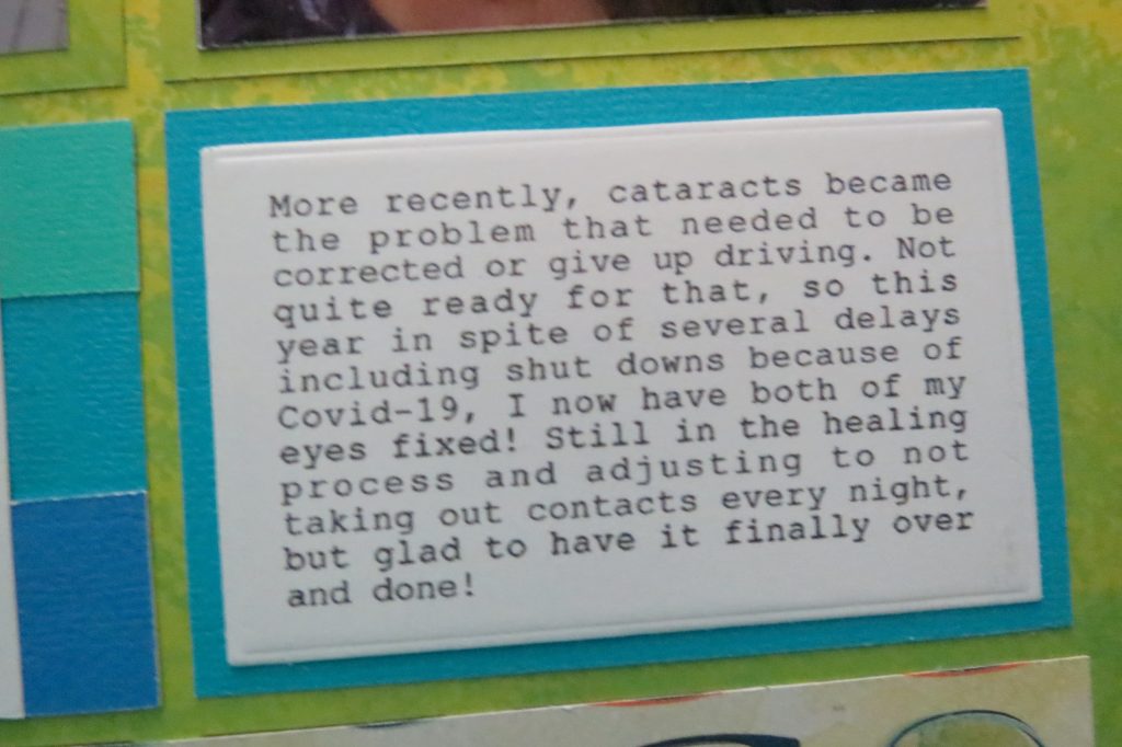
Two journal blocks give a before and after to the story with pictures of both before and after. My center photo reflects the transition. The mats for the journal blocks repeat the center color from the center block. The narrow border allows more room to journal. This time, my handwriting was just a tad too sloppy to fit the space so formatting, printing and cutting with the MM CL die set made it easy.
What really was a plus in composing this page, was that the colors in my photos worked well with all the paper choices. That won’t always be the case.
We have several Bright Bold Colors of Grids for you to try adventuring into new territory. Look for coordinating colors that you can use as mats to play up the colors or in choosing white or even black mats to neutralize the colors to let your photos mingle without clashing, still giving you the benefit of the bright bold colors that your summer pictures deserve to show them off!
Andrea Fisher