
Harmony and unity go hand-in-hand in art.
Harmony is a pleasing agreement of elements that share a common trait. This is done by repeating similar characteristics, like subjects, shapes or colors, on a layout. But harmony is not boring ... think of it more as organizing the chaos.
Unity is when the elements on a layout create a balanced, complete whole. It gives the entire piece coherence.
What Elements Create Harmony & Unity on a Layout?
#1. Photos
Photos can be unified by using the same subject or theme. You may want to use photos that have similar sizes and colors to harmonize your page
On this layout, Paije decided to change these photos to black and white, since they did not match well in color. Now they are in harmony and unify the layout.
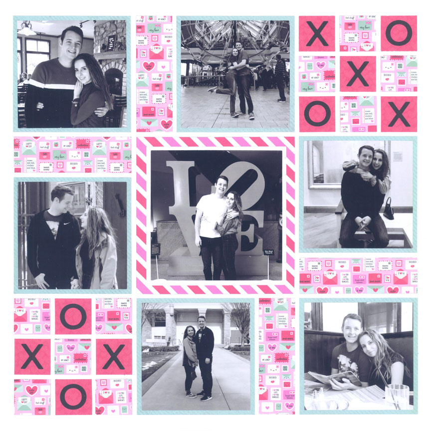
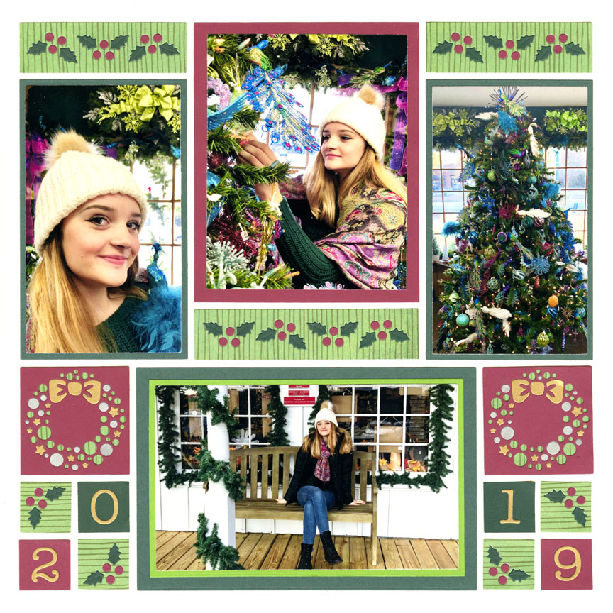
"X&O" by Paije Potter - Pattern #388
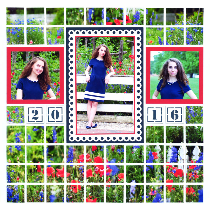
"Alexis in Blue" by Tami Potter - Pattern #330
#2. Colors
The dominant colors in the photos are red and blue (from the flowers) and the girl is wearing a blue dress. Notice how these colors are also repeated on the layout design as the colored mats. The elements (the photos, mats, and die cuts) work together harmoniously on the layout through the color. Repeating these colors unifies the elements and photos.
#3. Shapes
Though the three ovals are not all the same size or shape, repeating the the closely similar shapes creates harmony. In other words, the three oval frames help to unify the layout.
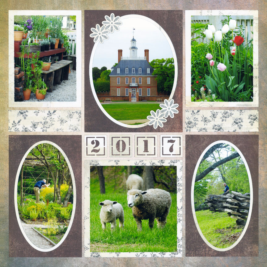
"Evening at Colonial Williamsburg" by Paije Potter - Pattern #108
"Peacock Tree" by Jodi Benson - Pattern #291
#4. Embellishing Elements
For scrapbook pages, it's important that the embellishing shapes and themes are displayed harmoniously. Here there are a variety of Holly Border dies and Wreath dies. While they are all different shapes and sizes, they represent the same theme (Christmas), which also gives unity to the layout.
More Examples of Harmony & Unity
This layout has wonderful unity and harmony. The elements on this page tie together the tiger's environment in the photos (India-inspired scenery). The distressed elements are repeated throughout the page, yet the torn paper is all shaped differently. The elements do not have to look exactly the same. The repeated distressing gives this layout harmony.
Also the bright orange and rustic brown card stock draws your eye around the layout. All the elements give this layout a unified theme and appearance.
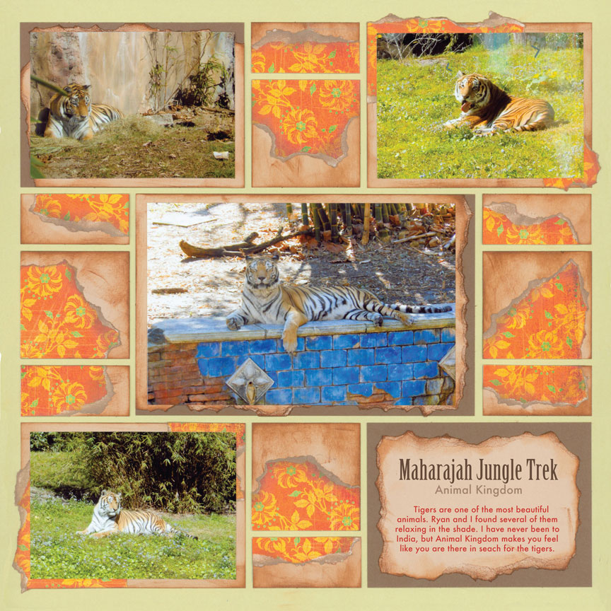
"Tiger Trek" by Paije Potter - Pattern #202
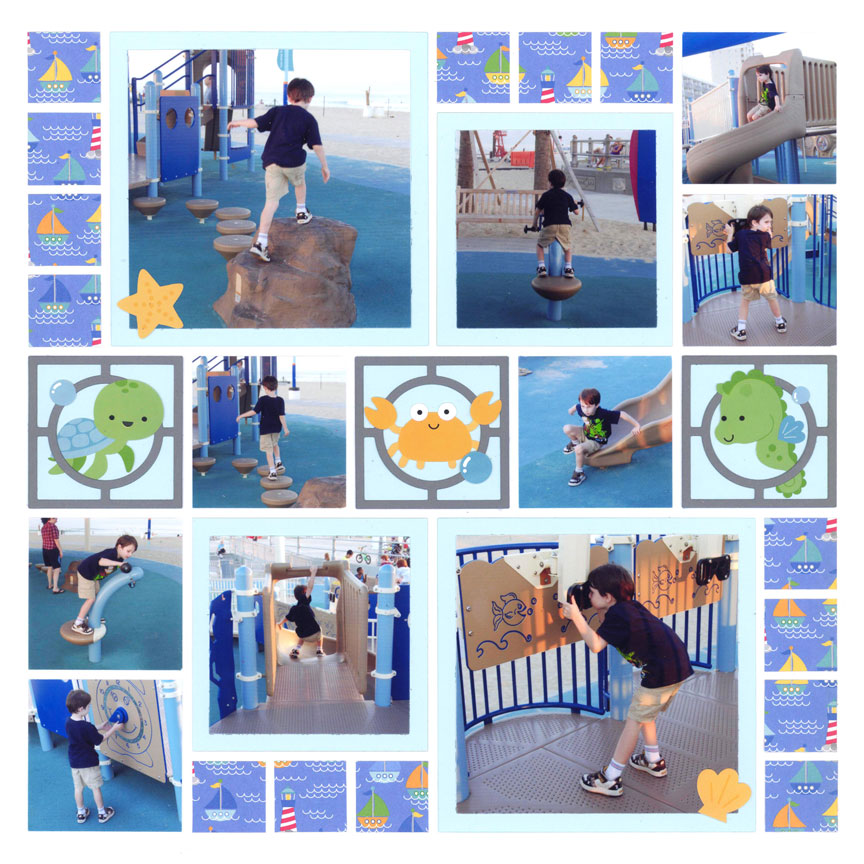
"Beach Park" by Paije Potter - Pattern #175
Even though the sticker embellishments are not exactly the same, they share similar colors and the same theme (ocean). Plus the patterned paper matches.
Blue photo mats were added to fit with the color scheme of the embellishments. The 2x2 Circle Center die is repeated as a frame for the critters.
This elegant layout has similar colors and embellishments that tie the layout together.
Notice the little loop designs? They are repeated around the layout.
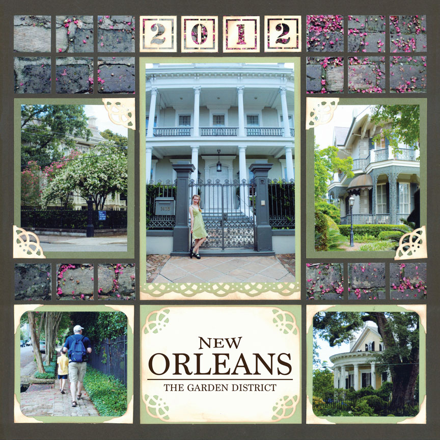
"The Garden District" by Paije Potter - Pattern #118
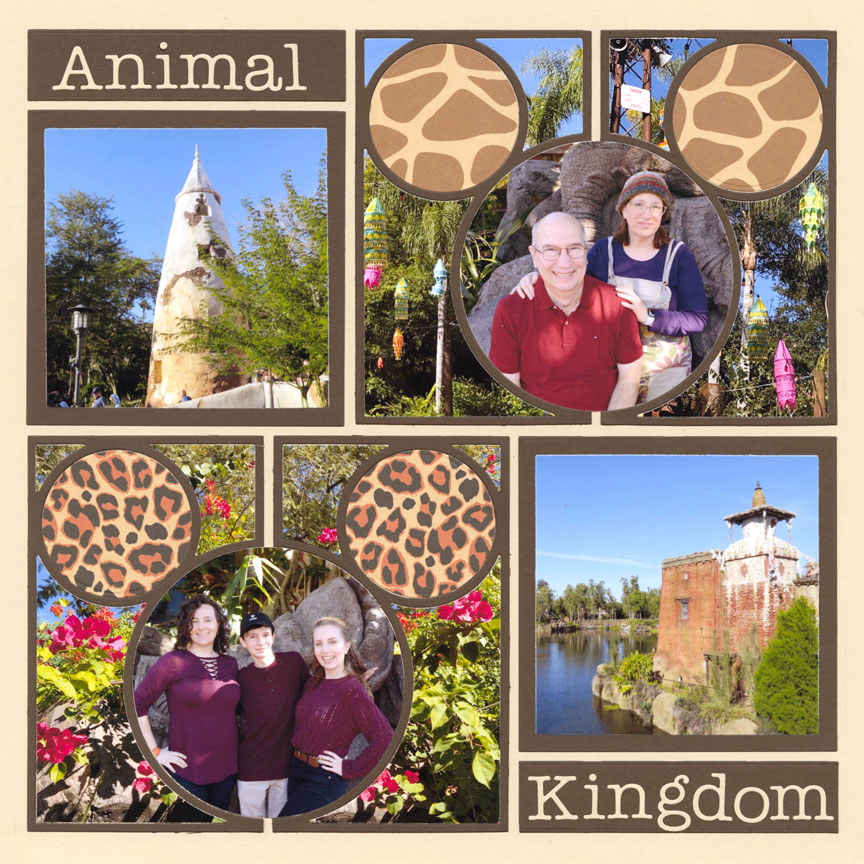
"Animal Kingdom 2018" by Tami Potter - Pattern #531
Don't forget about the fonts for titles! Keep all your alphabets and numbers the same font to unify the page.
The Mickey-shaped ears also harmoniously work together since they both show animal print designs.
The titles on this layout show harmony by repeating the same colors and using the same font.
All of the journaling blocks also use a white background, tying them together on this page.
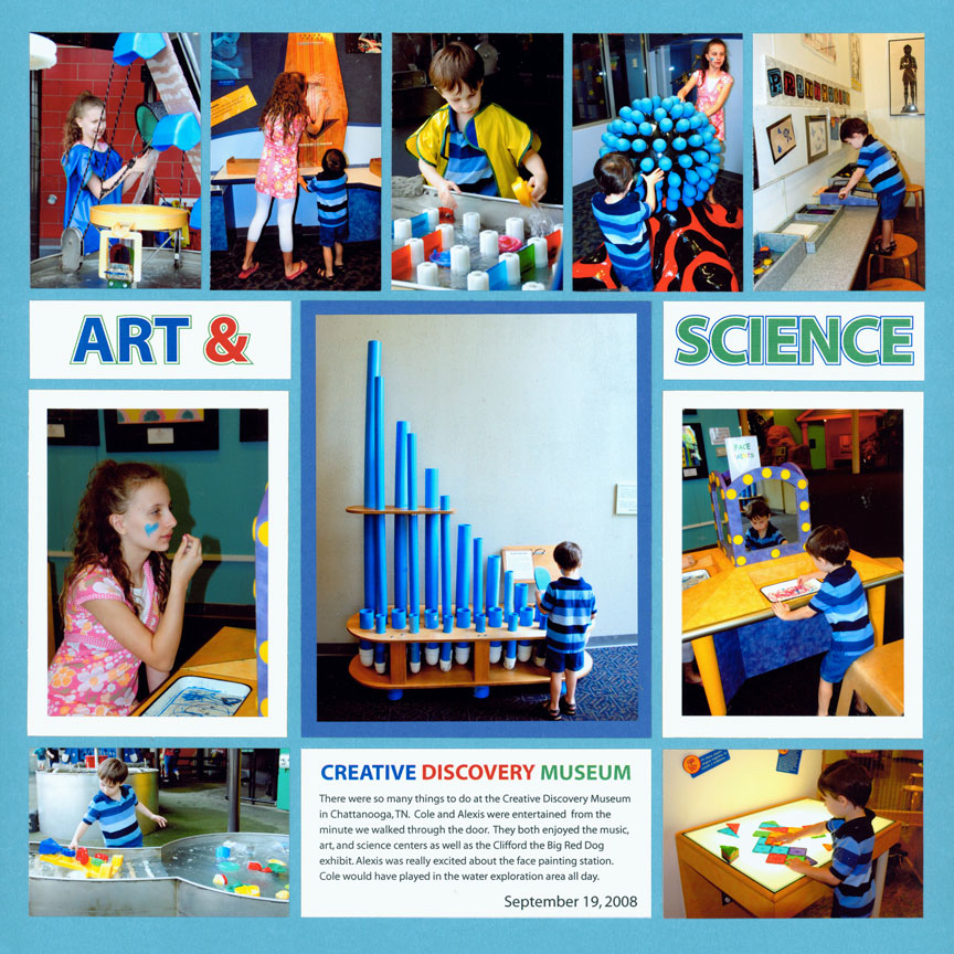
"Art & Science" by Tami Potter - Pattern #205
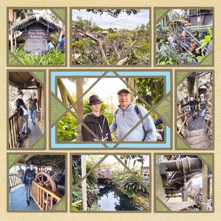
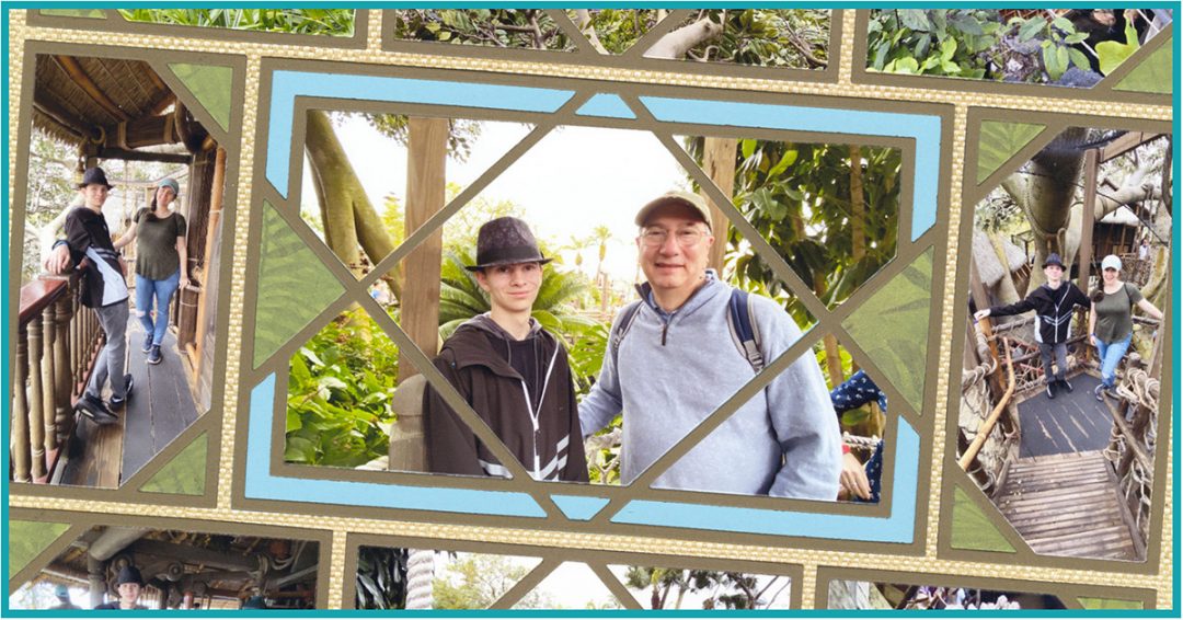
"Robinson Treehouse" by Tami Potter - Pattern #407 (Flipped)
Specialty dies, such as the Crisscross collection, naturally provide harmony and unity to a layout by creating beautiful lines and shapes that go together.
Since the photos are of the Swiss Family Robinson Treehouse, Tami tied the layout together by adding the leafy jungle patterned paper. Plus her choice of using the "Natural Weave" grid paper fits well with the theme.
How to Tie Your Two Page Spreads Together
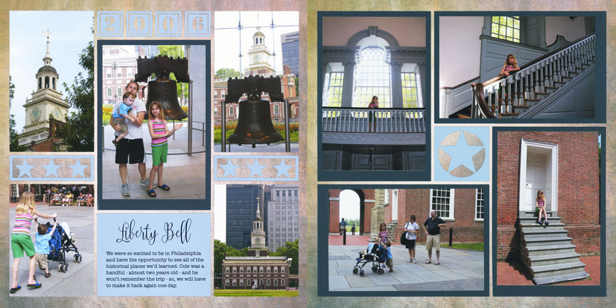
"Philadelphia" by Tami Potter - Pattern #532 & #228 (Flipped Opposite)
Although the exact dies are not repeated on either side the spread, both have the same star shape and colors.
The shape of the focal point on the left layout (the 4x6 mat and photo), also repeats around the layout on the right.
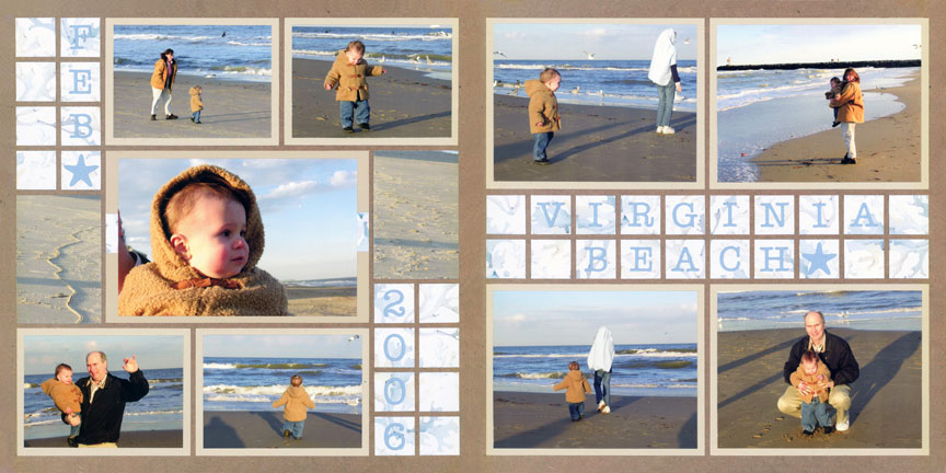
"Virginia Beach 2006" by Paije Potter - Pattern #451 & #349
On this layout, the same pattern paper is cut into mosaics on both sides. The two pages also use the same color, Alphabet 4 and have a little starfish die cut.
Shapes from die set C are repeated in the horizontal direction on the two spreads.
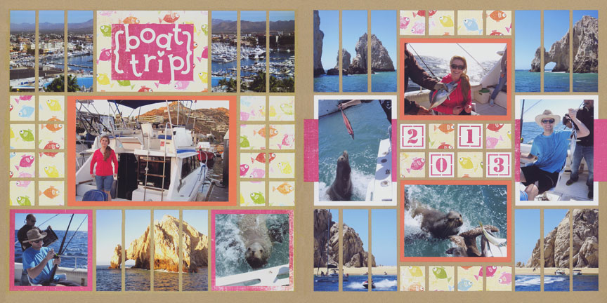
"Boat Trip" by Paije Potter - Pattern #216 & #209
To tie the two layouts together, the same pattern paper was repeated and made into a mosaic look on both sides.
Plus, the bright colors repeat and so do the strip die-cut elements.
A sandy colored background was chosen to fit with the ocean theme on the layout.
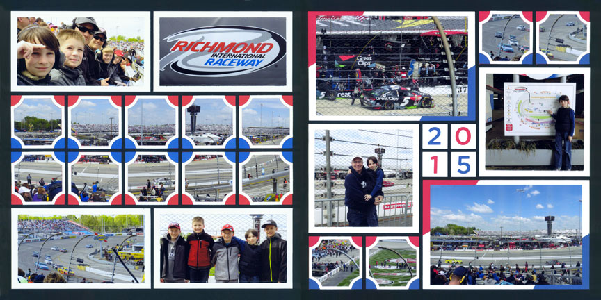
"Richmond Raceway" by Paije Potter - Pattern #425 & #163
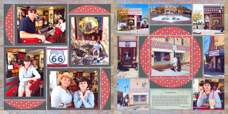
"Route 66" by Tami Potter - Pattern #116 & #402
Tami used the 1x4 Horizon Die in a clever way to tie the pages together. On the right layout, you see the full circle design created with the die. Then on the left layout, she repeated the die on a pinwheel page, without turning it into a circle.
Notice that she used the same exact paper colors on each cut also. With all the elements unified and harmonized, doesn't this layout just "say" Route 66!
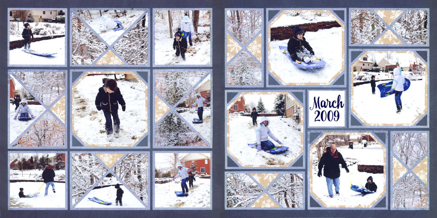
"Snow 2009" by Paije Potter - Pattern #344 & #373
It's important to make sure specialty dies are harmonized on both sides. On the left side, you have the 4x4 and 3x4 X-Factor dies that create a unifying design.
Instead of repeating that same layout, Paije added variety by using the 2x4 X-Factor on the right side along with the 4x4 die.
She also repeated the photos of snow-covered trees, the snowflake patterned paper and the blue card-stock.