Space is defined as the distance or area between, around, above, below, or within elements. Both positive and negative space are important factors to be considered in every design.
In the case of Mosaic Moments®, space is organized using a grid. There are 10 square spots in each direction (horizontal and vertical) that are used to create our "positive" space. The gaps between the squares/elements become the "negative" space. Elements, such as your photos and paper, layered on top of the grid, determine the use of positive and negative space and your overall page design.
Since photographs are the most important elements on your page, it is especially important to consider how you use the space between them. Keep scrolling to see examples on how we applied design principle, SPACE:
The Grid Divides the Elements
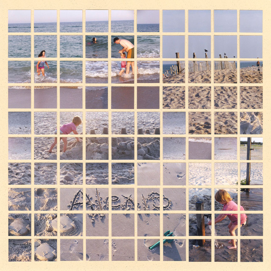
"Beach" by Tami Potter - Pattern #160
The grid paper was designed with space in mind. If you make a mosaic design, like the layout shown, each square is equally separated, which gives the layout an organized feel.
The lines in between the squares create your negative space. The elements are also divided in a harmonious and calm way, which appeals to the eye. So, naturally the grid paper allows you to apply the design principle, space.
Add a Mat for Separation
It's also important to consider how you use the positive space on your layout. Here the negative space is defined beautifully with neat, straight lines. The positive space on the other hand is filled with photos, which can appear very busy.
To ease your eyes, Tami added a mat behind the center photo. Not only does this define her focal point, but it adds a separation from the other photos. This gives your eye a break from the busyness.
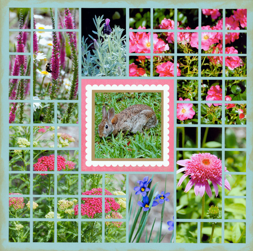
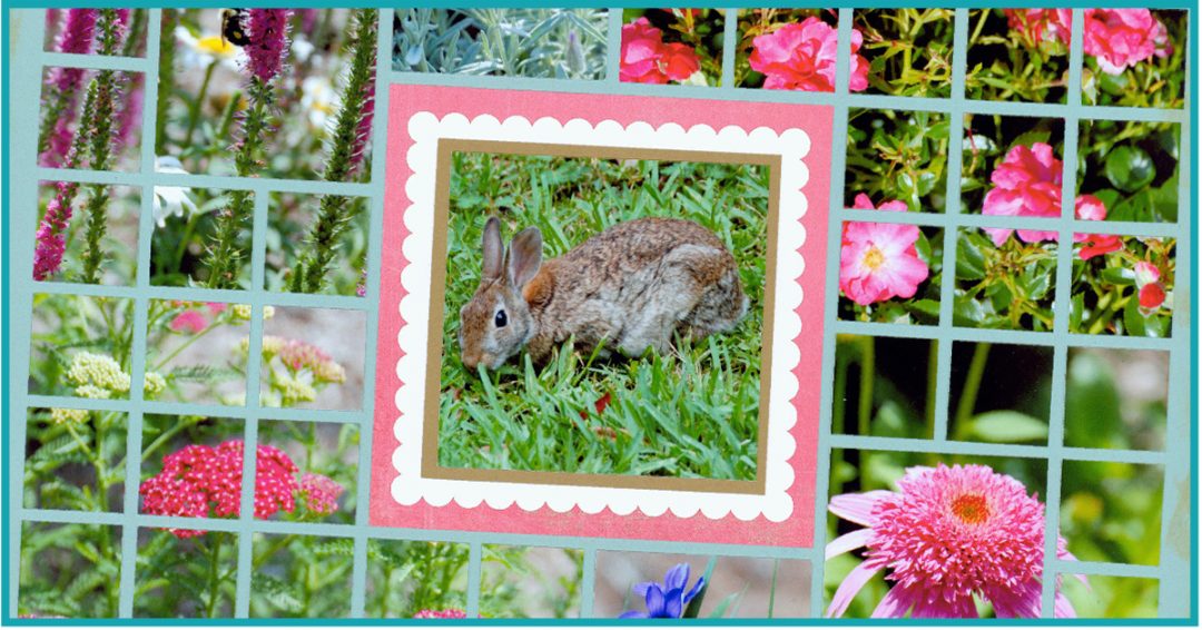
"Bunny" by Tami Potter - Pattern #215
Add Space by Matting Photos
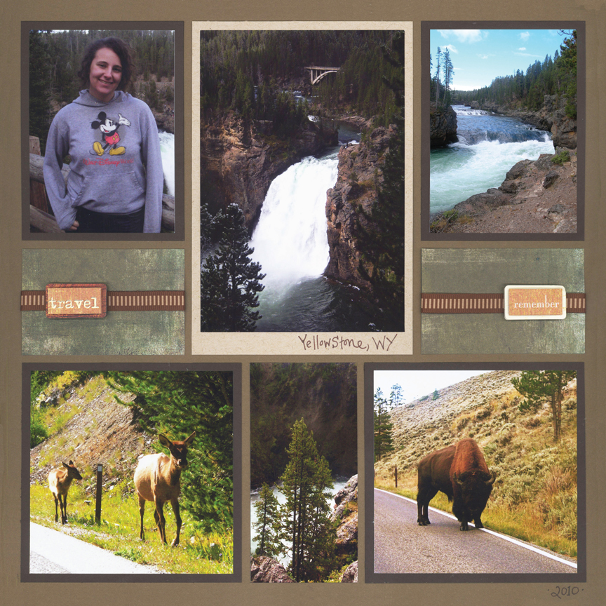
"Yellowstone 2010" by Paije Potter - Pattern #243
If you look at the majority of our pages, you will notice we mat many of our photos. Matting helps photos pop.
Mats can also be used to make space for journaling or embellishments.
Since all of the grid lines must be covered, there can be a lot of elements on a layout. Creating an organized and balanced page design will help keep your layout from feeling too busy when your photos are in tight proximity of each other.
Use Frame Dies For Breathing Space
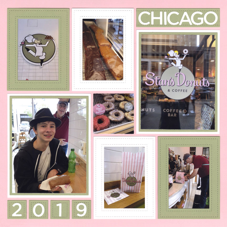
"Stan's Donuts" by Tami Potter - Pattern #601
Use Paper Strips for Separation

"Zoo Trip" by Tami Potter - Pattern #283
The top and bottom rows of this page are filled with 2x3 photos. None of the photos have mats. They are only separated by the negative space of the grid.
Since the top and bottom rows are busy, Tami filled most of the space in between with pattern paper. The strips of paper, create space for a date and title and make the layout easier on the eyes.
Have fun with Negative Space
It's easy to forget about the negative space, since we mainly focused on the elements that create the positive space.
It can be fun to find ways to show off the negative space, as well.
One simple trick we love to do with large mats is cut them into two or three smaller pieces. Compare the mats behind the top left and right photos with the mats of the bottom left and right photos. Instead of using the same two large brown mats on the bottom, Tami cut them and added red strips. Now you can see more evidence of the negative space (grid gaps) behind the larger photos, which draws attention to certain parts of the photos and adds more interest to the layout.
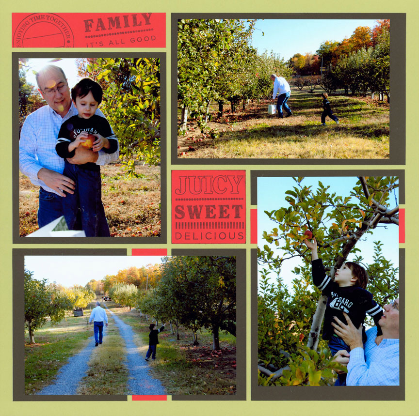
"Apples" by Tami Potter - Free-styled layout
Add Extra Space for the Focal Point
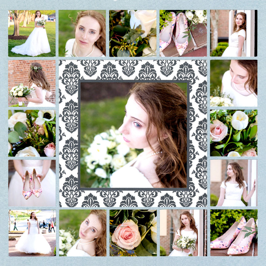
"Bride" by Paije Potter - Pattern #191
One way you can make your focal point photo stand out is by giving it extra space. None of the 2x2 photos around it have mats and they are close in proximity to each other.
Make extra space for the focal point by using a contrasting cardstock or pattern paper mat. This sets the photo apart from the rest, clearly defining it as the center of attention.
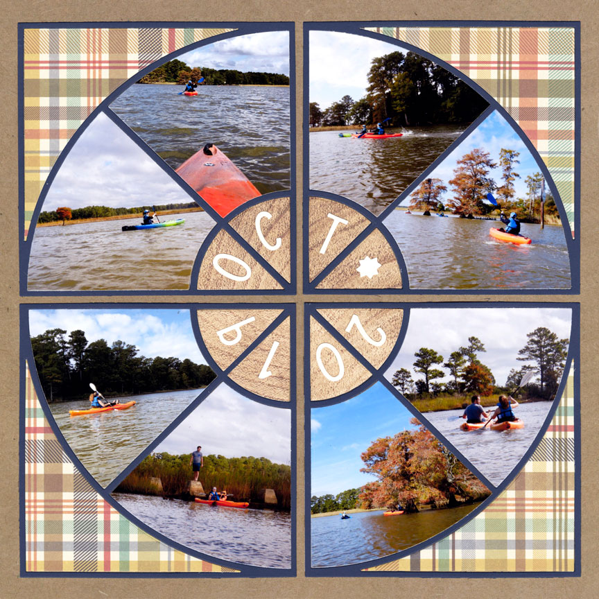
Use the Space in Specialty Dies
When using specialty dies, such as Horizon, X-Factor, Diamond Mine or Dial (shown here), consider playing with a variety of options for what you will place in the die cut spaces.
On this layout, Paije used both pattern paper and photos to fill the spaces of the Dial Die. The paper, filling each corner spot, gives her design essential breathing space. It helps to clearly define the circular shape, and draws the viewers attention to the photos.