In design, contrast is defined as the juxtaposition of elements in order to highlight their differences and create visual interest. So why is contrast important on a scrapbook layout? This design principle is often used for the focal point so it stands out the most on your page. But, contrast also gives your layout visual interest. Without contrasting elements, your layouts could seem dull.
When your hear the word "contrast" you might think of colors such as black and white. While color is one way to add contrast to your pages, there is so much more you can do! Keep scrolling to see how you can create contrast on your layouts and help them to stand out:
1. Use Dark & Light Colors
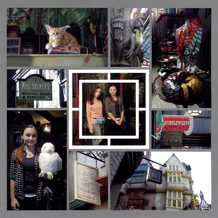
"Skower's Store" by Tami Potter - Pattern #
A very simple way to create contrast on your scrapbook layout is by using light and dark colors. Here the chosen grid paper is a dark grey, plus the photos are dark due to the indoor lighting and shadows. To add contrast, Tami placed a white frame over the focal point to help it stand out from the rest.
Without the contrast of the white frame, the center photo might easily be overlooked since the dark tones look very similar to the rest of pictures.
2. Combine Warm & Cool Colors
You can also use warm colors (red, yellow, and orange) and cool colors (blue, green, and purple) on the same layout for contrast.
On this page, Danielle chose a blue grid paper and used blue paper mats. The warm hue orange pattern paper stands out on the cool blue hues, creating contrast. Plus, notice her photos have a lot of red and yellow colors. The blue background helps the contrasting warm hues to stand out.
Bonus: Blue and orange are complimentary colors. This color scheme is perfect for creating contrast.
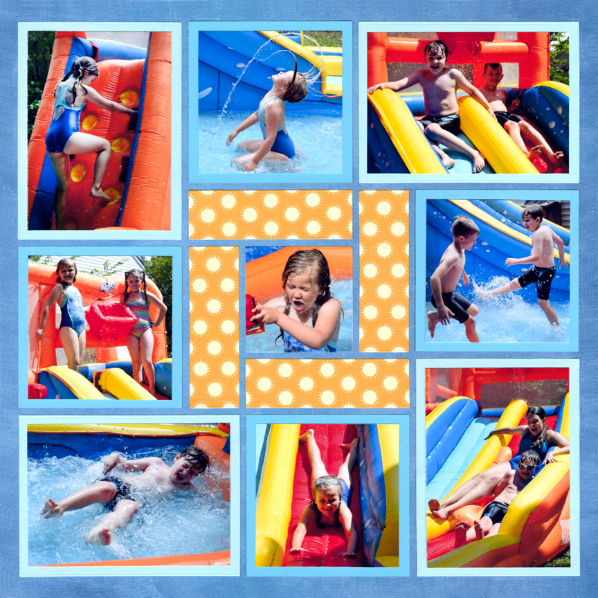
"Backyard Waterpark" by Danielle Lawson - Pattern #
3. Use a Color with Neutrals
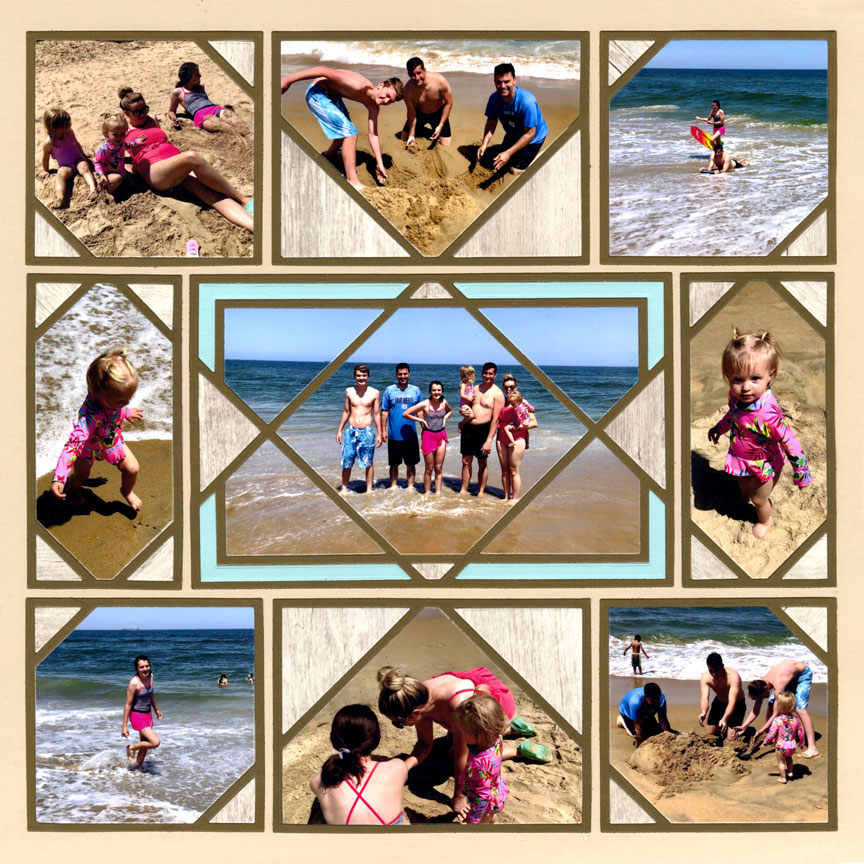
"Day at the Beach" by Jodi Benson - Pattern #
If you are using a lot of neutral colors on your layout (such as browns or greys), add a pop of color as a contrasting element.
This page gets compliments often because of the blue shown in the center. Putting a different color amongst all the brown adds a surprise element. The bright blue contrasts the rest of the page, which helps the layout go from dull to amazing!
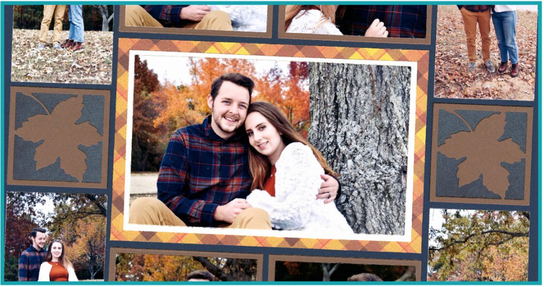
4. Add a Patterned Paper
Now that we covered a few ideas with color, let's look at other elements that create contrast on a layout.
Paije intentionally created contrast here by only putting one piece of pattern paper on the page. Since the rest of the layout is made with solid cardstock, the pattern paper stands out more.
This is a very simple idea, but you will love the result if you stick to one pattern paper on a layout.
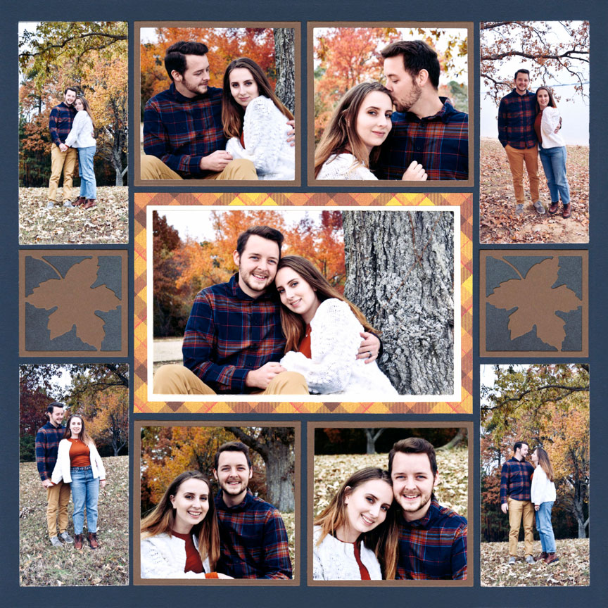
"Fall-ing for You" by Paije Potter - Pattern #
5. Change Up the Shapes
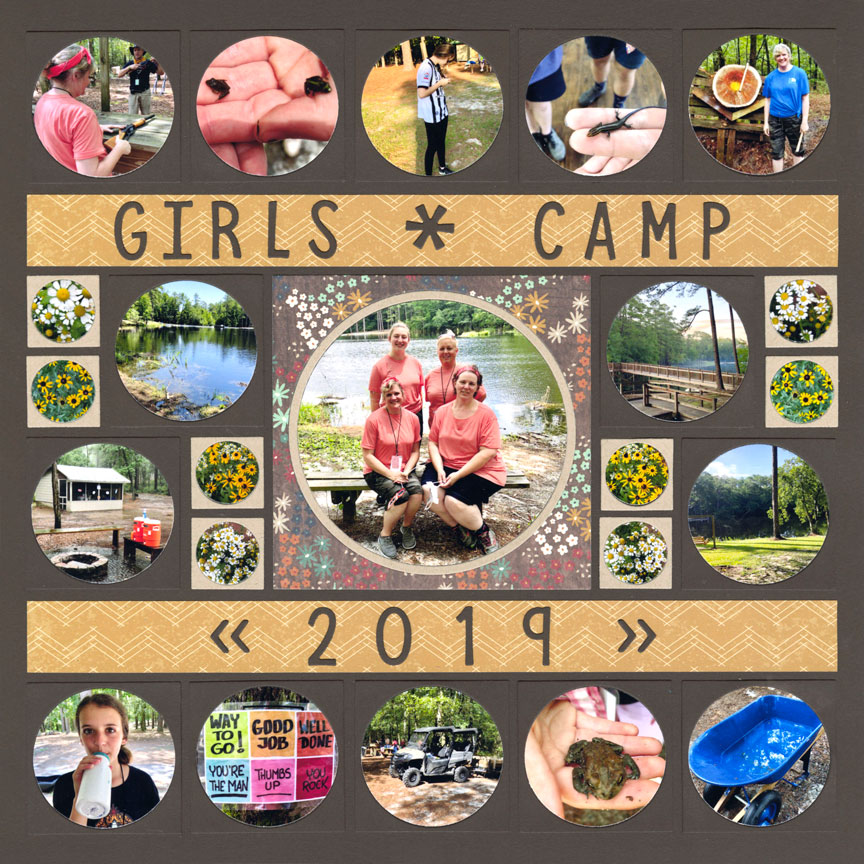
"Girls Camp 2019" by Jodi Benson - Pattern #
You probably noticed immediately that this layout is filled with circles. The contrasting elements here are the two straight paper strips.
The two strips help this layout to have an organized feel. If this page was entirely circles, it may feel more chaotic. But, the contrasting shape of the strips keep all the elements from appearing too overwhelming.
6. Cut One Photo Differently
You can add contrast to your layout by cutting one photo different from the rest. Here, Paije cut the top photo into strips. You could also cut it into a mosaic or cut it with a strip frame die.
Since the rest of the photos are solid, the strip photos create a unique element on this page.
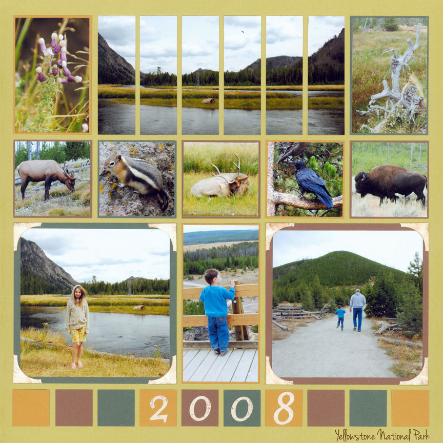
"Yellowstone" by Paije Potter - Pattern #
7. Make Calm in the Chaos
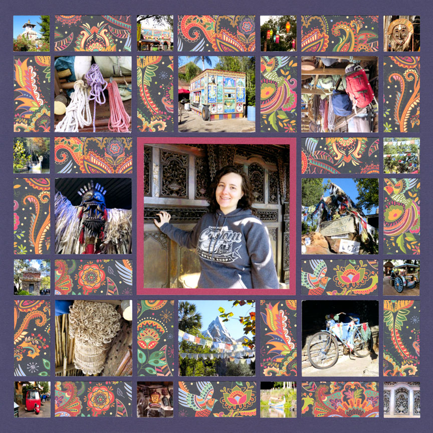
"Paije at Disney's India" by Paije Potter - Pattern #
This layout is very busy. There are lots of little photos and small cuts of pattern paper.
If you feel your layout is looking busy (such as a mosaic design or pattern with smaller design spots) contrast it with a simple element.
In the center is a larger 4x4 photo and a solid cardstock mat behind. This simple look gives your eye a place to rest, but also contrasts the rest of layout.
6. Photo Orienation
The contrasting element on this page is the center photo. Notice that the rest of the pictures are a square shape. The middle photo stands out since it's the only one that is vertical.
You could have a layout with mostly horizontal photos and one vertical and vice versa.
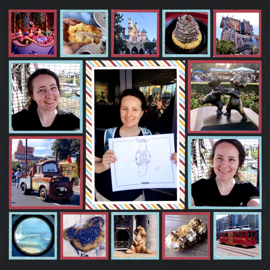
"Disney Trip 2017" by Paije Potter - Pattern #
7. Space It Out
"Florida Botanical" by Tami Potter - Pattern #
An easy way to make contrast on your page is by putting a mat only behind one photo.
We love the extra space given to the center photo. Even if you used mats on all of your photos, you can add extra space on one of them to create contrast.
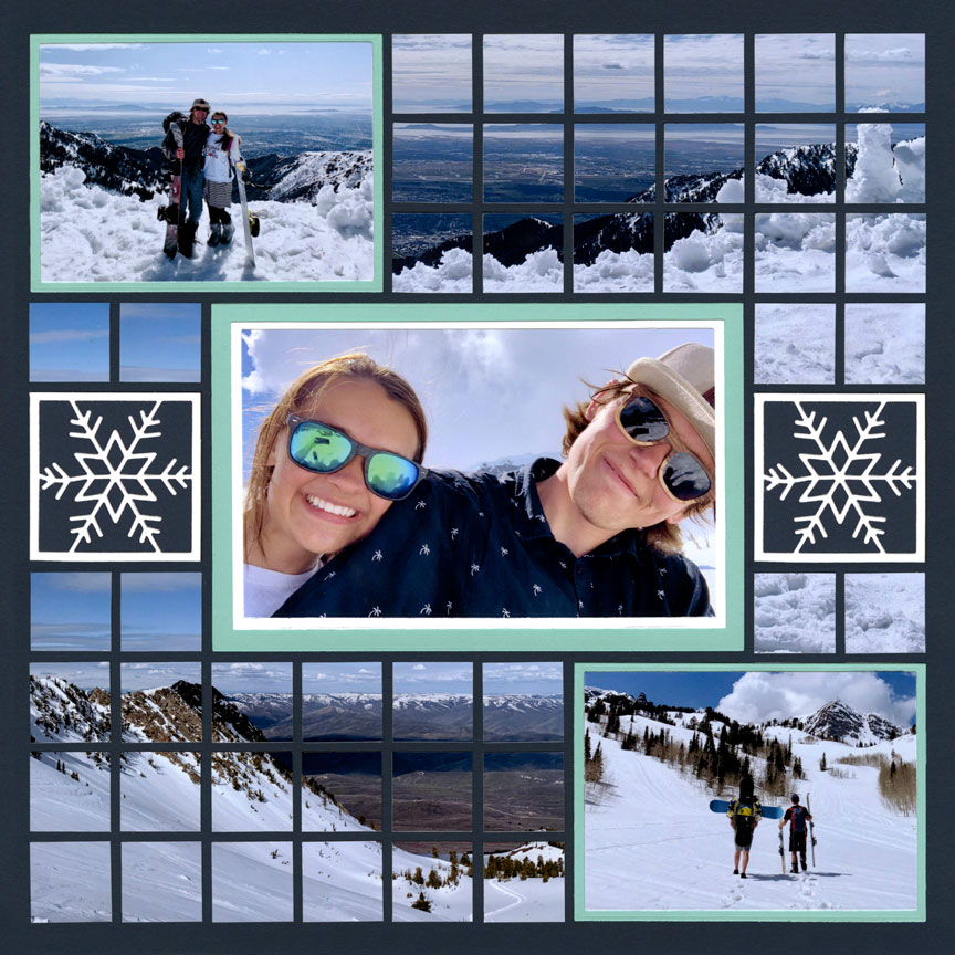
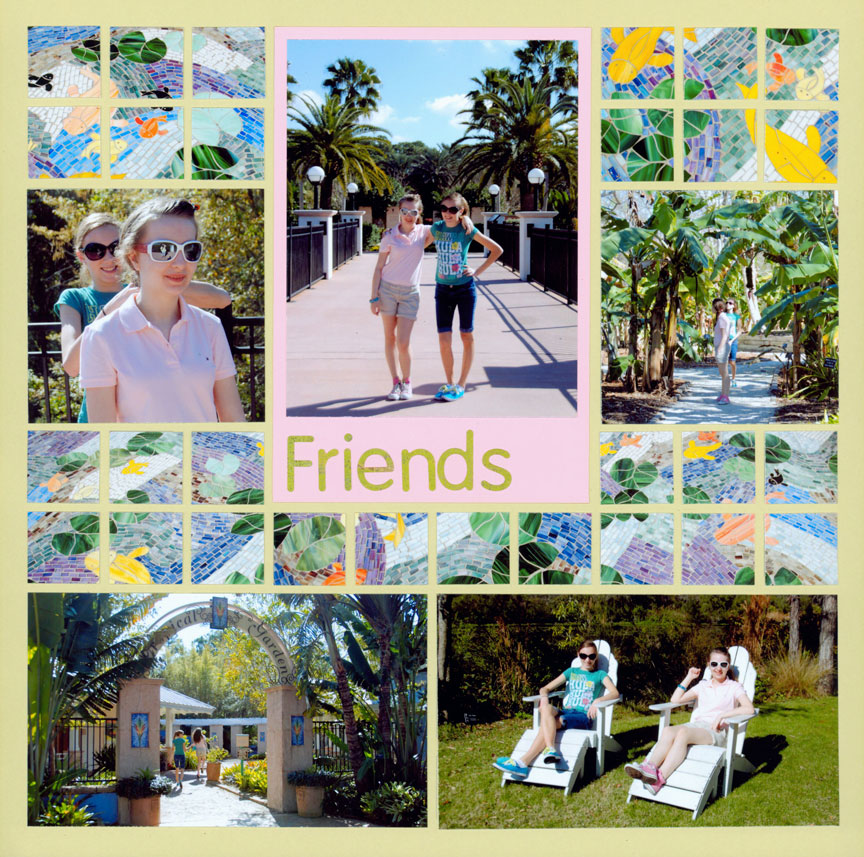
8. Scale
You can also create contrast by using different sized design spots on your pages. Here, half of the layout is made up of the little 1-inch squares that make the mosaics. You can contrast this by adding larger photos in your page design.
Also you can contrast the scale in your photos. Notice how the center photo of the couple is very close up and it contrasts with the two where they are further away in the pictures.