
The key to a beautiful layout is more than just pictures and papers. Design principles are vital.
There are many components to a great design and we may be subconsciously doing them just because our eye "knows." But, take a step back and examine the science behind design. Let's see what a difference it can make in our layouts.
We will start with Balance. As we look at the examples below take note of the placement of colors, shapes, sizes, and visual weight of the photos. (The closer you are to a subject the "heavier" its weight is on a page.)
Symmetrical Balance
If you drew a line down the center of a layout, the elements on each side of the line would be the same size and shape. This is symmetrical balance.
In it's simplest form, it's basically a mirror image of the other half of the design.
This design is pleasing to the eye and offers a clean, sophisticated and formal look to the layout.
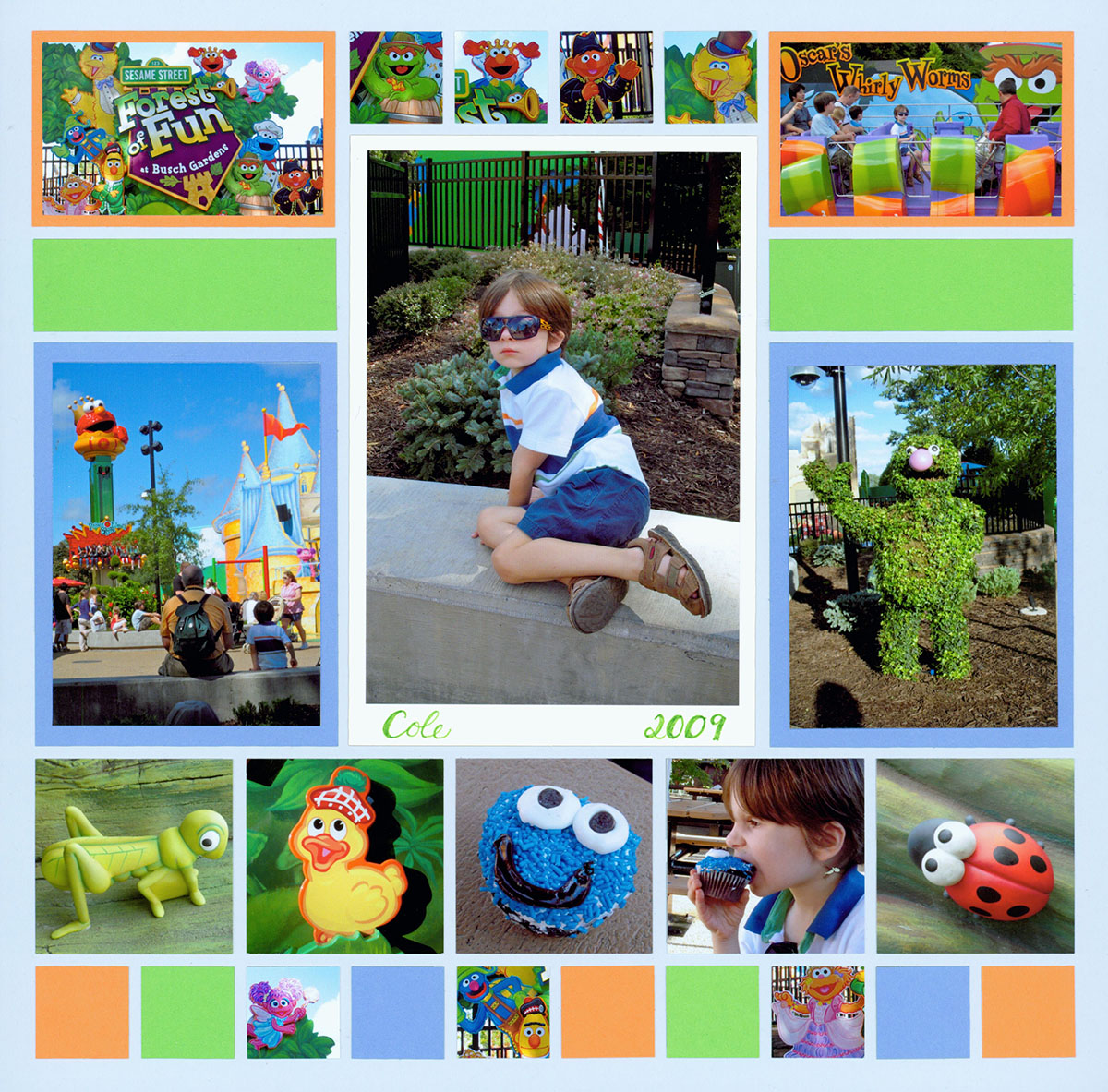
"Forest of Fun" by Tami Potter - Pattern #131
Symmetrical balance was created on this layout using several design principles.
First, the same colors are opposite each other ... both photos at the top are matted in orange and green rectangles are also on each side of the center.
Next, the photos on each side of the center feature subjects taken from the same distance to balance each other out.
Finally, size plays its role. The hierarchy of the large centered photo is further enhanced with a bright white mat. Size, placement, and color clearly designate the focal point, on this page, so our eye knows where to look first.
Tip: Look at the "symmetrical" category on the pattern gallery for more examples of symmetrical balance.
In this example, shape and color create a strong symmetrical balance.
Unique shapes can be a great option for creating visual balance, especially in small places. Notice how the 1x3 quatrefoil die is placed on each side of the photo of the lambs. The symmetry is further established, with color, by using photos of bright red & blue flowers on each side of the center photo.
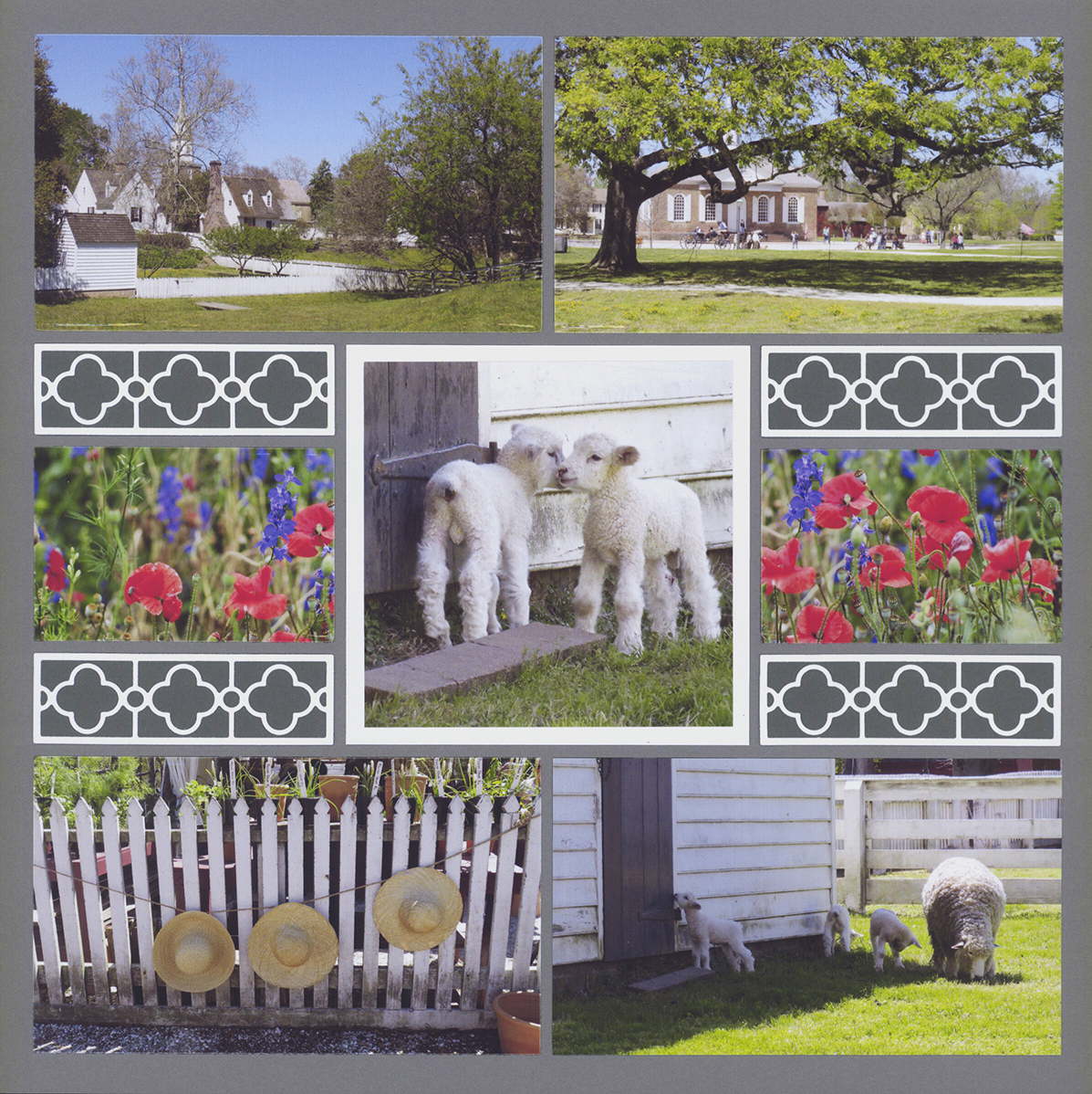
"Triplets at CW" by Tami Potter - Pattern #352
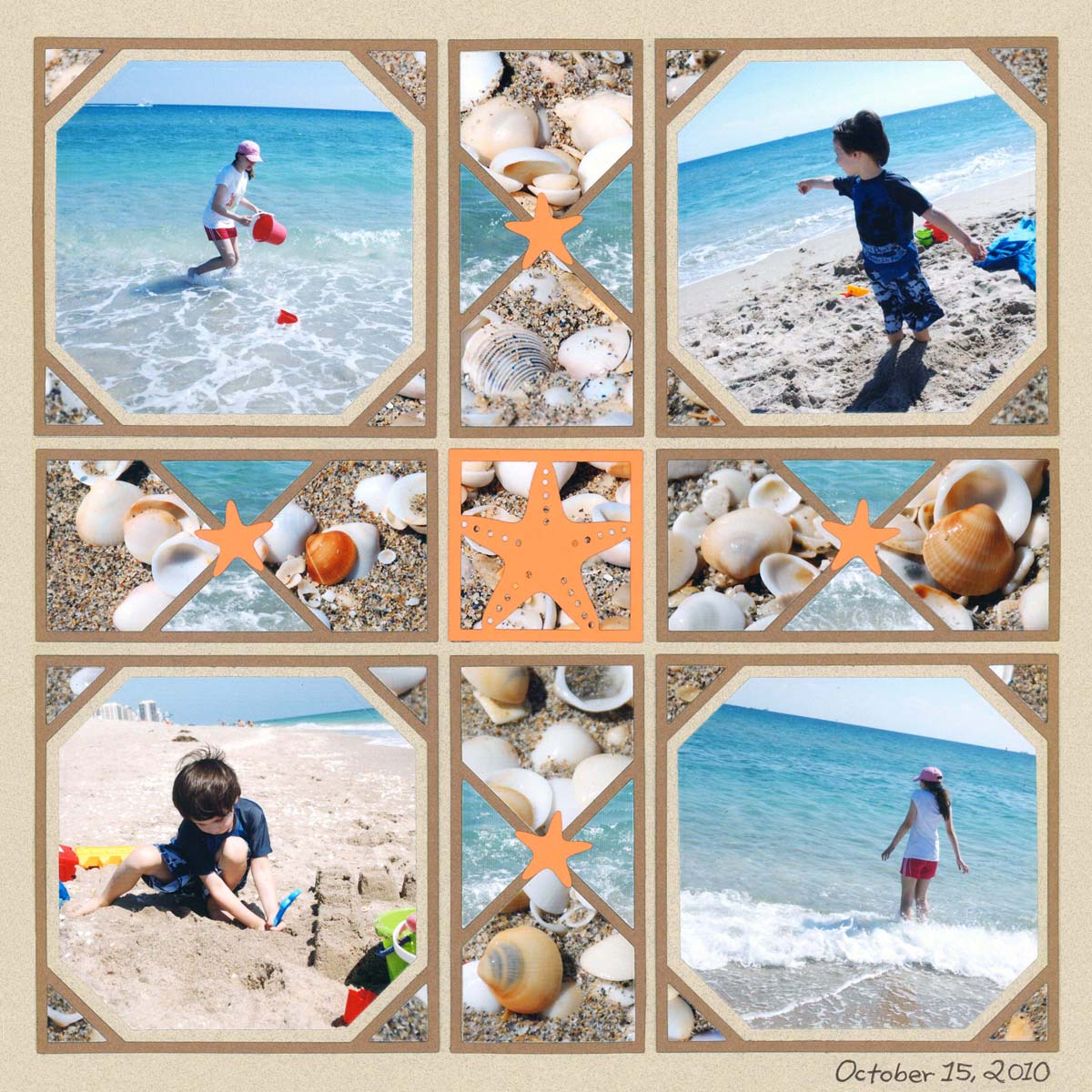
"Fall Beach Trip" by Paije - Pattern #368
Symmetrical balance can also be achieved with mirroring both side to side and top to bottom, as seen on this Fall Beach Trip page.
With no obvious focal photo, the use of orange color and star shapes help carry the eye to each quadrant of the page through repetition.
Finally, photos of the same subject, taken from the same distance, are placed diagonally from each other. Had both photos of the girl been on the same side of the page, the page would feel lighter on that side.
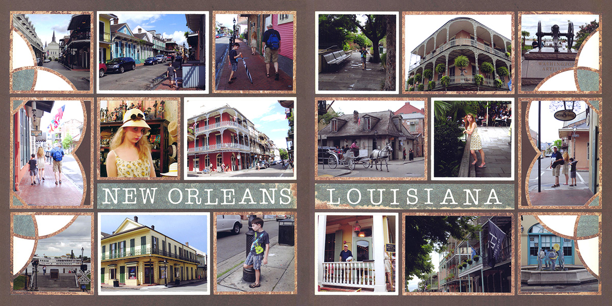
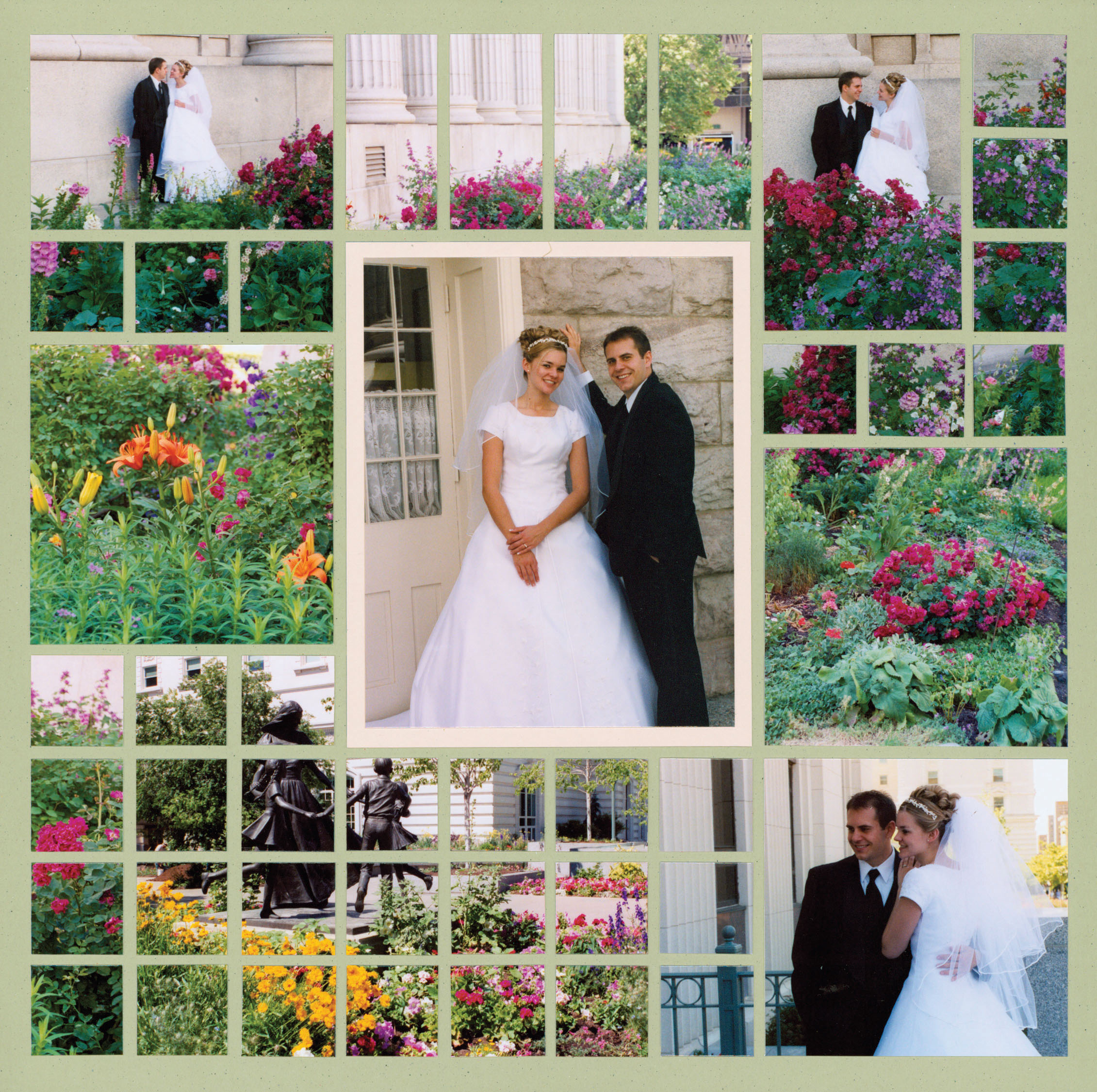
"New Orleans, Louisiana" by Paije - Pattern #455
Symmetry doesn't have to be established on a single page. When creating a 2 page spread, a great way to create balance, is by mirroring the design of the first page on the second page.
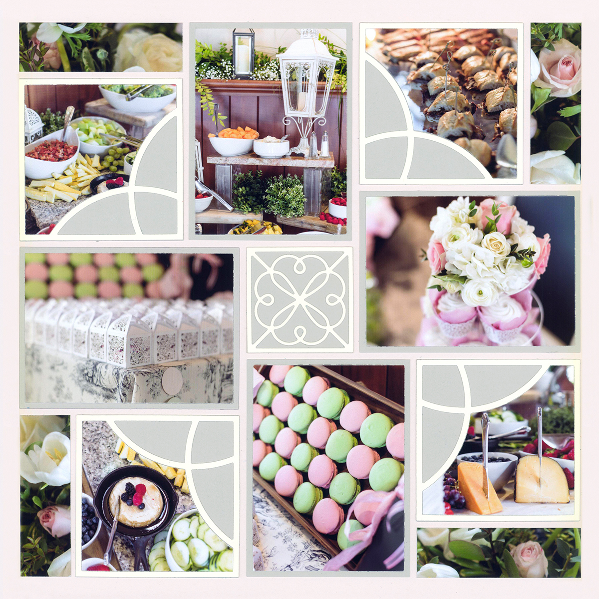
The top to bottom and side to side balance of this mosaic style page was created by adding a "belt" through the center.
The belt offers a visual break from the mosaic squares and creates a space for a title and journaling.
When creating mosaic designs, balance is important. Color, vanishing points, subjects and distance all play into creating symmetrical balance.
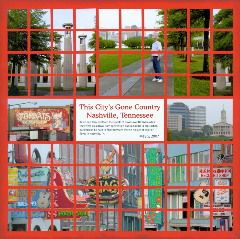
"Gone Country" by Tami Potter - Pattern #183
Asymmetrical Balance
Rather than a mirror-image on each side of the center line, asymmetrical balance can be thought of more like a teeter-totter. Both sides of the imaginary line must weigh the same in order for the teeter-totter to remain level.
This can be achieved by having two people of equal weight on each side. Or, by placing one heavy person on one side and a couple of lighter people on the other side until the teeter-totter is balanced and level.
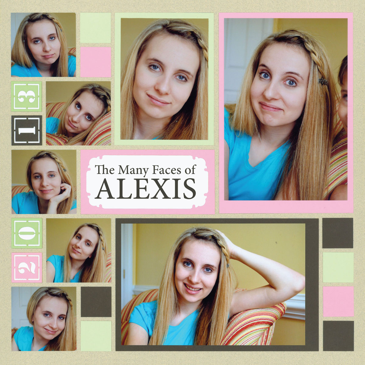
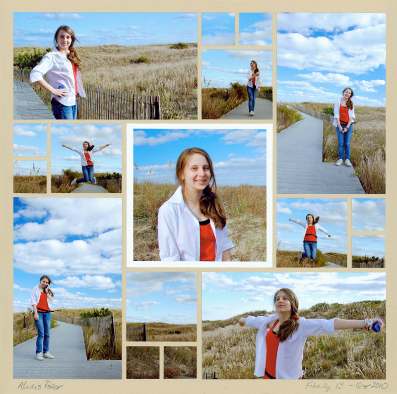
"The Many Faces of Alexis" by Paije - Pattern #210
In this example, a border style grouping (five small photos), on the left, help balance a page that is filled with larger photos on the right.
The small squares added to the lower right are important to the design. They bring balance to the right side of page via size, shape and color.
The title block, Many Faces of Alexis, breaches the border and ties the two sides of the page together.
Here, the juxtaposition of the two photos -- top left and bottom right --next to the focal point give balance to this asymmetrical layout.

"Ski Utah" by Tami Potter - Pattern #171
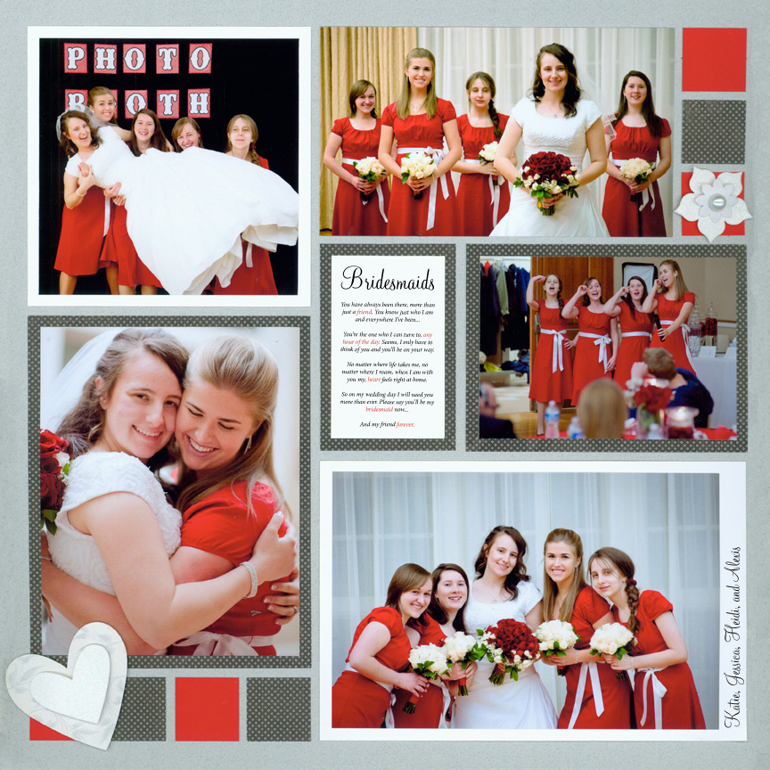
"Bridesmaids" by Paije - Pattern #211
Although there is a straight column on the left third of this page and a puzzle effect on the right two-thirds, the heavy black in the photo on the left carries more weight and helps the page balance.
The repetition of 1-inch squares on either side of the layout reinforce that balance.
Asymmetrical balance can also be achieved by placing large, decorative dies in opposite corners, like this example.
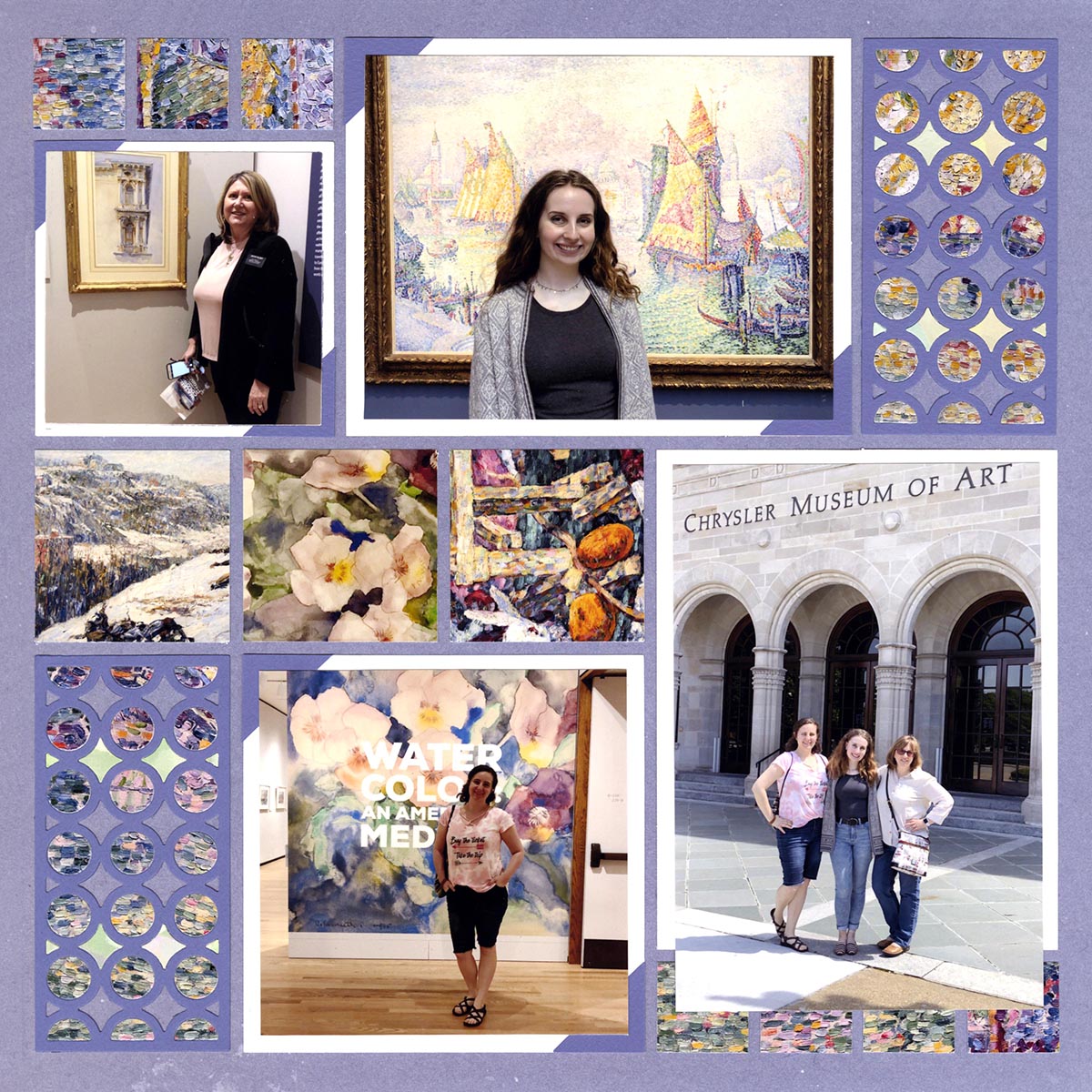
"Chrysler Museum of Art" by Paije - Pattern #155
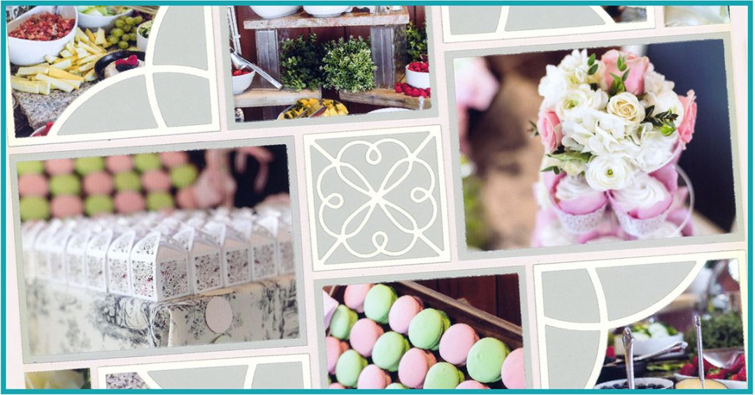
"Moon Wedding" by Tami Potter
No pattern was used for this layout.
If you are "free styling" your layout, it is very important to keep balance in mind.
Here Tami used photos with similar lighting and colors to bring balance.
Radial Balance
In radial balance, items are placed equally around a central point -- like the petals of a daisy, spokes of a wagon wheel or, in our case, a pinwheel.
Pinwheel patterns are often our favorites because they are pleasing to our eye and allow for both horizontal and vertical photos of several sizes.
Check out some pinwheel patterns, here.
"Finally Thirteen" by Tami Potter - Pattern #107
In this example, the pinwheel rotates around the center focal point photo. The white mat draws the eye there immediately and then it follows the circular pattern around the layout.
Additional balance is created by placing close up photos in opposite corners from each other.
There does not have to be a clear focal point in a radial design. In this case, the placement of colors, letters and dies draws your eye to the center of the layout and then pulls it into each corner to see the photos.

"40th Year" by Tami Potter - Pattern #353
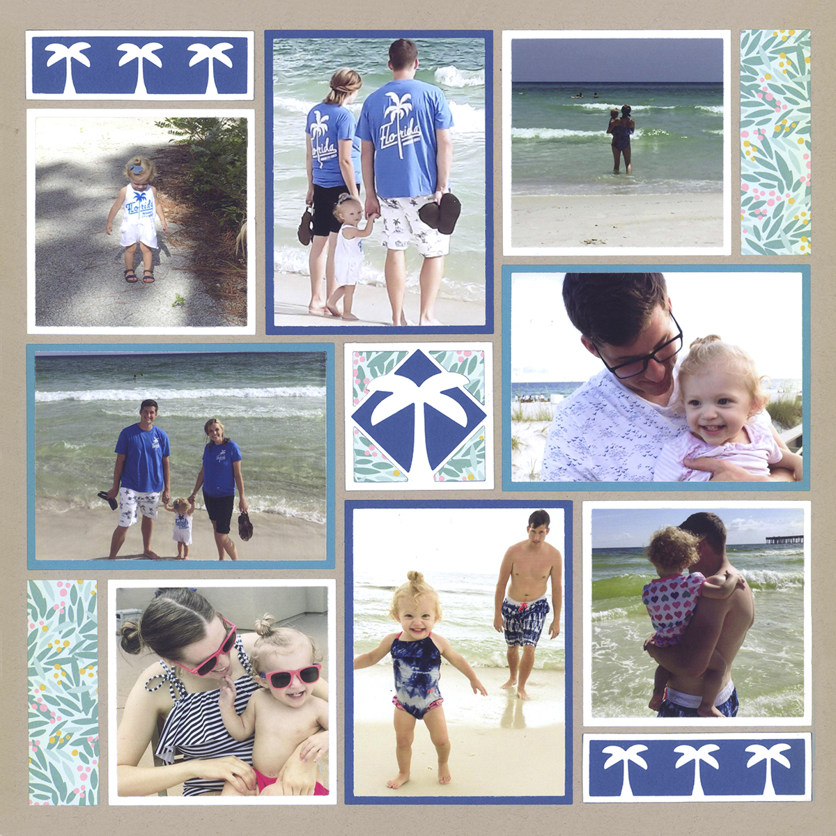
"Florida Trip" by Jodi Benson - Pattern #427
This radial layout was balanced by placing the two 1x3 die cuts on opposite horizontal corners and pattern paper on opposite sides in the vertical corners. The palm die in the center, which includes both shapes and colors of the four corners ties the layout together. The automatically draws the eye to the center and then around the pinwheel.
Mat colors, also shown here depending on the size and orientation of the photos, further help move the eye around the page.
This layout with the 3x3 Sweetheart Die is balanced by placing it equally around the focal point. Notice also that each of the loop sides face into the center of layout, and not in different directions.
"Reception Details" by Paije - Pattern #427
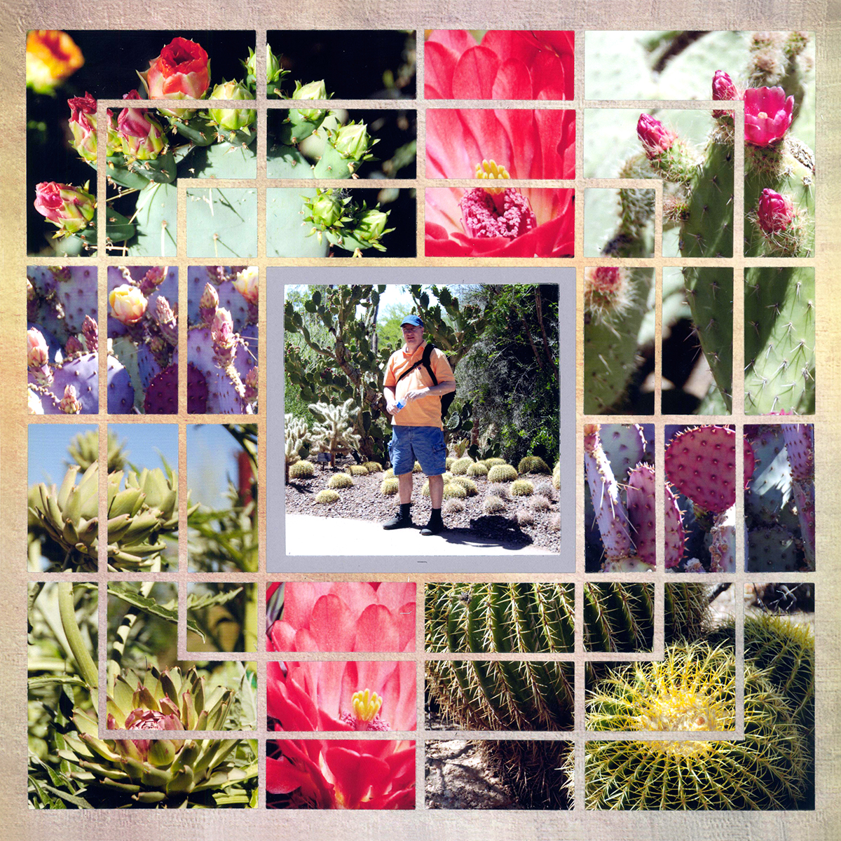
"Cactus Garden" by Paije
The placement of photographs gives this layout radial symmetry. Paije intentionally placed the green cactus photos in each corner to balance the brighter photos on the page. She also placed the pink and purple flowers opposite each other.