
When working with the Mosaic Moments® System, we generally start with a single-page pattern. However, many of us prefer two-page layouts in our albums, so these patterns must be converted to a spread.
The key to creating that two-page spread is to make sure there is balance and continuity across the two pages. This can be easily achieved by using the mirror image of one pattern next to the original pattern. But, not all of our pages work in such a symmetrical, and structured, design.
To help you know which pattern categories work well together and which ones do not, we previously published an article featuring six basic rules to use when creating a two-page spread. You can find that article, along with lots of examples, here.
But, there are a plethora of additional options for creating two-page layouts. Here is one of our tips and some more "advanced" ideas.
Tip #1: Make Sure the Focal Points are Different
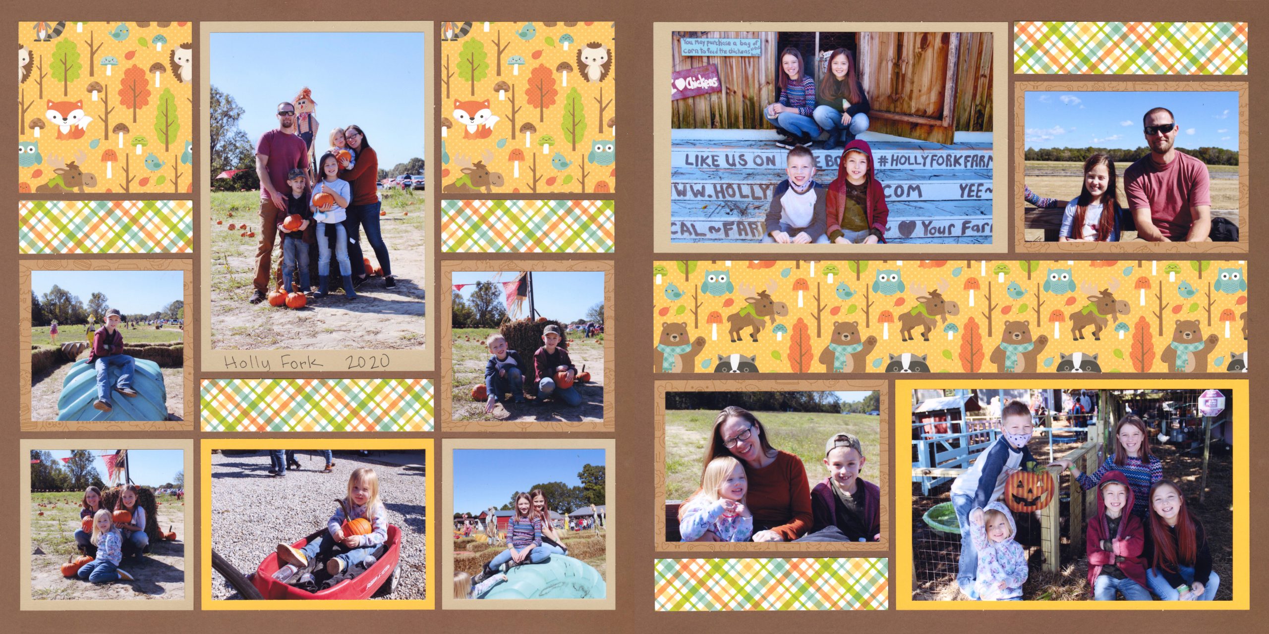
"Universal 2020" by Paije Potter - Patterns #444 (Columns) & #340 (Pinwheel)
"Virginia Beach 2006" by Paije Potter - Patterns #451 & #349
For this layout, Paije only had one photo she wanted for the focal point. So, on the left layout there is a 4x6 rectangle that is the defined focal point. The right layout does not contain a very defined focal point, since all of the photos are the same size.
So, only one layout needs a focal point, and you can choose a second pattern with no defined focal point.
"Oakley" by Lauren Jones - Patterns #614 (Symmetrical) & #502 (Mostly Squares)
On this layout, the two focal points are the same shape (4x4 squares). But, they are placed in different spots. On the left, it is in the top center and on the right layout, it is in the center of page.
For the most part, we avoid using focal points that are the same shape, but in this case placing them in two different spots still helps them to stand out without competing.
Tip #2 - Use Patterns from the Same Category
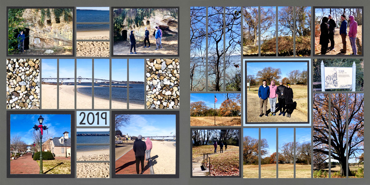
"Yorktown 2019" by Jodi Benson - Patterns #193 & #293 (Strip Patterns)
Both of these pages are Strip Patterns. However, because the strips are in the center in the page on the left side and on the corners on the right side, the two patterns work together.
The continuity is helped along by the use of 4x4 squares in each corner on the page at the left and in the center of the page at the right.
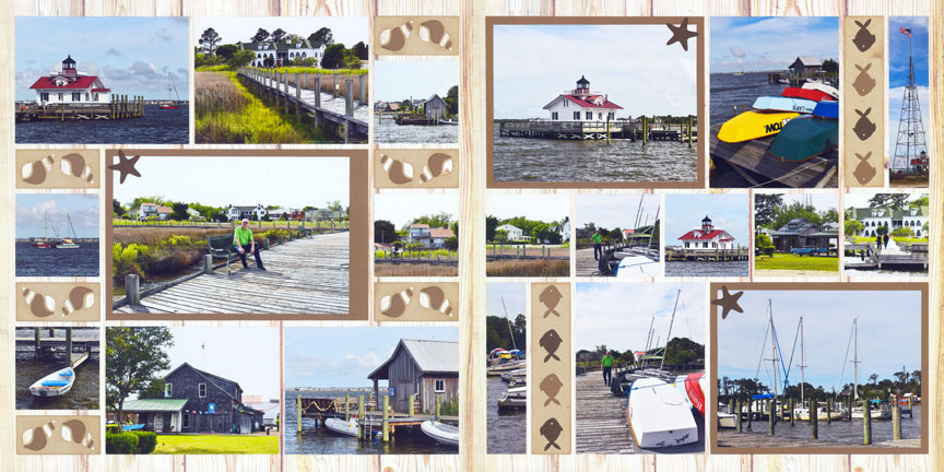
"OBX Trip" by Paije Potter - Patterns #394 & #414 (Row Patterns)
These pages both feature Row Patterns. In a Row Pattern, you can draw horizontal lines across the page without running into any elements. While each one has three rows on it, the rows fall in different places on the pages.
This is OK because of the three large, matted photos with starfish on them. By placing them in at different levels, the eye automatically goes from the one in the center of the left page to the one on top of the right page and then to the bottom of the right page.
Even though they are not the same sizes, they provide balance to each other.
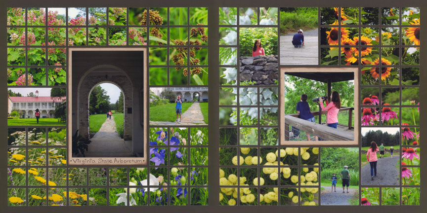
"Virginia Arboretum" by Paije Potter - Patterns #227 & #215 (Mosaic Patterns)
Despite the fact that both of these pages feature the Mosaic Pattern, and both have a focal point in the center of the page, they still work well together. The secret to this combination is to have two different-sized focal points on the layouts.
Having larger photos go in the opposite direction on each page also helps make the two focal points different enough that they offer balance instead of competition.
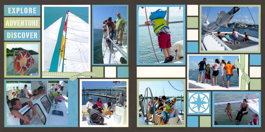
"Catamaran" by Tami Potter - Patterns #303 & #112 (Free-Style Patterns)
Free-style Patterns are possibly the most difficult to match. However, by placing a ribbon and bow on a photo on each page, and having go it in an alternate direction, helps to balance out the focal points.
Repetition of color and accent shapes help as well.
Tip #3 - Use a Busy Pattern with a Simple Pattern
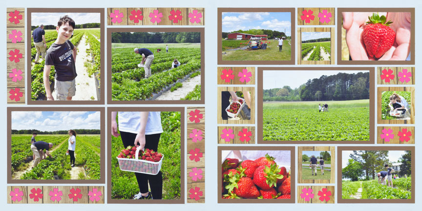
"Strawberry Fields" by Paije Potter - Patterns #357 (Pinwheel) & #202 (Symmetrical)
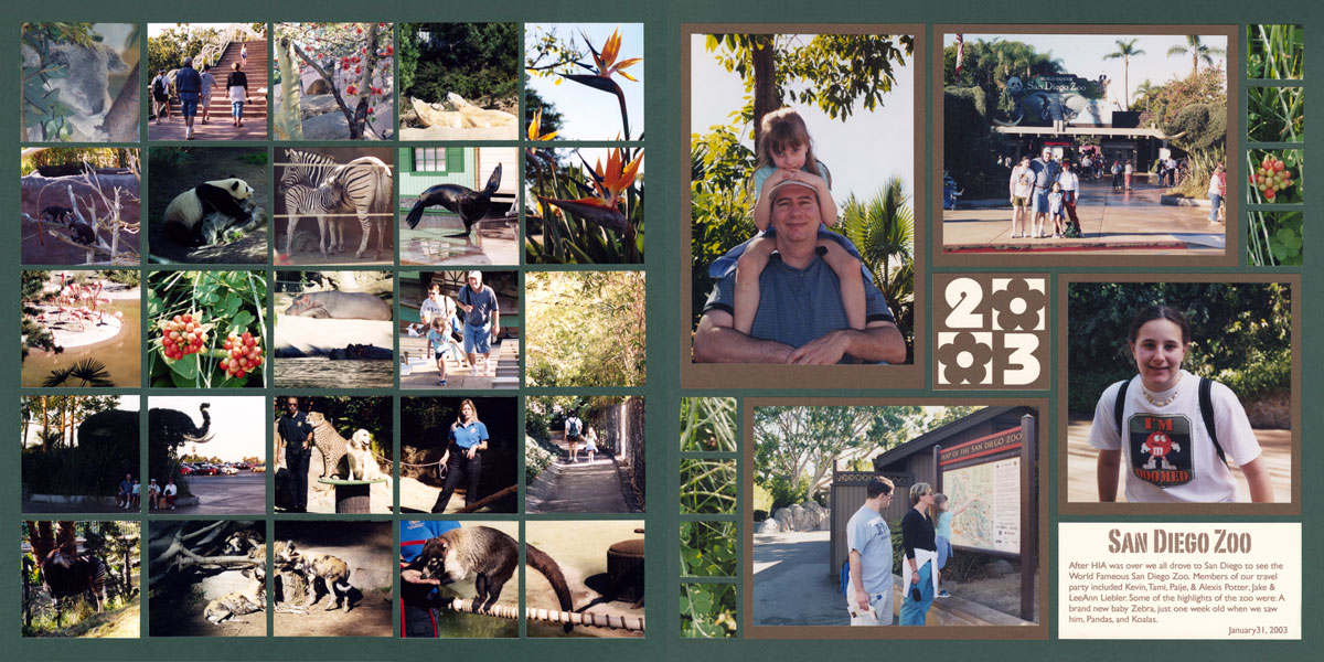
"San Diego Zoo" by Tami Potter - Pattern #101 (Mostly Squares) & Free Styled Pinwheel Pattern
Tip #4 - Use a Symmetrical Pattern with an Asymmetrical Pattern
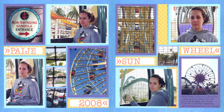
"Sun Wheel" by Paije Potter - Patterns #189 (Free-Style) & #161 (Pinwheel)
Although these layouts are very different, the choice of color mats balance the photos in a crisscross pattern across the spread.
Further balance is obtained by the subject matter in the photos. For example, the top left photo is a circular sign that is almost the same size as the gondola circle in the bottom right corner.
The use of the same colors and shapes for the words also help move the eye around the layout, with a start and finish in the same row.
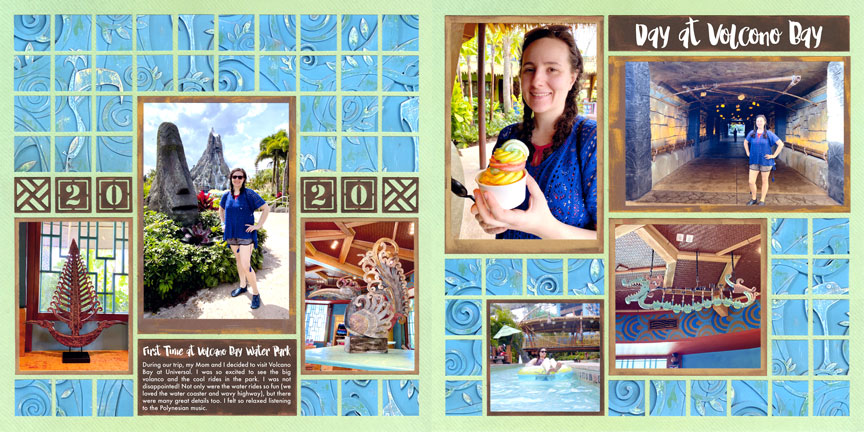
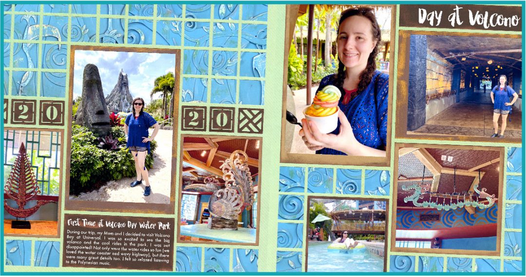
"Day at Volcano Bay" by Paije Potter - Patterns #367 (Mosaic) & #268 (Free-Style)
Remember the key to creating any two page spread is to have balance. On the right, the page pattern is very top heavy since there are two 4x6 design spots right on the top.
To balance the top heaviness on the right side, Paije found a pattern that was "heavier" on the bottom. Most of the larger design spots are closer to the bottom half on the left layout.
Also, remember to have similar elements on both sides of your two page spread. Here, both patterns have mosaic elements, plus the 4x6 SQ design spots.
Tip #5 - Use Column or Symmetrical Patterns with a Row Pattern
Two categories that seem to fit well together are Columns (or Symmetrical) balanced with a Row Pattern.
This is a great option if you have a mix of vertical and horizontal photos.
"Autumn's Calling" by Lauren Jones - Patterns #393 (Column) & #615 (Rows)
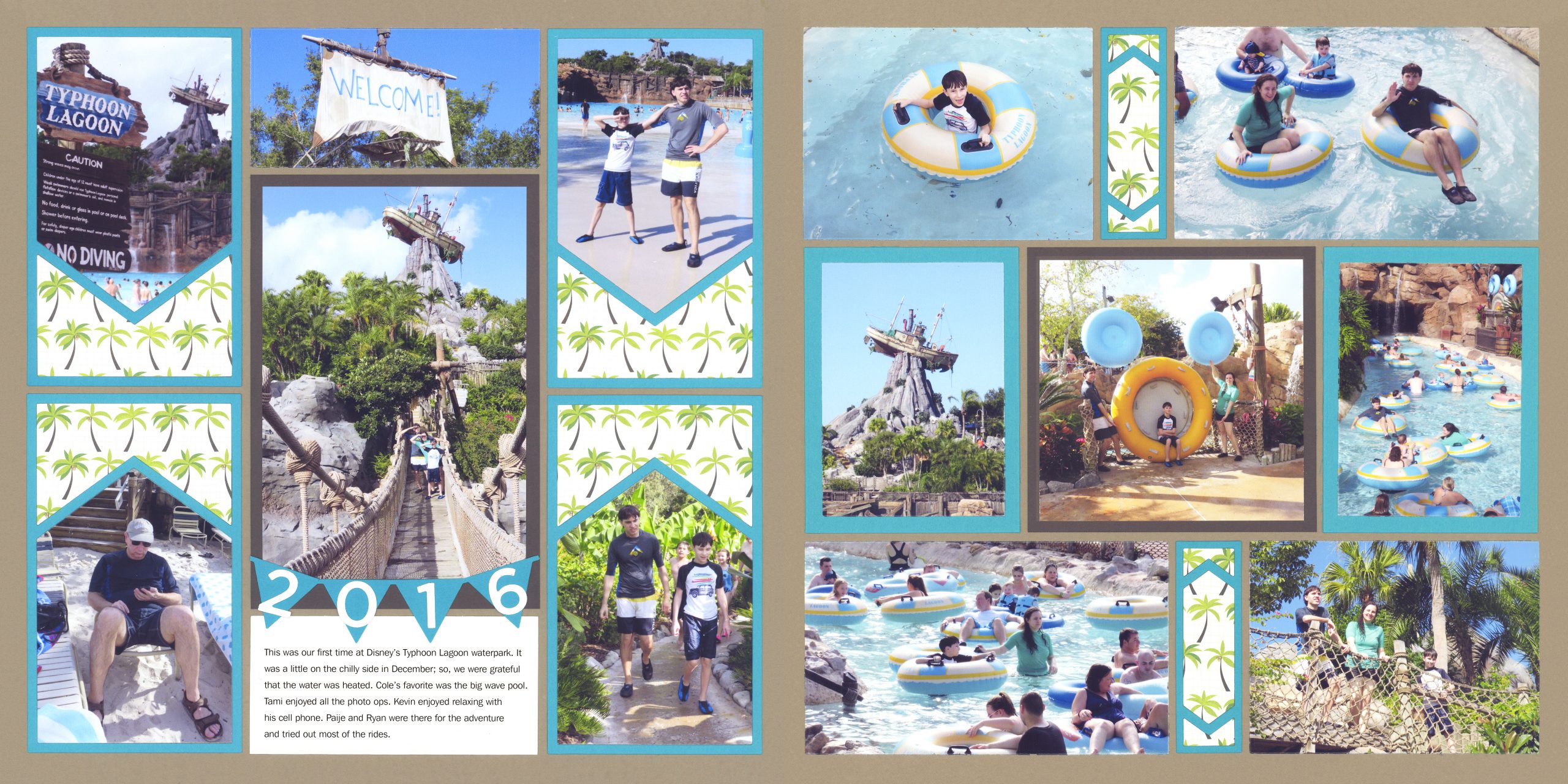
"Typhoon Lagoon" by Tami Potter - Patterns #335 (column) & #342 (Rows)
Although the focal points are in the same place on both of these layouts, the different sizes keep them from competing.
The addition of the journaling block, the banner, and the pattern paper on both sides of the large photo on the left, draw the eye immediately there, making it the obvious main focal point on the layout.
The center photo on the right page, matted in brown, draws the eye to it second. This encourages the eye to naturally travel over the two-page spread.