
Page patterns, and most sample layouts, in the Mosaic Moments® System are single pages, so they are easier to see. However, they can easily be made into two-page spreads.
We have put together a tip and 5 different ideas, with lots of additional examples, to help you turn single-page layouts into double-page spreads. It's easier than you think ... check it out below.
Tip #1: Use Similarities
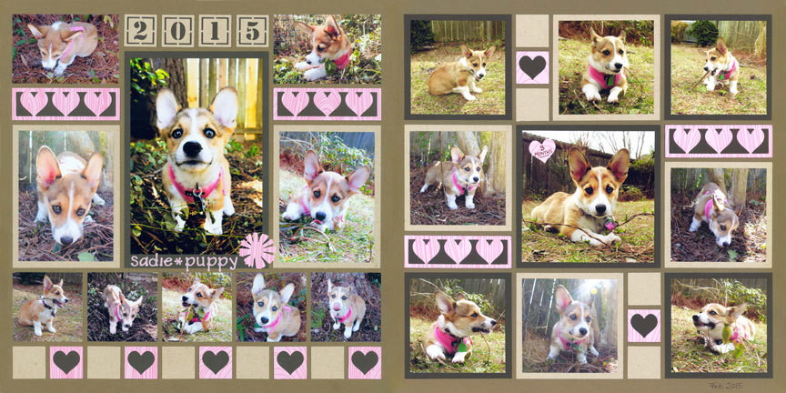
"Sadie Puppy" by Paije Potter - Patterns #131 (symmetrical) and #100 (Mostly Squares)
Both patterns pictured here have horizontal 1x3 spaces that Paije filled in the same way. She adjusted page pattern #100 slightly so it would have 1-inch squares, just like the pattern on the left. Then, she filled them in the same way as she did on the left page so the two pages blend right in together.
Paije intentionally chose these two patterns because both have square shapes. On the left there are five 2x2 squares and the right layout has 3x3 and 4x4 sized squares.
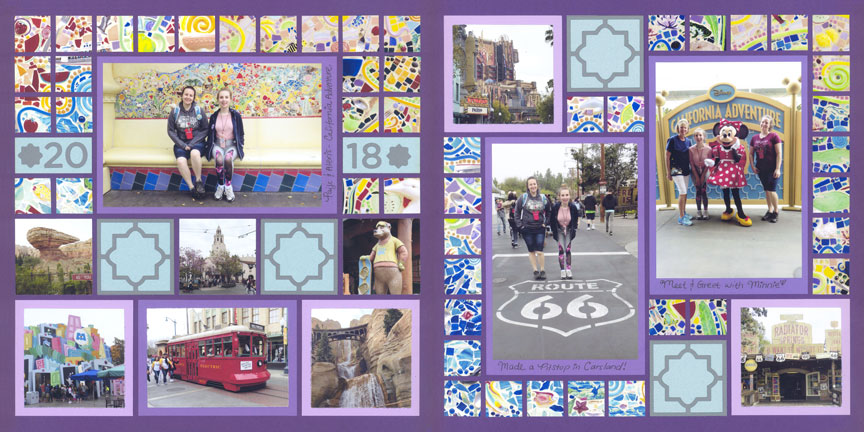
"California Trip" by Paije Potter - Patterns #395 (Mosaic) and #301 with adjustments (Column)
Each of these patterns include mosaic elements, 2x2 square shapes, and similar photo spaces, which together create a cohesive design.
Notice that although there are three large spaces for photos, one is vertical and two are horizontal. Do not worry -- they still blend beautifully. The variety simply adds to interest to the page.
If you look closely at the page patterns, you will notice some slight adjustments on this layout. While the pattern on the right called for some 1x2 elements, Paije replaced them with 1x1 elements to continue her mosaic theme. You can always alter a pattern to fit your photos and design if needed.
"My Happy Place" by Candy Spiegel - Patterns #564 (Rows) and #533 (Pinwheel)
Although these two page patterns are very different, the repetition of daisy-like flowers and patterned paper help them coordinate.
Also, notice how Candy used the Mini Loop Border Set on the right-hand page to replicate the intersecting circles of the Charmed Die on the left.
Now let's see ideas on what patterns to choose for two page spreads:
Tip #2 -- Add a Pinwheel

"Yoga in the Garden" by Candy Spiegel - Patterns #369 (Pinwheel) and #600 (Rows)
A pinwheel pattern (pictured on the left) provides a nice contrast to a row pattern (pictured at right). Notice how the large photos on the pinwheel break up the long rows and add interest to the page.
The photo mats, used on the larger photos, help take the eye across both layouts.
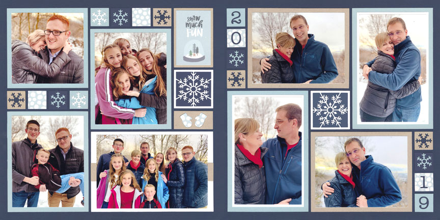
"Snow Much Fun" by Jodi Benson - Patterns #179 (Freestyle) and #117 (Pinwheel)
For this example, Jodi combined a freestyle pattern with a pinwheel pattern. This is a great option when you have a lot of large photos to use.
Repeating the colors, snowflakes and 1-inch squares on both sides ties the layout together.
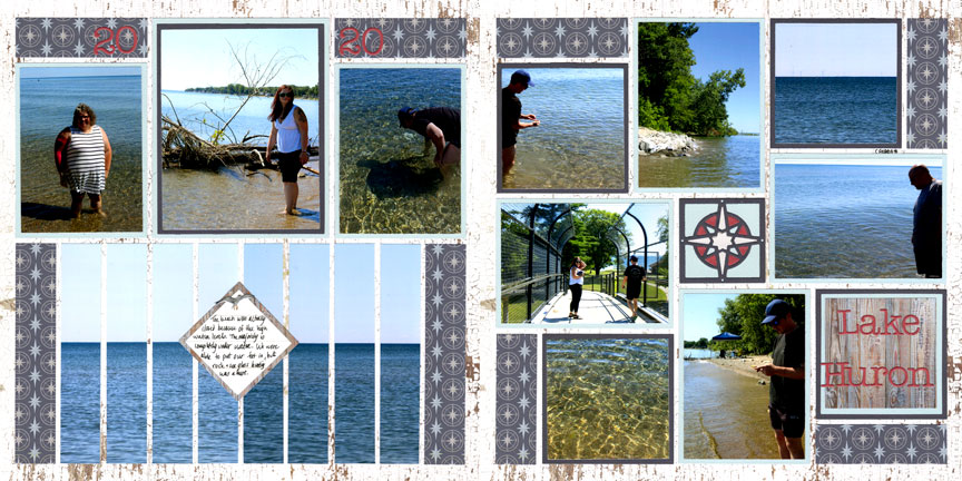
"Lake Huron" by Candy Spiegel - Patterns #588 (Strips) and #427 (Pinwheel)
Tip #3 -- Use a Rotational Balanced Pattern
Similar to a pinwheel, a rotational balanced pattern provides the feeling of motion, like a spinner or clock. However, these patterns do not have a center element that the objects "spin" around.
Rotational balanced patterns are found in the columns category and the mostly squares category.
This tip works well for all page pattern categories on the gallery.
"Pink Ladies" by Paije Potter - Patterns #430 (Symmetrical) and #467 (Column)
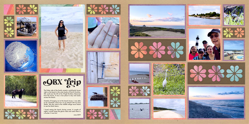
"OBX Trip" by Paije Potter - Patterns #460 (Column) and #214 (Column)
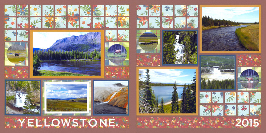
"Yellowstone 2015" by Paije Potter - Patterns #607 (Mosaic Style) and #606 (Column)
Tip #4 -- Mirror the Pattern
Mirroring a pattern is an incredibly easy way to match pages of a layout. You simply take the layout on the left and flop it and repeat it on the right.
Mirror patterns work best with asymmetrical patterns, such as those found in the freestyle category. For best results, avoid this method with symmetrical or pinwheel patterns.
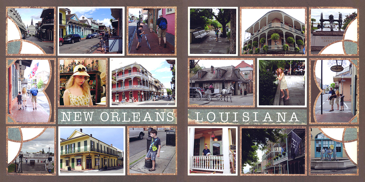
"New Orleans, Louisiana" by Paije Potter - Pattern #455 (Rows)
For this example, Paije used the Sweetheart Dies on the left and right of her spread. This technique creates a nice order to the layout ... almost like a pair of bookends.
By mirroring the pattern, she was able to create a long strip for her title that goes across both pages.
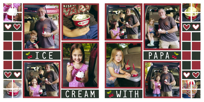
"Brusters" by Lauren Jones - Pattern #551 (columns)

"Play Ball" by Tami Potter - Pattern #119 (Mosaic Style)
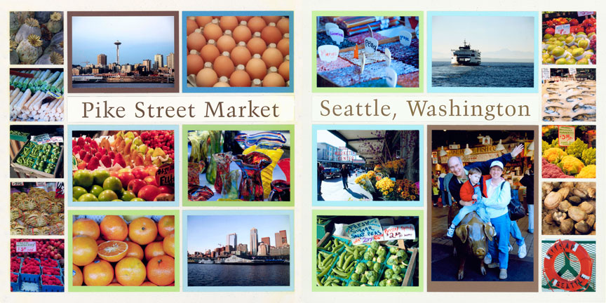
"Pike Street Market" by Tami Potter - Pattern #151 (Column)
Tip #5 -- Flip it Upside Down
Similar to doing a mirror image, you can also flip a layout upside down to make a matching page. This is a great option if you like an asymmetrical look on your layout.
This tip works the best with asymmetrical patterns.
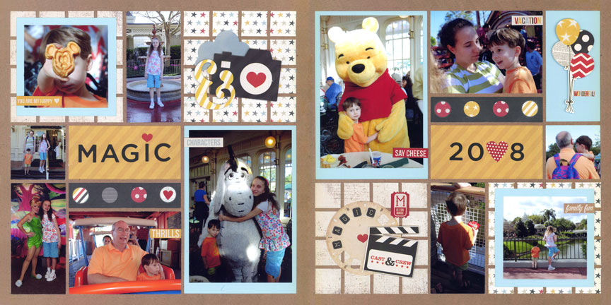
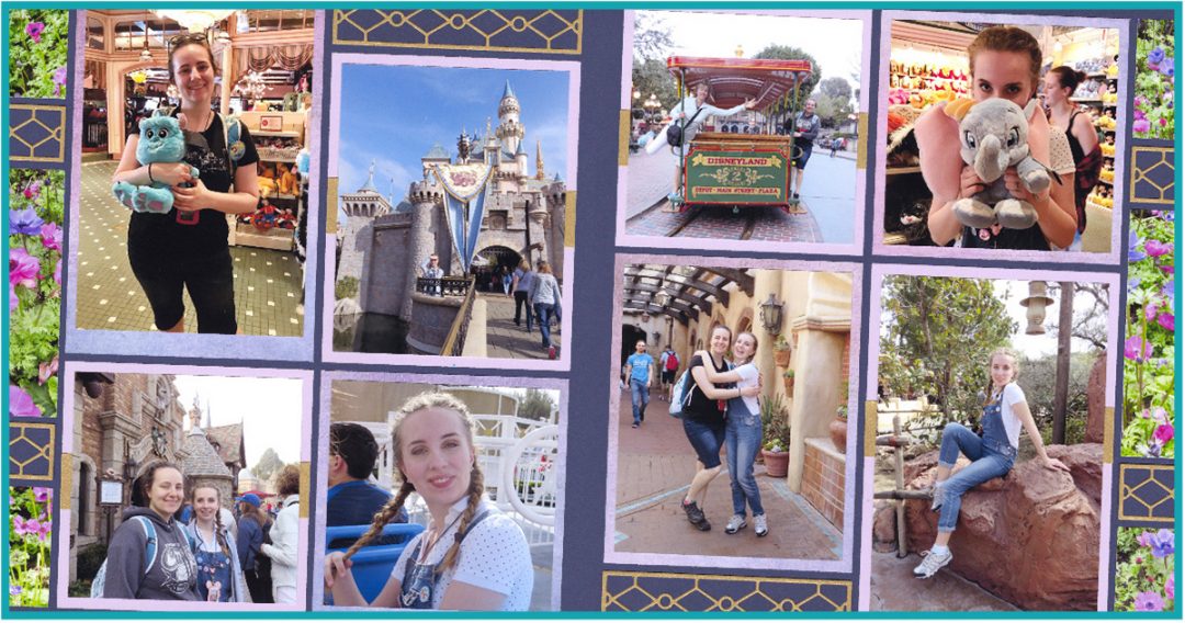
"Magical Trip" by Paije Potter - Pattern #288 (Freestyle)
"Disneyland Trip 2018" by Paije Potter - Pattern #494 (Column)
Tip #6 -- Complete the Rows
When you have a pattern of rows, you can extend the row across the entire 2-page layout.
This tip mostly works for row patterns paired with column or symmetrical patterns
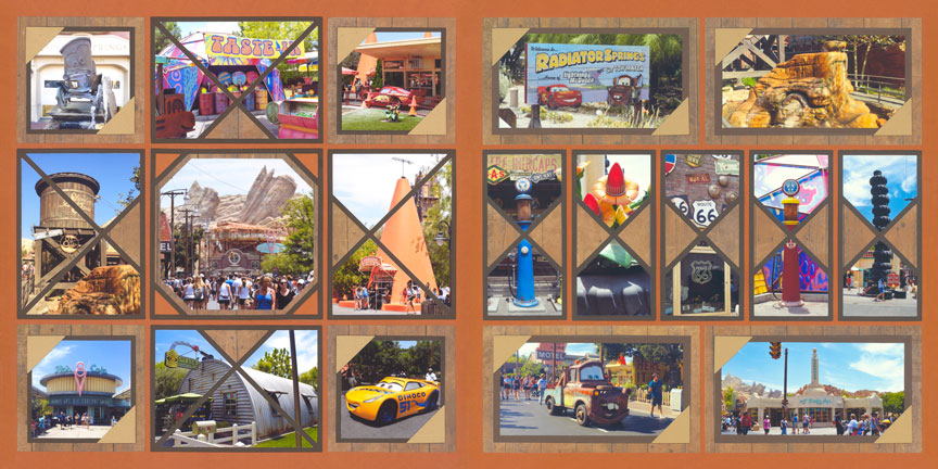
"Carsland" by Paije Potter - Patterns #344 (mostly squares) and #345 (rows)
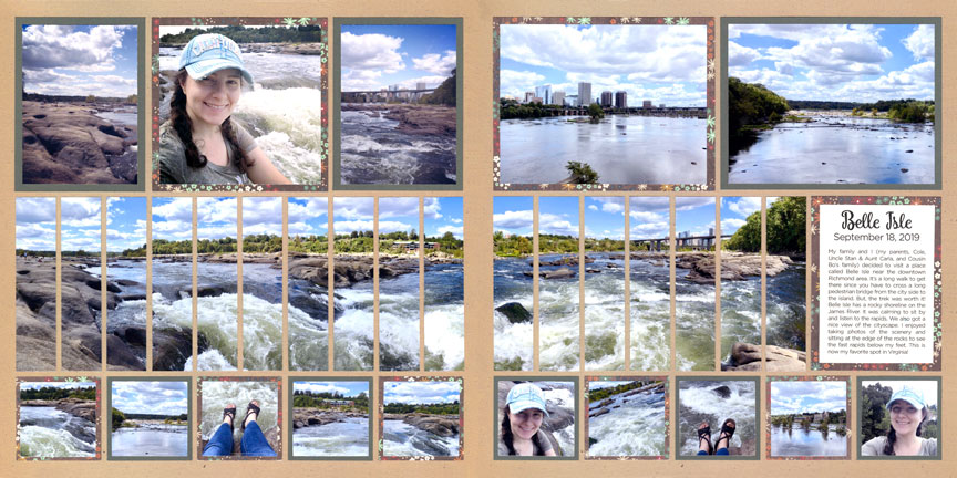
"Beautiful Belle Isle" by Paije Potter - Pattern #546 (Strips) and a freestyled pattern
Here, Paije wanted to keep the strips going to show the full panorama. So, the right layout is not a pattern on the gallery, but it was easy to make her own pattern just by extending the rows.
Using 2x2 squares along the bottom is a great option when you have a lot of photos of scenery, animals, flowers or even people in the distance.
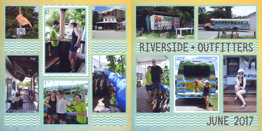
"Riverside Outfitters" by Paije Potter - Patterns #420 (Column) and #150 (Rows)
In some cases, a row across a two-page layout might be too much. In that case, break the row slightly, like Paije did here.
See how the middle column on Paije's left page breaks the rows? Because the paper she used has such strong graphics, the eye, at a glance, will still see those rows.