
Bright colors grab our attention and make us happy. But, when scrapbooking, they can easily overwhelm the focus of the scrapbook -- the photos.
Here are 10 layouts featuring bright colors, along with some tips on how to make them work for you. Check it out!
Soften with Patterned Paper

"Beach Ball Fun" by Paije with Red Chili Pepper Grid Paper
This patterned paper, while incorporating all of the bright colors, has a soft pattern paper foreground.
This allows it to be used repeatedly on the layout, softening the bright Red Chili Pepper Grid Paper, and letting the photos shine. A paper like this gives your page a beautiful contrast that does not feel too overwhelming.
Pull Color from the Photos
When the subject of your photos is bright, like the girl wearing the pink bathing suit in this layout, you can actually make her stand out better by using a brightly colored grid paper.
Adding contrasting colors, like white and green, helps move your eye around the layout.
To keep things from getting overwhelming, some of the photos are matted in a patterned paper that is nearly the same shade of pink as the grid paper.
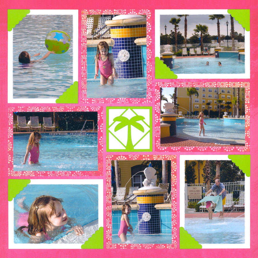
"Fun at the Pool" by Paije with Cyclamen Pink Grid Paper
Color Inspiration From The Location
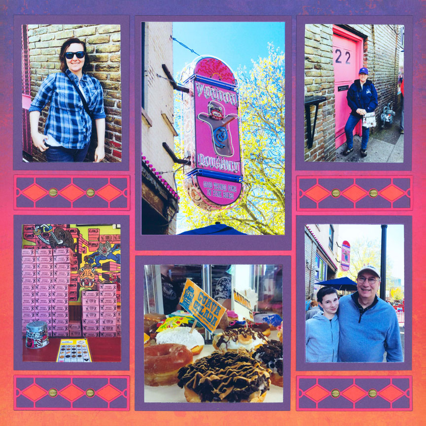
"Voodoo Doughnut" by Paije with Sunbrella Grid Paper
Every element of this page is based off the eccentric donut shop shown in the photos.
The colors, the vertical photos and the horizontal border designs were inspired by the unique sign. This keeps the eye from getting tired and keeps the photos in focus.
Paije also used the exact same shade of purple found at the top of the ombre grid paper as her mat color. This naturally draws your eye right down the layout. Perfect!
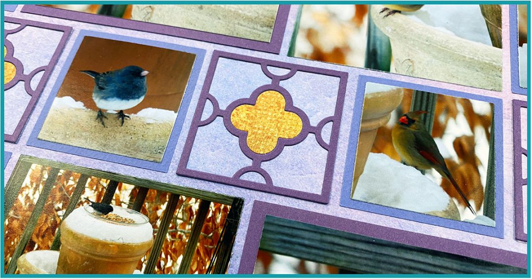
Snow Stands Out On Bright Colors
Photos of snow are typically less colorful than other pictures, so using brightly colored papers provides contrast that helps them shine.
You might also consider matching colors to the season ... winter photos look great with cool colors, like purples and blues. And, if you look closely at the snow, it often has a soft blue or purple hue to it.
Paije also added a little gold, which complements the purple hues.
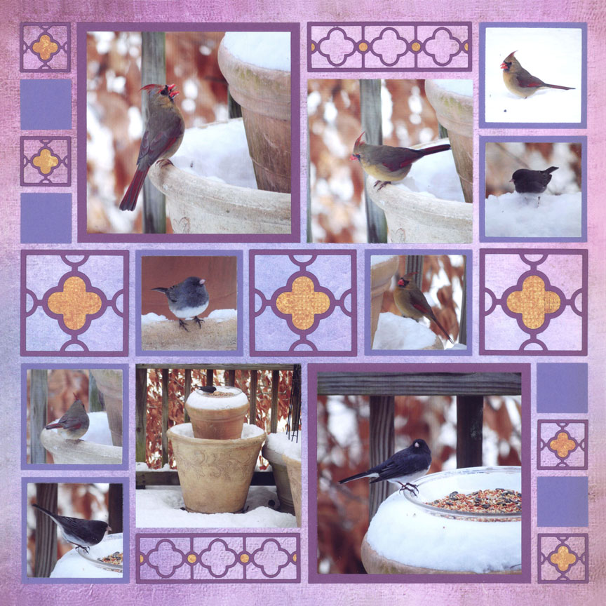
"Winter Birds" by Paije with Grape Grid Paper
Liven Up the Sand and Water
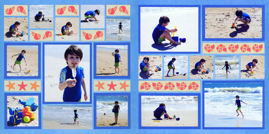
"Beach Day" by Paije with 'Always Afloat' Grid Paper
Beach photos are naturally calm and lacking in a lot of color. So, they benefit from bright backgrounds.
One easy way to choose a color is to match the clothing of the subject. In this case, the bright blue of the boy's shirt makes it work well with the blue grid paper and blue photo mats. Since the water is a softer shade, the dark blue mats give them contrast. If the water clashed with the blue, you could use the green of the boy's shorts instead.
Adding the pops of orange in the border dies keeps the eye moving around the layout. Orange, yellow and reds are great contrasting colors with beach scenes, and add warmth on a cool page.
Include Contrast
If the main colors in your photos practically match your grid paper, they will blend right into the background. You can fix this by using colors that contrast.
These photos, for example, have a lot of red and yellow in them. So, Paije used blues and greens for her accents and grid paper to keep the photos standing out.
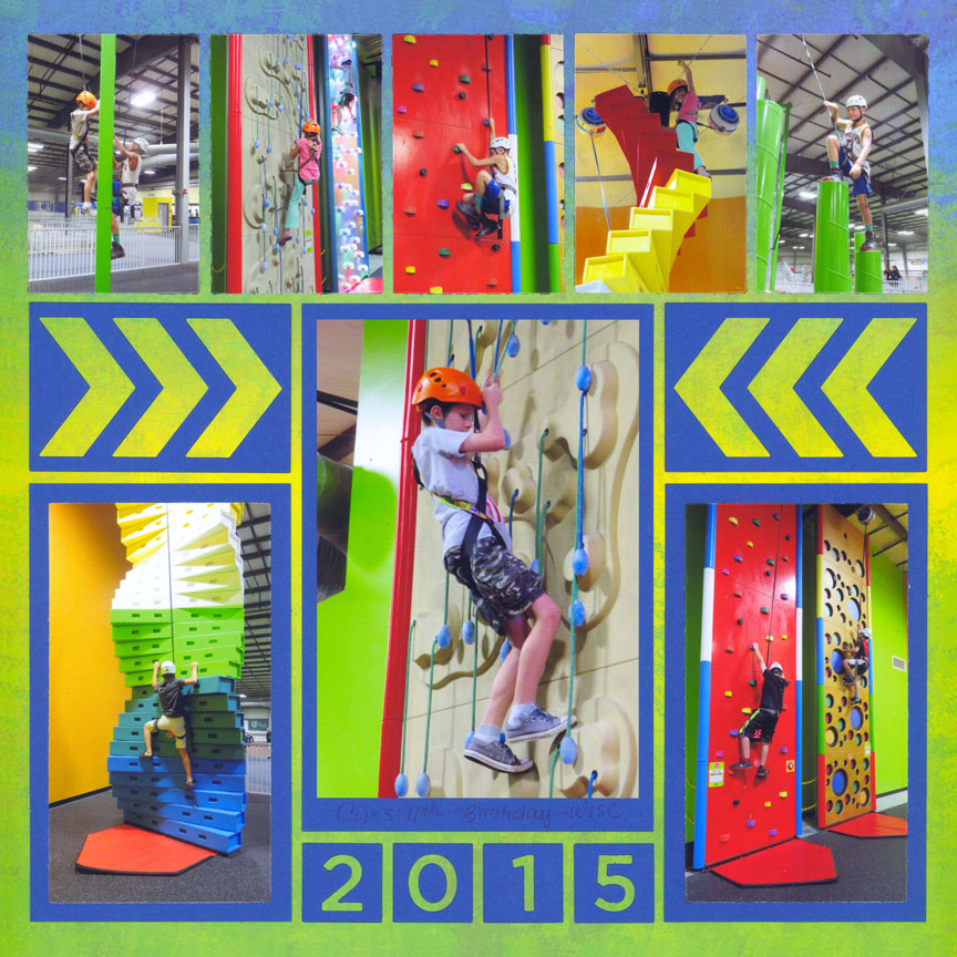
"Fun Climb" by Paije with Board Shorts Grid Paper
Make it Fun
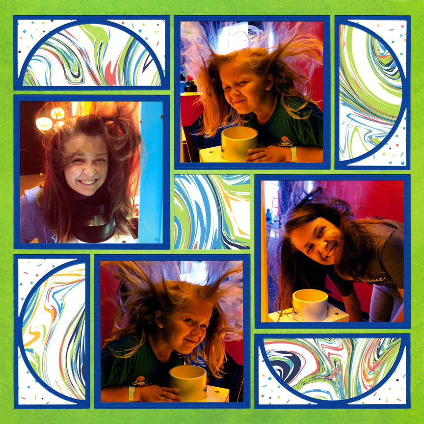
"Floating Hair" by Danielle Lawson with Between Toes Grid Paper
Bright colors make us think of fun and youth. Use them to help tell the story of silly experiences.
Here, Danielle used a bright blue cardstock for photo mats and the outlines of her die cuts to tie all of the fun colors together. Adding a paper with white or another neutral hue helps tone down the brightness.
Include Cool Colors
To keep really bright colors, like yellow and orange, from becoming alarmingly bright, mix in some cool shades.
Here, Jodi used soft blue, along with neutrals white and black to help tone down the yellow. You may want to avoid a very bright blue, and instead go with a softer hue (shown here), or go the opposite with a shaded blue.
Yellow and orange hues tend to be difficult for most people. The key is to add neutrals, such as white or cream to tone down the overly bright colors.
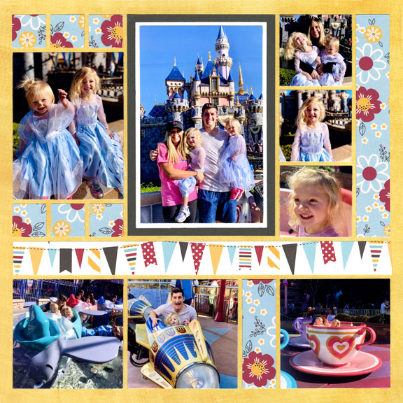
"Disneyland 2020" by Jodi Benson with Pineapple Crush Grid Paper
Include Neutrals
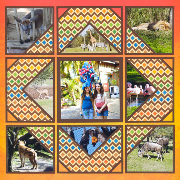
"Tampa Trip" by Paije with Heatwave Grid Paper
Trips to the zoo are wonderful opportunities to use bright colors, since the animals, and their habitats, are generally neutral.
For this layout, ultra-bright orange and yellow are used to make the photos really pop. However, the colors are kept from being overdone by incorporating neutrals like brown and white.
Using a single photo that has lots of color, like the one in the center here, draws the eye right into the layout.
Don't feel you have to duplicate all of the colors in your photos. The center photo here has blues and pinks, but it still compliments the bright orange. While the orange conveys the warmth of the summer day, blue or pink wouldn't have the same effect.
Use Complementary Colors Carefully
When you have a bright Grid Paper, you can use complementary colors, such as blue and orange shown here.
The key is to make sure your tones are different. In this case, the orange background is very bright. Instead of using a bright blue, Paije chose a hue that is lighter in color. Using a neutral, such as white, keeps the complementary colors grounded.
Paije also used green and some purple on her page, which are next to blue on the color wheel. The cool color scheme tones down the orange background.
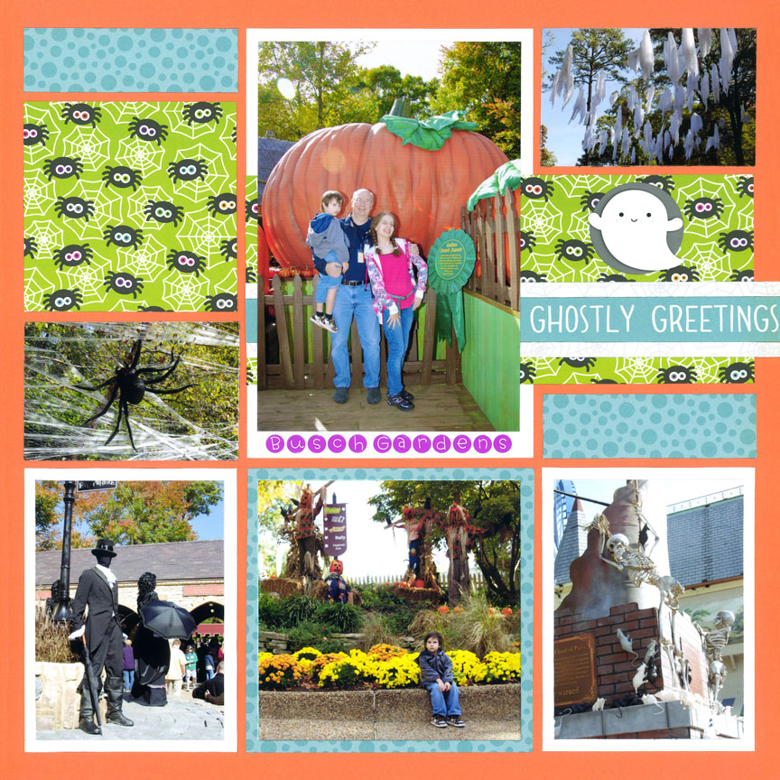
"Ghostly Greetings" by Paije with Orange Grid Paper