
This month I was excited to create a Mosaic Moments™ page based on the non-fiction book, “Letters to Juliet”. Many of you probably saw the film that came out a few years ago. It’s a really cute movie, but I will note that it is a fictional story based on the information given in the book. “Letters to Juliet” is an informative book about the many letters that are sent to “Juliet” in Verona, Italy. Thousands of people ask for love advice, and a group of volunteers help answer their questions. To learn more about this book, check out the synopsis on goodreads.com. You can also do some research of Verona, Italy through a search engine to learn more about its history.
Letters to Juliet is perfect for scrapbook ideas for couples, valentine pages, or maybe you actually took a trip to Verona, Italy. Hopefully this will help you start brainstorming for a possible page.
Here is a list of inspiration I gathered from the book and Verona:
Theme:
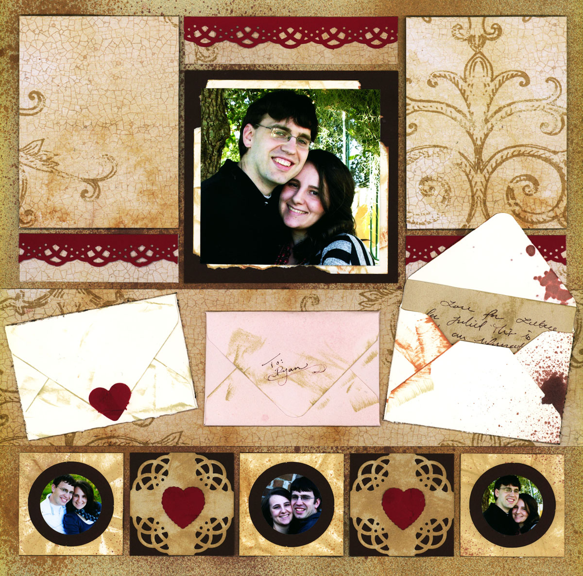
I was inspired by many of the letters that are sent to Verona every year. Based on this, I decided to make my page a romantic theme about my husband and I. The envelopes contain little love notes I would send to my husband.
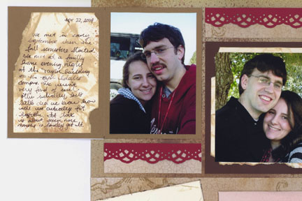
Textures:
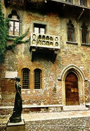
The photograph above shows a statue of Juliet in front of her balcony in Verona, Italy. The texture on the building is so pretty! I love the distressing and the bricks. Many of the buildings in Verona are old and distressed. You can find more photographs of Verona on the The Mosaic Moments™ Design Team Pinterest Board for Letters to Juliet . I highly recommend checking out their board since there are many good things to help inspire you! There are many pictures of book covers, travel photos of Verona, and the wall of letters.
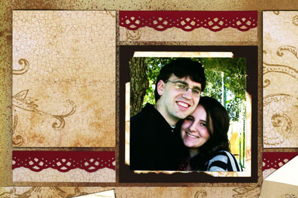
I love the the distressed texture and added this look to my page. Below is a close up image so you can see the textures on my page. I chose pattern paper with a crackled wall look, and the center has a layer of torn paper to look like a distressed wall. Plus I sprayed a few colors of alcohol ink to give my page a tattered look.
Shapes:
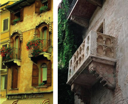
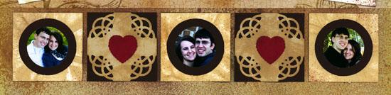
As I was researching I saw several photos of windows around the city and Juliet’s balcony (shown above). I noticed that Verona’s architecture has many arch shapes, and I wanted to add this to my page. But I personally was unable to find any embellishments with this particular shape. Instead, I decided to use the closest shape I had, circles. I was inspired by the windows to add Circle Tiles as little windows for my photographs (see below).
Patterns:
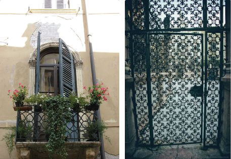
I found these two photographs on the ‘Letters to Juliet’ Pinterest page. I really like the patterns from much of the iron work found in Verona. I had a punch perfect for creating gorgeous patterns. So, I created a row of 2.125 in. squares and I punched out the edges on a couple of them. You can see these under the ‘Shape’ section.
Icons and Symbols:
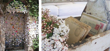
Icons and Symbols The main icon for this book would probably be Letters. I incorporated this on my page by creating small envelopes. You may be able to find small envelopes at a craft store, but I made these myself. The Picture shows the wall of letters in Verona so I wanted to make my envelopes look tattered and old as if they had also been on the wall for a long time. I even put some tattered looking notes in the envelopes (shown in the envelope on the far right).
Another Icon you may want to add is hearts. This fits with the romantic or love theme. I simply added a few red hearts I created with punches. This also a great way to add color. I didn’t want my entire page to be plain brown so I think the brick red accents helps my overall layout stand out.
Color:
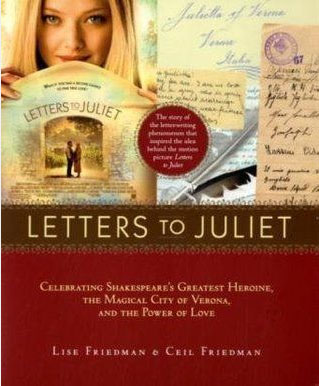
I was inspired by this book cover (shown above). I love the brick red and the chocolate brown border with the pretty design. Red is a great color for romantic pages since it represents love and passion. I have a border punch that makes beautiful designs (it goes with the corner punches I mentioned earlier), so I created little accent borders that helps bring extra color to the page.
Typography:
I did not create a title for this page as I usually do. But, I did write little notes in the hidden flaps (see above). I did my best to imitate much of the script hand-writing shown on old letters. I personally hand wrote it, but there are some fonts you could use as well. Whatever font you choose, make sure it is legible.
Come back to the Tips and Techniques Blog next week to learn the step – by – step process of creating this page.