1. Draw Colors From the Photos
"Rainy Day" by Jodi Benson - Pattern #476
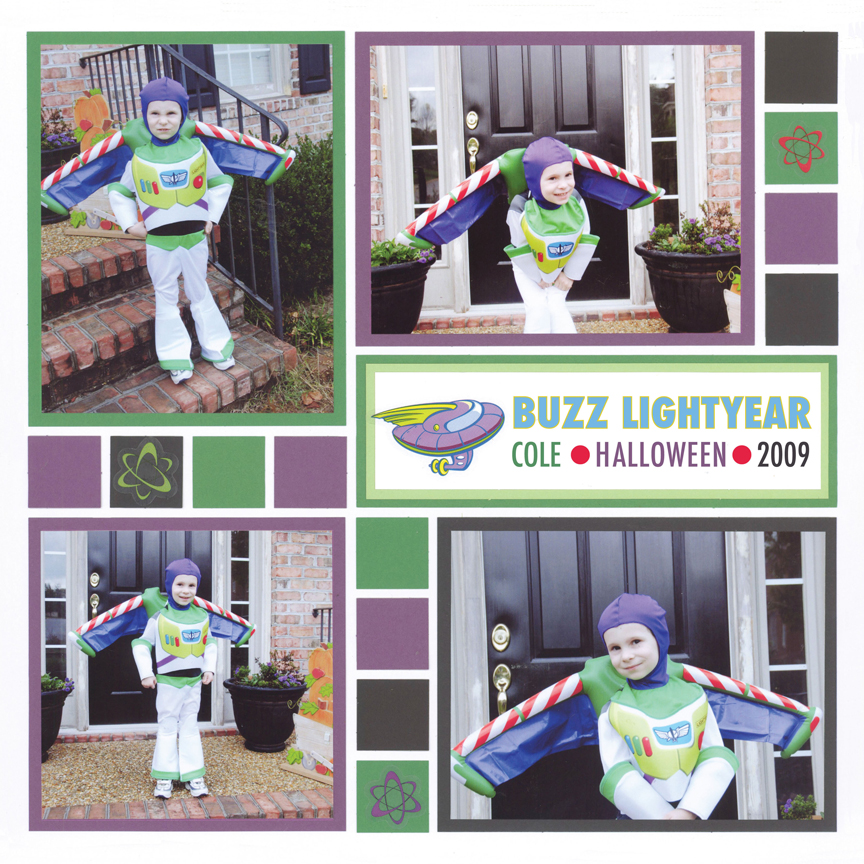
"Cole as Buzz" by Paije Potter - Pattern #129
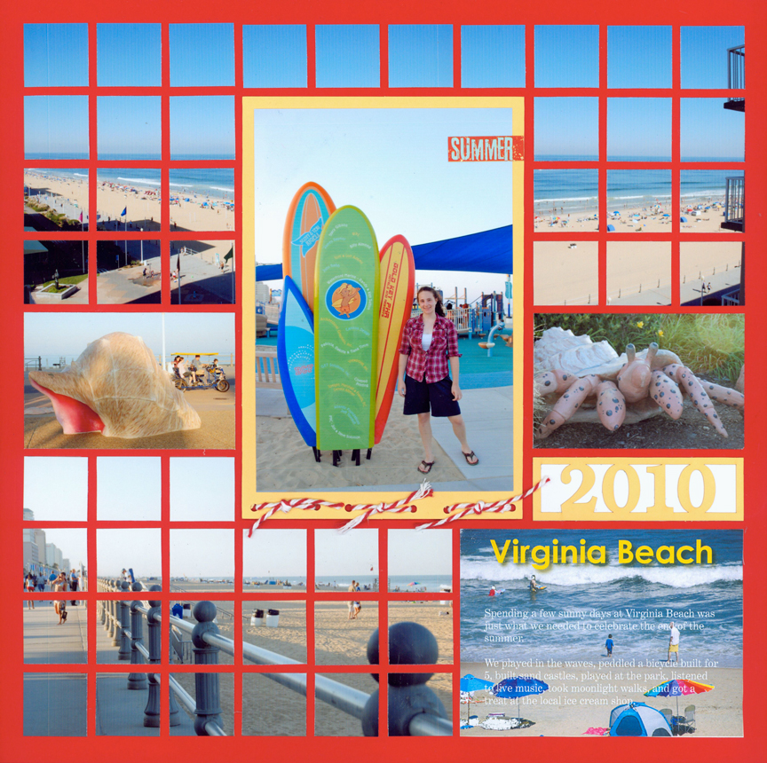
"Virginia Beach 2010" by Tami Potter - Pattern #123
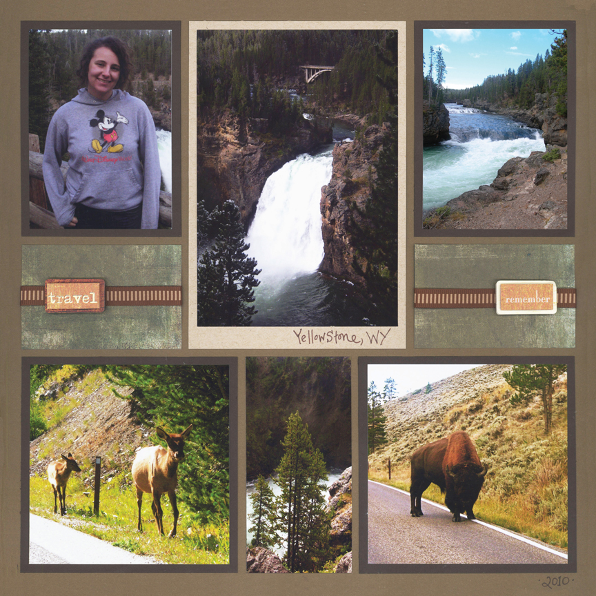
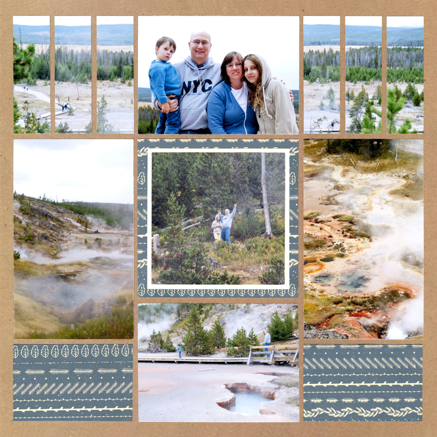
"Yellowstone 2010" by Paije Potter - Pattern #243
2. Select Colors from Pattern Paper
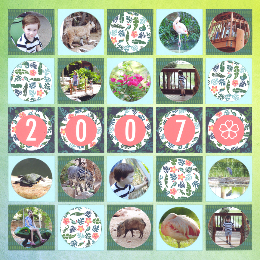
"Phoenix Zoo" by Paije Potter - Pattern #101
If you look closely at the leaves of this pattern paper, you will see the blue, green and pink used to accent this layout.
You will also notice many of the papers used here are pattern papers. If you are not sure how to mix the different colors and patterns try using a paper pad. Often all of the papers in the pad are designed to coordinate together, so as long as you choose from the same pad, you know they all work.
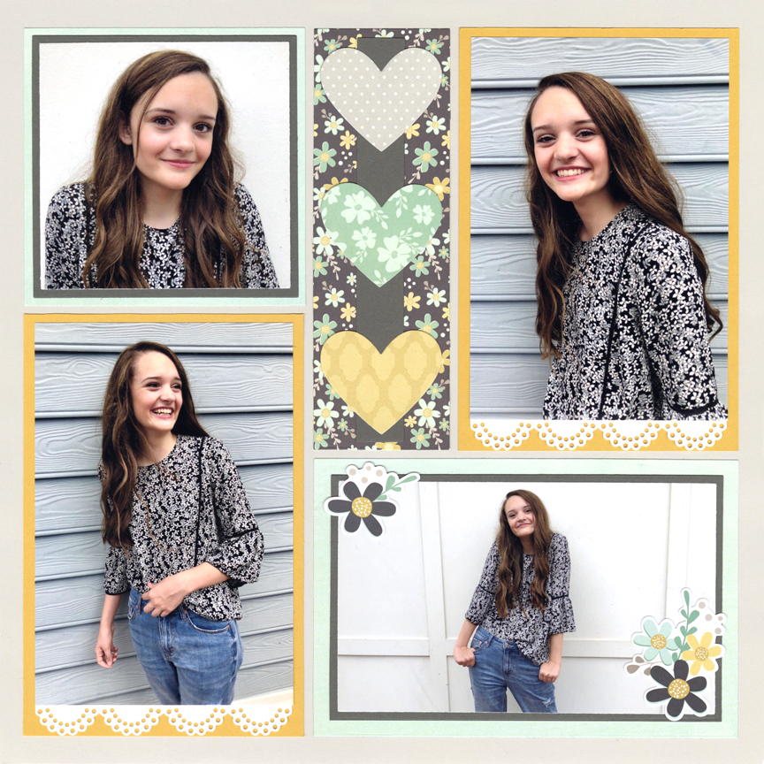
For this one, Jodi started with the floral print, then matched the shades of blue, yellow and pink to it.
By cutting her own embellishments with Mosaic Moments® dies, everything matches perfectly.
"Sunshine" by Jodi Benson - Pattern #236
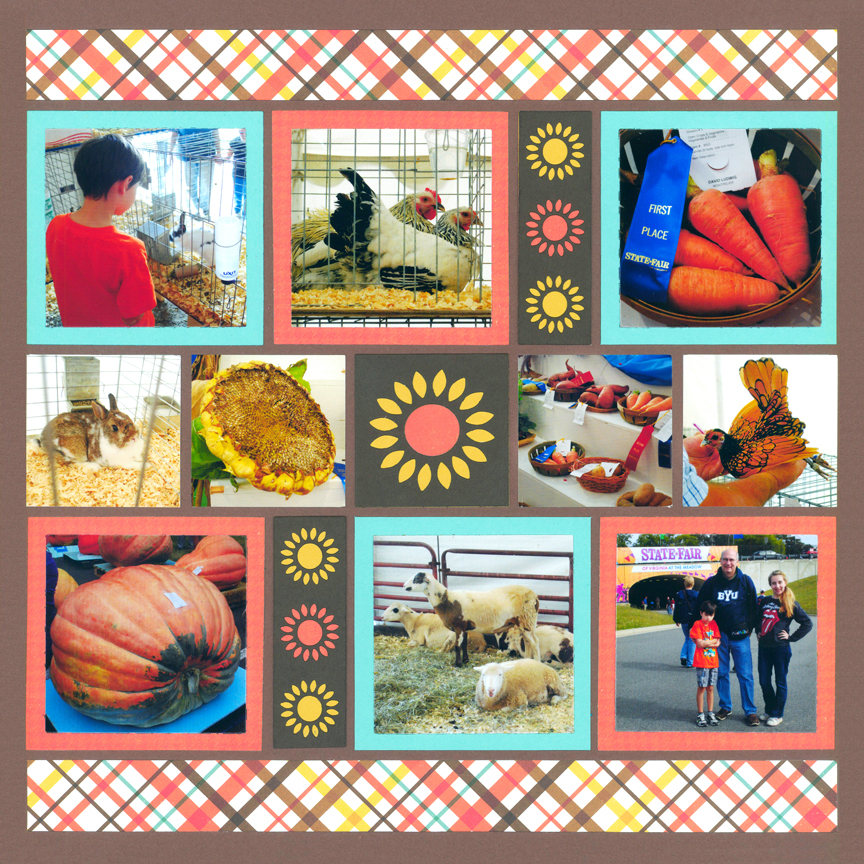
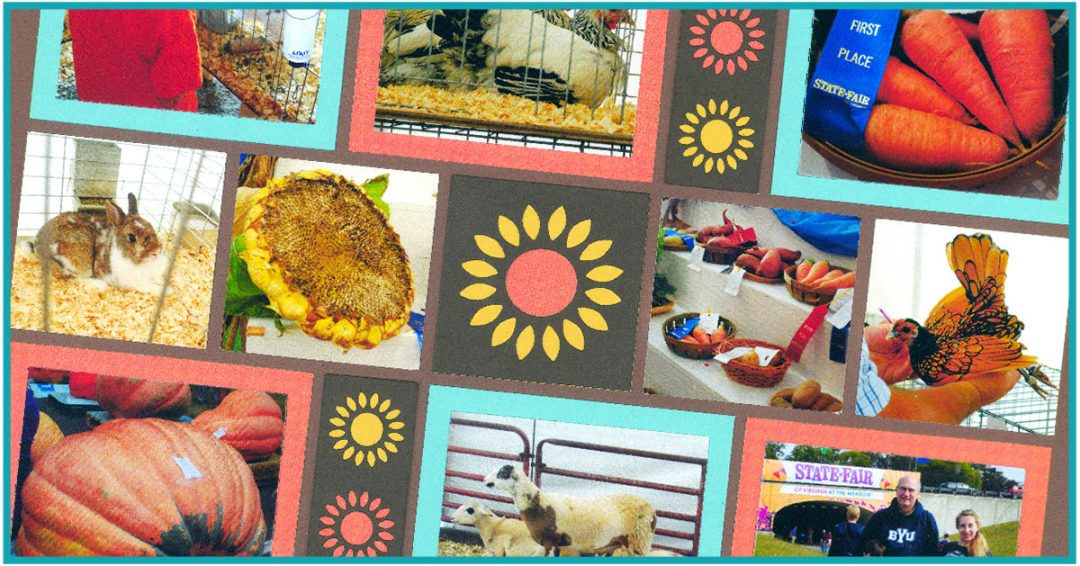
"State Fair" by Paije Potter - Pattern #337

"Yellowstone 2010" by Paije Potter - Pattern #243
3. Use the Color Scheme
"Alexis & Matt" by Paije Potter - Pattern #416
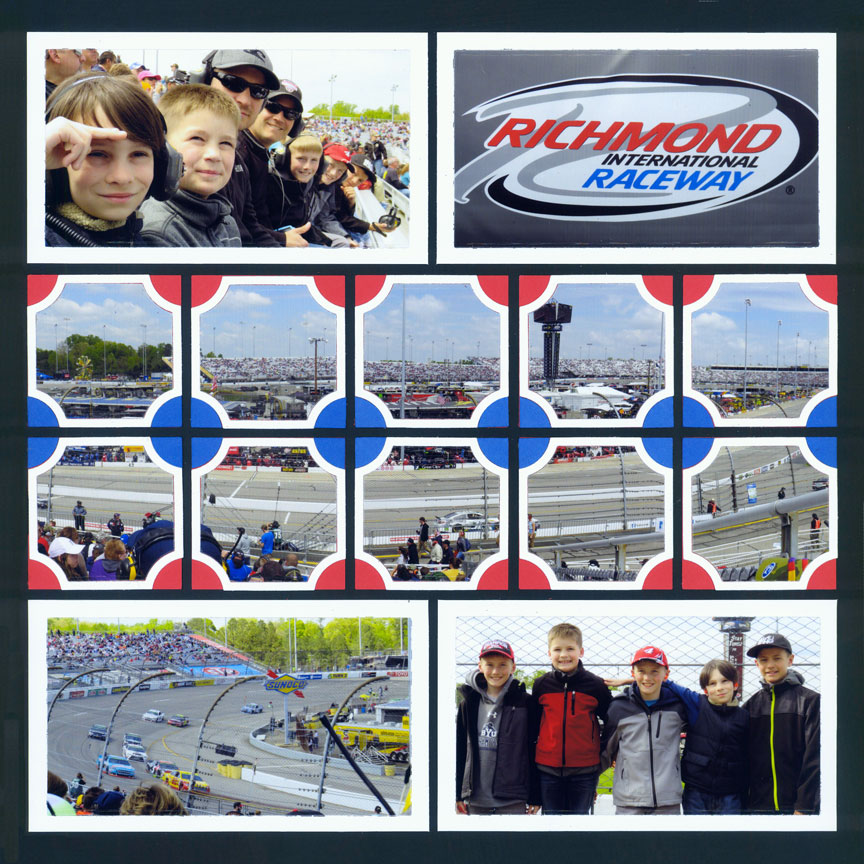
"Richmond Raceway" by Paije Potter - Pattern #425
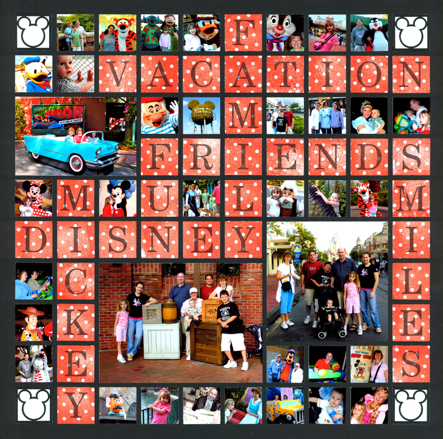
"Disney Vacation" by Tami Potter - Free-styled Layout
Theme parks, like Disney, may have more than one set of colors. If you are focusing on Cinderella and other princesses, you might go for pastel blues, pinks and purples.
If your page is about Winnie the Pooh, you might use golds, oranges and reds.
But, if you are focusing on Mickey Mouse, you can do red, white and black, like Tami did here.
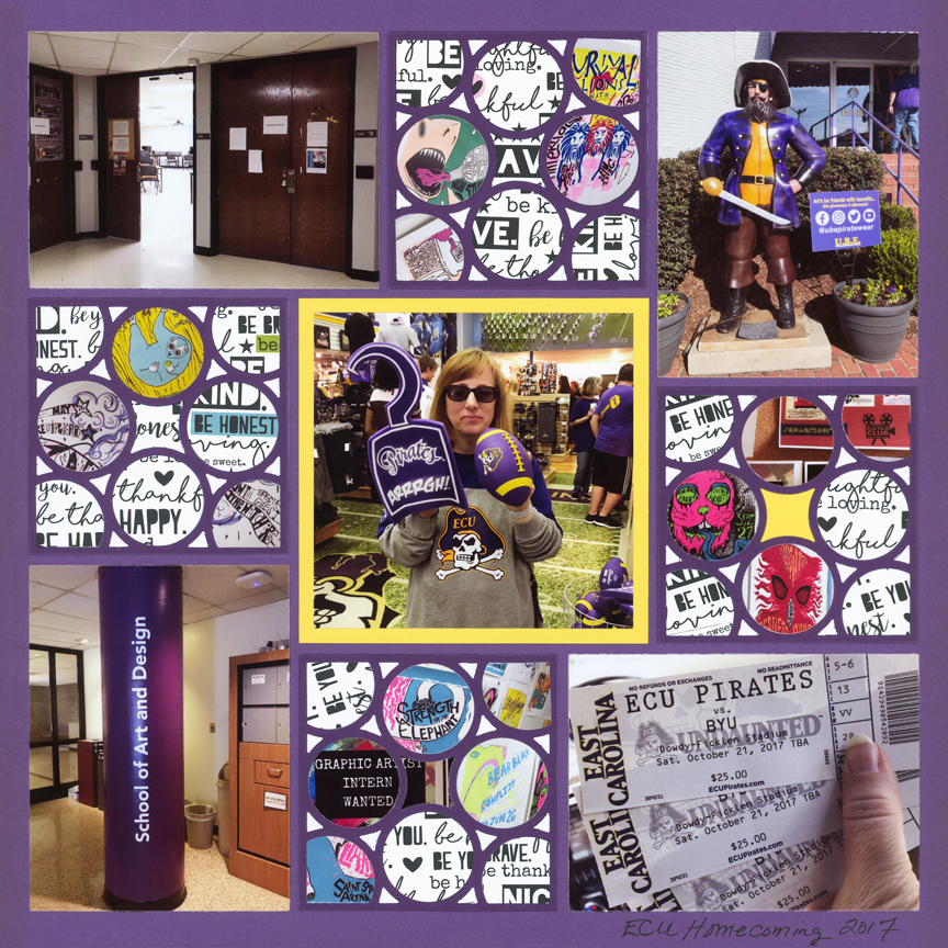
"ECU Homecoming" by Tami Potter - Pattern #361
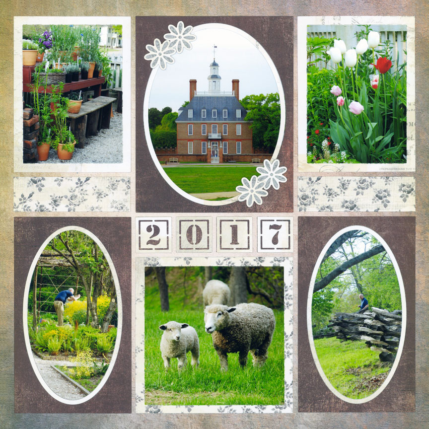
4. Get Inspired by the Location
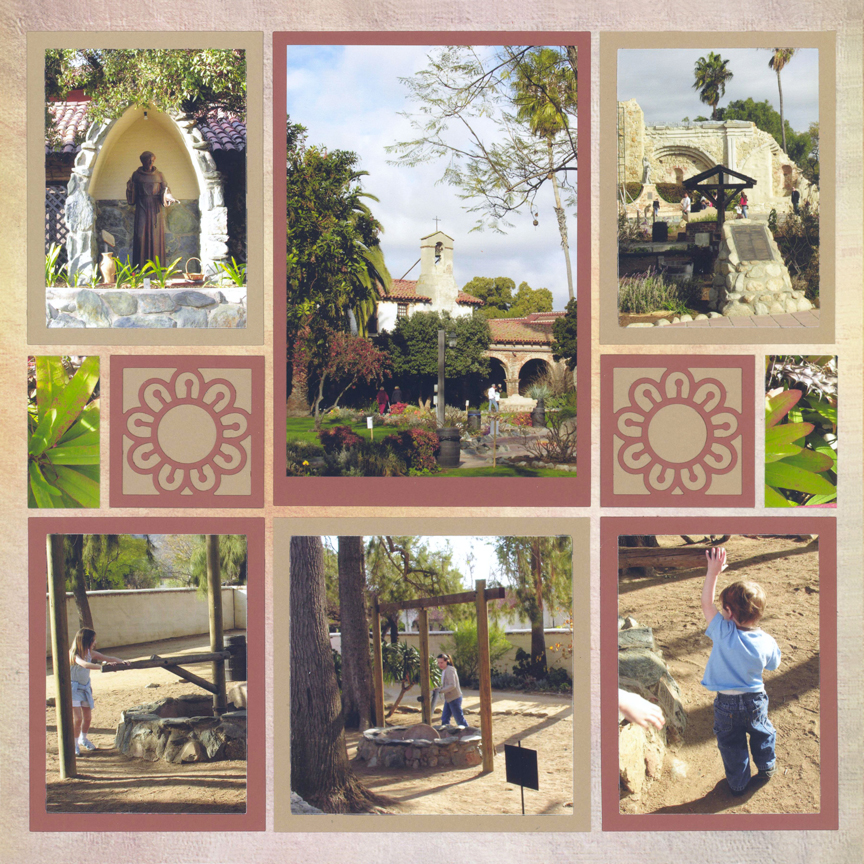
"Historic California" by Paije Potter - Pattern #444
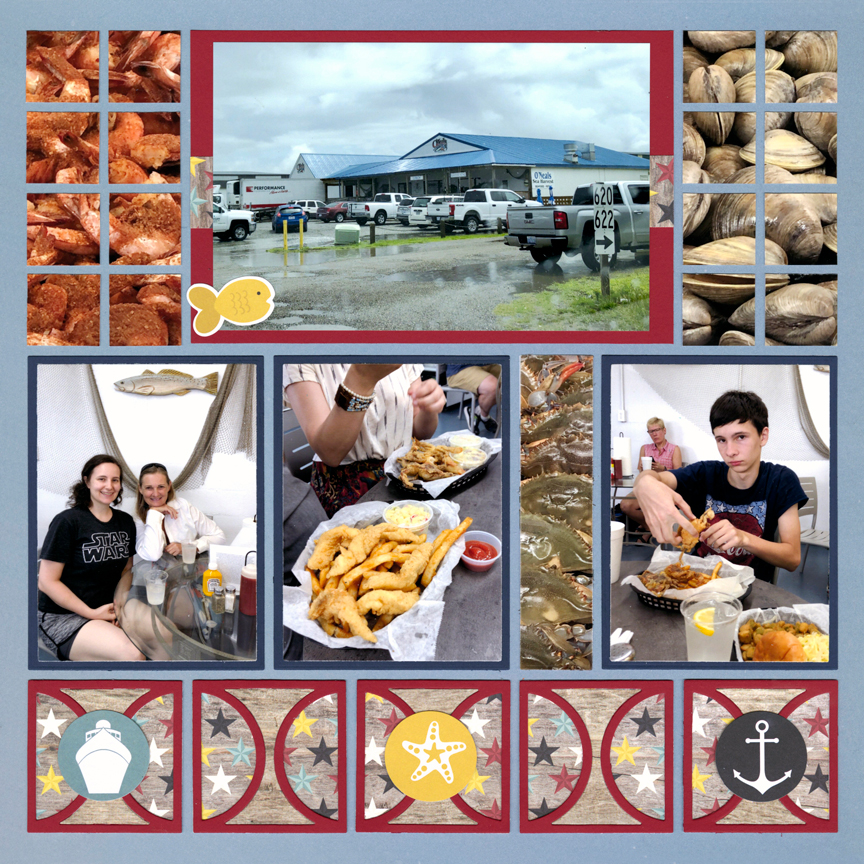
"O' Neils" by Paije Potter - Pattern #437
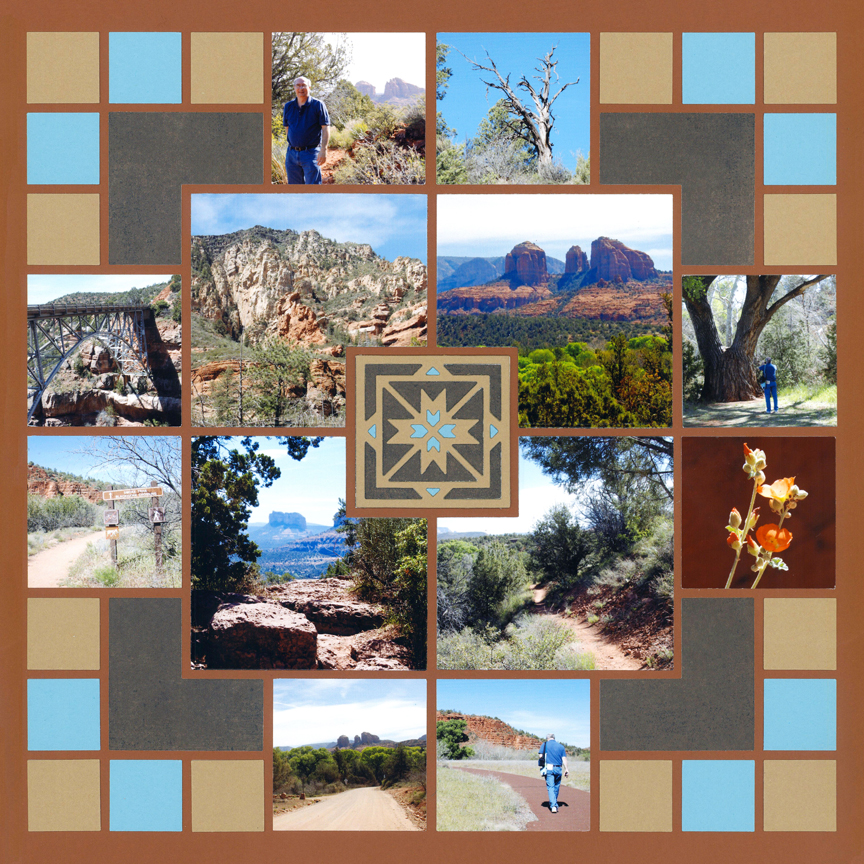
"Sedona" by Paije Potter - Free-styled Layout
Bright colors, such as the blue and red, were chosen since this theme park also had lots of bright colors.
Primary colors (Blue, Red, and Yellow) are great for pages with young children. They fit perfectly for a layout about Sesame Place - a park themed for pre-schoolers.
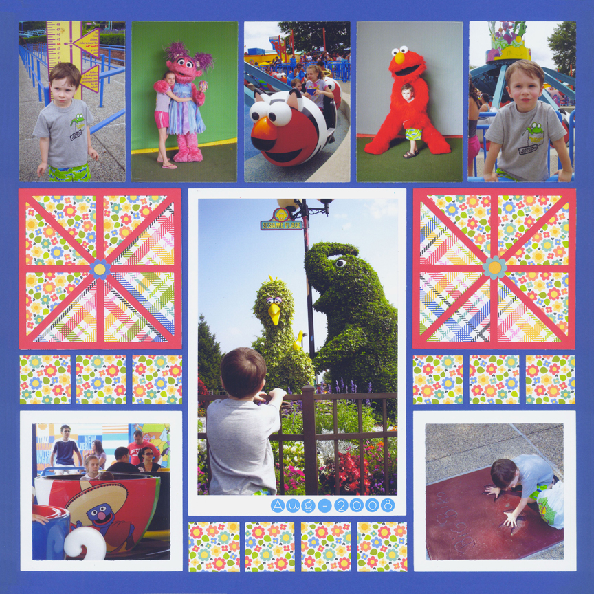
"Sesame Place" by Paije Potter - Pattern #267
5. Try Seasonal Colors
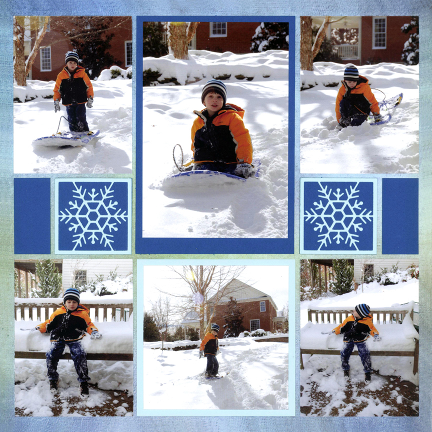
"Snow Day for Cole" by Paije Potter - Pattern #444
"Pink Ladies" by Paije Potter - Pattern #467
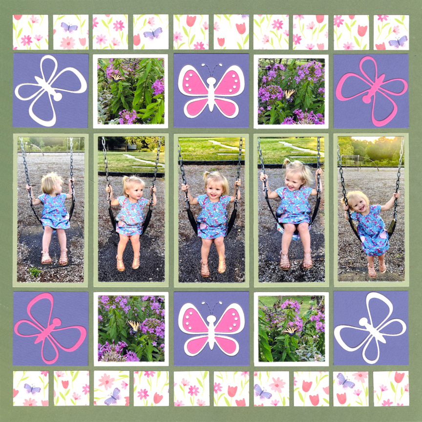
"Swinging" by Jodi Benson - Pattern #464
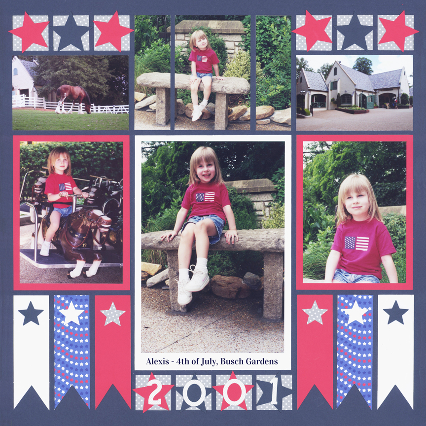
"Alexis 2001" by Paije Potter - Pattern #252
6. Express a Mood
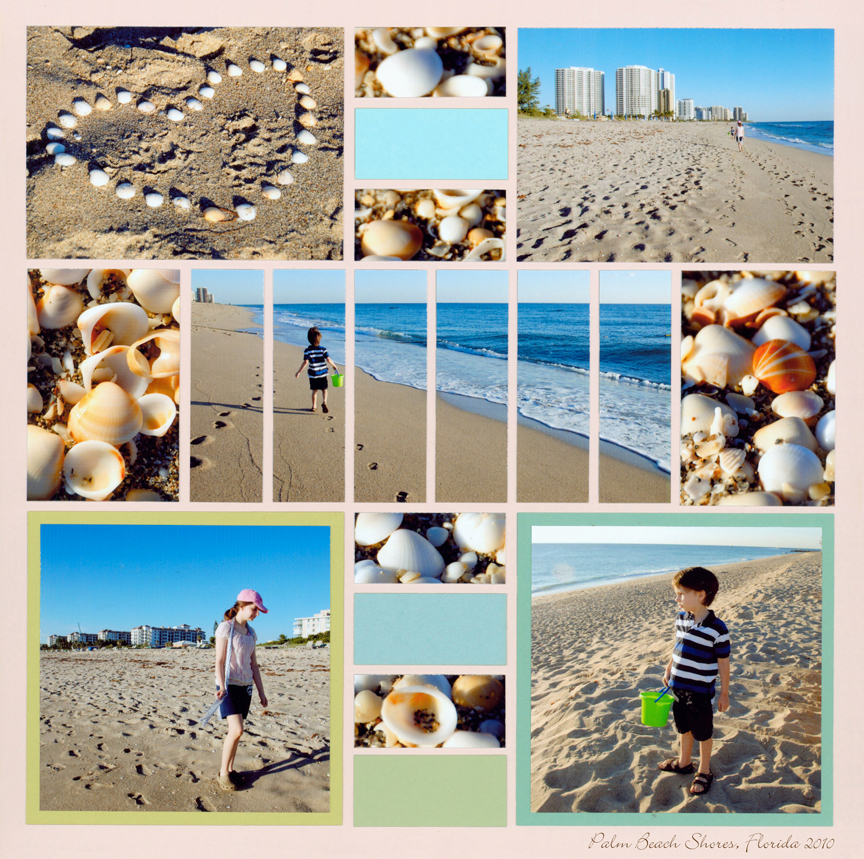
"Palm Beach Shores" by Paije Potter - Pattern #193
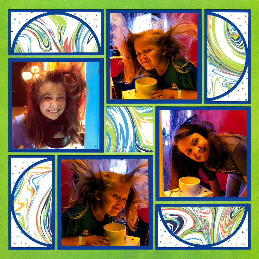
"Floating Hair" by Danielle Lawson - Pattern #373
"Hike Yellowstone" by Paije Potter - Pattern #213
"Evening at CW" by Paije Potter - Pattern #108
7. Focus on the Theme
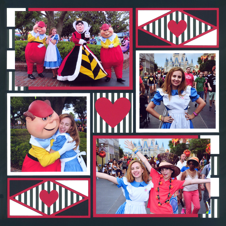
"Alexis as Alice" by Paije Potter - Pattern #327
For these Alice-and-Wonderland-themed photos, the colors were based on the black, white and red of the Queen of Hearts.
While blue and white could also have been chosen, the Alice in the photos would not have stood out as well as she does with the Queen-of-Hearts theme.
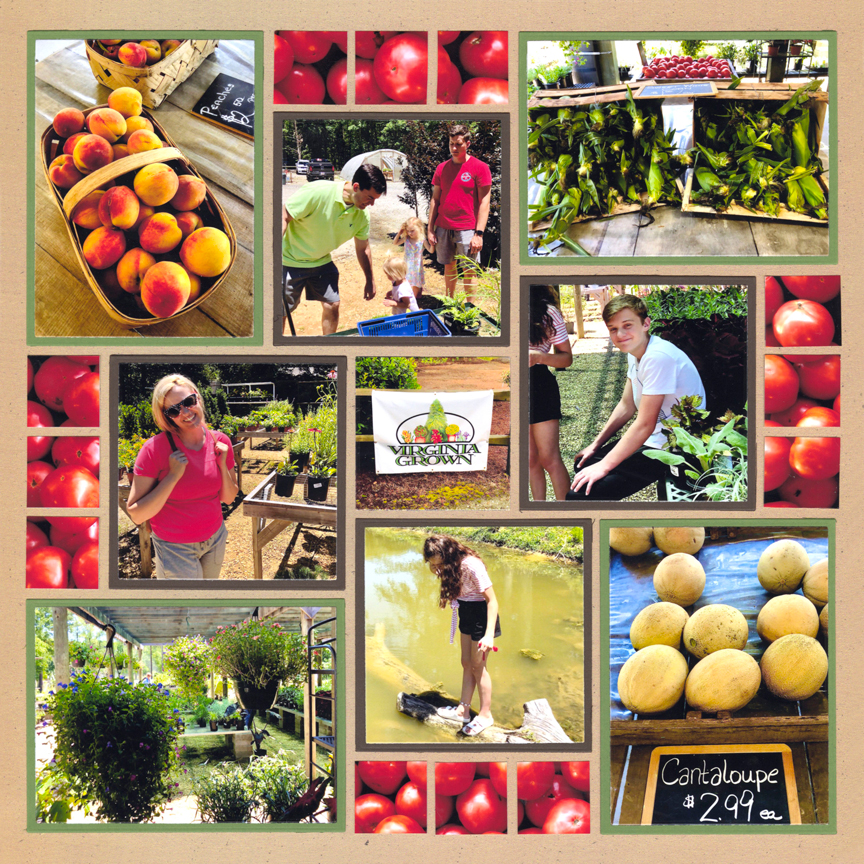
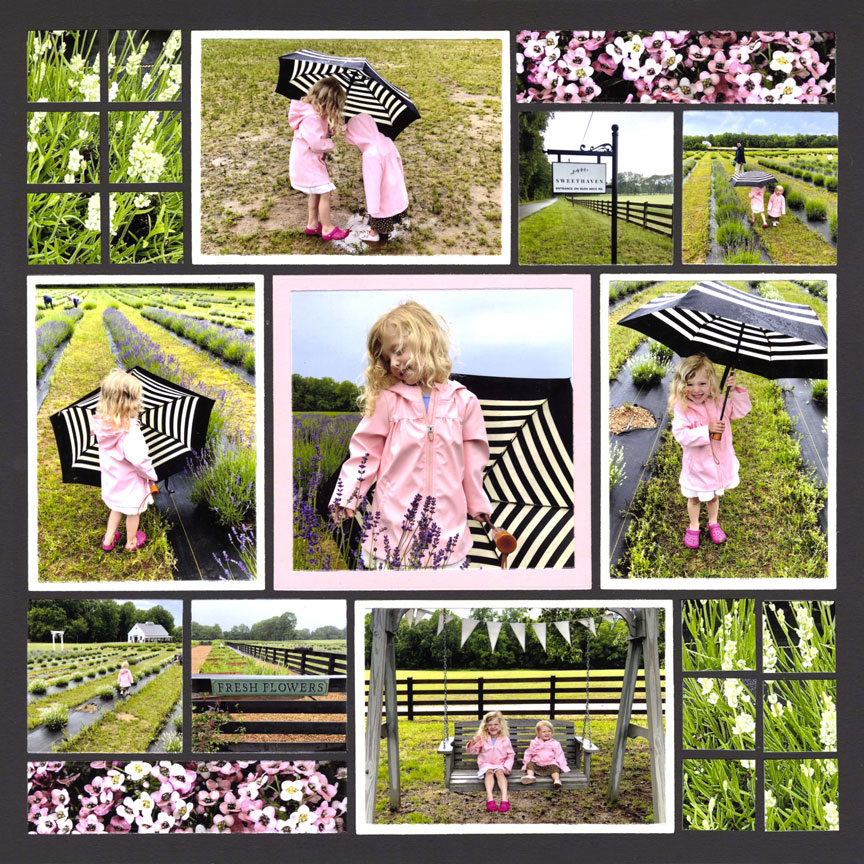
"Virginia Grown" by Jodi Benson - Pattern #576
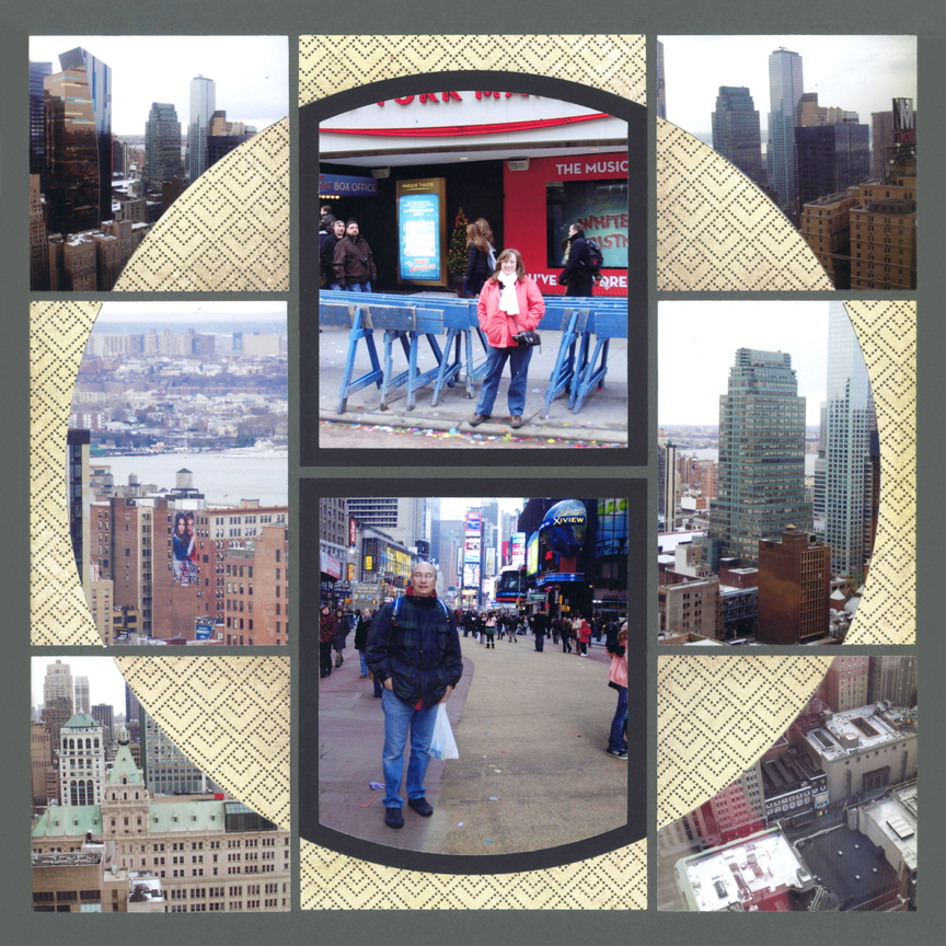
"New York" by Paije Potter - Pattern #446 (Rotated)
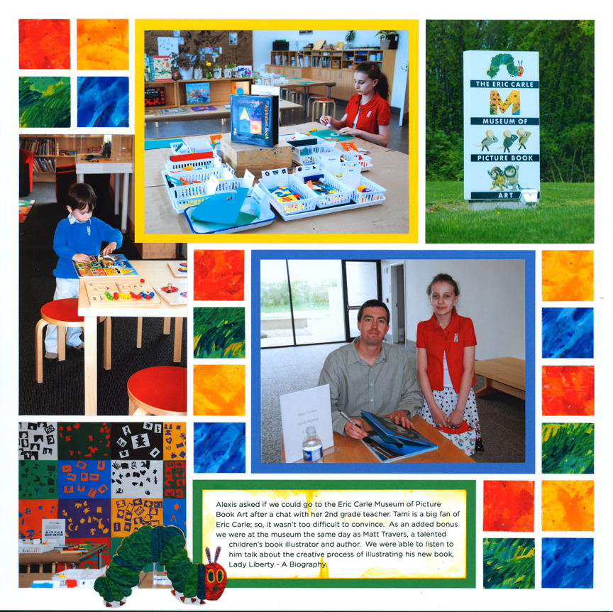
"Eric Carle Museum" by Tami Potter - Free-styled Layout
8. Try a Touch of Personality
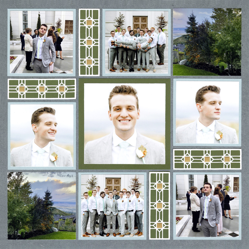
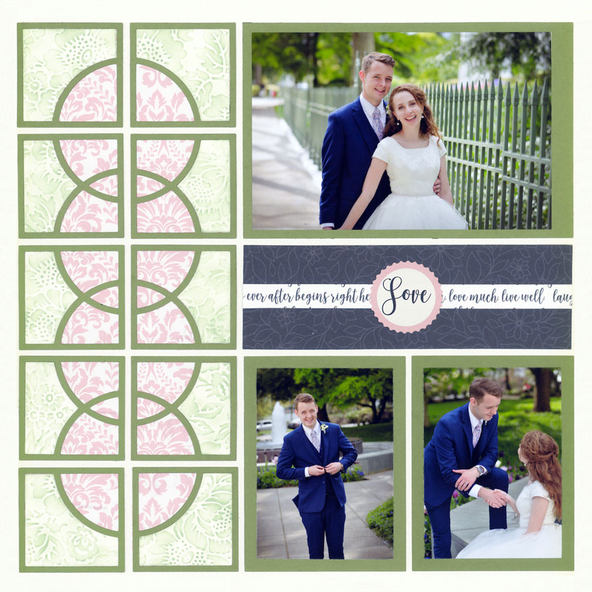
"The Groom" by Jodi Benson - Pattern #448 (mirrored)
This page has very masculine feel due to the dark blue background and green. Plus a little bit of gold was added for the "wedding" theme. The colors chosen have a mature feel.
For pages of adults, it might be more appropriate to use darker or muted tones.
These bright-and-bold colors fit with this girl's personality. Choose colors that fit that particular person. Bright colors are great for an outgoing personality. Pastels are often chosen for someone who is shy and sweet.
Tip: If you are struggling to pick a color, use that person's favorite one. Not only will it fit their personality, but it also helps tell their story.
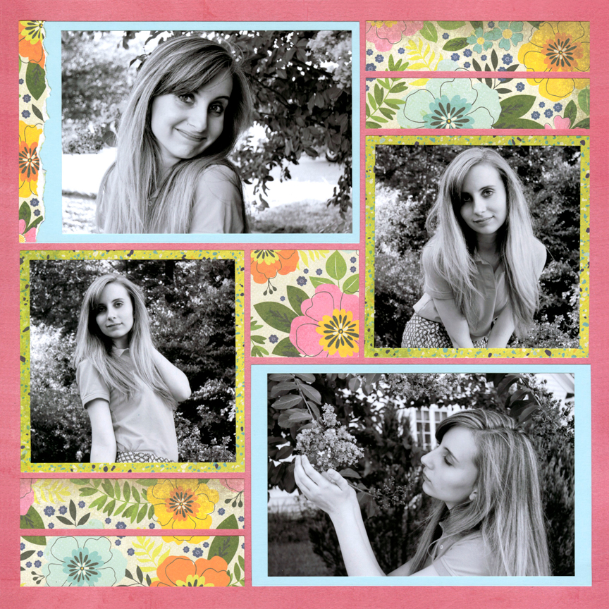
"Alexis 2014" by Paije Potter - Pattern #520
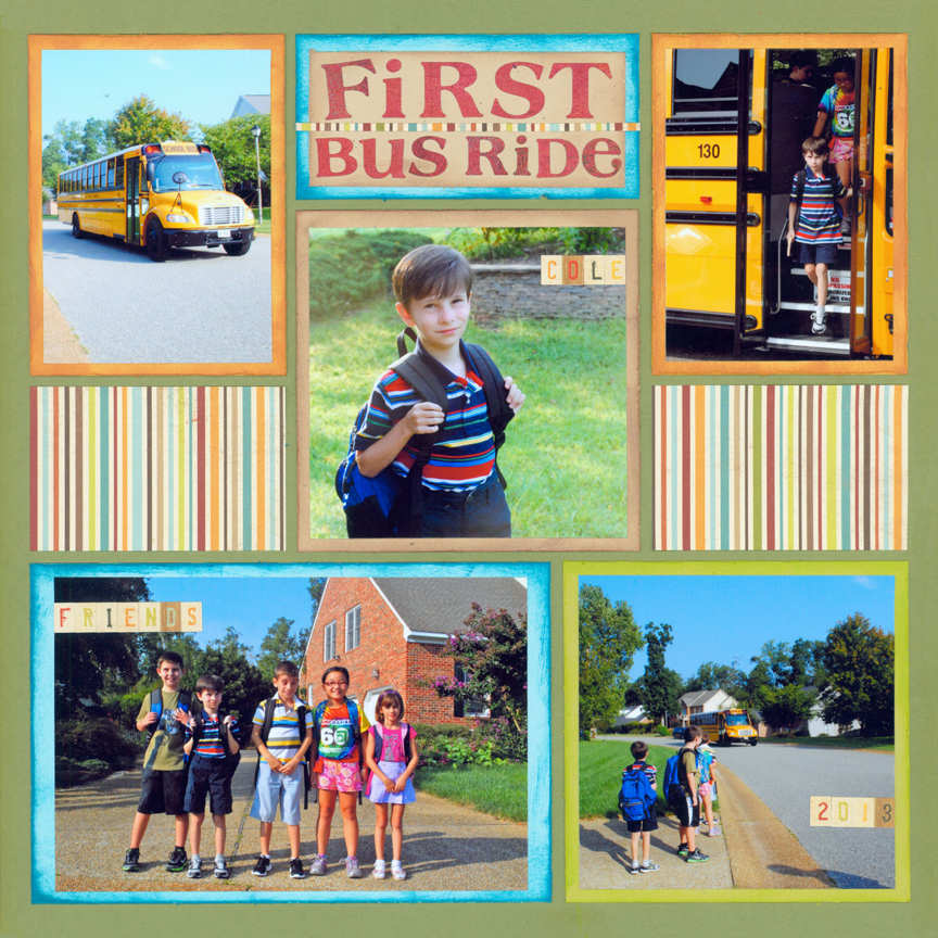
"First Bus Ride" by Paije Potter - Pattern #142
Consider the age of the person on your page. For children, you may want to use brighter hues.
Here, multiple fun-and-bright colors were chosen, which fits perfectly for a grade-schooler.
The younger the child, the brighter the colors. As kids age, it's usually more appropriate to use darker and muted tones.
Of course feminine pages don't have to be pink! Pastel colors work wonderfully for a "girly" layout.
You can choose colors based on the gender of the person. Common feminine colors are warm such as pinks, reds, and yellows. Masculine colors tend to be the opposite - so cool colors such as blue and green.