
What is next after you’ve worked with the Basic Dies? Let’s explore the possibilities!
There are a number of Level 1 Explore Dies that are easily included in your layouts that help carry your theme or just add a decorative element to your layout.
While we enjoy being able to get so many of our photos on a page, it’s nice to be able to create an interesting page with places to allow our eyes to rest or direct us around a layout, and add something new.
Some of these extra dies are sized to cover a four-block area 2×2, others are strips covering 1×2, 1×3, and 1×4 spaces, even a few 2×3’s will fill the bill. Many of these sets also include a 1” square die to carry the design into even more spaces.
Some of these dies give a twist on the plain 3×3 or 4×4 with a decorative frame.
Let’s look at a few ways to incorporate these special dies as we move beyond the basics, explore the possibilities and add some flavor to our creations.
Some of what we can do is just based on our personal likes. Do you have a die that you really like the design, maybe it even fits your theme?
Some of our choices have to grow on us. Maybe it’s the latest die out and you liked how you’ve seen the designers show it off, but now, you are staring it in the face and you aren’t quite sure how to incorporate it in the project before you.
You can choose to cut these elements from any number of materials or cardstock colors to contrast or match photos, mats or even your grid choice.
When you choose mats to match your grid choice, the die piece will blend into the background and the choice of photo or background paper will be more prominent.
Monochromatic, high contrast, or even colors to support your theme are possibilities that all render different looks. Sometimes, you just can’t beat playing around to see how things look. Don’t be afraid to change things as you go. Sticking to a choice even if it’s not feeling right as you go will deter you from trying it again. You can always save pieces you discard this time for a future project.
A pattern is always helpful to work in these die choices. Viewing the Pattern Gallery can be a quick way to separate patterns to use. At a quick glance the colors in the patterns identify those spaces you will need in order to fill with your selected dies.
The 2×2 spots can be reserved for photos or easily be replaced with the 2×2 dies of your choice. The other strips are less likely to be filled with photos and become a great place to include your chosen dies.
Some of these dies will carry a playful feel, others a bit more formal. The same die you include in a garden page might be excellent in a heritage page too.
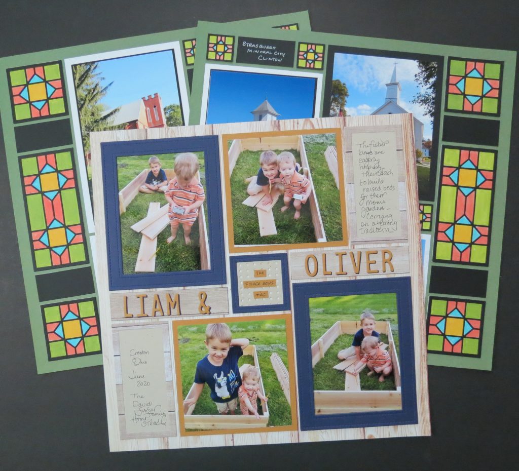
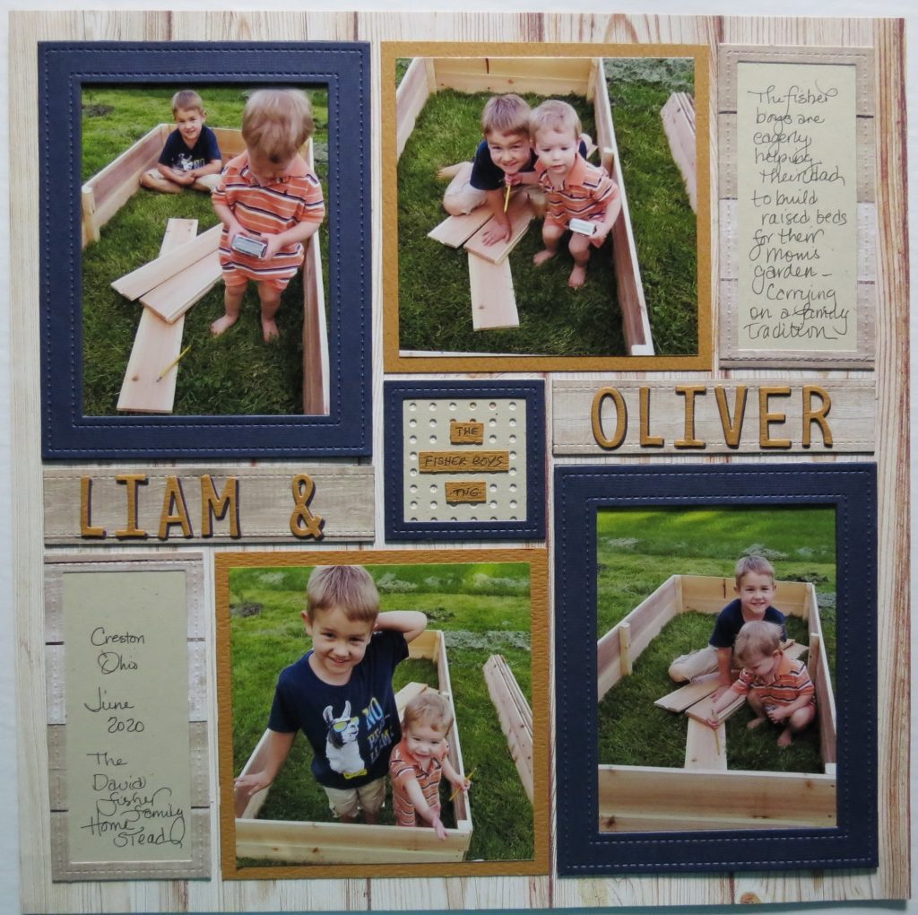
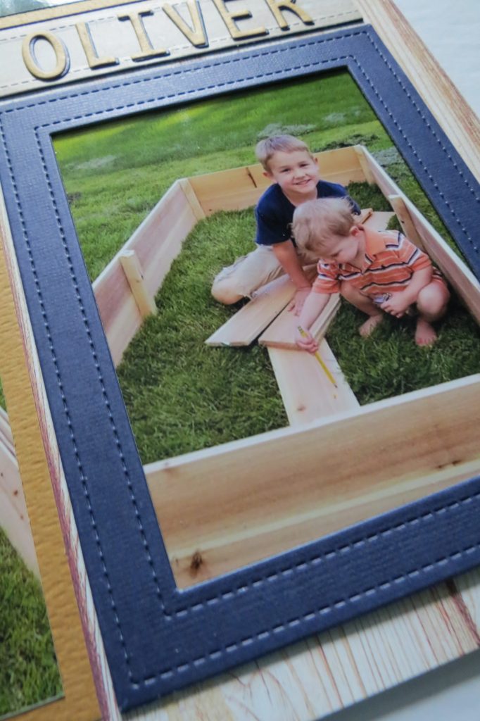
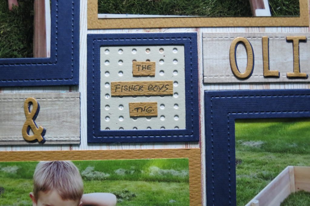
Liam & Oliver the Fisher Boys TNG
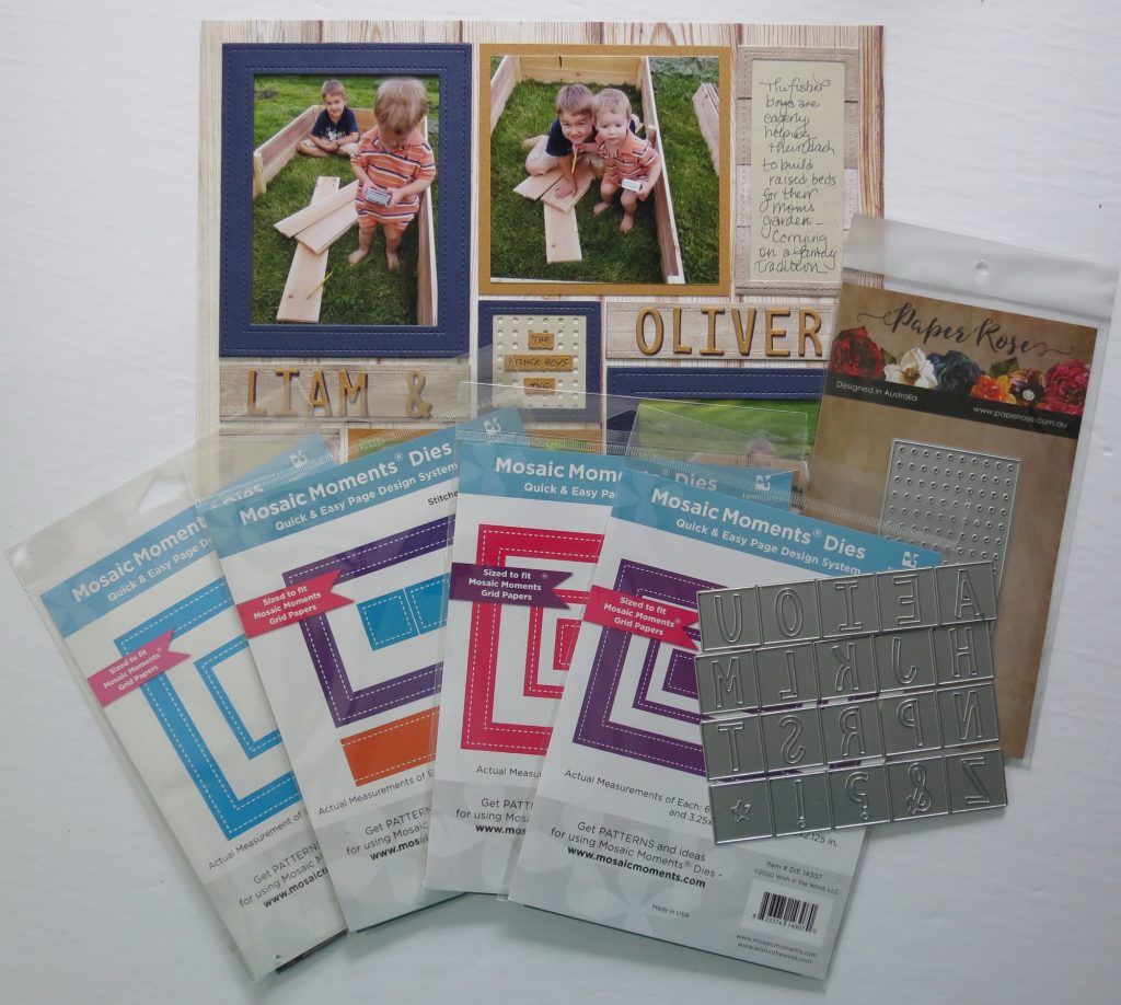
I’m going to start with a simple upgrade to the Basics…our family of Stitched Frame Dies, for some of my photos plus a shadow Alphabet Title in addition to still layering a couple of photos.
- 4×6 stitches frame set 2×4
- 4×5 stitches frame set 4×5
- 3×4 stitches frame set 1×4
- Stitches Frame 4×4 (which includes the 2×2)
- Alphabet 3
- Pattern #486

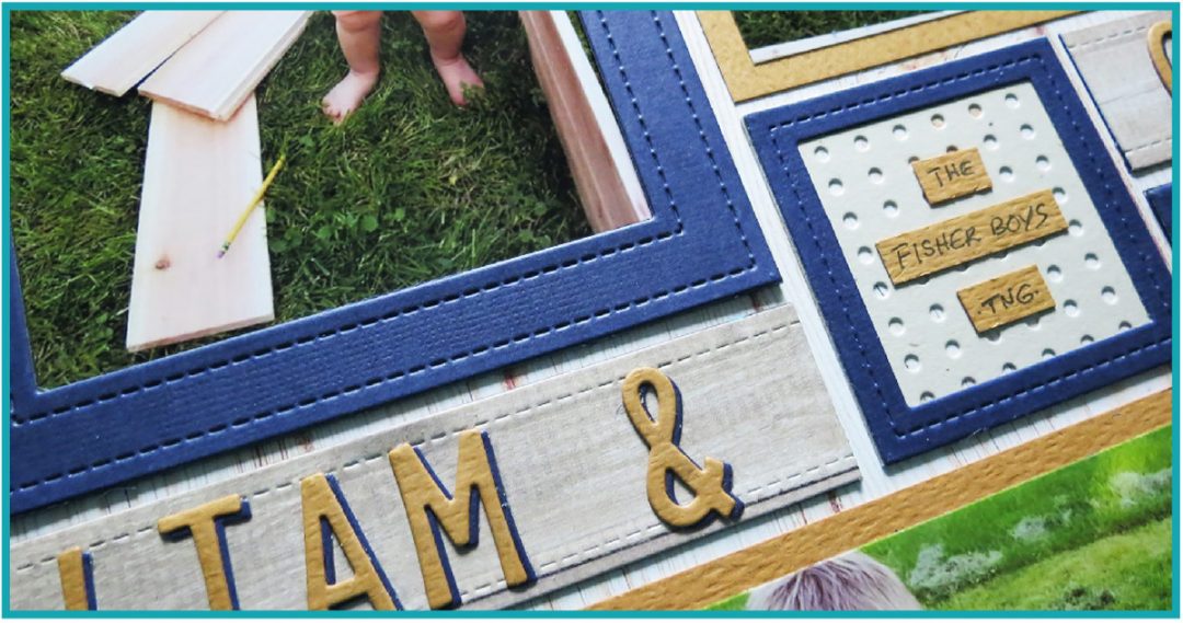
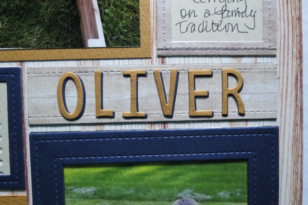
Here’s how I put things together. I began with Bleached Wood Mosaic Moments Grid Paper to fit with my photos of the boys building. I’m using the Stitched Frames which gives me the jeans type stitching just perfect for the boys, and in navy, the color picks up on Liam’s shirt and the stripe in Ollie’s outfit. I cut two additional frames in black for each frame to stack and give a little bit of a shadow or depth to the frame.
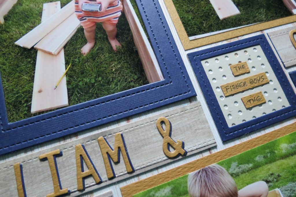
I’ve matted with a burnt orange cardstock for two photos and tan for my journal blocks that I frame out with wood plank paper 2×4 stitched frames. I’ve used a new die from Paper Rose that cuts a pegboard panel, I thought it was perfect for my little carpenters, just like their dad’s workbench. I’ve put that directly to the grid, added a narrow 2×2 stitched frame on top and added a strip of tags for a title.
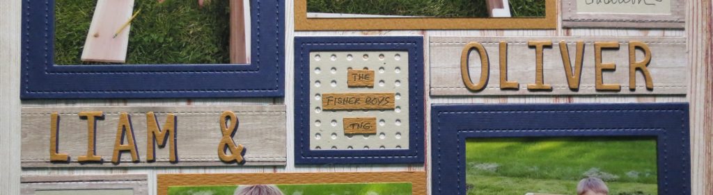
I have cut the letters using the Alpha 3 die set in both the navy and the burnt orange to add their names. I apply the letters to a 1×4 stitched strip of wood plank paper that has stacked two under layers. I wanted to get a wood plank element to match the lumber in the photos. I began with the navy and then added the orange on top slightly off to allow for a shadow effect.
These are just a few ways to step your Basic pages up with the use of Level 1 – Explore Dies. Now I’d like to try something a little more intricate. This time with the new Craftsman Dies.
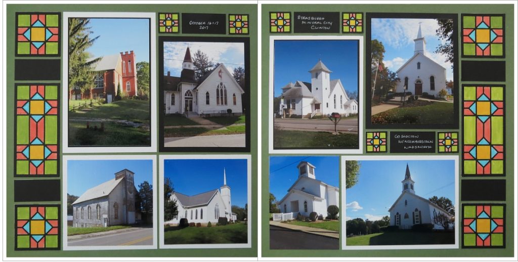
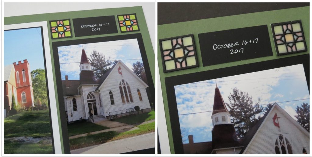
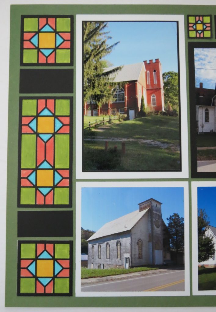
Historic Ohio Churches
One of the things I enjoy photographing are old houses and historic churches. There’s a lot of interesting architectural finds out in the country that often go unappreciated. These churches were taken mid-October a few years back when I was out in search of fall colors, finding very little. I was on the Barn Quilt Trail in Coshocton County so I got several of those, but along the way I stopped to capture a few of these churches too.
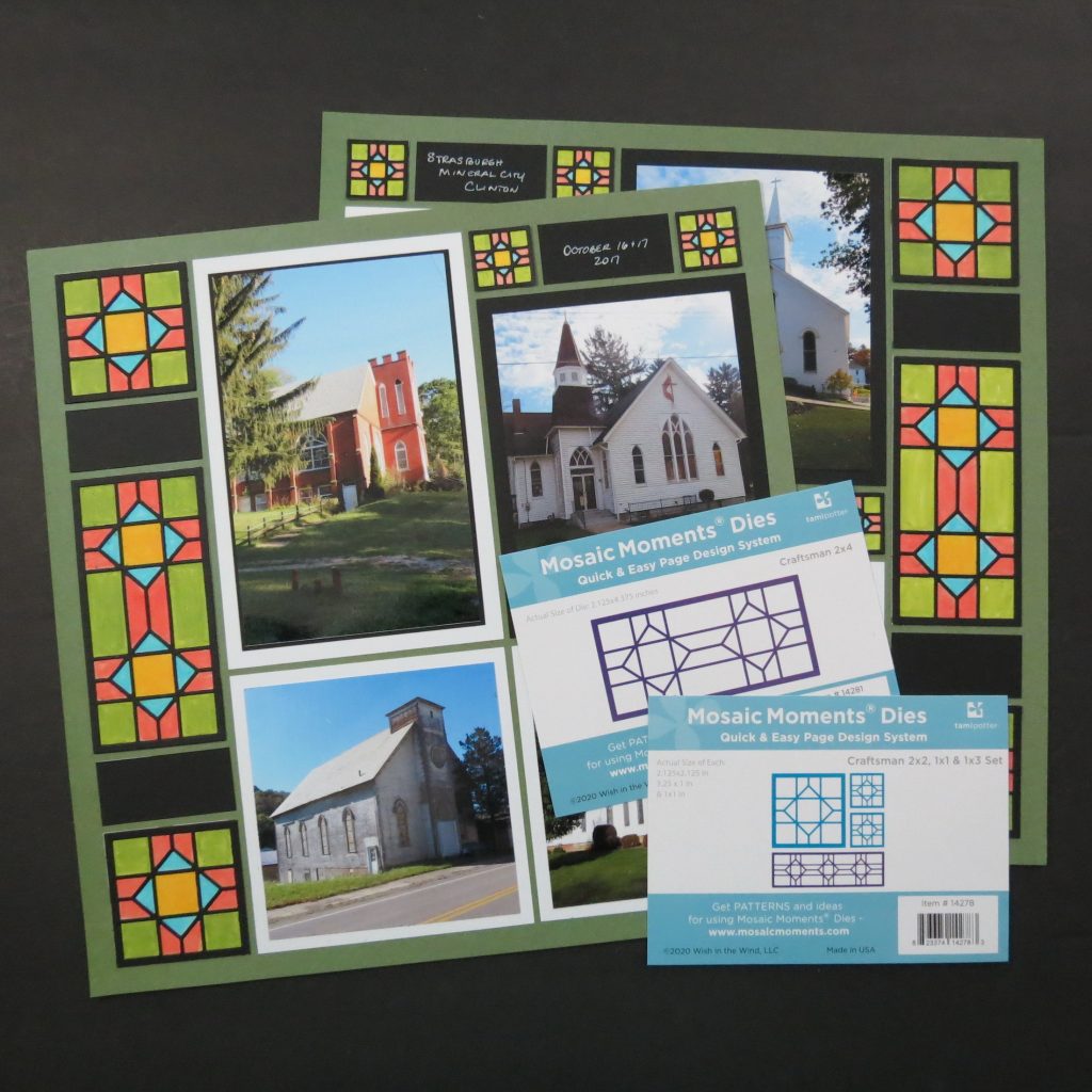
For the most part the churches are all white with either black or gray roofs like the mats I have chosen to use. Meadow Green from the Mosaic Moments Trailblazer Collection was a good shade of green to use for the fall greens in the pictures.
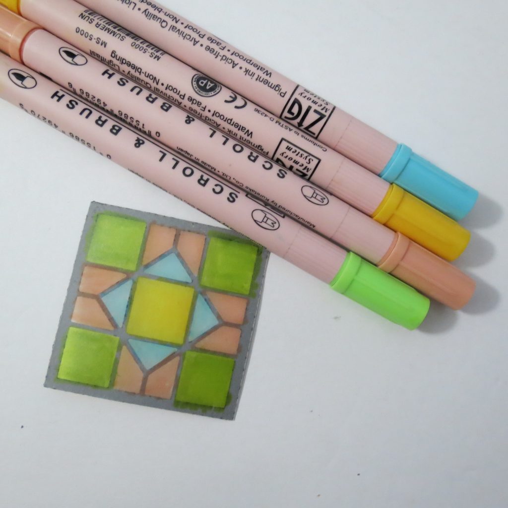
What I needed to add in was some color. The new Craftsman Dies were just right for a touch of stained glass. The colors I chose are Island Coral, Bluebonnet, Summer Sun and Kiwi Zig Brush markers. I have colored the back side of vellum that I have attached to my Craftsman die pieces. This helps to mute the colors. I did two layers of color making it a bit more vibrant, not unlike stained glass with the sun shining through. Now these dies also make a nice quilt like element on your pages too!
I’ve used this technique before and after trying a few other ideas, I came back to this. However, let me show you a few of the other techniques that you can use with this Level 1 Explore die set.
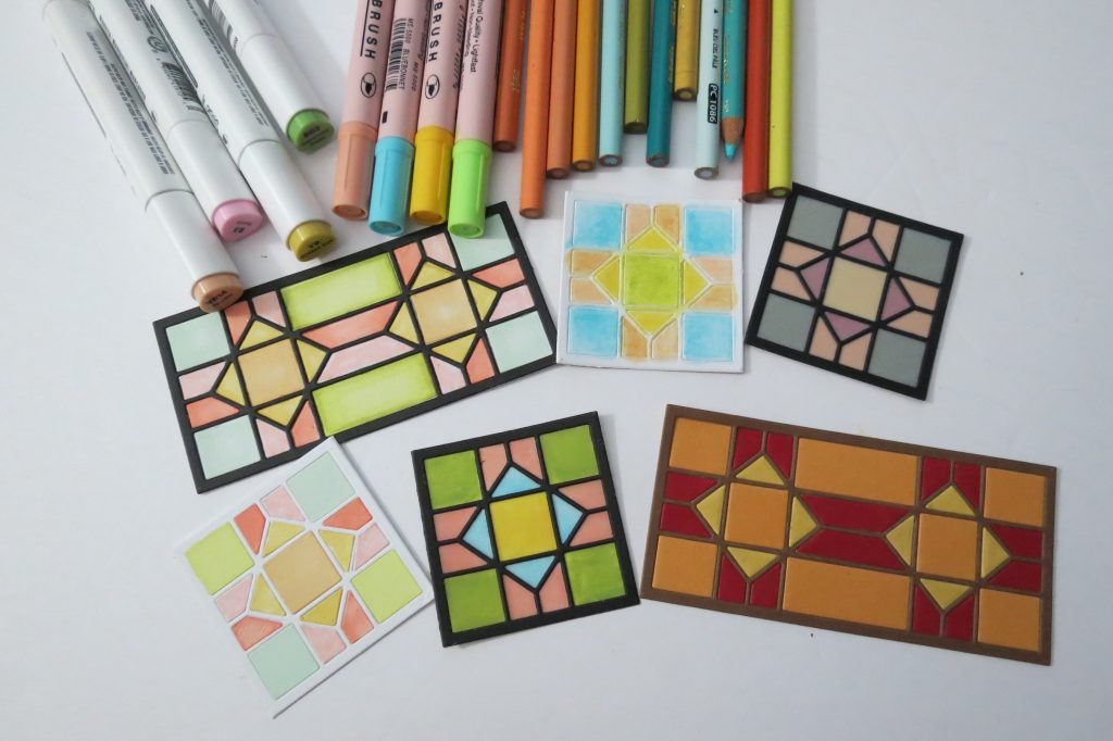
- Cut from white cardstock and adhesive on the backside I used my alcohol markers to color in the spaces. Then Cutting a black die section and adhering over the white, I cover up all the imperfections. If you like blending your colors this is a good way to get that wavy colored glass look.
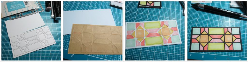
- Cut the die in several colors of cardstock and fill in the pieces. I found these cardstock colors to be a bit too bold and solid looking for me, so I also tried a second layer with another die piece backed with vellum giving it a muted look, much better, I thought for this application.
- My default is usually to color with Prismacolor Pencils and blend with Gamsol and a paper stubby. I can layer colors and then blend nicely, but it just wasn’t what I wanted this time.
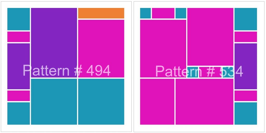
My search for a suitable pattern led me to choose Patterns #494 and #534. They both had a side column that would allow me to use both the 2×4 and the 2×2 Craftsman Dies. With a little adjustment to the #494 pattern I was then able to use the 1” square die on both pages too.
With only a slight exception, all 8 of my photos were landscape photos, so I really shouldn’t have picked these patterns, but with a few editing steps, they all became useable in these pages without sacrificing too much. They were patterns that suited my dies, and that was important.
The smaller 1” squares I thought might be too much color on the page and so I also made vellum layers for a more muted look, but maybe that was too subdued and I went back to the originals. I’ll save those discarded 1” squares for another time!
I’ve kept the tagging/journaling to the inside sections and let the outside 1×2’s in black be a part of the design.
The Explore Level Dies don’t have to be plain and simple all the time, you can explore the possibilities for adding color and details without too much more work.
I hope you’ll try and see how you can incorporate some of the Explore Dies into your formerly Basic Layouts and have some fun exploring the possibilities!
Andrea Fisher