
Determining which colors go together on a layout can be a challenge.
While artists may study color theory for months, scrapbookers can learn the basics right here.
Monochromatic
Monochromatic is a fancy word for a single color. Different shades are created by adding white, gray or black to a color. For example, take blue. If you add gray, you can get more a denim tone. Add white and you have sky blue. Add black and you have navy. But all of these colors began with the same basic blue.
When you combine these different shades of blue you are working with a monochromatic color scheme.
Creating a layout with a monochromatic color scheme is easy. You simply pick a color and then select a few shades of it to work with. Check out these examples.
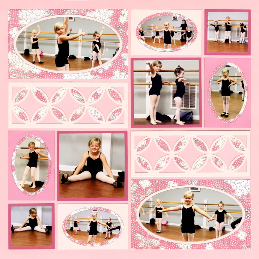
"Little Dancer" by Danielle Lawson - Pattern #366
All Pink
Let's start with pink. In this layout, Danielle used multiple shades of pink. Alternating the shades keeps the eye moving around the page to take in each adorable ballerina.
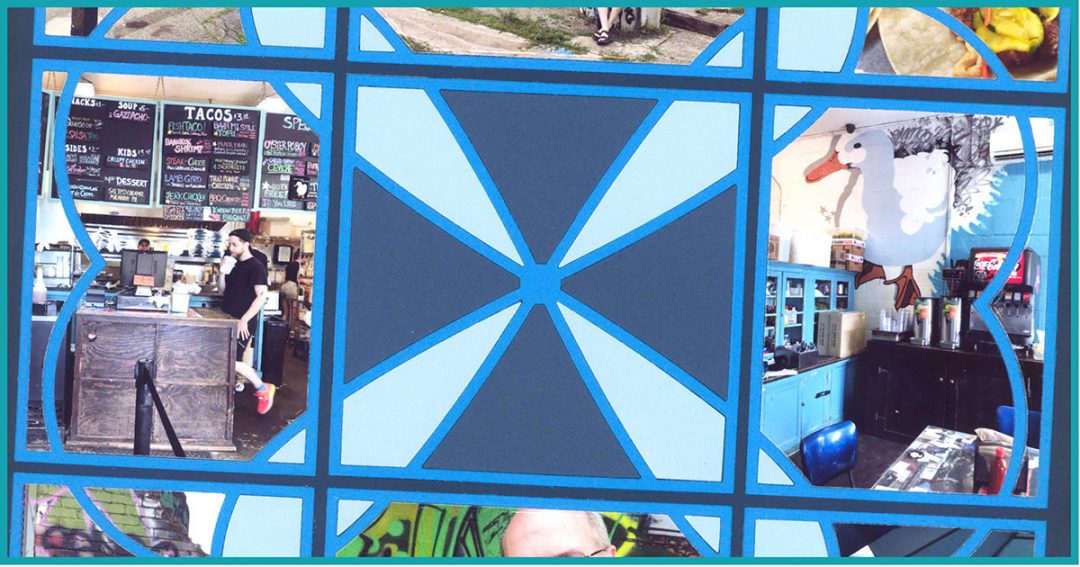
All Blue
This one focuses on four-different shades of blue. The blue heart outlines, made from the Sweetheart Dies, really pop against the navy blue grid paper.

"Anniversary Trip" by Tami Potter - Pattern #344
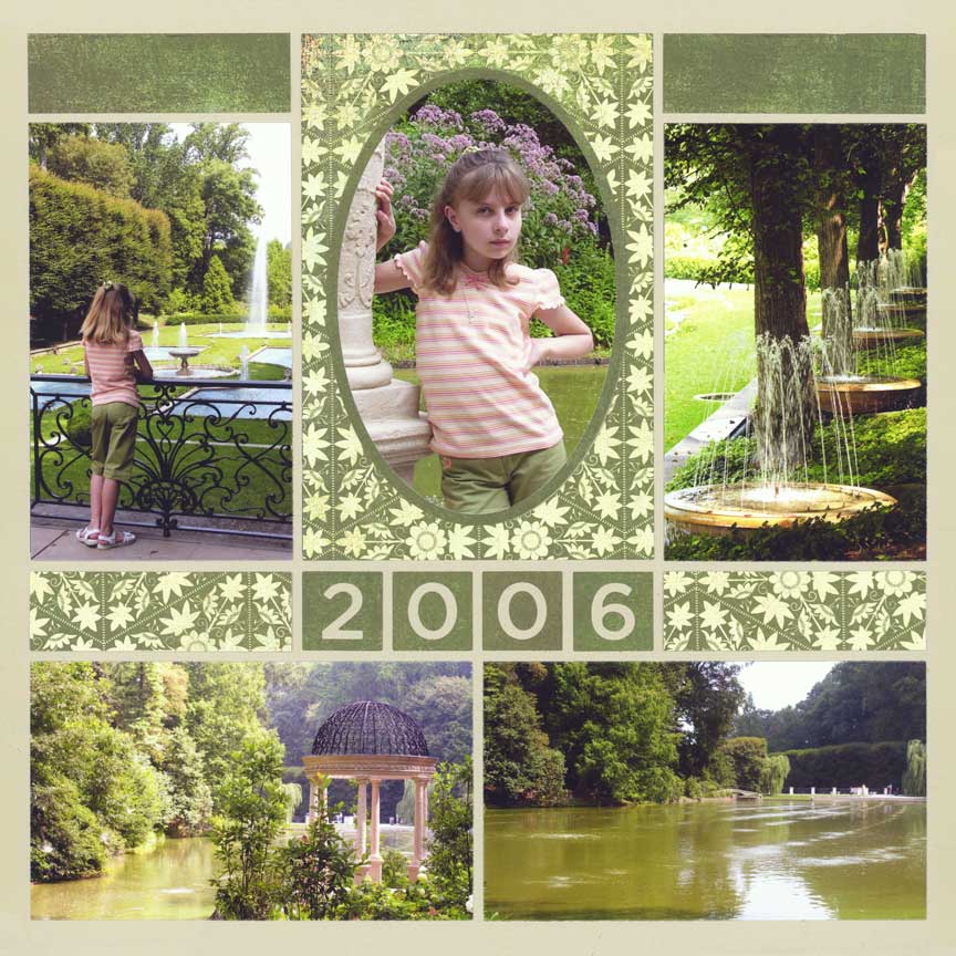
"Alexis at the Gardens" by Tami Potter - Pattern #328
All Green
This layout is almost all green shades of green -- from the grid paper to the water, to the shorts Alexis is wearing. Keeping everything green provides a soft, relaxing feel to the layout.
All Purple
The monochromatic shades of purple on this layout are extremely close together. So, unlike the blues in the layout above that really pop, these purples blend together to create an interesting backdrop for the photos.
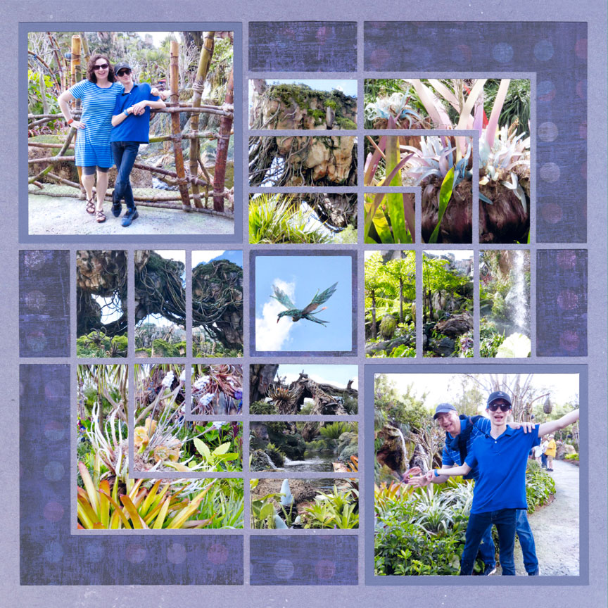
"Pandora 2018" by Paije Potter
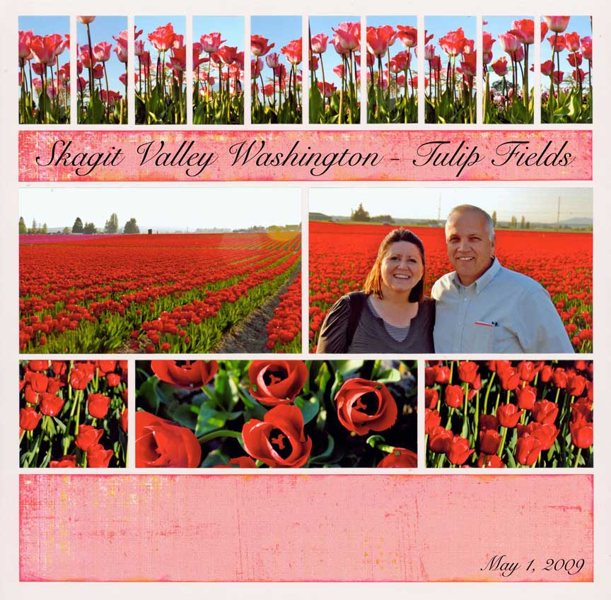
"Skagit Valley" by Tami Potter - Pattern #207
All Red
When a bold color is too much for a painting, an artist will often add white to the color to soften it. When white is added to red, it becomes a shade of pink.
On this layout, Tami knew red would be too much, so she went with a pale pink grid paper and a reddish pink paper. Adding a bit of red chalk or ink around the edges of each pink element can help blend it into the red flowers.
Analogous
Analogous colors are next to each other on the color wheel.
What's a color wheel? Well, take the two ends of a rainbow and make them so it become a rainbow circle. That's basically a color wheel. The basic colors on a color wheel are red, orange, yellow, green, blue, and purple.
Learn more with these examples of analogous color schemes.
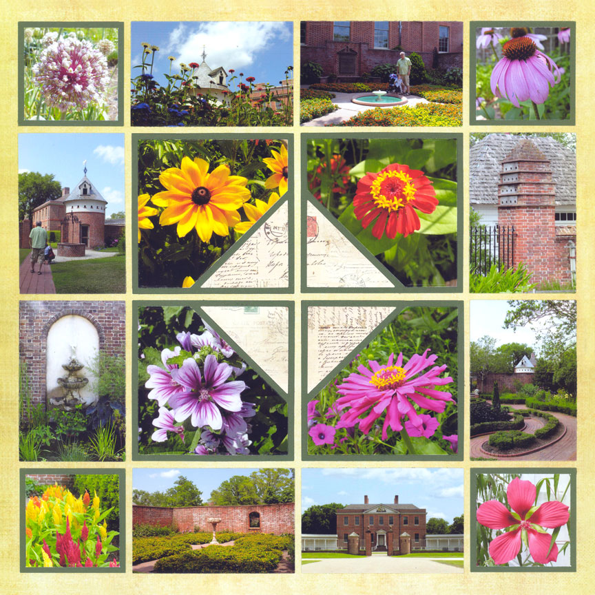
"Palace Gardens" by Paije Potter - Pattern #407
Green & Yellow
Analogous colors often have the same base color in them. So, if you think all the way back to kindergarten art class, you may remember making green from yellow and blue.
Both green, and obviously yellow, have yellow in them and they work beautifully next to each other, as you can see on this layout.
Blue, Purple, & Pink
Likewise, blue and red make purple and the three colors are next to each other on the rainbow or color wheel.
Here, blue, purple and pink, a lighter shade of red, work beautifully together.

"Lovely Lily" by Paije Potter - Pattern #324 (mirrored)

"Disney's Asia" by Paije Potter
Red-Orange & Yellow
The grid paper used on this example is an analogous color scheme all on it's own. It features shades from yellow, through orange, to almost red. Pulling those colors out for the photo mats makes a beautiful layout without having to think about what colors go together.
Blue & Green
Blues and greens are a favorite summer color scheme for many. They work well because they are analogous colors. But, they are also are main colors in nature, unless you live in the desert, and they have a peaceful vibe about them.
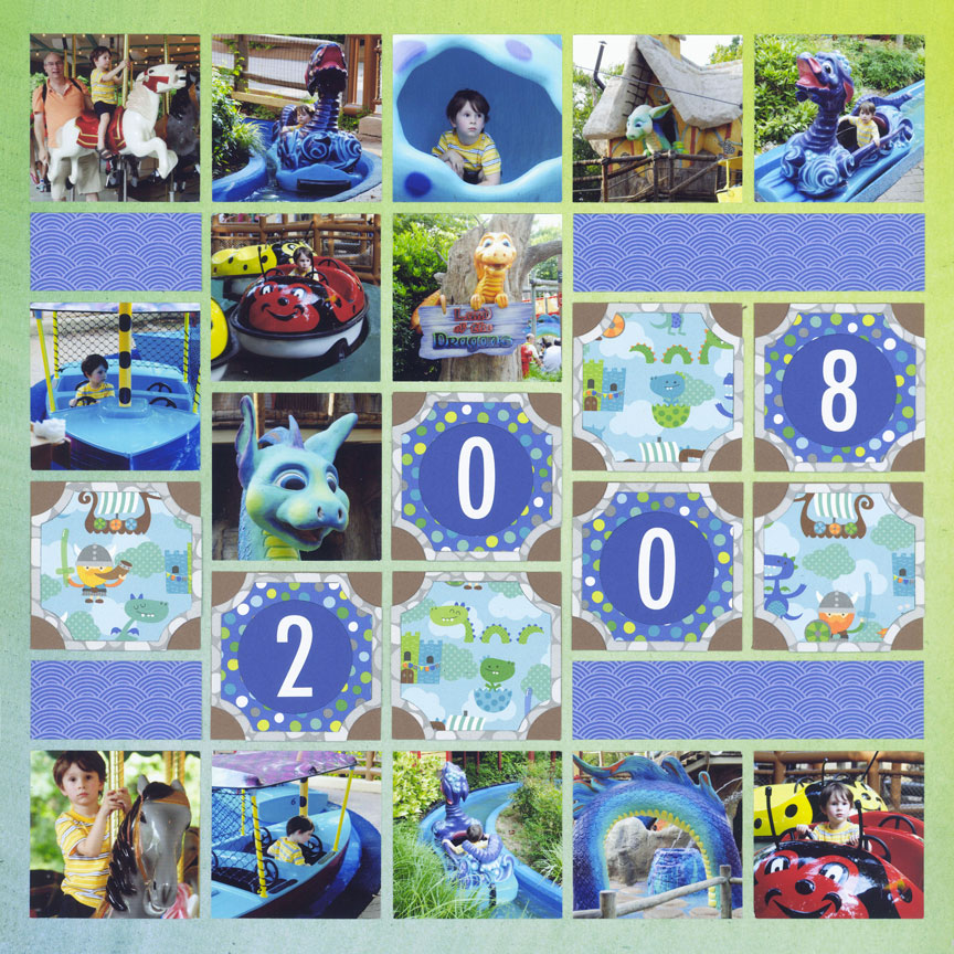
"Land of the Dragons" by Paije Potter
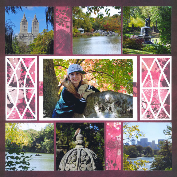
"Central Park" by Paije Potter - Pattern #385
Purple & Pink
Pink and purple are often thought of as colors for little girls. But, when you mix the right colors together, you get these beautiful shades that look amazing with the colors of nature.
Complementary
Complimentary colors are those on opposite sides of the color wheel. These colors have high contrast and may not appear to go together at first.
Traditional holiday colors, as well as some school and team colors, are often complementary -- think Christmas colors of red and green, the purple and gold of the Minnesota Vikings, or the Detroit Tigers colors of blue and orange.
Complementary colors can be challenging to work with, so here are some tips to make it easier.
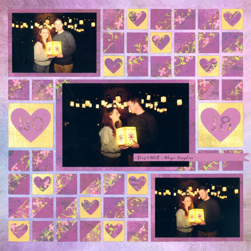
"Tangled Hearts" by Paije Potter - Pattern #445
Purple & Yellow
This layout features the same colors as the Minnesota Vikings football team. However, by softening those shades to lilac and yellow, you immediately reduce the effects of these typically overpowering colors.
Paije also used patterned paper that features many shades of color, rather than solid cardstock in those shades. That helps to keep the color under control as well.
"One tip is to use different tones of one or both colors," Paije said. "Notice there is a mix of light and dark purples on this page, which helps the colors not be too overwhelming."
Red & Green
Red and Green is not just for Christmas. The red apples in the trees was used as the color inspiration for this page.
Rather than match the exact color of green in the photos, Tami used a lighter shade of grid paper to soften the effect.
You can also help tone down the colors by adding neutral colors, like the brown used here, for the photo mats.
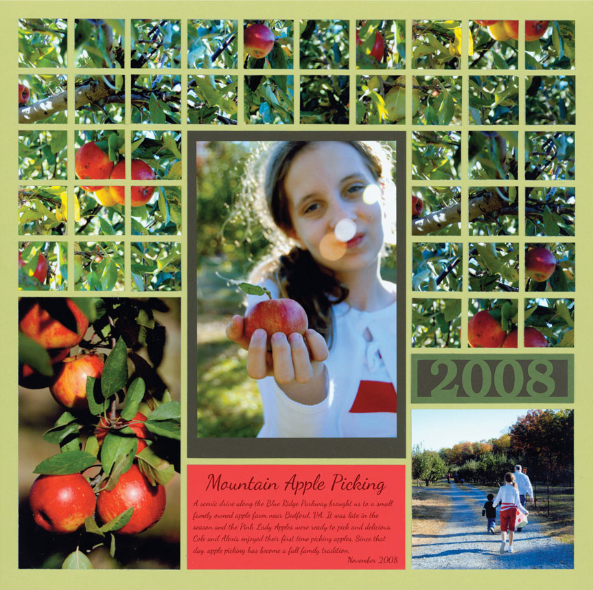
"Mountain Apple Picking" by Tami Potter - Pattern #319
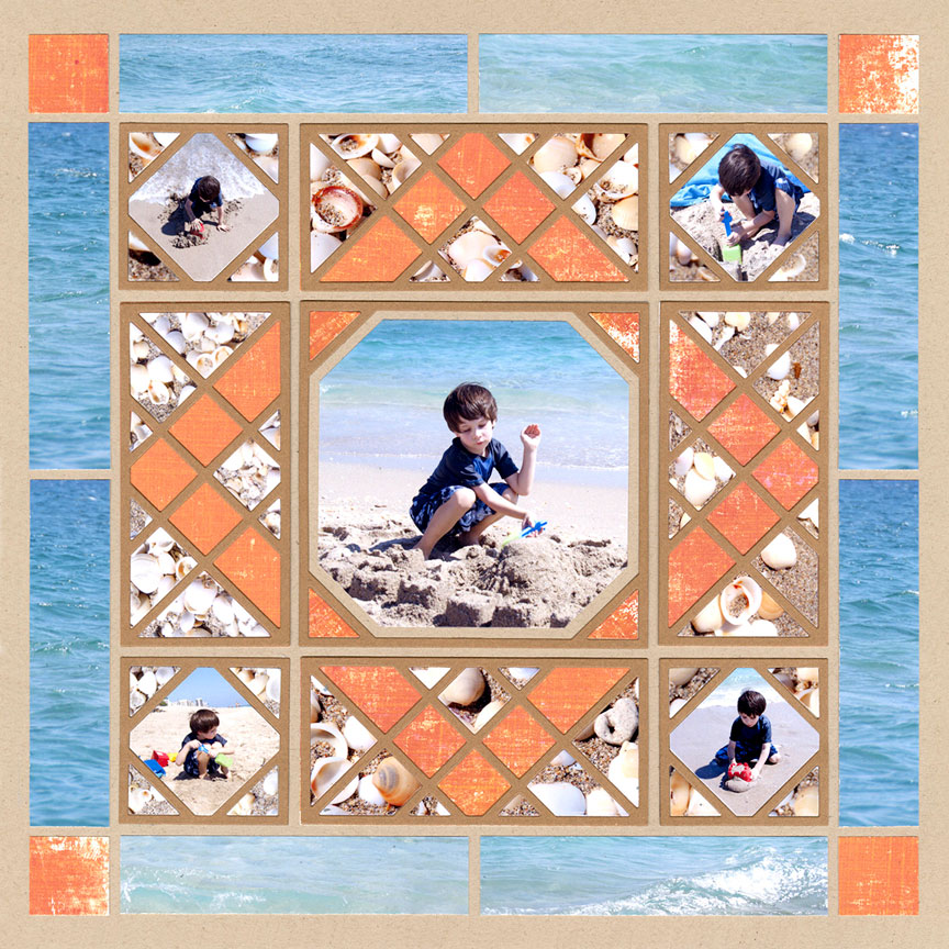
"Florida Beach" by Paije Potter - Pattern #545
Blue & Orange
Blue and orange are very bright on this layout, but again, by using pattern paper has a bit of white in it, and the ocean photos that have varying shades of blue and white, the colors are pleasing and not jarring.
Paije used a neutral background and cut the X-Factor dies with brown to keep the brighter colors in their place.
Bright Pink & Lime Green
When you want to use bright colors, try adding a bit of white or black. White and black, unlike a brown or gray shade, keep the drama created by combining bright colors. But, they still provide a resting place for your eye.
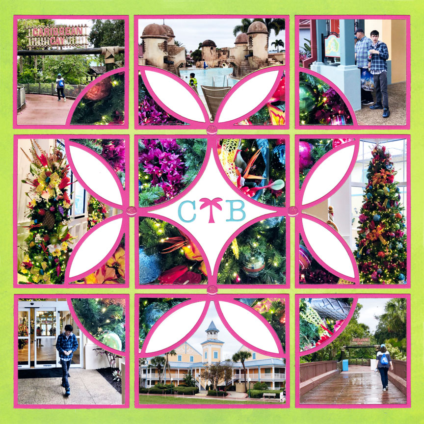
"Caribbean Christmas" by Paije Potter - Pattern #344
Color Combination Ideas
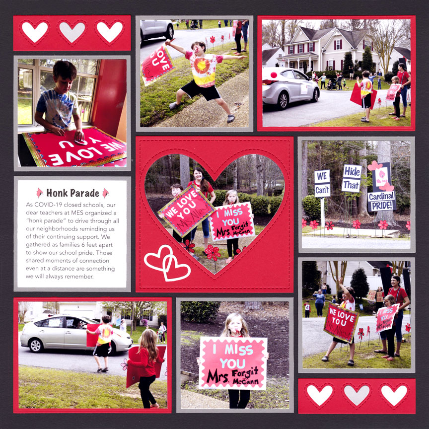
"Honk Parade" by Danielle Lawson - Pattern #502
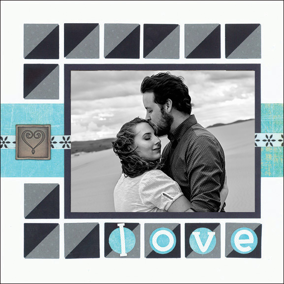
"Love" by Paije Potter (8x8 Grid)
Black, White, Grey, and One Color
A black and white color scheme looks very classy with one bright color such as red or teal. Black and white are very contrasting and can bother your eyes if not used carefully. So, be sure to add some gray colors to help tone things down.
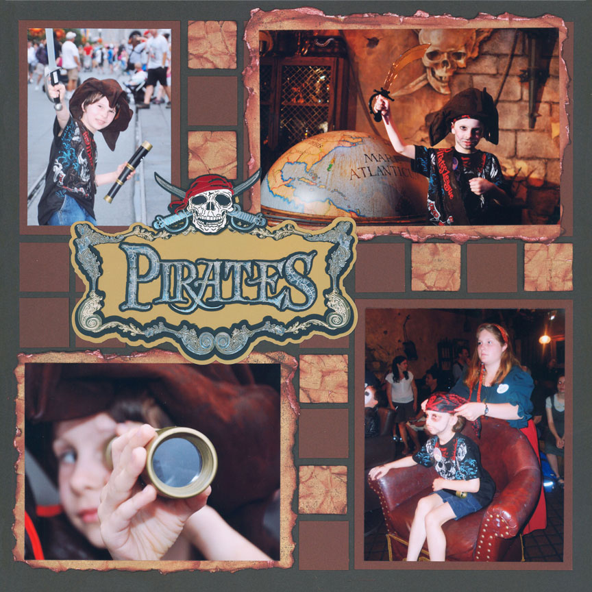
"Pirates Life For Me" by Paije Potter
Keep It All Neutral
You don't always have to use bright colors on your pages. All browns work so well with many photos since they go with just about everything! Brown may seem boring, but look closely and you will see they have tints of color such as red or green. Experiment by using different tones and colors of brown on your pages.
Neutrals & One Color
Just like the black and white color scheme, a layout with mostly browns and one bright color really stand out! Here the pink is an adorable accent and not too in your face (which could distract from the photos).

"Sadie" by Paije Potter - Pattern #131

"Rafting Fun" by Tami Potter - Pattern #361
Blue, Green, & Orange
The colors on this layout were inspired by the boy's clothing in the center photograph. Blue is the coolest color and was used in the background. The green and orange are very bright, so white was also added to help them not be too overwhelming on top of the blue. Notice the orange was used minimally since it's a very bright color.
Use these colors together to give your layout the feeling of "fun".
Yellow, Green, & Brown
Yellow and brown were inspired by the giraffe paper, and green is a perfect color to represent nature. Yes, the yellow colors are very bright, but the medium brown and green tone it down.
This combination is wonderful for layouts of the zoo. Brown and green are generally associated with nature, and adding the yellow brightens up these common colors.
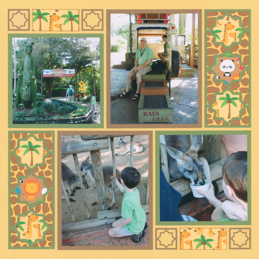
"Tampa Busch Gardens" by Tami Potter- Pattern #334 (slightly adjusted)

"Typhoon Lagoon" by Tami Potter - Pattern #335
Aqua, Brown, & Lime Green
Aqua, cocoa brown, and a hint of lime green are perfect for tropical pages. Notice that the pattern paper with the bright green was used minimally, otherwise it would overwhelm the layout. Placing the aqua and green over the brown colors helps them stand out.
Blue, Orange, & Yellow
Here is another color scheme that says "fun" and is also great for summer pages. These colors were inspired by the "Griffon" logo.
Here the yellow and orange were used equally on the layout, which would generally look very bright. But, the darker blue was purposely chosen to help tone down these colors. If the background was a light blue instead, this layout would be harder on the eyes.
Play around with the tones of color. If your chosen colors seem too bright together, switch one of them out for a darker color.
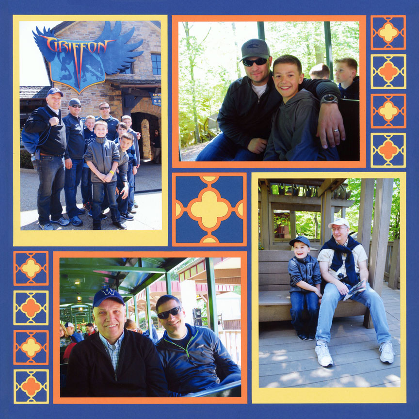
"The Guys at the Griffon" by Tami Potter - Pattern #354

"X&O" by Paije Potter - Pattern #388
Aqua & Pink
The aqua and pink were inspired by the patterned paper from Doodlebug Design®. These colors are often used for feminine or summer layouts.
Since the colors are very bright, Paije chose to use a white background so the paper would not look too busy. Plus she used black and white photos, so the page would not be overwhelmed with color!
Red, White & Blue
Although this color scheme is a patriotic classic, it can certainly be used with lots of different photos!
Red is very bright, so a dark blue was chosen. If the blue was also bright, the colors would hurt your eyes! Also notice there are two different tones of red, which adds interest, but also keeps the red from being too overwhelming.
"Alexis & Cole at CW" by Tami Potter - Pattern #331
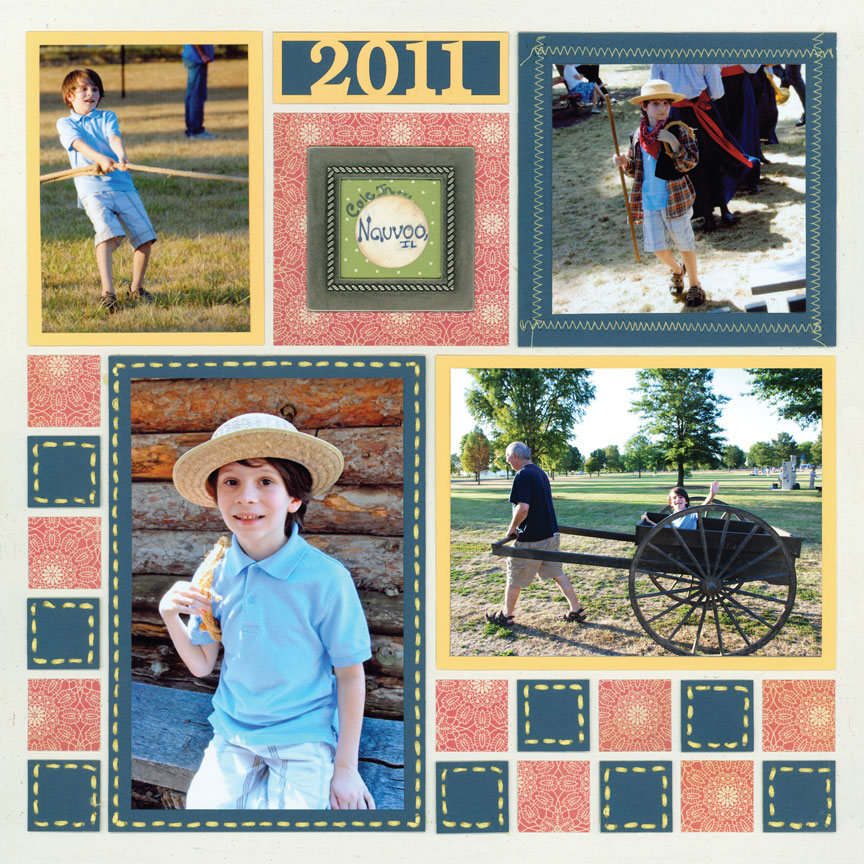
"Cole in Nauvoo" by Paije Potter - Pattern #132
Blue, Red, & Yellow
Yes! The three primary colors can be a great color scheme on pages. Again, notice that a dark blue was chosen to go with the bright yellow. A neutral background was chosen to not overwhelm the colors.
On this Page, Paije chose greyed tones to fit with the pioneer theme. But, red, yellow, and blue are fabulous colors for pages with young children. So, you can also use brighter versions of these colors for kids.