
Let’s face it – not every series of photos is going to make a beautiful mosaic or an amazing panorama. Sometimes you are going to have basic scrapbook layouts. In cases where the photos need to be larger (such as back to school photos), you may need a pattern like this:
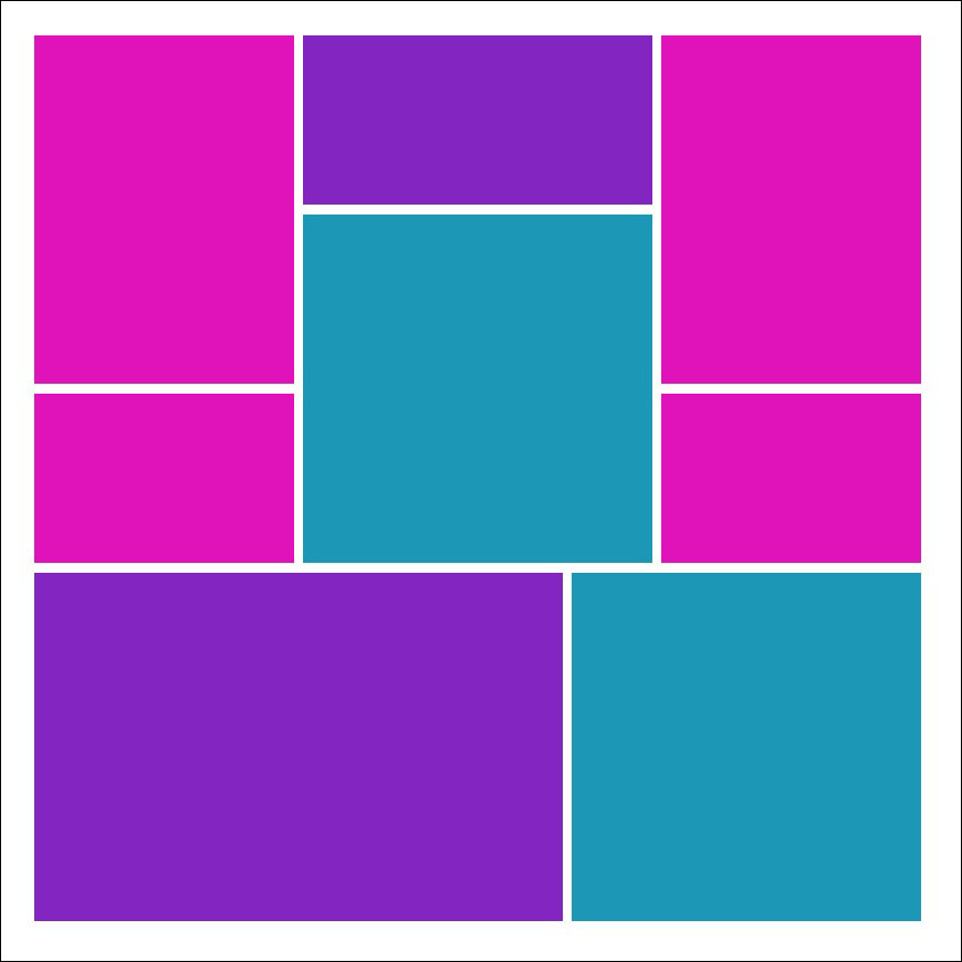
Pattern #142 – A Basic Scrapbook Layout
I wouldn’t consider this pattern to be the most exciting or interesting. But, it does have several large photo spots, which is what you need sometimes. I love the large square as the focal point, and the two 2×3 design spots are great for embellishments. It’s the right pattern for my photos, but I want to spice it up! Here are some ways you can do that:
#1 – Add Colorful Photo Mats!
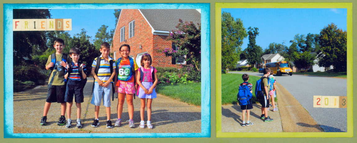
Add various colors of card stock to mat the photos. Sometimes we stick the photo right on the grid paper, but I think this might seem too boring on this type of page pattern. The mats add extra color and I think it actually helps the photos pop out more!
You can also add chalk ink or stain to make your mats stand out more. I added some to make the card stock a little bit brighter.
#2 – Don’t just add Photos!
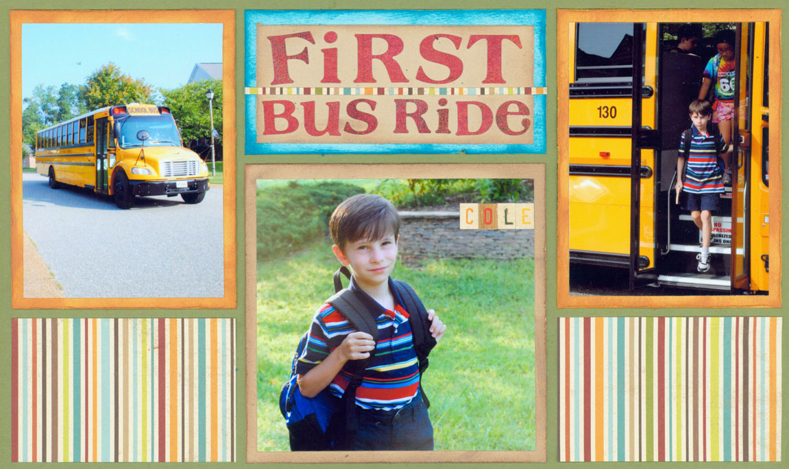
That’s right! If you only use photos on this page pattern, it might seem too basic (depending on the photos, of course). I like to add a little embellishment or patterned paper to catch your eye! I think these elements add interest to an otherwise basic scrapbook layout.
So, for my page I added striped paper. It’s colorful but does not detract from the photos too much. Plus, I made a bright & fun title spot above the focal point. I think this page would not appear as fun if I only placed photos on the grid.
#3 – Do Something Unique!
If your layout still appears bland or it feels like something is missing – this is a great opportunity to do a unique technique or add a fun embellishment. Check out some of our posts in the ‘Scrapbook Ideas’ section if you need ideas.
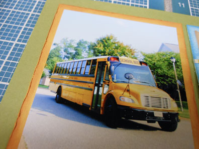
I just did a simple technique, but I think it made my layout pop more. I used an Exacto knife to roughen up the edges of the Paper Tiles. This added texture, plus it made my page a little more unique. Here is a close up shot (look on the edge of the orange mat):
The Final Result:
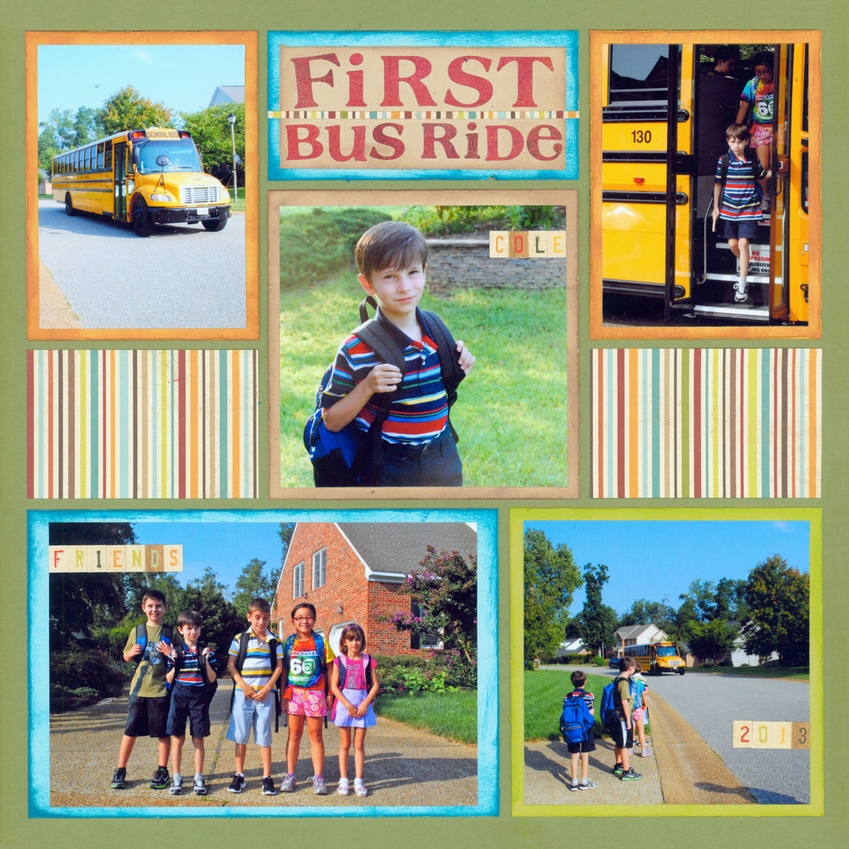
Overall I think what might have been a basic page pattern is now a very colorful layout. My images needed a design that would fit larger photos. So, pattern #142 fit my needs and I was able to dress it up so it could stand out!
Ready to Make Mosaic Moments pages? Click Below to get our Die Bundle Set to make scrapbook layouts easier & faster.