
5 Ways to set the mood for your beach (or lakeside) scrapbook pages.
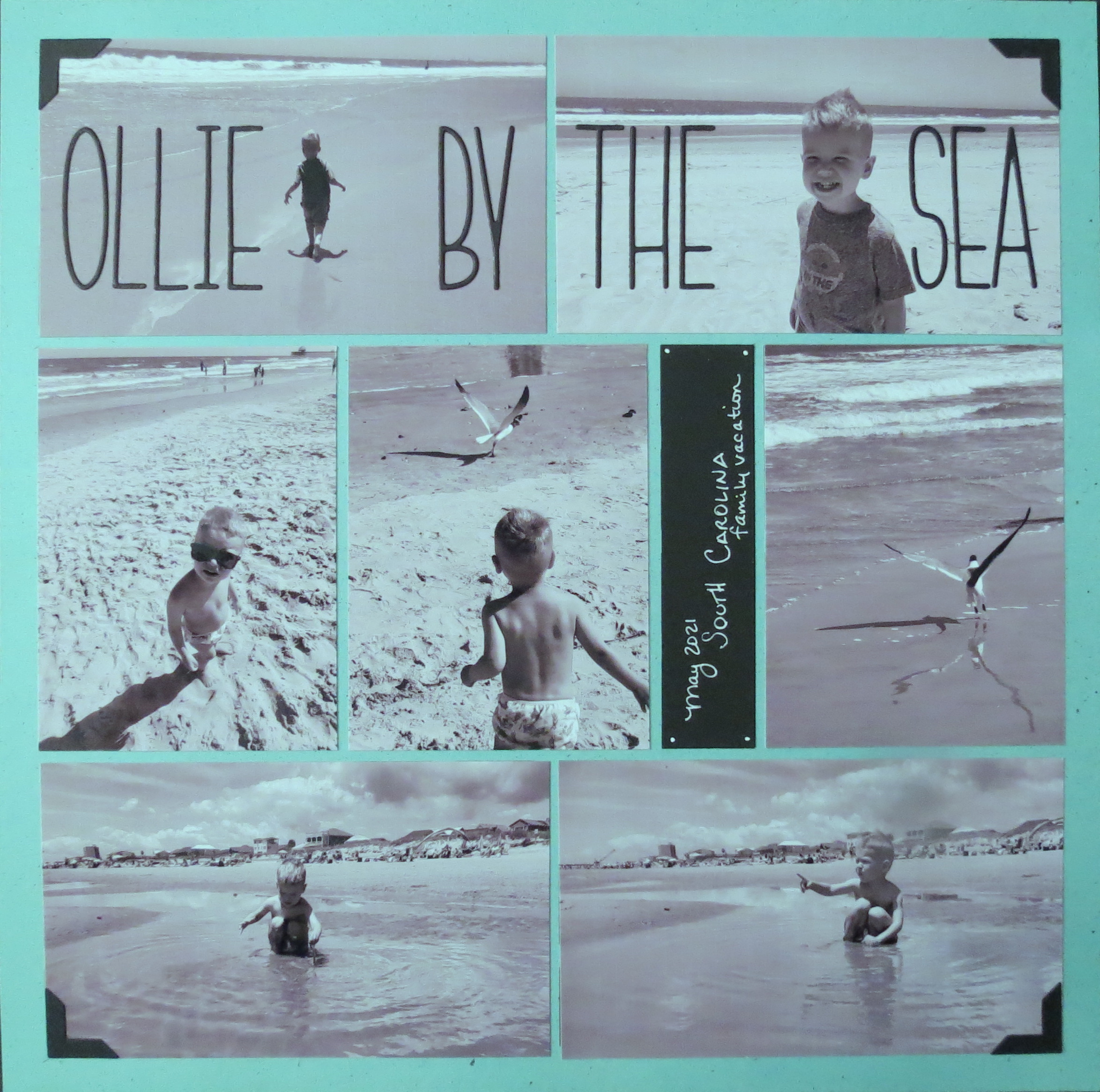
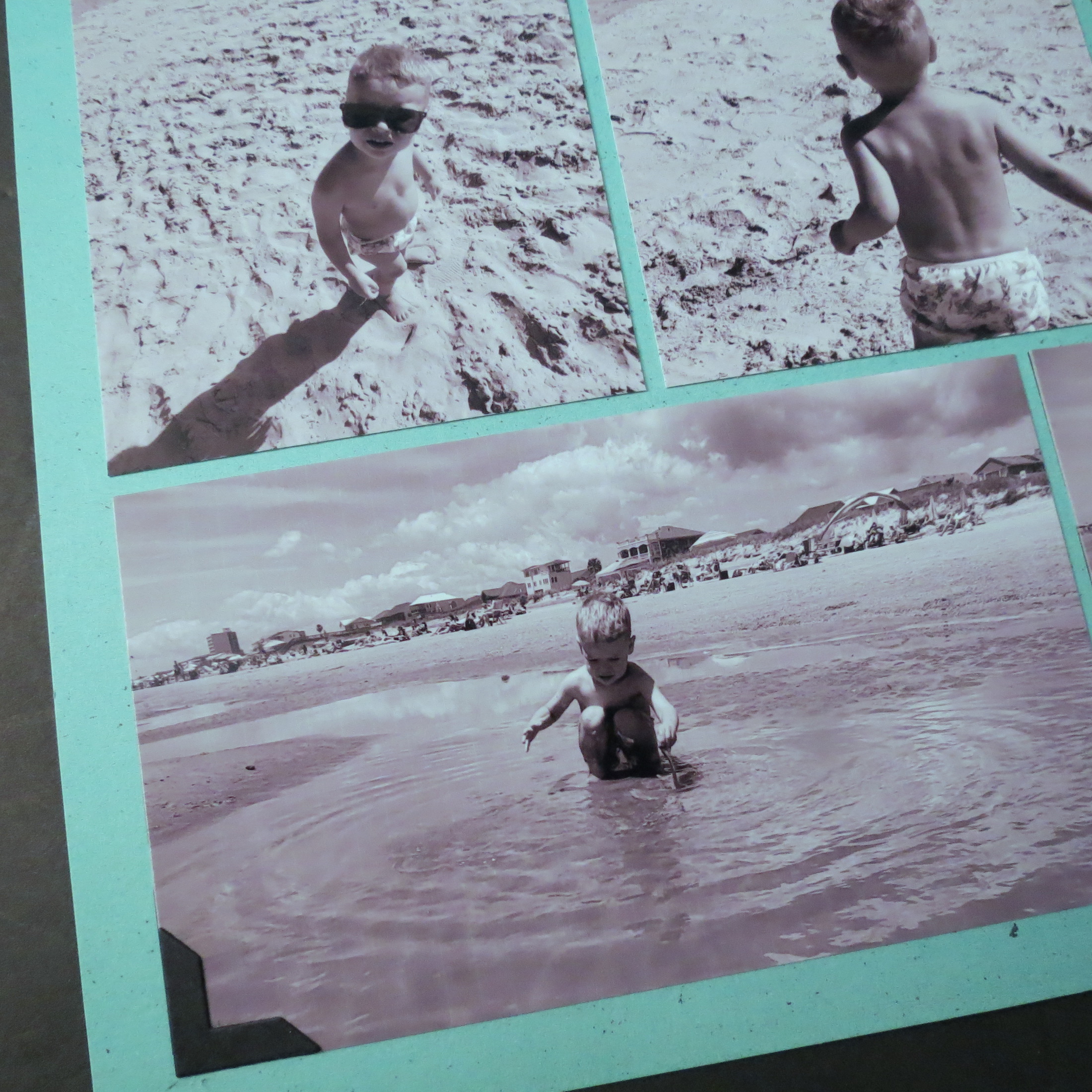
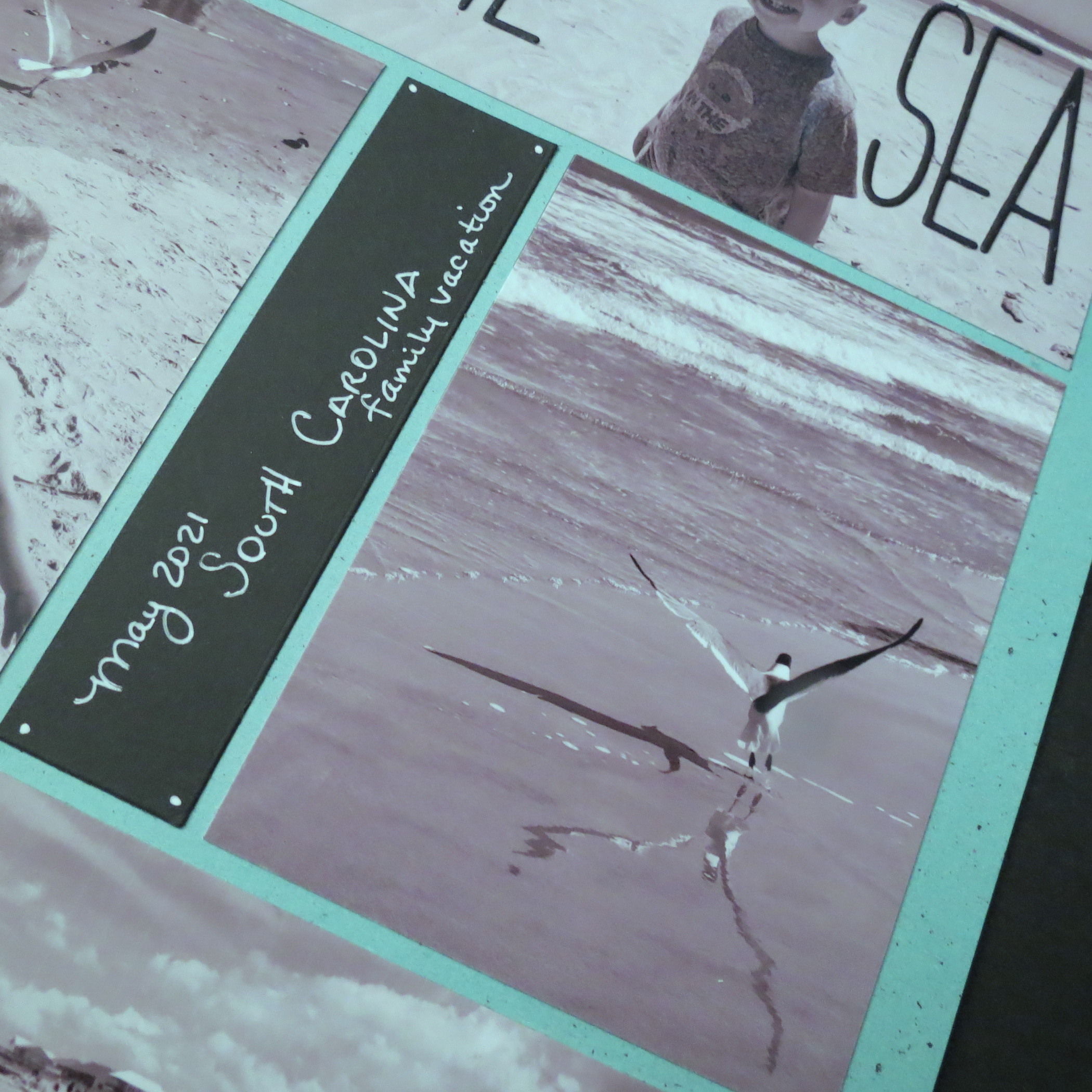
I’m featuring the Nantucket Collection Grid Papers this week and the subject matter is Beach Pages. Well, the Ocean is a very long way away and the nearest beach is about an hour and a half from us, so these are photos I’m borrowing from my son, David, who took his family down to the South Carolina Beaches for a vacation this spring. I’ve done some cropping and editing to get the photos I wanted to use for this project. This is a small portion of what were vibrant, colorful photos and I wouldn’t describe them as calming as they were, so here are a few things I considered to achieve that goal.
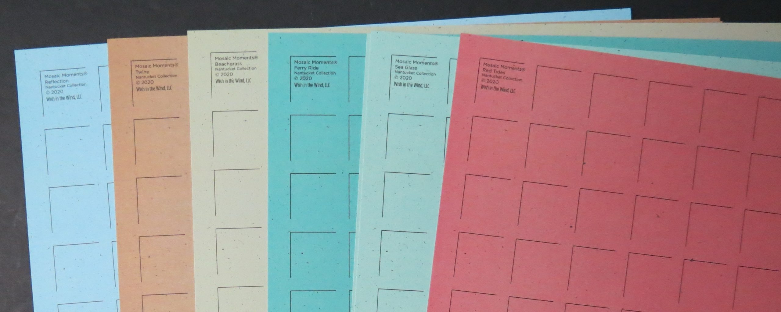
The Grid Choice. The Nantucket Grid papers have a vintage feel to me and so I play to the vintage feel in all the other choices I am making. I selected Ferry Ride for my layout.
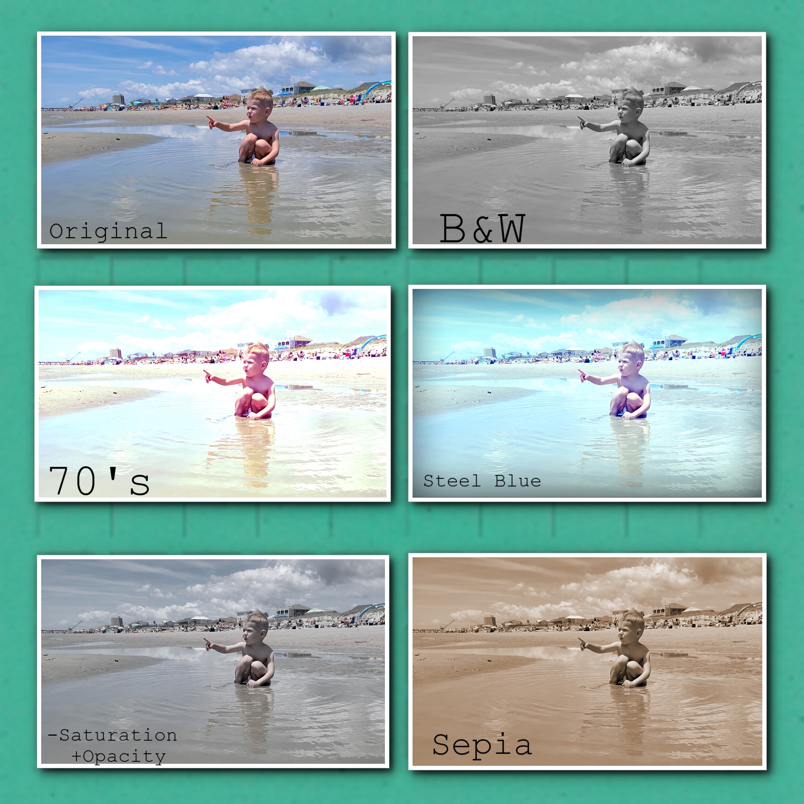
The Color. The photos as taken are vibrant colorful pictures. I want to neutralize the colors I will use by playing with the color before printing. I’ve used Black & White for my choice, but have shown some other options that you might be able to work with. I show a few that take out color, change the exposure for a vintage look and then one that changes the Opacity, and another adding Sepia tones. Anyone of them might be a good choice for other papers in the Nantucket Collection.
The Focus. Keep your photos simply cropped. Make sure your subject is clear…the sand, the sea, the people. Try things off-center for a new point of view. Remember The Rule of Thirds. I explain it more in detail with examples HERE in a previous post.
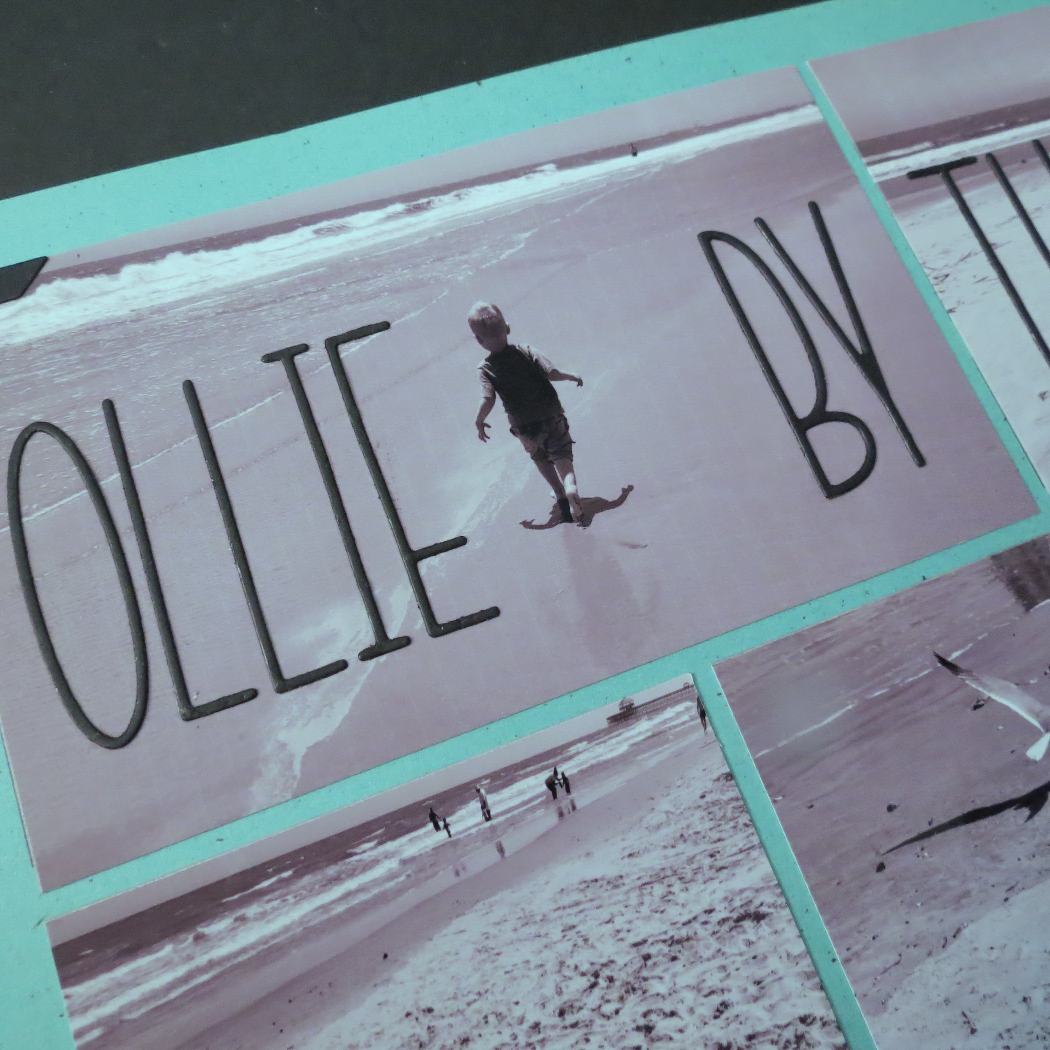
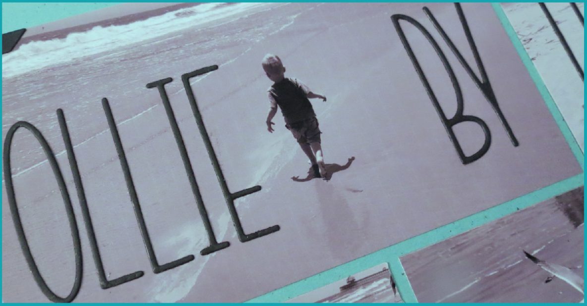
The Title. My Title is clean, crisp, subtle and blends into the photos. I’ve used the Tall Thin Alphabet from Scrapbook.com. They are one layer only. This time I wanted them to blend into the photos like a magazine title.
The Embellishments. I used photo corners from the Square Diamond 2×2 Die to pull in the 4 corners of the page for a collage effect (see the bottom left corner in image below). They are simple, vintage and classic additions.
A small 1×4 black cardstock journal piece records the date, place and event with white gel pen and small dots in the corner adds a tag look without extra dimension.
I hope that if you’ve got photos from a recent beach visit, you might try playing with the color in the photos to create a different mood, a different look, maybe even a calmer affect. Enjoy!
Andrea Fisher