1. Pick a Pastel that Creates Contrast
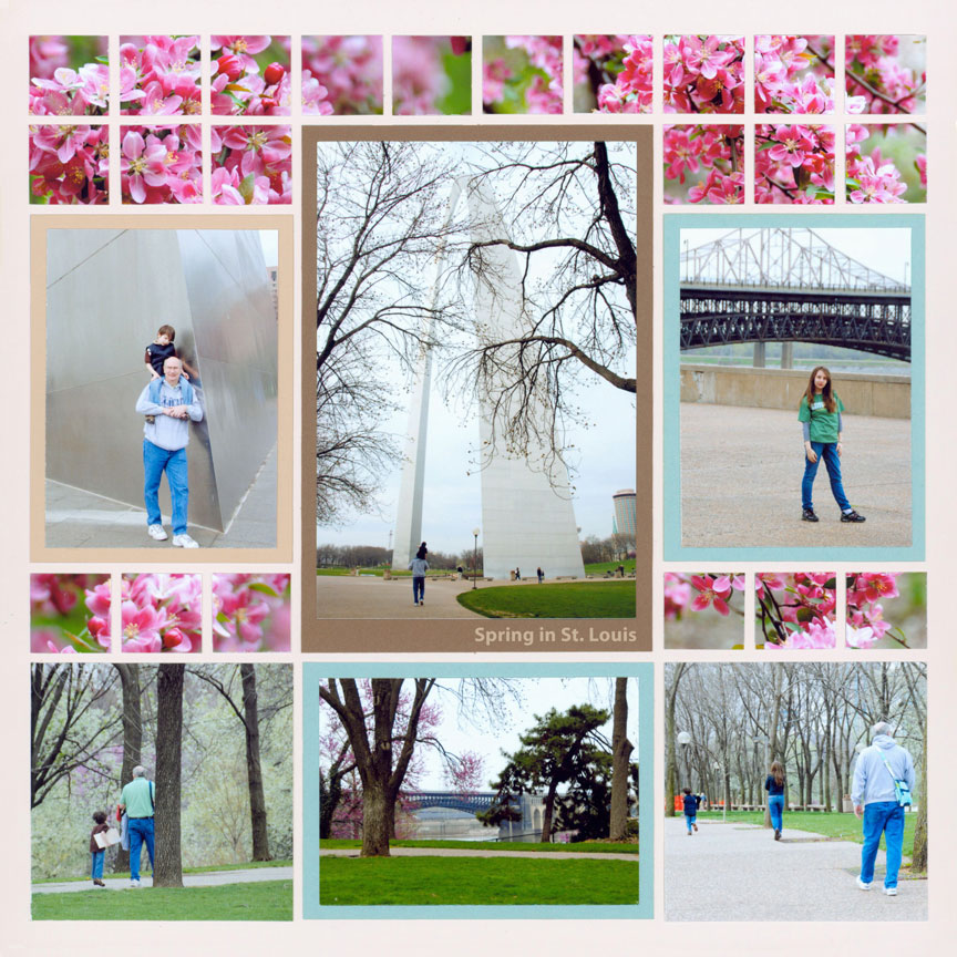
"St. Louis" by Paije Potter - Pattern #118
This page is the perfect example of using a pastel 12x12 grid paper that contrasts with the pictures and mats used on your layout.
Paije used 12x12 Petal Pink grid paper to contrast with her blue and brown mats as well as her photos. The light pastel pink color is light enough to make the darker pink in the flowers really stand out. The Petal Pink grid also contrasts withe the light blue elements in the photos. Paije used the Basic Die Bundle with the 1 inch grid Die to crop her mats and photographs.
2. Pick a Pastel that Creates Unity
Another tip is to create unity on your pastel grid. Here, the light pink background with the pastel photos creates a unifying design.
Here Paije chose 12x12 Petal Pink grid again. Do you see how different this page looks than the first example? The photos seem to fade into the background. The brown rocks, beach and embellishments stand out and the grid becomes just another part of that gorgeous sky.
Paije used the Basic Die Bundle, the Layering Die Bundle, the Strips 1x5.5 inch Die, and the Strips 1x3 Die.
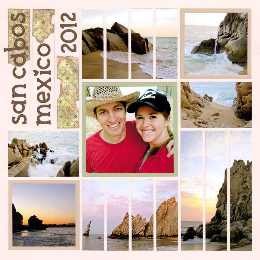
"Mexico" by Paije Potter - Pattern #155
3. Use a Pastel thats Matches Your Photos
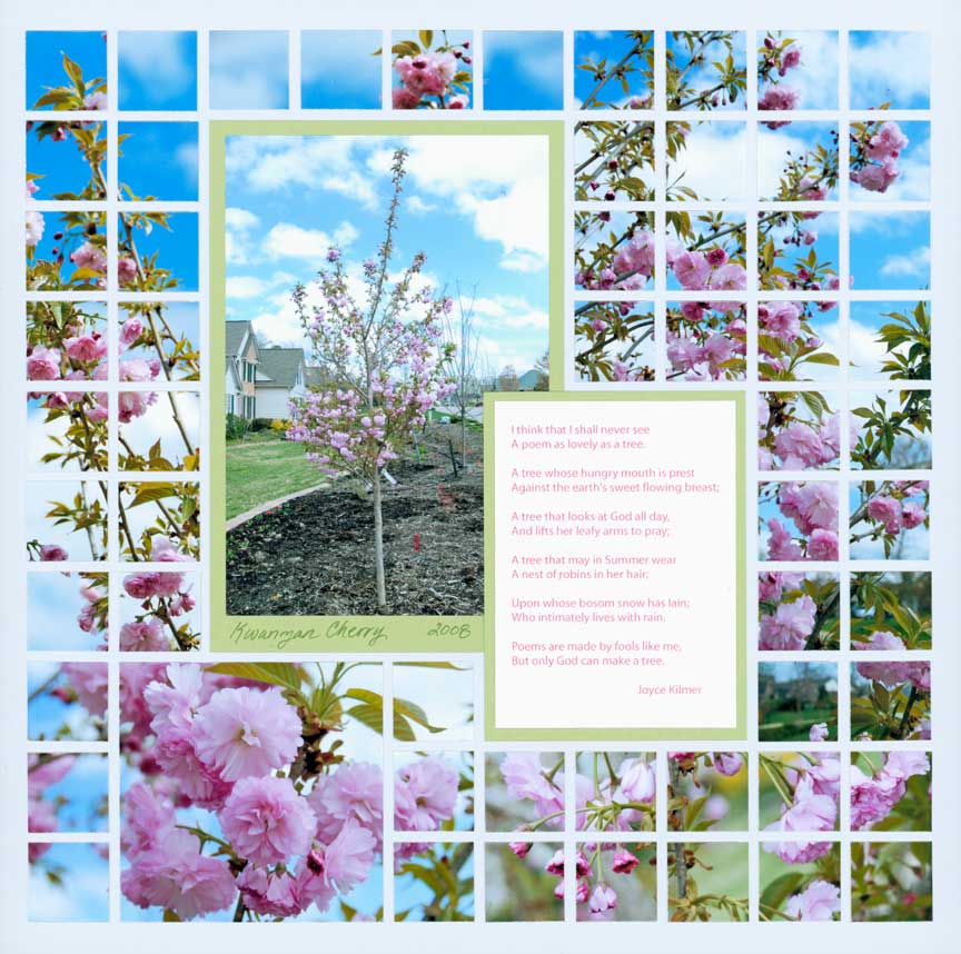
"Kwanzan Cherry Tree" by Tami Potter - Free-styled pattern
Mosaic Moments® has many colors to choose from, not just Petal Pink! Here Tami chose a beautiful blue that matches the light blue sky in these photos. We call this color Mist. We love how it complements so many colors and looks stunning.
This pale blue grid picks up the color of the sky in this mosaic layout. You can pick any color that matches a color in your photos. This tip works best if there is the same color in most of the photos you would like to use on your layout. 12x12 Mist Grid Paper is a popular pastel choice for many pages.
4. Pair a Pastel with Bright Colors
If you have a lot of vibrant bright colors on your layout you can pair them with a light pastel grid paper.
Here Tami used Mist 12x12 Grid paper again to go with the bright oranges, blues, and greens of her photos and mats. If she had chosen a bright grid it would have been too much competition for your eyes' attention and would have looked garish. The bright colors look like they belong together as they are on top of this pale blue.
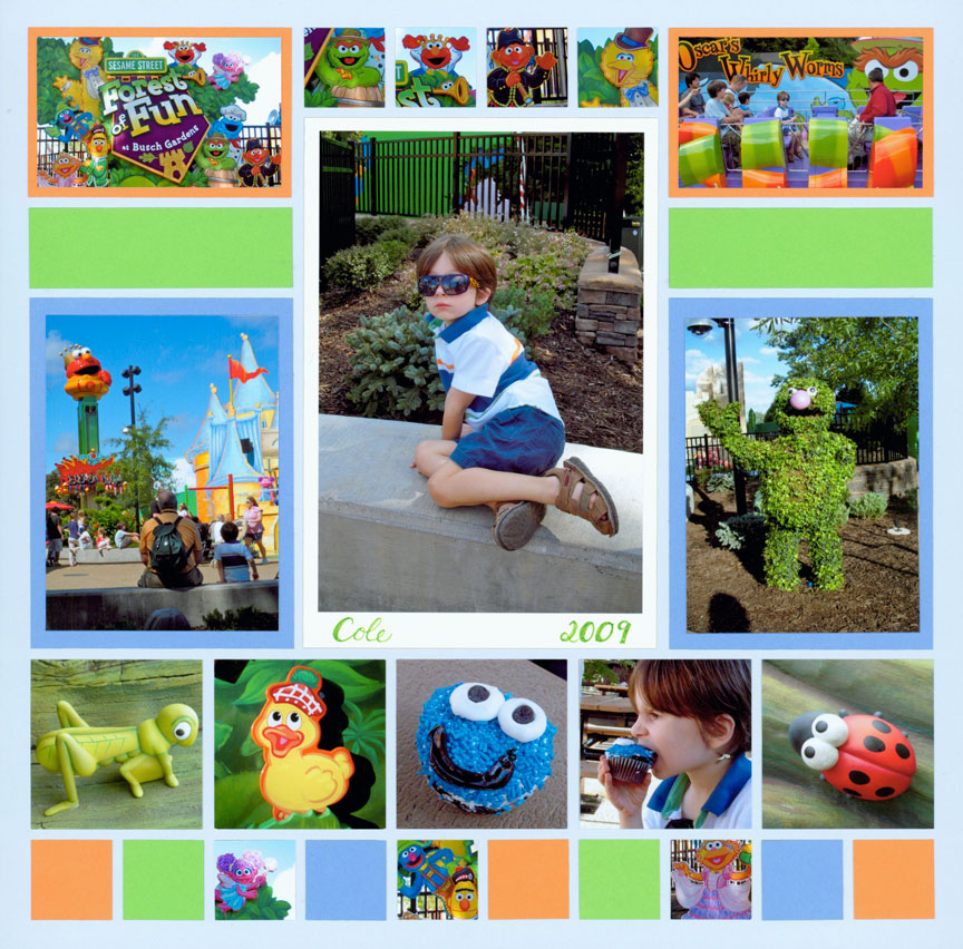
"Forest of Fun" by Tami Potter - Pattern #131
5. Use Pastels for a Calming Design
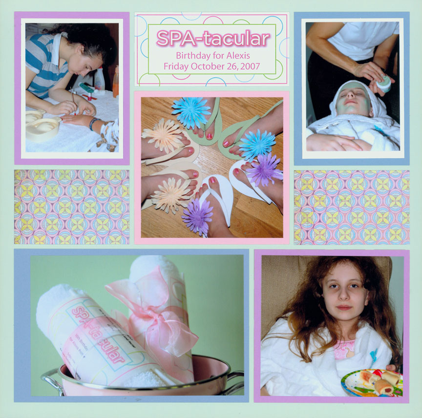
"SPA-tacular!" by Tami Potter - Pattern #142
Photos look great on top of a calming pastel color. Lotus 12x12 Grid Paper is a very calming green pastel color.
When using a lot of colors on your page, a calming pastel green will work for you. It also helps that it matches a color in many of Tami's photographs.
This green also matches the subject of her page which is a birthday spa party. It is a nice touch to use the theme of your page when selecting your color grid paper. Nothing says spa like Lotus grid paper.
6. Choose a Pastel that is Surprising
Fresh Cream 12x12 Grid is a surprising choice for this page. Usually when you think of a trip to the Bahamas you would think of blue or green to match the beach. But since Jodi had lots of tropical blue and green patterned paper she chose this creamy yellow grid to really stand out.
You can do the same on your page. Pick a soft pastel that helps your photos and pattern paper stand out!
Alphabet 3 Caps Die Set is the die she used for the lettering and the Wild Flowers Die Set is the die she used for the flower embellishment.
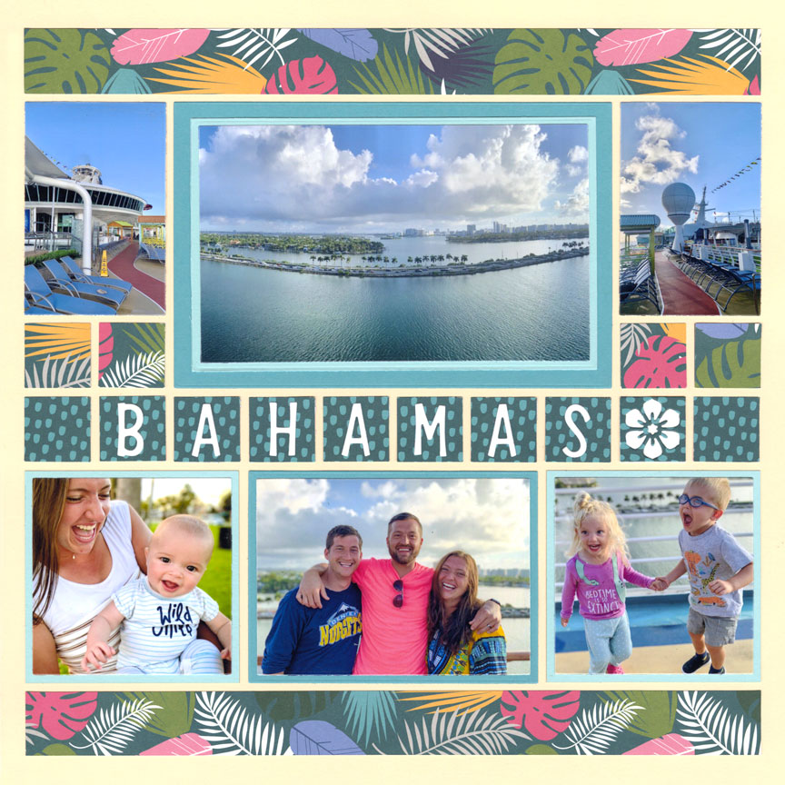
"Bahamas" by Jodi Benson - Pattern #519
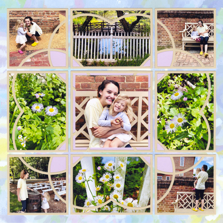
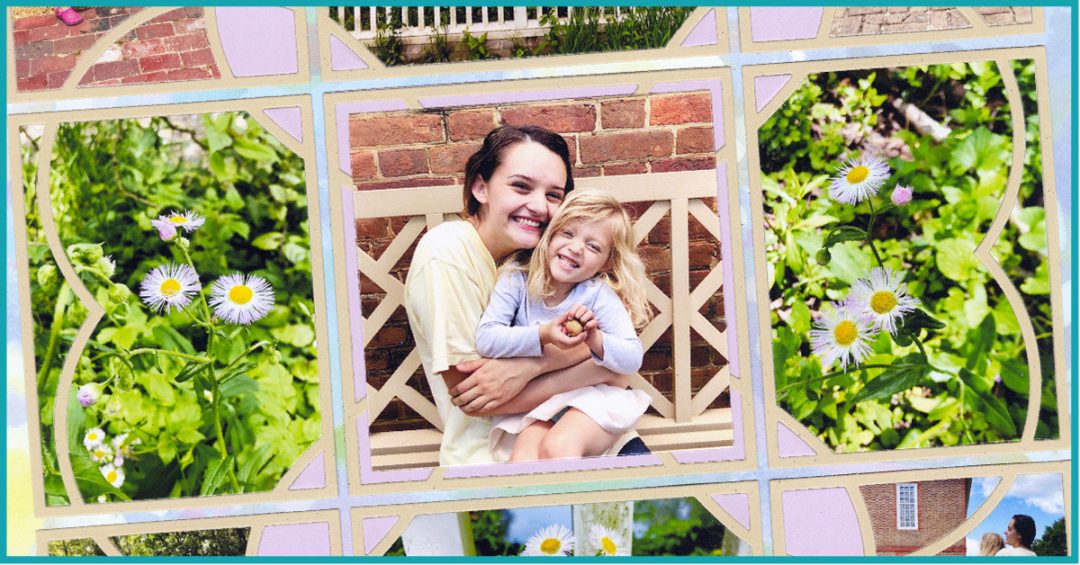
9. Make it Stand Out with Purple!
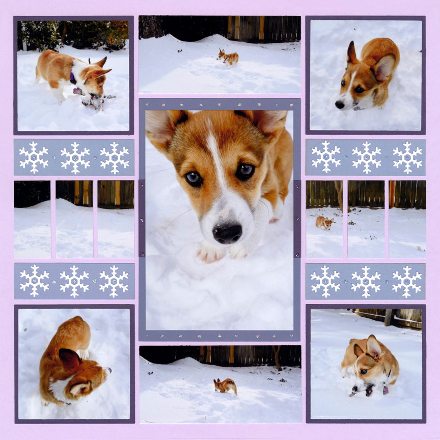
"Puppy Loves Snow" by Paije Potter - Pattern #605
Pastel purple can make a big statement and we know many people tend to shy away from this big color. Well, at Mosaic Moments® we say lean in and try out purples!
Paije used Lilac 12x12 Grid Paper on this layout instead of the typical blues we tend to go for in the winter. She chose a variety of darker purple colors for her mats and accents.
Mr. Snow & Flakes Die Set is the die she used for her snowflake embellishments. We love how she added a little sparkle to her page with small dots of glitter.
7. Pick a Neutral Pastel
"Family Portraits" by Jodi Benson - Pattern #142
Just like in your home when you paint your walls a neutral grey, you can pick a light grey for your 12x12 grid. Grey 12x12 Grid is a wonderful light grey color and perfect neutral background for your layouts.
Here Jodi used the Argyle 2x3 Die in shades of blue and patterned paper. You can see how the grey grid is a great background that doesn't compete with her design elements. The love of this family shines off the page.
8. Experiment with Monotone
Here Paije used the same 12x12 Grey Grid as before but she kept her mats and patterned paper in similar shades of grey. by keeping the tones of her page similar it gives the page a monotone feel. It's a classy, more elegant feel that is perfect for the subject of her layout. Wedding pictures look more formal and the grey color scheme looks formal too.
Paije used the Arches Die Set that come in 3x5 and 2x5 to fit the grid. She added just a touch of pink for her title "Together" and a little flower embellishment in the bottom corner of her page.
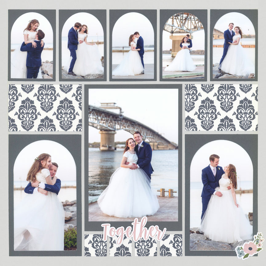
"Together" by Paije Potter - Pattern #376
10. Match Your Pastel Grid Paper to Your Patterned Paper
A great tip is to choose a pastel to match your patterned paper. Your pages will always look great if the pastel grid paper you choose matches your patterned paper.
Here's a big surprise - this patterned paper is actually 12x12 grid paper called Kindness from the Happiness Collection. Our grids have a back that is grid-less so that you can used it as card stock or in this case patterned paper! Pale Blue Grid Paper is the pastel color Paije chose for her 12x12 grid. It looks bright against her photos. She used the Puff N Stuff 3x4 Die in a grey color to complete her layout.
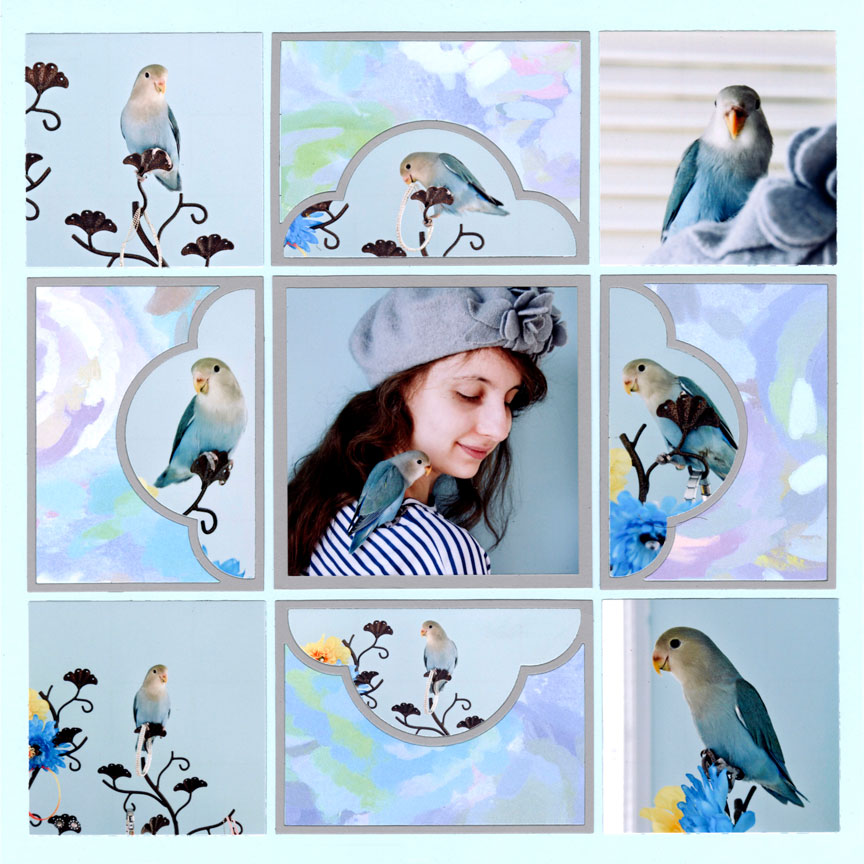
"Paris the Bird" by Paije Potter - Pattern #344
11. Try the "In the Garden" Collection
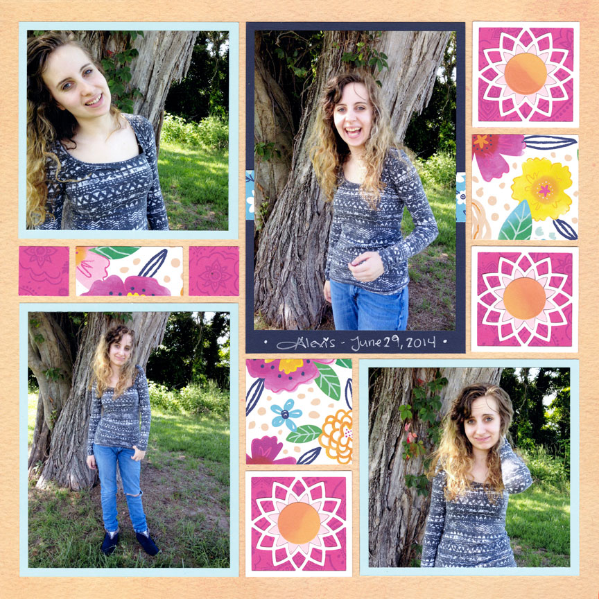
"Playful Portraits" by Paije Potter - Pattern #255
In the Garden is Mosaic Moments newest 12x12 Grid Collection. In the Garden Collection includes Mulch, Peach Blossom, Tulips, Clear Skies, New Leaf, and Right as Rain. We are in love with this collection and use it all the time on our layouts.
Paije tried Peach Blossom which makes her page fun and bright. It's a soft orange color with a great texture print and we love how different it is. She used the Celestial 2x2 Die Set with a bright pink patterned paper as her embellishments.
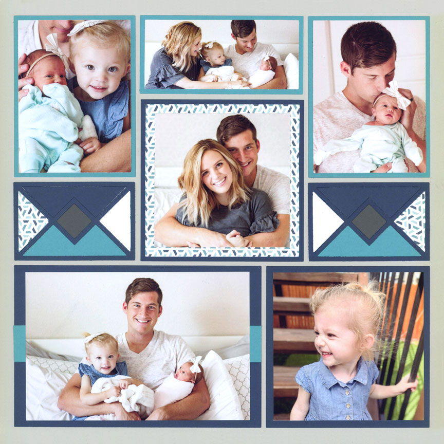
12. Try the Happiness Collection
The Happiness Collection includes Love, Kindness, Gratitude, Faith, Hope, and Charity. Jodi chose Kindness for her grid. It has a pattern of lovely pastel colors in a flower impressionist style.
She used the Sweetheart Dies in an almond neutral color. By using the Sweetheart 3x4 Die, Sweetheart 3x3, and Sweetheart 4x4, Jodi created a swirling heart pattern on her page. She added her matted focal picture on top of the Sweetheart 4x4 Die. She filled in her small design spaces with a pastel purple color card stock.