
Are you afraid of using bright colors for your scrapbook pages?
Some of us are a little intimidated by the brightly colored grid paper and cardstock choices. You may stay far away from them as much as possible (we totally get it!). To help you out, we gathered some of our favorite bright pages and are sharing the designers' tips for success. Hopefully after you have read this post, you can have a little more confidence using these fabulous tones.
Let's get started with our first tip below:
Tip #1 - Add In White
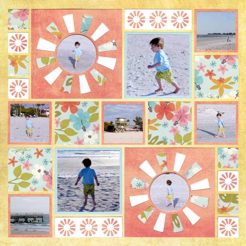
"Sunny Day in Florida" by Paije Potter - Pattern #687
Our first tip is to tone down your brights with a white paper, or you can use off-white in some cases.
The reason? If this page was only filled with the orange, yellow, and blue - your eyes likely would bug out! Your viewers likely wouldn't stare for very long. But, with the addition of white, your eyes will feel more relaxed and get a break from the brighter hues.
When in doubt, use some white cardstock on your bright pages.
This Layout Features: 12x12 Sunlight Grid Paper from the Lazy Days Collection, the back of 12x12 Tangy Grid Paper from the Cool Drinks Collection, Sunny Days Die Set (L1), the Layering Die Bundle Colored A-L through E-L (L1), and the Basic Die Bundle A-E & 1" Grid - Colored (L1). Pattern paper from Simple Stories™.
Tip #2 - Use Black & White Photos
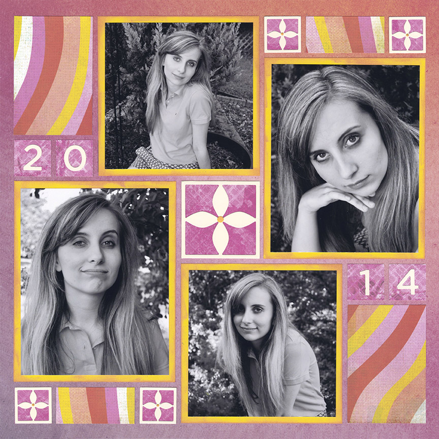
"Alexis 2014" by Paije Potter - Pattern #548
Want to use lots of bright colors? We think black and white photos are the balanced solution.
All of the papers (except the off-white) are very bright and indeed seem very busy. But, what off-sets this is the black and white photos. This combination works so perfectly and what a great opportunity to use your grey-scaled pics.
You won't regret this tip one bit!
This Layout Features: 12x12 Afterglow Grid Paper from the Ombre Collection, Bloom Die Set (L1), Numbers 2 Die Set (L1), and the Basic Die Bundle A-E & 1" Grid - Colored (L1). Pattern paper from Vicki Boutin™.
Tip #3 - Draw Colors From the Grid Paper
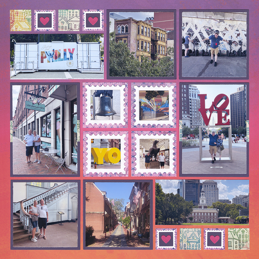
"City of Brotherly Love" by Paije Potter - Pattern #855
This is the best tip if you are using a multi-colored grid paper, such as Sunbrella shown above.
First, it makes your decision making easier. You might be intimidated at first, until you realize you can just use the same colors. The trick is to use various shades such as the dark and medium purple papers shown above. Paije also added mini pink hearts to match the background. We recommend sticking with one or two colors, so your page doesn't feel overwhelming to look at.
If you don't know what will work with these bright colors - just remember this tip!
This Layout Features: 12x12 Sunbrella Grid Paper from the Summer Collection, Stamp Die Set (L1), the Layering Die Bundle Colored A-L through E-L (L1), and the Basic Die Bundle A-E & 1" Grid - Colored (L1). Pattern paper from Vicki Boutin™.
Tip #4 - Place Brights on Muted Colors
"Day at the Sand Dunes" by Paije Potter - Pattern #664
Yes! These Lucky Charm die cuts look so bright cut in yellow, but they totally work.
One of the reasons this page worked out so nicely is due to the background choice. The Grid Paper is Sea Glass from the Nantucket Collection. All of these colors are muted tones (meaning grey was mixed in), and they do help you not be so blinded by the brights!
The striped pattern paper also helped out in this case since it coordinated and brought in some white.
This Layout Features: 12x12 Sea Glass Grid Paper from the Nantucket Collection, Lucky Charm 4x4 Die (L3), the Layering Die Bundle Colored A-L through E-L (L1), and the Basic Die Bundle A-E & 1" Grid - Colored (L1). Pattern paper from Echo Park™.
Tip #5 - Give Your Pages a Fun Personality
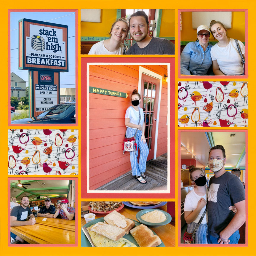
"Stack 'Em High" by Paije Potter - Pattern #561
One thing we can say about brights is they give your pages an "outgoing" personality people will take notice of.
The photos on this page were of a pancake house with fun themes - see the "Happy Tummies" sign in center photo 🙂 Restaurant photos tend to be on the dull side, but with this color scheme - this page is hot as the fresh pancakes! If you shy away from brights, it might be time to jump in and take a risk. This page turned out fun, exciting and a stand out because the designer, Paije, tried some new colors.
Don't fear the brights - give your layouts a stand out personality, and give your memories the well deserved attention.
This Layout Features: 12x12 Gold Grid Paper, the Layering Die Bundle Colored A-L through E-L (L1), and the Basic Die Bundle A-E & 1" Grid - Colored (L1).
Tip #6 - Use Soft Colors On Top of Brights
"Happy 19th" by Jodi Benson - Pattern #511
Isn't this page just so sweet? You may not expect that with a bright orange background color.
What helps is this particular orange is a little more muted (this is Tangy from Cool Drinks). But, the other part is the pattern paper and cardstock choices. The blue color is a softer, medium tone, and even though it's a complimentary color to the orange, it does not feel overwhelming at all! Jodi's pattern paper of choice also has softer tones, making this page feel almost light and airy.
Bright grid paper doesn't only need to be saved for the most exciting themes, but can be used for the sweetest memories too.
This Layout Features: 12x12 Tangy Grid Paper from the Cool Drinks Collection, Wright Corners 1x1 Set of 4 Die (L1), the Layering Die Bundle Colored A-L through E-L (L1), and the Basic Die Bundle A-E & 1" Grid - Colored (L1). Pattern paper from Echo Park™.
Tip #7 - Add In Black

"Summertime Kayaking" by Paije Potter - Pattern #469
Similar to our first tip, a different color you can add is black.
Placing black with bright colors, can help the page feel a bit more grounded. We use this tip on more masculine pages and cool themes (like a kayak trip for example). We like that the black also gives a bit more depth. When a page seems too light and bright, black can be a solid choice that truly tones everything down!
One tip is finding a black pattern paper that is not 100% black (above, this paper had other colors mixed with it) - this is a great tip if solid black seems too bland.
This Layout Features: 12x12 Limeade Grid Paper, Crisscross 3x5 Die (L3), Crisscross 2x3 Die Set (L3), Crisscross 4x4 & 1x1 Die Set (L3), and the Basic Die Bundle A-E & 1" Grid - Colored. Pattern paper from Vicki Boutin™.
Tip #8 - Use Analogous Color Schemes
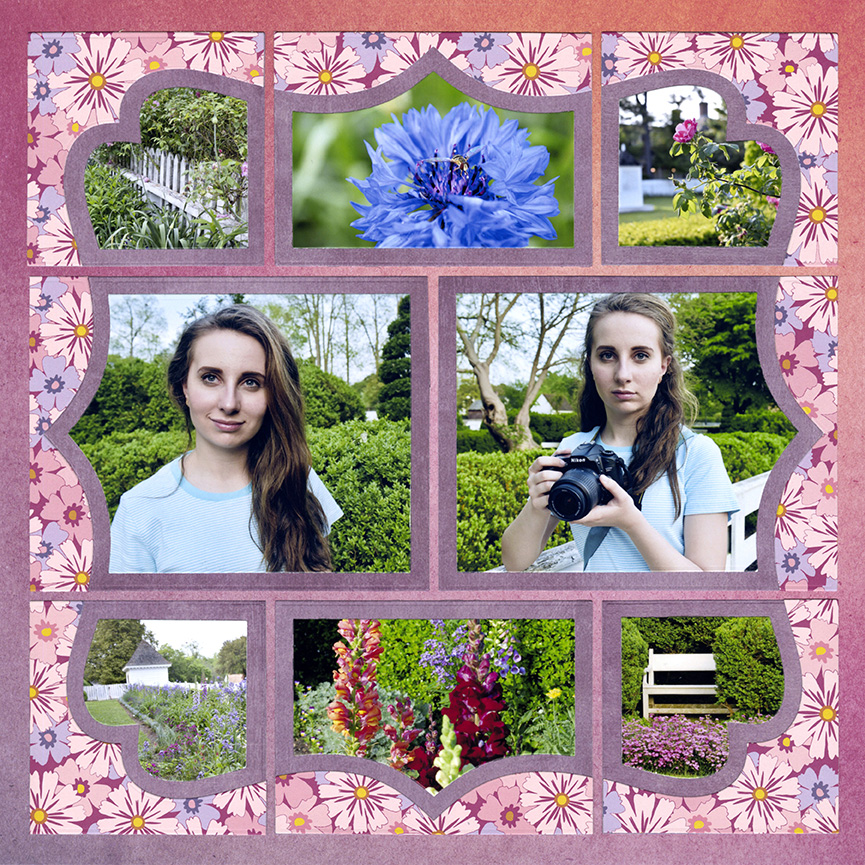
"Taking Photos at Colonial Williamsburg" by Paije Potter - Pattern #446
When in doubt, an analogous color scheme is a great choice for bright pages.
An analogous color scheme means that your chosen hues sit right next to each other on the color wheel. On the page above, the primary colors are pink and purple. There is also a bit of orange and yellow - just a little further on the color wheel. Not only do these colors work wonderfully together, but do you see how much the green in the photos really pop?
If you are struggling to choose your colors, try this tip!
This Layout Features: 12x12 Afterglow Grid Paper from the Ombre Collection, Whimsy 4x5 Die (L2), Whimsy 3x3 & 3x4 Die (L2), and Whimsy 3x3 & 3 x4 Layering Die (L2). Pattern paper from Paige Evans™.
Tip #9 - Make Slimmer Cuts of Bright Paper
To keep your colors from being "too much", you can always add a slim amount on your page.
On the layout above, Paije used yellow to cut her Hip Hop die cuts, plus she used an orange in the smallest sections. She also made her mats with the orange paper, but notice how thin they look. Yellow and orange are not well-favored by many people, but just a touch of them can still make a page look absolutely adorable.
For this layout, Paije's color scheme was inspired by the photos - which ties every element together!
This Layout Features: 12x12 Always Afloat Grid Paper from the Summer Collection, Hip Hop 2x2 Die Set (L3), Hip Hop 2x3 Die (L3), the Layering Die Bundle Colored A-L through E-L (L1), and the Basic Die Bundle A-E & 1" Grid - Colored (L1). Pattern paper from PhotoPlay™.
Tip #10 - Use Various Tones of the Same Color

"Paddle Board Yoga" by Jodi Benson - Pattern #602
Oh boy! This background is a super bright orange - what can you do about it?
Many of you may avoid this color, but we say give it a chance! One solution is to use two different shades of the same color for your mats and embellishments. If Jodi only used the dark blue, your head would likely feel dizzy! But with the light blue added - this page is lovely.
Of course, the white cardstock was also a great choice for toning down these complimentary colors (did we talk about this enough already?).
This Layout Features: 12x12 Orange Grid Paper, Wave Border Die Set (L1), Sea Life 2 Die Set (L1), the Layering Die Bundle Colored A-L through E-L (L1), and the Basic Die Bundle A-E & 1" Grid - Colored (L1).