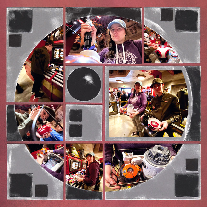
This page holds a great memory; but, that isn't the only reason I love it.
Too often we go in search of the obvious to help tell a story. How many times have you read posts like this on scrapbook boards: "I'm looking for a die cut shape of hockey sticks for a page about my grandchild's hockey game."
Do we really need a die cut shape of the Eiffel tower to place on a page next to a selfie taken in front of the Eiffel tower? Is there an alternative solution that might bring more interest or lasting appeal to our layouts? I believe there is!
I love how Paije used simple shapes and colors to create the atmosphere for her photos on this Droid Depot page. The theme isn't obvious at first glance. The viewer has to take a closer look before they understand exactly what is going on. This intrigue adds a level of interest that doesn't develop when the answers are obvious. It's an opportunity for the viewer to experience the excitement of that "aha moment" when they get it and it all comes together.
I'm not here to say, "avoid stickers or die cut shapes". Obvious can be the right answer. However, when time allows, exploring alternatives can be a lot of fun and very satisfying.
I'm pretty sure a traditional layout with stickers of BB-8 or R2-D2 would not have created as much interest as this clever design.
- Tami Potter
Layout Design: "Droid Depot" by Paije Potter
Supplies Used: Mosaic Moments® 12x12 Bright Fire Grid Paper from the Renaissance Revival Collection, Horizon Die Set (L2), Horizon 3x5 A And B Die Set (L2), Horizon 4x5 Die Set (L2), Basic Die Bundle A-E & 1" Grid - Colored (L1), gray and black cardstock, and chalk ink.
