
Traditional colors of reds and greens are usually our go to colors for scrapping the Christmas season, but each year a multitude of non-traditional colors make their way into our cards and ornaments.
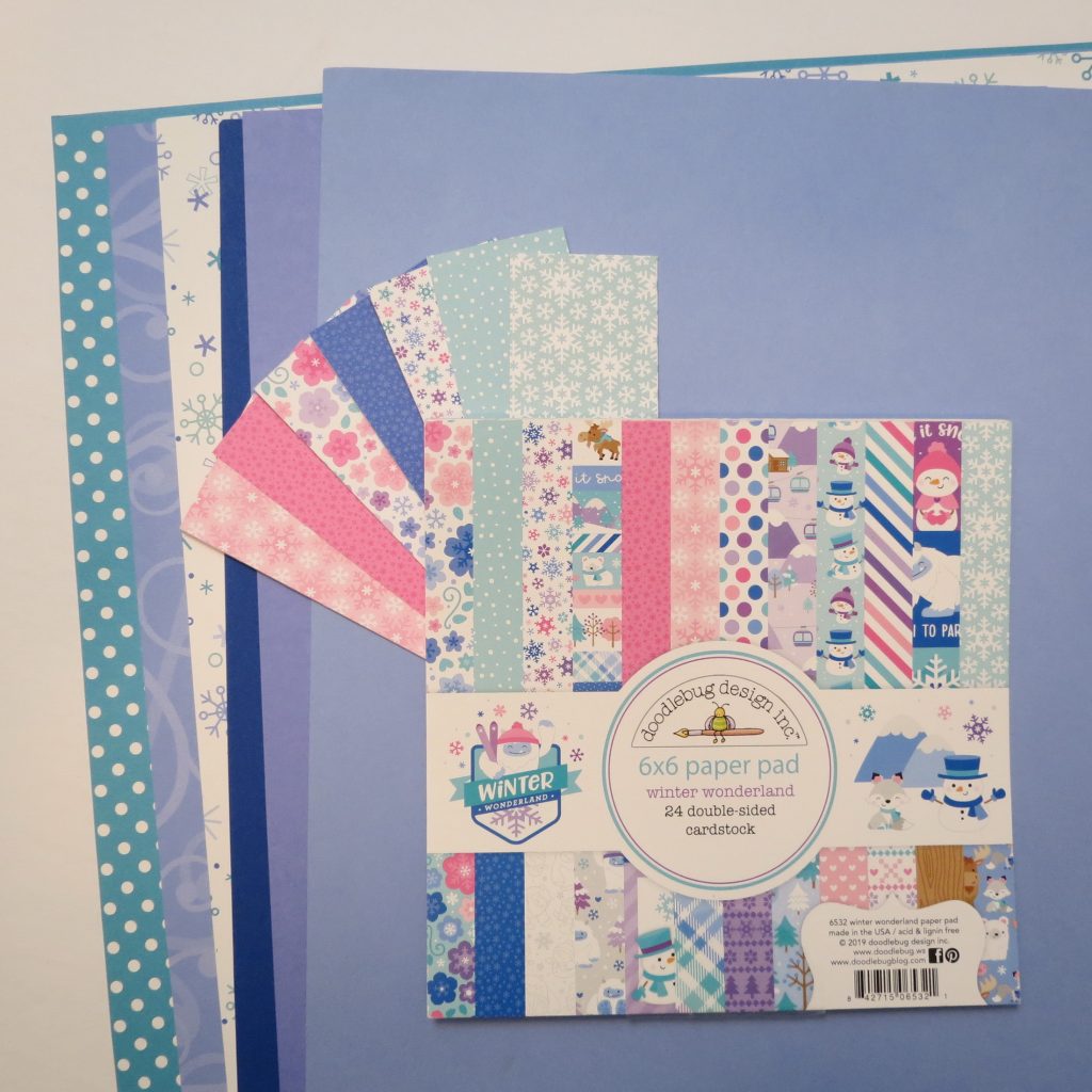
I considered several color options for this post like lime green, aqua, royal blue, purple, pink, periwinkle and white. As I collected my papers, a variety of Doodlebug Designs Inc. pattern papers from years ago and then more currently I was reminded of one of the things I love about this line of papers. From year to year, they use a certain pallet of colors and change the patterns making it easy to blend the span of years and borrow some from one collection and some from another and have it all work together smoothly.
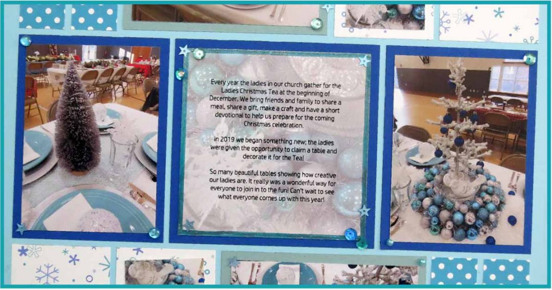
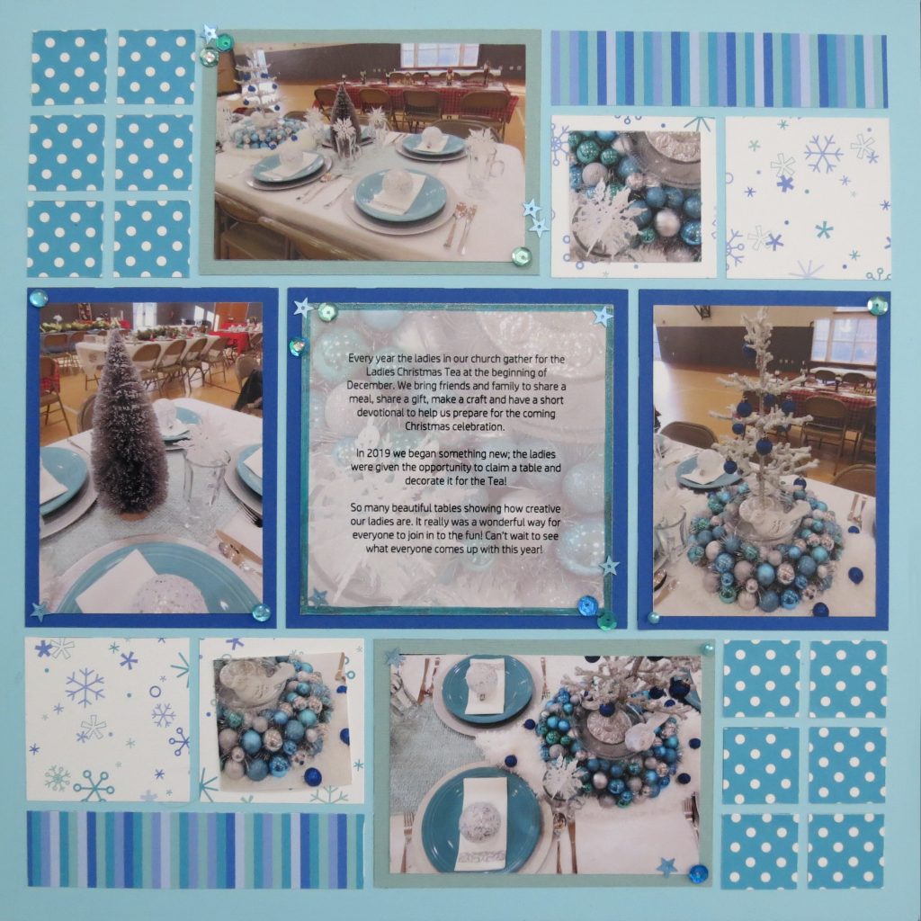
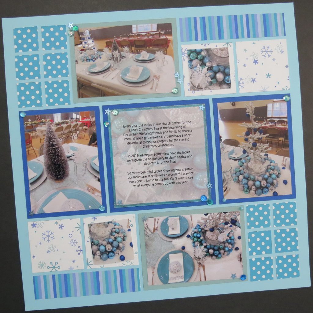
With papers in hand I went looking for photos that would work. That wasn’t as easy to accomplish as so much of what I had clearly fell into the traditional reds and greens. Then the photos from last year’s Ladies Christmas Tea gave me what I wanted! I also had just what I wanted for the patterns I wanted to consider, two vertical and two horizontal photos, just right for a pinwheel pattern.

After considering several patterns I decided on Pattern #476. This pattern allows me the opportunity to fill 1” squares, 1×4” sections, and 2×2 squares with patterned papers and the photo spots with solid cardstock mats in blue and pale green. I’ve selected Sky Blue Grid Paper to build my page on.
Using the strip paper in the 1×4 spot sets the color choices I want to include. Taking into consideration the colors in the photos, I want to include the dark blue and pale, frosty green as mats. By using the blue for the center journal square and the two side spots, it looks less like a pinwheel pattern and more like a row pattern.
The Aqua Polka Dot paper is a perfect match for the plates in the photos and the snowflake paper carries several of the colors and adds a lightness to the page.
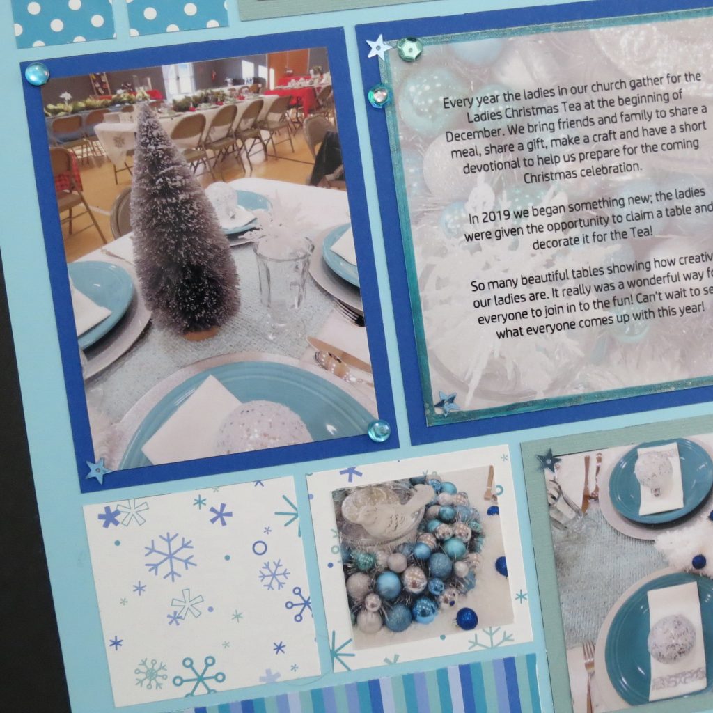
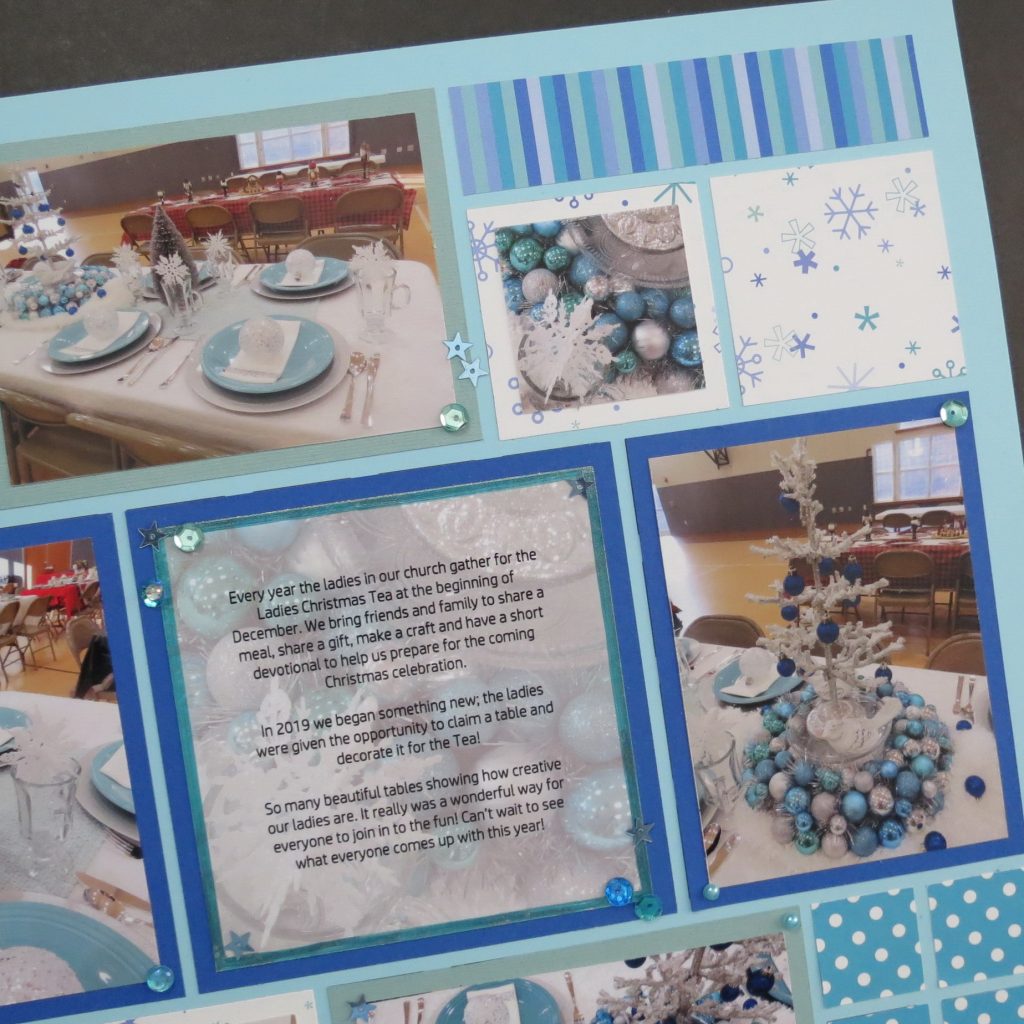
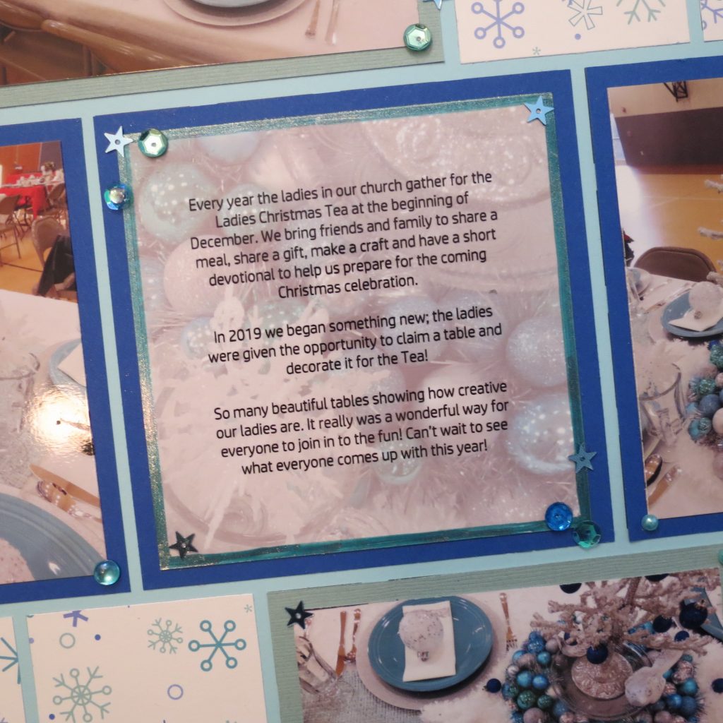
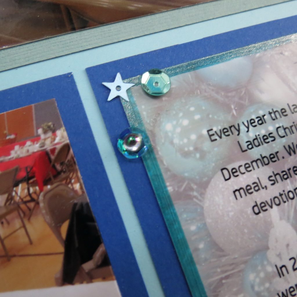
I planned on a white journaling block with a border drawn using the Nuvo Glitter Marker Artic Blast. It adds a nice bit of sparkle that matches well. I thought printing it out on photo paper would add a bit of shine and as I was formatting things, I decided it might be nice to crop a section of one of the photos and use it as a backdrop to the words by reducing the opacity. I like the effect achieved with photo backdrop connecting the two outside photos in a full row.
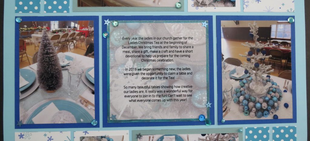
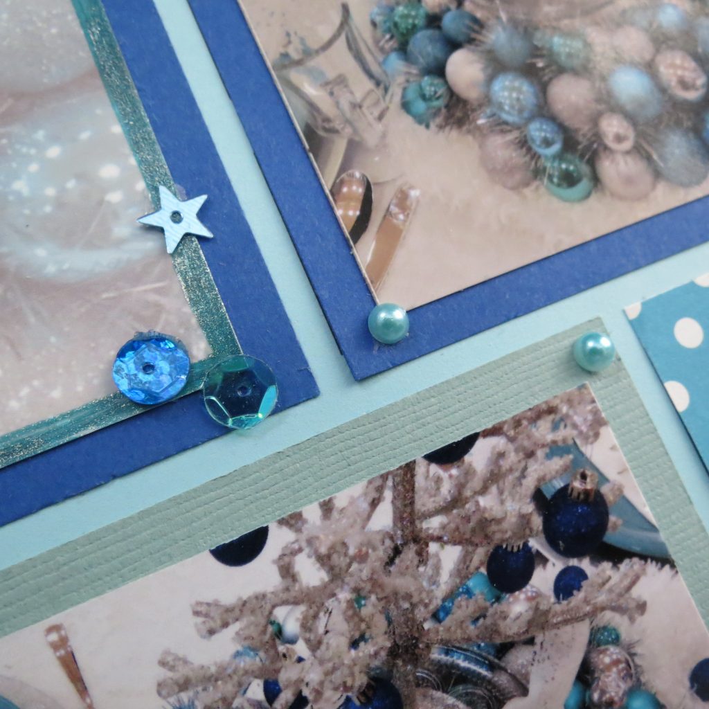
I decided to add two cropped sections of the photos to focus in on some details and place with a wide border on two of the 2×2 spots keeping a good portion of the patterned paper revealed.
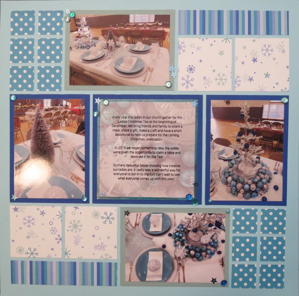
Although I was pleased with this page, I also thought some sparkle might make it a bit better. I pulled sequins, pearls and gems in coordinating colors together and some light blue stars (from Studio Katia at Simon Says Stamp) to go on a few spots. After I applied a few here and there, I found another style I wanted to add on and at the time, the grands were at my side looking to “help” so they each got to add one, or maybe two, to places I was pointing out…but…well, you know that goes! Close was good enough.
Now if these or other non-traditional colors appeal to you to use in a layout this year, you will do well to plan out some of your photos and look for photo ops that might feature your chosen color pallet. Always remember to take multiple photos in both directions (horizontal/vertical) and from above or below so you have options when it comes to putting together your pages. Even up-close clusters of ornaments and papers in your color scheme can be used as fillers, Christmas is a great time for gathering many of those types of pictures. Keep your eyes peeled!
I hope that you might try something new this year, find some non-traditional colors that you can incorporate and have fun! Celebrate and enjoy as you scrap!
Andrea Fisher