
Updated: June 2022
When you need to add a title or the date to your layout, try using alphabet and number dies instead of sticker letters.
These dies allow you to create titles that match your layout perfectly, you will never run out of a particular letter, and, over time, they will save you money. Buying an alphabet set or two is an investment that pays off quickly and repeatedly.
Here are some of our tips for getting the most bang from your buck.
1. Mosaic Moments® Alphabets
Alphabet 2 & Numbers 2 are a classic, simple, bold font that is good for everything.
You can get it in both upper and lower-case. It's a san-serif font, so the letters have a simple and modern aesthetic. We love the Alphabet and Number 2 dies since they are very versatile.
This font also comes in 2x2 sized numbers.
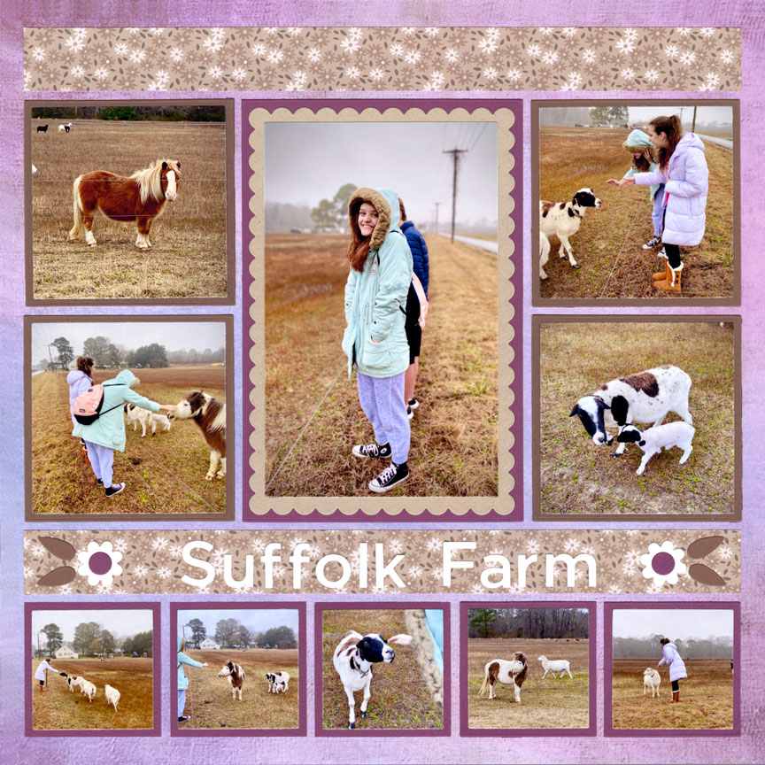
"Suffolk Farm" by Jodi Benson - Pattern #490

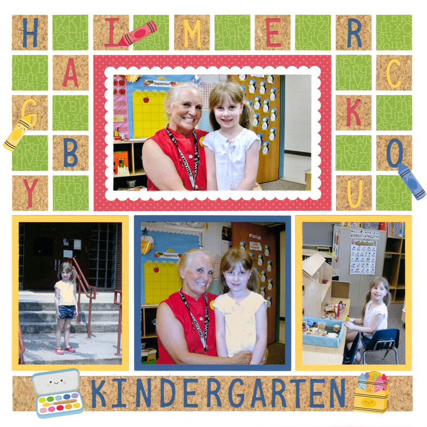
"Kindergarten" by Paije Potter - Pattern #304
Alphabet 3 & Numbers 3 are filled with whimsy, and we love this font for fun layouts.
It offers both upper-case and lower-case letters and is perfect for pages about children and pets. With a storybook feel, it goes with anything lighthearted, humorous, energetic or just plain fun.
We also love this font because the letters are more narrow - so you can squeeze the words into tighter spaces.
Alphabet 4 & Numbers 4 are a typewriter font that can also be used for anything.
It is a bit thinner than the other fonts, and has a coordinating lower-case set as well. It may have a bit of a feminine feel, making it ideal for pages about love, family and anything girly or sophisticated.
This font also comes in 2x2 Numbers!

"Lovely Lily" by Paije Potter - Pattern #324 (mirrored)
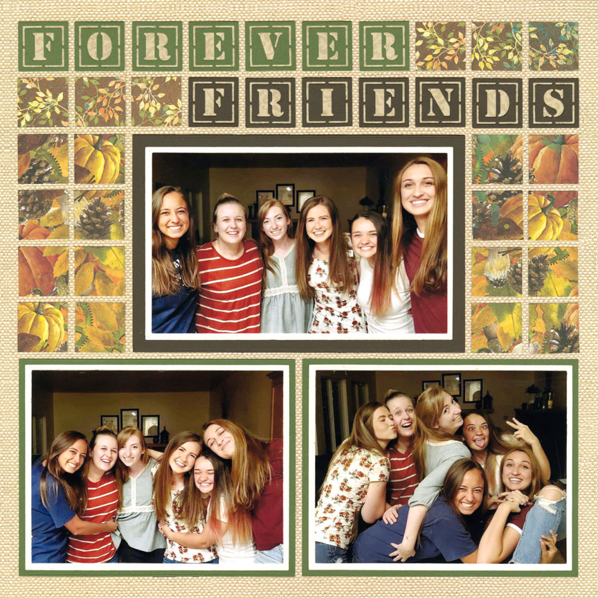
"Forever Friends" by Jodi Benson - Pattern #399
Alphabet 1 resembles a stencil. *Right now it is not always available on snapncrop.com.
It comes in capital letters only, and is great for masculine layouts, as well as summer camp, military, and anything mechanical.
2. Working with the Negative
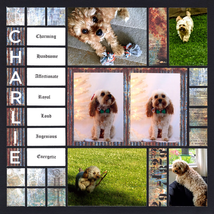
"Charlie" by Candy Spiegel
Each of the capital alphabet and number sets can be used in a few ways.
You can cut them out and place the negative space on a 1-inch square on the grid. This will allow the color of grid paper to show through. Or, you can place a 1-inch square on the grid paper first, and then lay the negative portion over the top. This will allow your numbers to take on whatever color is on the 1-inch square. A third option is to place the negative on the 1-inch square and then cut the letter a second time with a contrasting color. You can then fill in the empty spaces with the additional color. From a distance, this will give you the same effect as the second option, however, up close, it will look more finished.
Any of these options work well when you are incorporating mosaics onto your layouts, you are building a crossword puzzle design, or you just want to spread out your letters.
3. Try the Positive
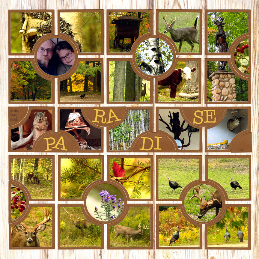
"Paradise Trophy Ranch" by Candy Spiegel - Pattern #101
Alphabet sets 2, 3 and 4, can also be used without the negative.
You can place any size shape on your grid paper and then cut out just the letters, or numbers, and use that part alone. (This is the only way to use the lower-case letters.) You could place each letter onto a 1-inch square, if desired. But, you can also put the letters closer together on a 1x4 rectangle, for example, to spell out a word.
This is a great option when you have a longer title or you do not have the space to spread out your word.
4. Cutting Tips
- If you are cutting your letters out of thick card-stock, photos, or thin felt, you may wish to cut on a metal plate that works with your die-cutting machine. The metal plate will help you cut all the way through the thicker materials. If you do not have one, it helps to make multiple passes through your machine.
- Mosaic Moments® numbers and letters are not individual dies. Rather, there are approximately five letters on each strip. You can cut multiple strips at once, but leave a bit of space between each die. This will help your machine cut better. Your letters may also cut better if you place the dies at an angle, rather than straight on your cutting plate.
- If you cut out of a paper you use often, like white or black card-stock, you may wish to cut multiple letters at once and store the extras in a box or container for future use. If you like the letters sorted out, look for a container meant to store beads. The lids of these close flush on the tops so no beads escape into a nearby slot if the box is tipped. That will also keep your letters from moving into the neighboring cavity.
- If you are working with scraps, or do not want to cut anything but the letters you need, trim your paper to slightly larger than the letter. Place the die so you can see the letters and put the paper on top. Then, use Purple Tape, washi tape or painters’ tape to hold the paper in place and carefully flip both the die and paper over and onto your cutting mat. These low-tack tapes will not hurt your die if they get cut, and they will be easy to remove without damaging your paper when you are finished. It will not hurt anything if portions of the die do not have paper on them.
5. Use Tweezers
Tweezers make working with letters immensely simpler.
Use them to pull out the letters and leftover pieces. Stick the pointy end through the holes on the back side of the die to push out the pieces that are held tightly in the die. And, use them to hold the letters when you are ready to place them on the layout, so your fingers are not in the way of lining them up.
6. Ways to Adhere
There are several ways to adhere your letters.
First, you can use a glue pen to adhere them to your layout. If you are working with a glue pen, place adhesive on the back of the letter and stick it right away, because the glue dries fast.
You can also run the pieces through a Xyron machine to turn them into stickers. When doing this, be sure to rub around the edge of each letter with a finger nail, unsharpened pencil, stylus or bone folder before pulling off the plastic covering. This will help eliminate any extra bits of stringy adhesive. If any are leftover after adhering the letters on the layout, you can use your finger or an adhesive eraser to remove the excess.
A third option is to put double-sided adhesive on the back on your paper before cutting out the letters. To do this, remove one side of backing from the adhesive and stick it to the backside of your cardstock. Cut out your letters and then use tweezers to take the backing off again and adhere it onto your layout. Depending on the thickness of the backing of your adhesive. You may need to run the letters through multiple times or use a metal plate.
7. Lining Up the Letters
One way to get your letters in a straight line is to line them up on a leftover piece of adhesive backing.
Place the bottom of the adhesive letter on the backing. It will hold, but not permanently stick. Hold it over your layout where you want your letters to sit. Adhere the top halves of the letters to your layout and then carefully pull away the adhesive backing and push down the remainder of the letters.
Of course, you can always eyeball the placement, as well. And, for a fun, whimsical look, try purposely putting them on angles.
8. Centering the Title
When you need the title to be centered, count the number of letters and spaces and choose the center letter.
For example, if your title has 13 letters, numbers and/or spaces, find the letter that would be number seven, if the first letter is number 1. Place that letter in the center of your block and then fill in the letters on the left and right.
If you are precise, consider that some letters take up more space, like the letter “m”, while others, like the letter “I”, take up less. And, use a centering ruler to get the exact center of your block.
9. Filling in the Pieces
If you are only using the positive, or actual letter, or only using the negative, or the square that goes around the letter, you will need to insert portions of the letters, like the dots on the “B”.
To do this, keep all of the pieces when you cut out the letter, but only put adhesive (or remove the backing) on the portions you are going to use.
If you are using the negative portion, place the border of the letter down where you want it. Then, place the letter inside and then the dots inside the letter. Remove the letter and discard and your dots will be in the perfect place.
If you are using only the letter, place it where you want it on your layout and adhere it in place. Then put the negative around it. You can then easily determine where the inserts go. Adhere them and then discard the negative.
10. Losing the Dots
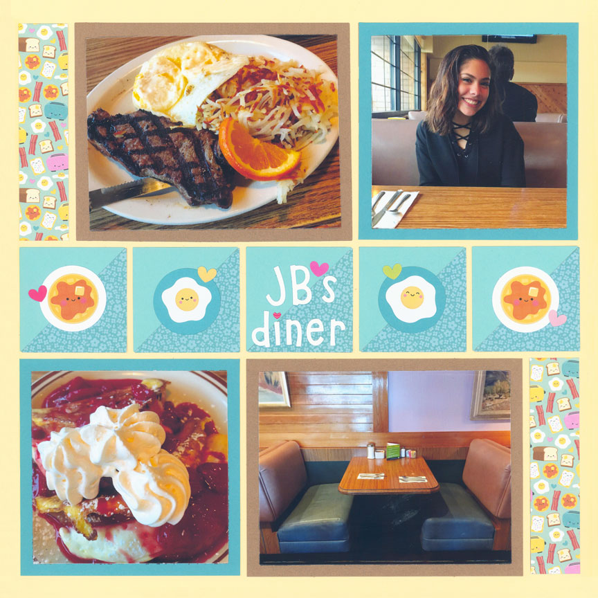
"JB's Diner" by Paije Potter - Pattern #248
It is difficult to keep track of the little dot on the “i” and “j”, as well as the bottom of the “?” and “!”. If you lose it, you have a few options:
- Cut out another
- Use a dot from a different letter that you do not need
- Use Stickles, Liquid Pearls, or enamel dots to create a dot
- Use a tiny sticker, like a flower or ornament, in place of a dot
- Add a gemstone in place of the dot
Layout above shows a mini heart sticker (Doodlebug Design™) over the lowercase I in "Diner".
11. Add Depth
If you want to add a bit of depth to your letters, consider cutting out three or four of each letter and stacking them on top of each other.
Try making only the main portion of the letter rise, like just the outline of the “B”, but not the little dots inside the “B”, to create a slightly different look. This technique is especially great when used with numbers that are significant, like turning 16, or a 50th anniversary.
This treatment is also awesome on cards.