
Pattern Gallery Feature: Symmetry
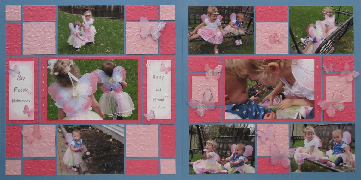
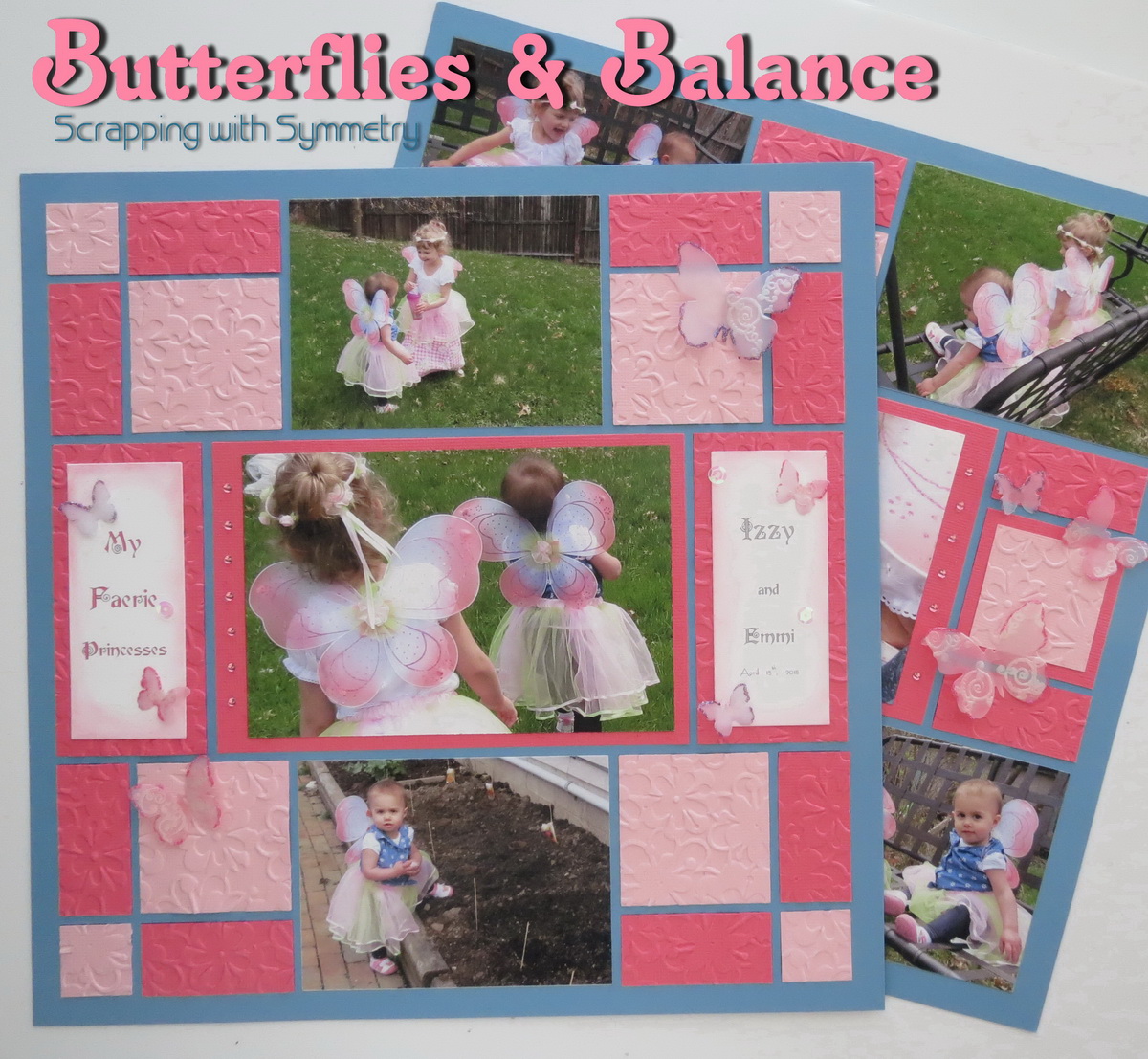
Butterflies & Balance two symmetry patterns from the Pattern Gallery
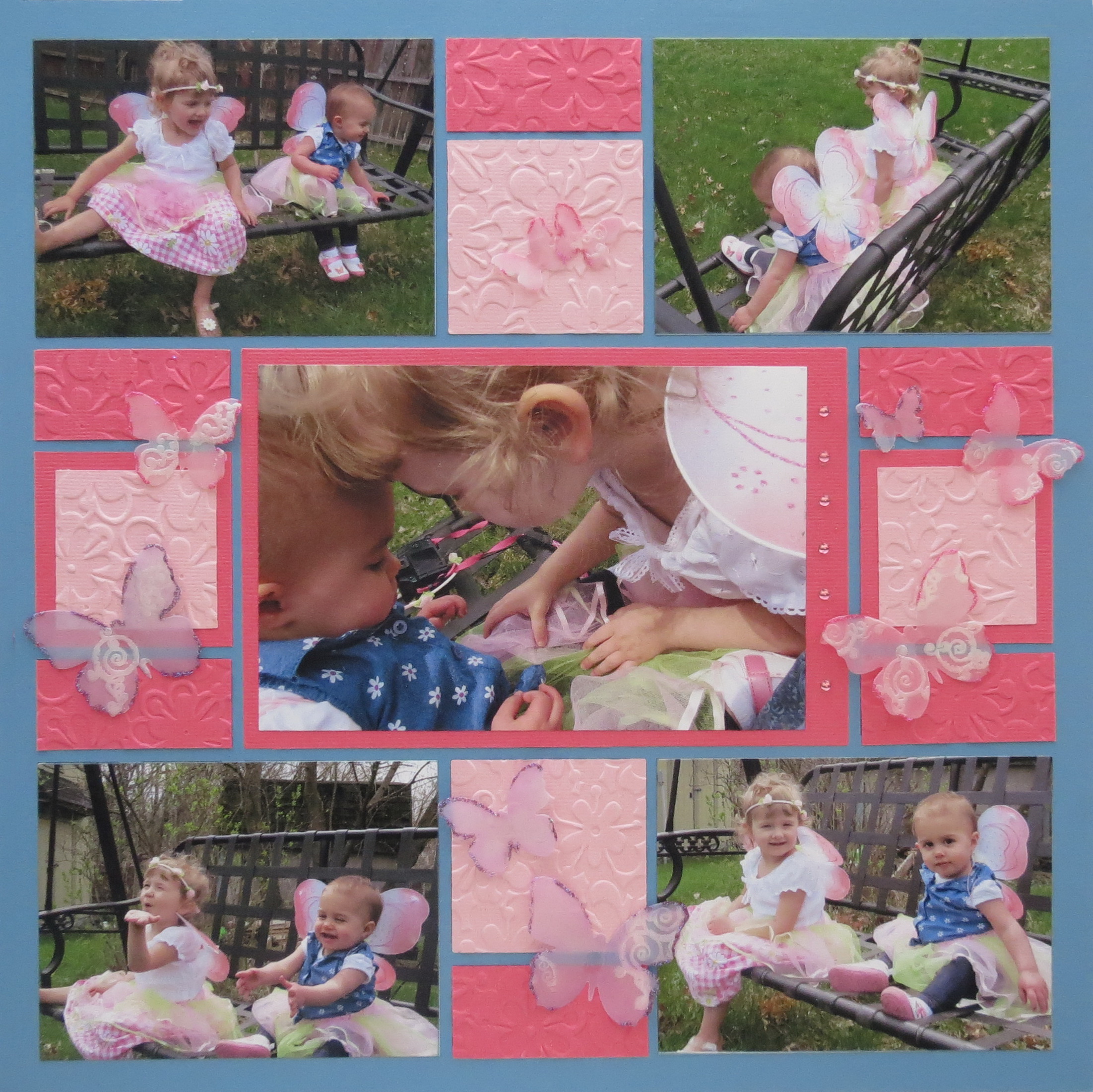
“My Faerie Princesses: Izzy and Emmi”
For the Pattern Gallery Feature this week “Butterflies & Balance” I’ve chosen two patterns as examples of Symmetry for the layout, patterns #109 and #202. I found they worked well together as they sit side by side. Each pattern if divided in half would be a mirror image of the other side; this balanced look is what we refer to as symmetry. Be sure to check out the Pattern Gallery where you’ll find many more choices for this style and others.

Pattern #202 used for page 2

Pattern #109 used for page 1
Supplies:
• 12×12 Bermuda Blue Mosaic Moments Grids
• 12×12 sheet of American Crafts deep pink and light pink
• Sizzix Clusters Embossing folder
• Amuse Butterfly Dies
• Mosaic Moments Die Sets A, B, C
• Pebbles Pearlescent Chalks
• Mark Richards Crystal Stickers Light Pink
• MM Fine Glitter Raspberry and Amethyst
• Clear iridescent sequins
• EK Success 1” Square Punch
• Title made in WORD; font: Fairy Scroll
• Technique Tuesdays scroll stamps from the ABC series
• Pearlescent embossing power

Butterflies & Balance supplies used for embellishments
This layout affords multiple photo spots on each page or as I have chosen to do use the areas for embossed color tiles and embellishments. My two central photos are both matted with the outside edges reserved for pink crystal stickers spaced ½” apart. The remaining six photos were trimmed with a MM die from Die Set C, and placed in their pattern spot.
TIP: Take inspiration from your photos for color choices, textures, embellishments and patterns you will use.Emmi’s blue shirt has tiny white daisies so I thought the “Clusters” embossing folder a good match. I used the MM Dies to cut out all the remaining color tiles before I ran them through the embossing folder. This keeps waste to a minimum.
The blue of her shirt was the inspiration for the choice of grid color, Bermuda Blue. The girl’s faerie/butterfly wings were the inspiration for including butterflies as accents.
Additionally, pattern # 109 actually reminds me of a butterfly with the outer corners 1×1 and 2×2 blocks drawing you into the center column like the wings on a butterfly. (This isn’t a Rorschach test…so…it’s just a butterfly, ok?)
The title blocks were die cut from white cardstock and then printed on the tiles.
TIP: Create and print title blocks to fit your paper tile.On the computer in WORD, I created two text boxes the size of the overlay die that I’ll use to cut the cardstock. The title and font were chosen then printed. Taking the cut cardstock I ran a strip of dot adhesive along the top backside edge and a dot at the bottom edge then inserted it into the space outlined for the title. Before printing I removed the box outline. Now I had two title blocks for the layout.
Or, you could also print directly to the cardstock and then use the dies to trim the title section out. Save the remaining cardstock for other applications.
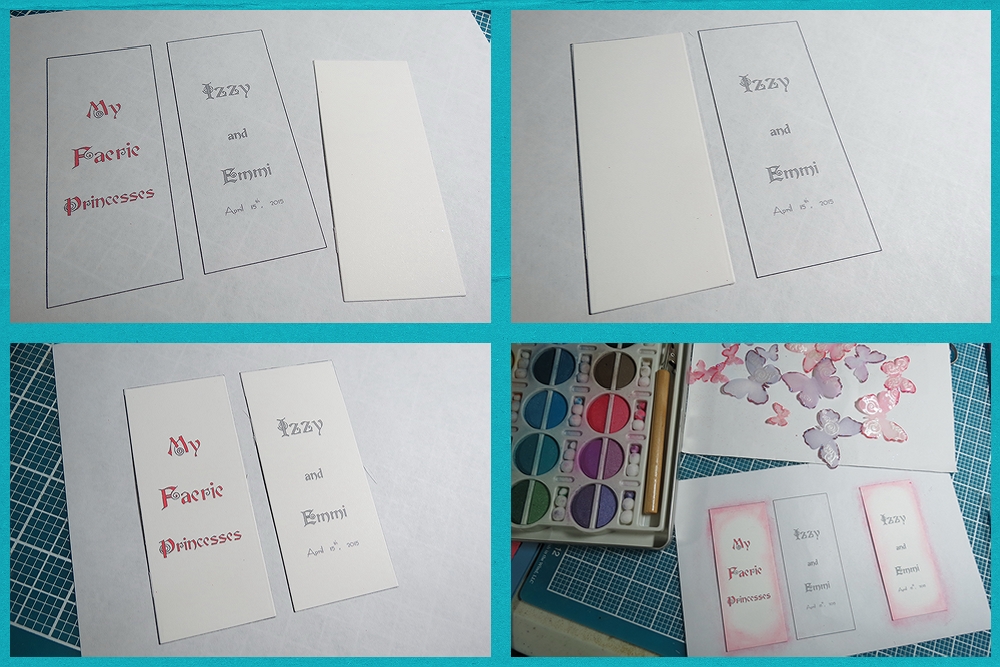
Butterflies & Balance steps to take for printing on paper tiles
Next, they were chalked with two shades of pink pearlescent chalks.
Additional touches of sequins and butterflies dressed them up a bit more.
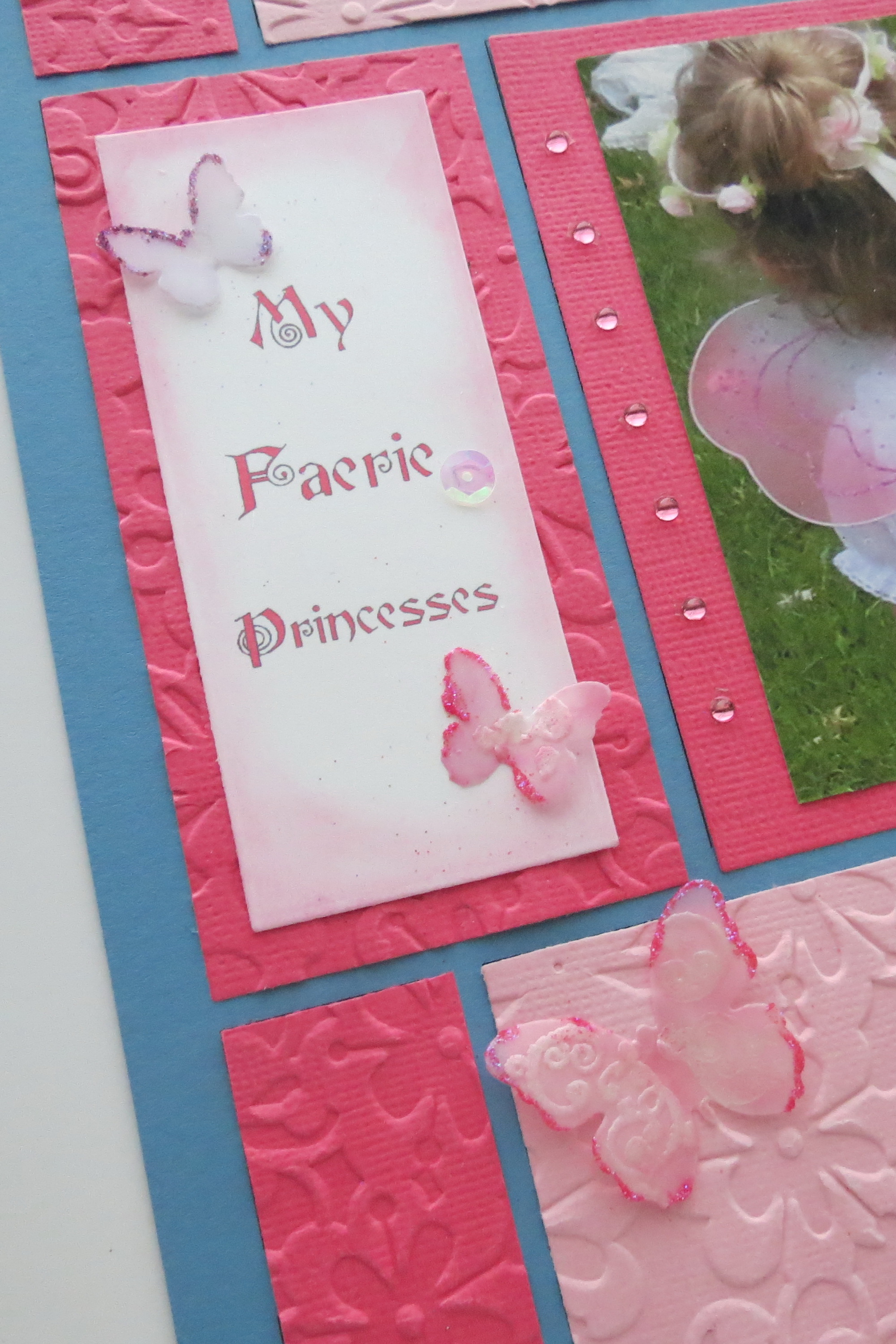
Butterflies & Balance adding sequins and butterflies to dress up the title block
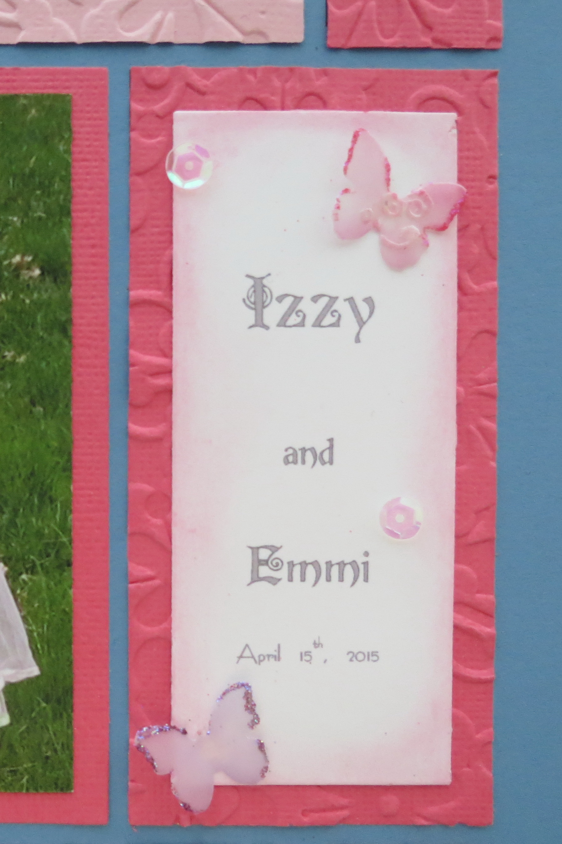
Butterflies & Balance sequins and butterflies add dimension, texture and bling!
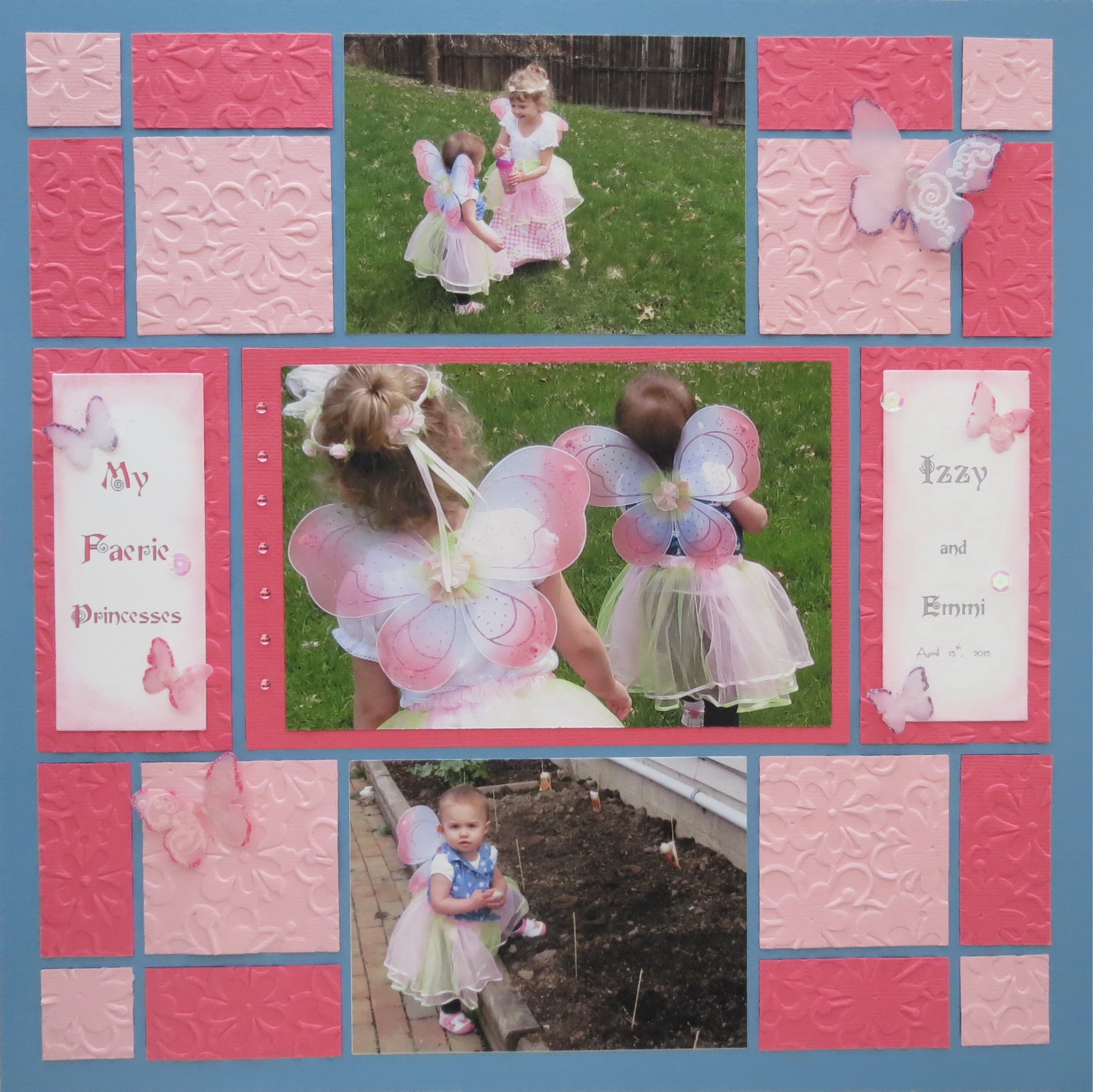
Butterflies & Balance page 1
The butterflies were die cut from the vellum, heat embossed with stamped swirls then chalked and glitter added to the edges by a light touch of glue. Glue Dots were used to attach to various spots on the grid. For some dimension place the dot in the center of the butterfly and ease the wings up and crease lightly. WARNING: Glitter gets all over everything no matter how careful you are! If you have sons, this will not be appreciated….
I wanted a light airy feel to the page with a touch of glimmer to reflect the wings of the girls in the photos, so I thought vellum would be perfect.

Butterflies & Balance chalked and embossed vellum butterfly
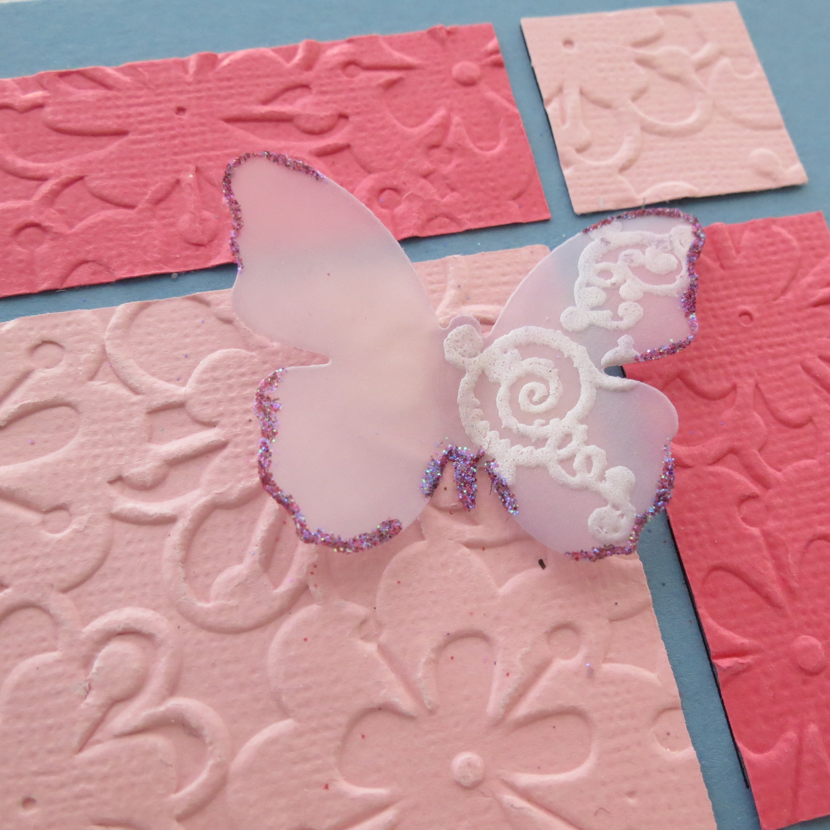
Butterflies & Balance Vellum Butterfly edged in random glitter accents
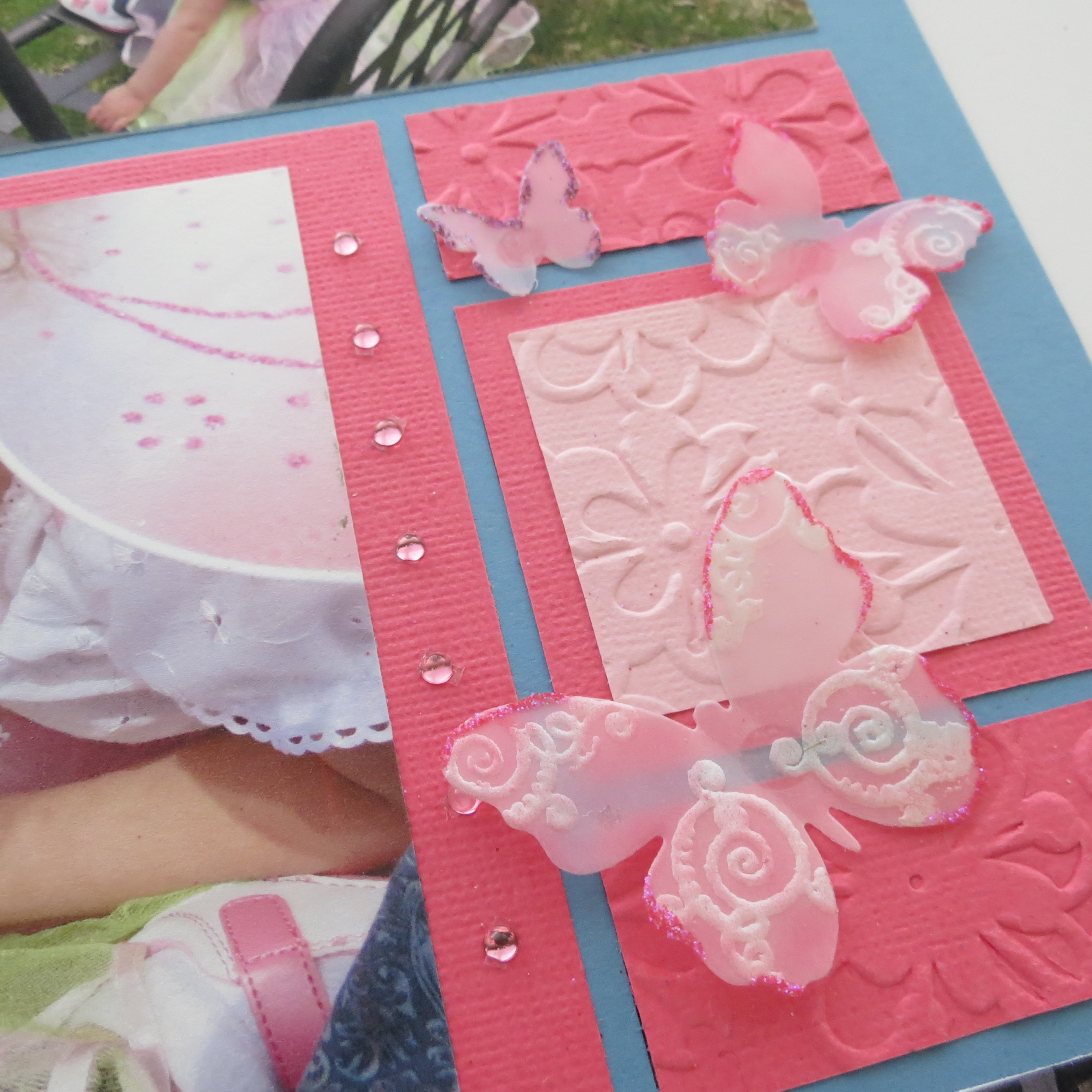
Butterflies & Balance and a bit of bling. Spaced 1/2″ apart pink gem stickers dress up the mat on each of the center photo mats. Vellum butterflies chalked, embossed and glittered!
Butterflies & Balance page 2 random butterflies in varying sizes adorn the page
I tried a few ideas before getting this one to have the look and feel the way I wanted, sometimes you just have to keep trying till you get something you really like and fits with the layout. Why not see what you can do to bring a little extra to your layouts?
Andrea Fisher
Be sure to visit our Pinterest board!

Butterflies & Balance 2 layouts featuring symmetrical patterns and 4 Tips for embellishing with embossing, gems, and glitter 1 New Technique for vellum butterflies